Looking for cool gradients for your graphic, web or UI design? Product designer and front end developer Indrashish Ghosh has created a useful online tool called uiGradients – a free collection of over 260 linear gradients that you can use for design and code. You can browse gradients by color, copy their hexadecimal or CSS codes, and even download a .JPG version of each one. … [Read more...]
What Do The Logos Of Successful Companies Have In Common?
What makes a successful logo? Is it color, simplicity, or the way symbols and typography work together? To find out, Smart Sign analyzed 2,000 logos from the Inc. 5000 list of America’s fastest growing companies and identified the most common design patterns among them. … [Read more...]
27 Beautiful Free Fonts For Your Next Design Project

As a designer, no matter how many fonts you own, you always want more. And then there's that heartbreaking moment when you've found a gorgeous typeface, only to see a big green button next to it that says "Buy Now for $75". Let's face it. We designers want freebies. We're drawn to them like a moth to a flame. … [Read more...]
29 Beautiful Color Schemes From Award-Winning Websites
Looking for color schemes for your website or UI? The design team at Visme, an online tool for creating presentations and infographics, has created a list of beautiful color schemes from websites that have been recognized by Awwwards, the world's largest web design awarding body. The list includes a wide range of color schemes - natural, earthy, contemporary, bold, elegant, … [Read more...]
36 Beautiful Color Palettes For Your Next Design Project

Looking for color palettes for your next design project? Whether it’s UI, branding, or web design, the right combination of shades can set the tone and make your work stand out. Color Hex is a great tool with nearly 40,000 ready-made palettes you can explore, copy hex codes from, and even download as PNGs for quick use. We’ve handpicked some of the most versatile and … [Read more...]
This Animated Video Brilliantly Explains How To Choose The Right Colors For Your Designs

Choosing the right color palette is essential to the success of any design project. But how do we know which colors look good together and which ones don't? How do the pros do it? The answer is color theory. Artists and designers have used color theory for centuries, but anyone can learn more about it. … [Read more...]
The Homepages Of America’s Fastest Growing Companies Have These Elements In Common

“You never get a second chance to make a first impression.” – Will Rogers. The homepage of your website is a user/customer’s first impression of your company. You have 0-8 seconds to engage a user, after which the majority of them leave. A one-second delay in your site speed can result in a 7% reduction in conversions. The key ingredients of an effective homepage are speed, … [Read more...]
25 Beautiful Free Fonts For Your Next Design Project
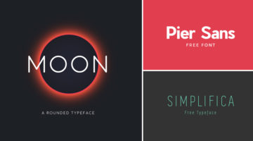
Fonts are to designers what shoes are to women. They can never have enough of them. And what's better than a beautiful font? A beautiful font that's available for FREE. We've compiled a list of 25 stylish and contemporary fonts that designers will love to get their hands on. Check them out below. … [Read more...]
How To Stay Creative, Even When You’re Not In The Mood
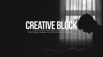
Every artist faces creative block at some point or the other. In this short video, filmmaker and photographer Sean Tucker discusses how he deals with the three major resistances to his creative work - perfectionism, rationalization, and fear. Watch below. … [Read more...]
7 Hidden Tricks That Could Change The Way You Use Photoshop

Did you know that the 'Recent Files' menu in Photoshop can show more than (the default) 10 files? You can change this number in Preferences > File Handling. Here's another tip: The tiny star (*) at the end of a document tab indicates that you have unsaved changes in that file. The forward arrow (▸) in the status bar at the bottom of every document provides a host of information … [Read more...]
35 Creative Invoices Designed To Leave A Good Impression On Clients

A good last impression is as important as the first one. In the design and creative business, every single item of stationery you present to a client speaks volumes about your capabilities and attention to detail. Most designers, agencies and studios put a lot of thought into designing creative business cards, letterheads and envelopes. But when it comes to invoices, few of … [Read more...]
A Useful Guide To Different Font Formats That Every Designer Should Know
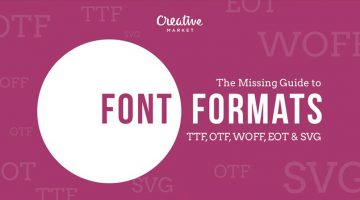
There are many choices of font formats but not a single one works across all browsers. You will have to use multiple font formats to deliver a consistent experience. These include TrueType Font (TTF), OpenType (OTF), Embedded OpenType (EOT), Web Open Font Format (WOFF) and Scalable Vector Graphics font (SVG). … [Read more...]
This Clever Pen Tool Technique Shows You How To Place Anchor Points And Curves In Illustrator
The Pen Tool is one of the most powerful tools in Adobe Illustrator and also the hardest to master. You don't always know where the anchor points have to go and where the bezier handles are supposed to be directed. Too many anchor points result in choppy curves and can also cause printing errors. The bezier handles need to be in the right direction and at the right length to … [Read more...]
This Animated Video Brilliantly Explains Layout And Composition In Graphic Design
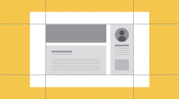
Layout and composition are the foundation of design. They give your work structure and make it easier to navigate. Without a well-composed layout, your elements would basically fall apart. GCFLearnFree has come up with an excellent animated tutorial on the five basic layout and composition principles that can help transform your work and sharpen your eye for design. Check it … [Read more...]
30 Great Font Combinations For Your Next Design Project
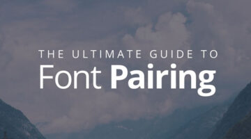
Designers often spend a lot of time deciding which typefaces to pair up and most sites don’t offer a real preview of what the text will look like. To make life easier for everyone, designer Poppie Pack from Canva has created a set of mock-ups that show different headline and body font combinations for a variety of design projects. Pack has also specified the font size and … [Read more...]
Beautiful, Minimal Photographs Of Sunsets For Color Inspiration

'Sky Series' is a gorgeous collection of sunrise and sunset photos by New York-based photographer Eric Cahan. He captures the natural polychromatic colors of the sky during dawn and dusk, and records the exact time and location of each photograph. … [Read more...]
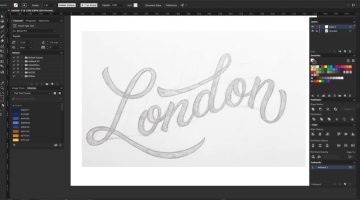
How To Convert Your Hand Lettering From Paper To Digital In Adobe Illustrator

Yesterday, we featured Mackey Saturday's 60 second tutorial on how to create a custom logotype. Today, we'll be focusing in depth on the process of converting your hand-lettering to vector, with the help of this brilliant tutorial from designer Jenn Coyle at Hello Brio Studio. Watch below. … [Read more...]
Designer Who Created The Instagram Logo Shows You How To Design A Logotype

A logotype is the name of a brand or a company designed in a visually unique way for use by that company. The logos of Google, Coca-Cola, Facebook, Disney, Cadbury, Nokia and Philips are examples of famous logotypes. The wordmarks are created using a custom or an existing typeface. If you're looking to create a custom logotype, check out this handy tutorial by Skillshare … [Read more...]
10 Tricks To Cut Out Anything In Photoshop
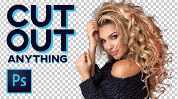
A young monk artist went up to his teacher who was reciting Photoshop keyboard shortcuts under a Himalayan tree and asked him “Teacher, when will I become a master artist like you?” The teacher replied “When you can select all the feathers of a morning sparrow without missing a single one, only then will you be a true Photoshop master.” (source) … [Read more...]
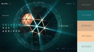
50 Beautiful Color Combinations For Your Next Design Project

Looking for some nifty color combinations for your next project? The design team at Visme, an online tool for creating presentations and infographics, has created a list of 50 beautiful color schemes you can use in your designs. These color presets are available within Visme to use in any charts or graphics that you create with it. Check out the list below. … [Read more...]
Learn Basic Photoshop Tools And Tricks With This Handy Cheat Sheet For Beginners
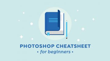
If you're using Adobe Photoshop for the first time without any training, all those tools and features can seem a bit daunting. Once you get used to the interface and spend a few hours on the program, you'll realize it's actually not that hard. To become a pro, you'll need practice, patience and an in-depth knowledge of most of the features the program has to offer. … [Read more...]
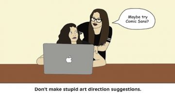
Adobe Pokes Fun At Annoying Bosses Who Micromanage Their Designers

To promote their stock photography service, Adobe has come up with a witty ad that spoofs hovering art directors who micromanage their designers. The 1:44 clip features a stereotypical art director providing constant inputs to his designer, who uses Adobe Stock to keep up with his demanding boss. Watch below. … [Read more...]
Sketch vs. Photoshop
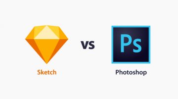
Blogger Helga Moreno has come up with a handy infographic that compares the time-tested Adobe Photoshop with the relatively new Sketch app, on the basis of their usability for web design and development. The infographic lists the key features of both apps and compares them on relevant parameters. … [Read more...]
8 Illustrator Tips And Tricks For Faster Work
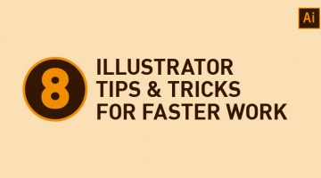
Did you know that the Symbols panel in Adobe Illustrator is a great way of building a collection of artwork that you can quickly draw from in-between projects? Also, the Graphic Styles panel lets you save and reuse an appearance (fill, stroke, opacity, etc.) that you've created. Ctrl/Cmd + D is useful for rapidly repeating the last transformation action performed. … [Read more...]
Legendary Designer Brilliantly Explains How To Charge Clients For Logos And Other Design Services

Chris Do is an Emmy award-winning designer and the visionary founder of Blind—a respected brand strategy and design consultancy based in Santa Monica. With a wealth of experience in the design industry, Chris also leads The Futur, an online platform dedicated to empowering creative professionals with the business skills they need to succeed. In this engaging video, Chris … [Read more...]
22 Graphic Design Mistakes That Novice Designers Make
After a few years in the graphic design business, you realize how important it is to get the basics right. Like following a file naming convention, creating scalable logos, ensuring proper kerning and leading, using high-res images for printing, and so on. … [Read more...]
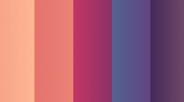
30 Beautiful Color Gradients For Your Next Design Project

Looking for cool background gradients for your UI? Software and design company Itmeo has created a useful online tool called WebGradients – a free collection of 180 linear gradients that you can use as content backdrops in any part of your website. You can download a .PNG version of each gradient and copy their CSS3 cross-browser codes. Sketch and Photoshop packs are … [Read more...]
10 Hilarious Examples Of How Punctuation Makes A Big Difference
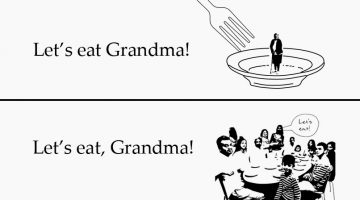
The absence or presence of a comma can change the entire meaning of a sentence. For example, there's a cannibalistic difference between "Let's eat grandma" and "Let's eat, grandma." The same holds true for apostrophes, hyphens, colons, and other punctuation marks. Curtis Newbold from The Visual Communication Guy has come up with a hilarious infographic that illustrates the … [Read more...]
5 Tips For A Killer Portfolio

Your portfolio should showcase only your best work. Don't use mediocre work as filler. Also, develop your skills using the "T-shaped" model, i.e., hold a thorough knowledge and strong skill-set in one subject, but also work beyond your area of expertise to collaborate in other fields. … [Read more...]
What Different Types Of Fonts Mean And How To Use Them
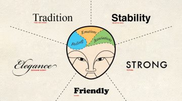
Every font has a unique personality and purpose. While working on a project, it's imperative to know which font matches the intended tone of communication. Serif fonts portray tradition, sophistication and a formal tone. Sans serif fonts are modern, humanist and neutral. Slab serifs are bold and contemporary. Script fonts are elegant, classic, stylish and formal. We've … [Read more...]
Adobe Illustrator ‘Pen Tool’ Cheat Sheet For Designers
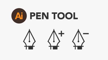
Paul Trani, Senior Worldwide Creative Cloud Evangelist for Adobe, has created a handy 'Pen Tool' cheat sheet for Adobe Illustrator. The 8-point visual guide covers the basics and shows you how to create straight and curved lines, add/delete/move anchor points and use bezier handles. We've also collated a few tutorials that Illustrator newbies might find useful. Check them … [Read more...]
Who Legally Owns A Website Once It’s Designed?
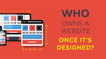
"I paid a professional web designer to create my site, of course I own it!" - this is probably the belief that almost every website client holds. It makes perfect sense - you paid someone to develop a website for you. Why then would you not own what you paid for? … [Read more...]
How Art Directors And Copywriters Can Avoid Annoying Each Other
Copywriter Stephanie Vicari and Art Director Caitlin Hickey wanted to tackle the potential complicated relationship that can exist between copywriters and art directors. The result? They created airline-style safety cards for budding creatives to ensure that no one steps on any toes. Check them out below. … [Read more...]
What Is SSL? Why Every Website Needs SSL Encryption for Security, Trust, and SEO

SSL (Secure Sockets Layer) is a core web security technology that encrypts the connection between a website and its visitors. This encryption ensures that sensitive data — such as login credentials, payment details, and personal information — cannot be intercepted, altered, or misused by hackers. … [Read more...]
The Recipe For Creating Epic Logo Designs
A logo is not just a graphical symbol, it is the embodiment of your organization. Designing a logo is not just about creating a business identity, it's about creating a connection between the customer and your brand. A successful logo is one that is memorable, versatile, appropriate and timeless. … [Read more...]
- « Previous Page
- 1
- …
- 6
- 7
- 8
- 9
- 10
- 11
- Next Page »