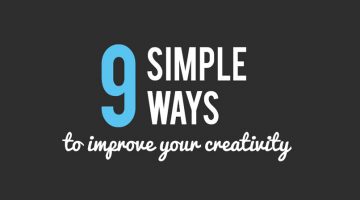
"Every child is an artist. The problem is how to remain an artist once we grow up." - Pablo Picasso. 60% CEOs believe that creativity is the most important leadership quality, but only 1 in 4 people believe they are living up to their creative potential. … [Read more...]
200 Words To Use Instead Of “Good”
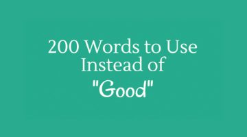
"Good" is dull and unimaginative. People often use "good" as a lazy replacement for a more appropriate word. Custom Writing have created an excellent infographic that lists 200 words you can use instead of "good". For instance, to describe taste, use "scrumptious" or "delicious". To describe a performance, use "stellar" or "captivating". Know more in the infographic below. … [Read more...]
10 Golden Rules To Improve Your Typography Skills
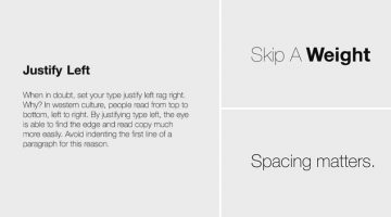
There are two types of typography - expressive typography (where type is used as a visual element) and functional typography (type that is meant to be read). Emmy Award-winning designer Chris Do's Typography Manual focuses on the latter and shares 10 golden rules to help you improve your type skills. Vietnam-based designer Leo Dinh has created an animated version of … [Read more...]
10 Common Photoshop Mistakes That Novice Designers Make
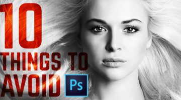
Still using Bevel and Emboss on your Photoshop text? That's not a bad idea if you want your designs to look like flea market flyers from the 90s. Here's a handy tutorial by Nathaniel Dodson at Tutvid that features 10 common Photoshop mistakes that amateur designers make, and how to avoid them. … [Read more...]
10 Simple Exercises For Designers And Desk Workers To Stay Fit
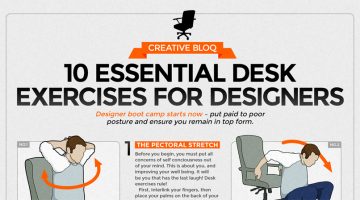
Designers and artists spend long sedentary hours at their desk which can lead to a range of health issues like obesity, back pain, neck strain, diabetes, heart disease and more. Jack Dennerlein, professor at Northeastern's Bouvé College of Health Sciences in Boston, suggests a 20-20-20 rule to counter the health risks of prolonged sitting - after every 20 minutes, walk 20 feet … [Read more...]
Web Design Psychology: How To Create A Site That Influences People
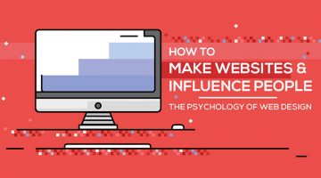
"Good design is obvious. Great design is transparent." – Joe Sparano. That line has stuck around for years because it gets at something most people building websites still miss: the best-performing sites aren't the flashiest ones. They're the ones that feel effortless to use. Web design psychology is what sits behind that effortlessness. It's the reason you trust certain … [Read more...]
69 Useful Photoshop Shortcuts To Speed Up Your Workflow
Photoshop shortcuts help speed up your workflow considerably. The more time you spend with the software, the more shortcuts you learn and use. Creative Bloq has created a handy cheat sheet/infographic that contains 69 useful Photoshop shortcuts to help you save time – a perfect reference guide for PS newcomers or as a checklist for experienced designers. Check it out below and … [Read more...]
9 Useful Tips For Better Typography
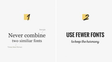
Like any form of art, there is no set formula to create good typography. Typographic choices that work for one form of text won’t necessarily work for another. There are however good practices to follow. Design resource website Pixelo has come up with a nifty animated video that shares a few useful tips to keep in mind when combining typefaces and working with … [Read more...]
How Filmmakers Use Shapes And Geometry In Movies To Trigger Your Emotions

The brain gives abstract meaning to many different shapes in a consistent way and filmmakers use this phenomenon to tell their story. In animation, for example, evil characters have sharper features, pointy noses and long curly fingers. The lovable characters are designed soft and round. … [Read more...]
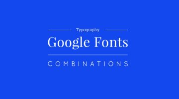
10 Great Google Font Combinations For Your Next Design Project
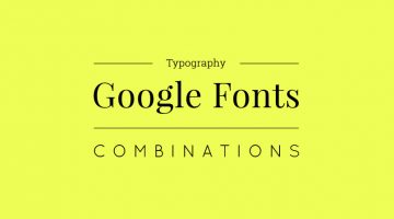
Designers often spend a lot of time deciding which typefaces to pair up and most sites just give one-sentence examples that don't offer a real preview of what the text will look like. To make life easier for everyone, the team at Milo Themes has created a set of mock-ups that show different Google Font combinations for headline and body copy. They've used filler text from … [Read more...]
15 Surprising Things That Can’t Be Copyrighted
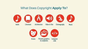
Copyrights are an essential legal tool for artists, writers, musicians and inventors to protect their work. However, not everything can be copyrighted. The ingredients of a recipe can't be copyrighted. Neither can a domain name, or the title of a book. … [Read more...]
The Psychology of Colors in Marketing (Infographic)
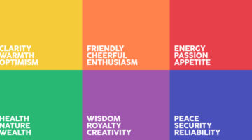
When buying a product, 93% of buyers focus on its visual appearance. 84.7% of buyers claim that color is the primary draw card. Different colors have different psychological effects on consumers - red encourages appetite, blue provides a sense of security, green stimulates harmony, orange promotes enthusiasm, purple is associated with royalty, and so on. Homestead has … [Read more...]
5 Things Every Designer Should Know When Dealing With Clients
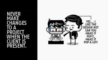
If you're making changes to a project in front of a client, you're doing it wrong. You might think you're saving time, but you end up making the design process look simpler than it actually is. Here's a handy infographic by Basekit and Josuedric that shares five such important tips you should keep in mind when dealing with design clients. … [Read more...]
Tips To Make Your Website User-Friendly For People With Disabilities
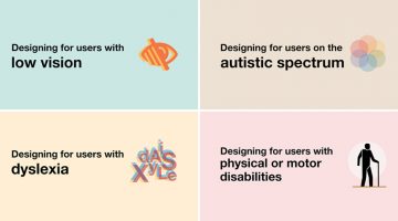
A website should be user-friendly for everyone, including those with poor vision, dyslexia, autism or physical disabilities. UK-based interaction designer Karwai Pun has created a set of six infographics that highlight the dos and don'ts of designing for accessibility. … [Read more...]
The 100 Best Web Design Tools And Resources
As a designer, it's imperative that you know your tools like an artist knows their paintbrushes. But with so many new apps and resources around, which ones should you bookmark? … [Read more...]
If You Want To Sound Smarter, Use These Words Instead Of “Very”
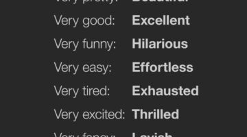
"Very" is vague and weak. People often use "very" as a lazy replacement for a more appropriate word. Proof Reading Services have come up with an excellent infographic that lists 128 words you can use instead of "very". For example, instead of "very colorful", you can use "vibrant". Instead of "very funny", use "hilarious". Instead of "very excited", use "thrilled". Know … [Read more...]
This Brilliant Font Lets You Create Graphs Quickly By Converting Numbers To Visuals
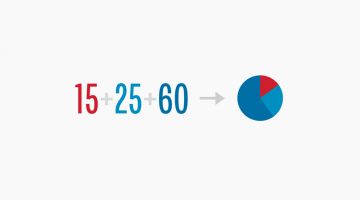
FF Chartwell is a handy typeface that lets you create charts and graphs out of numerical data with just a few keystrokes. Designed by Travis Kochel, the typeface transforms simple strings of numbers into a graph with corresponding values. The visualized data remains editable, allowing for updates and styling. Here's how it works: … [Read more...]
15 Great Google Font Combinations For Your Next Design Project
Designers often spend a lot of time deciding which typefaces to pair up and most sites just give one-sentence examples that don't offer a real preview of what the text will look like. To make life easier for everyone, the team at Milo Themes has created a set of mock-ups that show different Google Font combinations for headline and body copy. They've used filler text from … [Read more...]
This Powerful Photoshop Trick Lets You Remove Unwanted Objects In Just 3 Simple Steps

To remove unwanted objects from an image, we usually use the Clone Stamp Tool to duplicate elements from the surrounding area. But here's a Photoshop hack that makes it even simpler. … [Read more...]
A Useful, Comprehensive List Of Typography Terms For Designers
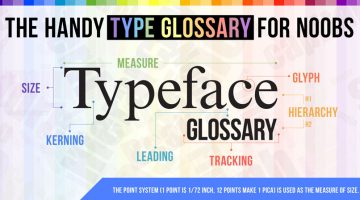
Do you know the difference between kerning and tracking, beak and serif, baseline and descender line? As a designer, it's imperative that you know what different typography terms mean, even if you don't use them every day. Here's a brilliant typeface glossary/infographic by DesignMantic that explains the meanings of terms like kerning, leading, tracking, glyph, serif, etc. and … [Read more...]
How To Remove Your Ex-Boyfriend Or Girlfriend From A Photo Using Photoshop

Picture this: You're browsing through your old photos and come across a fabulous picture of yours that you want to share on social media. There's just one problem. Your ex is in it too. What do you do? If you have Photoshop on your system, Aaron Nace from Phlearn offers a handy tutorial that shows you how to remove unwanted people and objects using the pen tool, clone stamp … [Read more...]
How To Structure URLs To Make Your Web Pages Rank Higher
Short and clean URLs don't just improve usability and user experience but they also help your pages rank higher in search results. Keep your URLs to under 60 characters, match them to their page titles and avoid keyword repetition and stop words like 'the', 'and', 'but', 'of', etc. FME Modules has created a handy infographic that offers URL structuring tips and suggestions to … [Read more...]
14 Graphic Design Terms That Most Designers Get Wrong
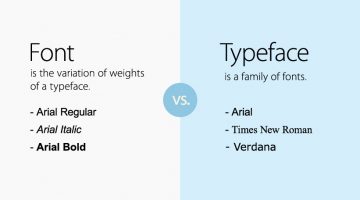
Most amateur designers don't know the difference between a font and a typeface. They use the two terms interchangeably. A font is the variation of weights (bold, italic, thin) of a typeface. A typeface is a family of fonts, like Arial, Helvetica, Bebas, etc. Another example is the usage of the terms 'color' and 'hue'. Color is an all-encompassing word referring to a hue, … [Read more...]
Beautiful, Inspiring Hand-Lettered Tips For Designers And Creatives
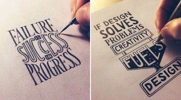
Sean McCabe is a hand lettering artist, type designer, and illustrator based in San Antonio, Texas. He runs a media company called seanwes by day and creates gorgeous hand-lettered typography by night. Using Pigma Micron pens, Sean weaves his magic on paper, offering inspiring tips and mantras for artists, designers, creatives, and just about anyone. He has spent over 9000 … [Read more...]
The Best Colors For Productivity And Creativity In Your Workplace
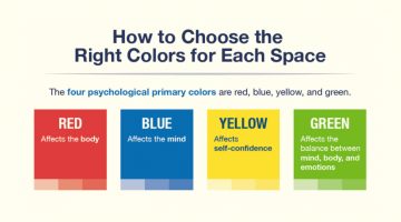
Did you know that yellow induces a sense of optimism and is a good color for high energy creative spaces? Red boosts heart rate, increases brain activity and is good for places where people work at night. Green boosts creativity, promotes harmony and is a good choice for brainstorming spaces. If you’re working remotely or looking to redesign your home office, platforms like … [Read more...]
How To Transform A Face Into A Powerful Text Portrait In Photoshop

You've seen typographic portraits of famous luminaries like Muhammad Ali, Steve Jobs, John Lennon, Audrey Hepburn, etc., but do you know how to create them? Marty from Blue Lightning TV shows you how to transform a photograph into a striking text portrait in these nifty Photoshop tutorials below. … [Read more...]
40 Little Things You Can Do To Break Your Creative Block
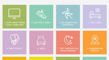
We're all short of creative juice sometimes. Panic-driven deadlines, unreasonable clients/bosses and lack of proper rest can sap the positivity out of your system, leaving you in a frame of mind that is seldom productive. The key is to (re)find your inspiration, trust your abilities and distance yourself from all things negative. … [Read more...]
How To Choose The Best Colors For Your Logo
Picking colors for your logo is not just an artistic decision based on personal preference. Different colors elicit different psychological responses that impact consumer behaviour. Red stands for excitement, passion, appetite and urgency. Green is associated with nature, wealth and conservation. Blue stands for confidence, trust and reliability. Yellow is associated with … [Read more...]
16 Tips For Better Brainstorming Sessions
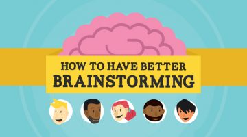
The best ideas come from great minds working together. But group brainstormings can be tricky. Senior members can end up dominating. People can be wary of contributing due to lack of involvement or fear of rejection. Every year, more than $37 billion is spent on unproductive meetings according to research compiled by online meeting service provider Fuze. … [Read more...]
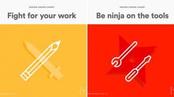
Designer Shares 10 Lessons He Learnt From Working In An Agency
Agency life is not for everyone. The fast-paced, deadline-driven environment saps your creative juices faster than you can say "brand positioning". You do however learn a lot - like how to go three days without a shower, how to claim free meals by billing them to the client, etc. It's definitely an experience that every creative should go through before switching to the client … [Read more...]
15 Signs You Need To Let Your Client Go
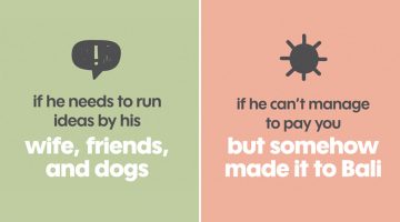
We creative types are not known for our patience. We freak out over what to eat when we see an ugly menu at a restaurant. We don't follow road signs if they're written in Comic Sans. But when it comes to clients, we listen, we hear and we understand. We're patient because (a) we want to use our creative skills to solve their problems and (b) they're paying us, damn it. … [Read more...]
24 Useful Design Tips That’ll Help You Create A Better Logo
Most small scale businesses on modest design budgets end up with amateurish logos that use stock art, are overly complex or follow trends that look outdated in a year. No use blaming the cheap freelancer, the owners themselves don’t know what they want. … [Read more...]
What Do The World’s Most Popular Logos Have In Common?
Logos may look different at first glance, but many of the world’s most successful brands share disciplined design choices. Across industries, clear patterns emerge in color, typography, shape, and structure. Strong logos are not accidental. They are built for clarity, memorability, and long term recognition. … [Read more...]
5 Color Choices You Must Avoid When Designing For The Web
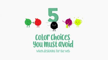
When it comes to web design, colors play a vital role in increasing conversions, reducing bounce rate and ensuring a smooth user experience. We often see websites compromising on readability by using light-colored text on light backgrounds. Also, it's never ok to use red and green in excess, even if you're making a Christmas-themed website. … [Read more...]
How To Cut Anything Out In Photoshop

A young monk artist went up to his teacher who was reciting Photoshop keyboard shortcuts under a Himalayan tree and asked him "Teacher, when will I become a master artist like you?" The teacher replied "When you can select all the feathers of a morning sparrow without missing a single one, only then will you be a true Photoshop master." (source) … [Read more...]
- « Previous Page
- 1
- …
- 7
- 8
- 9
- 10
- 11
- Next Page »