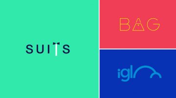
Milan-based creative director Duminda Perera has created a series of clever wordmarks/calligrams of common words we use every day. He’s altered, combined or replaced letters with shapes and symbols that visualize the meaning of the word. So the letter ‘n’ in ‘wine’ looks like a wine bottle, the two o's in ‘igloo’ form the shape of an igloo, and so on. Check them out below. … [Read more...]
Clever Illustrations Of Historical Events Using Digits From The Year They Occurred In
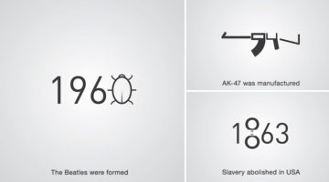
Levan Patsinashvili and Davit Babiashvili are a designer duo based in Georgia, Europe. When they're not busy creating advertising campaigns at Saatchi and Saatchi Tbilisi, they apply their creative skills in a project titled D1G1TAL CHR0N1CLES - a series of pictograms that visualize major historical events using digits from the year they occurred in. Check them out below. … [Read more...]
27 Famous Logos With Hidden Meanings

A logo is more than just an emblem that represents a brand; it's a visual representation of a company's identity, values, and mission. Some logos, however, go above and beyond in delivering a message. These logos have hidden meanings that are deliberately incorporated into their design, adding another layer of intrigue and interest to the brand. These cleverly crafted … [Read more...]
Designer Challenges Himself To Create 25 Logos In 25 Days Using The Golden Ratio
Dhaka-based Graphic/UI designer Kazi Mohammed Erfan undertook a 25-day logo challenge to create one new logo every day based on the golden ratio. His objective was to reintroduce viewers to the beauty of the golden ratio and to promote himself as a designer. Erfan used Adobe Illustrator and Photoshop to create the logos. He has also shared working sketches to show the … [Read more...]
Watch This Calligrapher Draw Famous Logos With Remarkable Accuracy Entirely By Hand
Sebastian "Seb" Lester is an English artist, type designer and calligrapher known for his prominent type designs and calligraphic prints. He started designing typefaces for Monotype in the early 2000s after graduating from Central Saint Martins, London, where he studied graphic design. … [Read more...]
After Working With Difficult Clients, This Designer Turned Their Comments Into Funny Posters
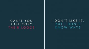
In the design business, if you put a nickel in a jar every time a client says something stupid, you'll have a jar full of nickels by the end of the week. After receiving his fair share of nonsensical client feedback over the years, Jonathan Quintin, founder and creative director of UK agency Studio–JQ, decided to collate a few of them into a poster series titled "The Client … [Read more...]
34 Clever Posters That Turn Famous Song Names Into Visual Puzzles
Swedish designer Viktor Hertz has a knack for turning song titles into visual puzzles. His ongoing series of pictogram music posters translates the literal meaning of famous song names into minimal icons and symbols — no words, just clever imagery that makes you work for the punchline. Created in Adobe Illustrator, each poster reduces an iconic track to its most visual, … [Read more...]
How To Choose The Best Colors For Your Logo
Picking colors for your logo is not just an artistic decision based on personal preference. Different colors elicit different psychological responses that impact consumer behaviour. Red stands for excitement, passion, appetite and urgency. Green is associated with nature, wealth and conservation. Blue stands for confidence, trust and reliability. Yellow is associated with … [Read more...]
13 Colorful Animal Logos Made From 13 Perfect Circles
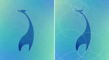
Paris-based designer and art director Dorota Pankowska was inspired by the simplicity of the Twitter logo, which was created using a pattern of 13 circles. She decided to challenge herself and see what other animals could be created using the same design principles. The result? Check it out below. … [Read more...]
37 Amazing Ads That Use Negative Space Brilliantly
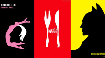
In art and design, negative space is the background space around the main object of an image. In a two-tone image (eg. black and white), the object is usually depicted in a darker color (black) than the background (white), thereby forming a silhouette. Sometimes, the tones are reversed and white is used to fill the silhouette (refer Coke examples below). When an artist … [Read more...]
16 Clever Typographic Movie Titles
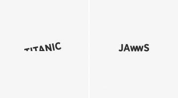
Istanbul-based digital creative Ali Erkurt has created a series of typographic movie titles that subtly hint at the plot or the central elements of the films. So, the 'w' in Jaws looks like the teeth of a shark, the 'i' in Matrix is replaced with the number 1 (the chosen one), the 'o' in Indiana Jones looks like his whip, and so on. Check them out below. … [Read more...]
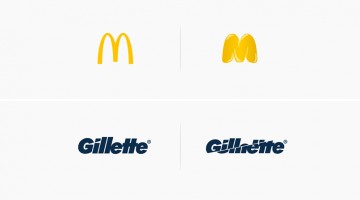
What Logos Of Famous Companies Looked Like When They First Started Out
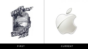
The logos of brands like Apple and IBM are iconic now, but when most of these companies started out, their logos were awkward, clip-arty and looked like they had been designed by amateurs on a budget. With time, they shed their extra weight and evolved into aesthetically pleasant shapes thanks to legendary artists like Paul Rand who were masters of brand identity … [Read more...]
Designer Challenges Himself To Create 30 Animal Logos In 30 Days Using The Golden Ratio
Ukranian designer Andriy Yurchenko took on a 30-day logo challenge to create one animal logo each day, using the principles of the golden ratio. The Kyiv-based artist specialises in web, UI/UX, and identity design. For this project he used Adobe Illustrator, Photoshop, and experimented with different color schemes to get the desired look. Check it out below. … [Read more...]
24 Useful Design Tips That’ll Help You Create A Better Logo
Most small scale businesses on modest design budgets end up with amateurish logos that use stock art, are overly complex or follow trends that look outdated in a year. No use blaming the cheap freelancer, the owners themselves don’t know what they want. … [Read more...]
What Do The World’s Most Popular Logos Have In Common?
Logos may look different at first glance, but many of the world’s most successful brands share disciplined design choices. Across industries, clear patterns emerge in color, typography, shape, and structure. Strong logos are not accidental. They are built for clarity, memorability, and long term recognition. … [Read more...]
Pun-Based City Logos Created Using Words Within Their Names
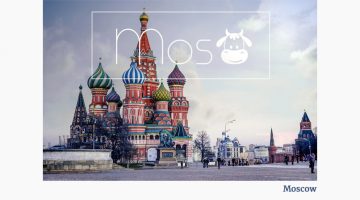
Bucharest-based designer/photographer Raluca Popescu was trying to create a representative banner for a travel agency, when she came up with the idea of creating pun-based city logos using words within their names. So the logo for Moscow has a cow in it, the logo for Cambridge has a bridge, Budapest has Buddha, and so on. Check them out below. … [Read more...]
Beautiful, Vibrant Animal Logos Based On The Golden Ratio
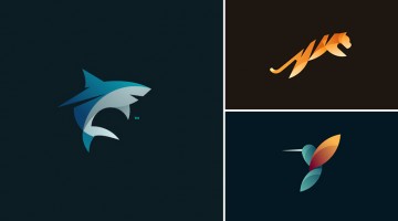
Here's a gorgeous collection of animal logos by Tom Anders Watkins, a half Finnish, half English, self-taught designer from Lincoln, UK. The 21-year-old is a multi-disciplined advertising creative and has won numerous awards such as Student of the Year from the Art Directors Club of Europe, D&AD New Blood and Adobe Photoshop's 25 Under 25. … [Read more...]
Vibrant, Beautiful Logos And Illustrations Made With Blend Modes And Transparency
Russian graphic designer Ilya Shapko has created a series of vibrant icons using blend modes and transparency in Adobe Illustrator. The project, titled 'Overlays', showcases colorful illustrated shapes cleverly placed over each other to form abstract animals and human figures against light and dark backgrounds. Shapko resides in Saratov and is a popular contributor on … [Read more...]
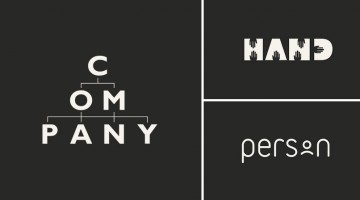
Designer Turns Everyday Words Into Clever Logos With Hidden Meanings
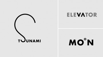
Almost twenty years ago, New York-based designer Ji Lee received a typography assignment in art school: take a word and express its meaning using only the graphic elements of its letters. No added shapes, no illustrations — just the letterforms themselves. Lee kept exploring the idea over time and eventually created more than 100 such designs. In 2011, he published a book … [Read more...]
Cool, Quirky Icons Of Everyday Objects Drawn Using A Single Line
Looking for unique icons for your next design project? Paris-based creative studio Differantly has created a nifty set of icons using just one single continuous line for each symbol. Every icon was imagined and conceptualized on paper before being vectorized with Adobe Illustrator. Check them out below. … [Read more...]
What Famous Logos Would Look Like If They Used The Products They Represent
What would brand logos look like if they used or consumed the products they represent? Italian industrial product designer Marco Schembri answers the question in this amusing project below. … [Read more...]
20+ Beautiful Vintage-Style Logos For Design Inspiration
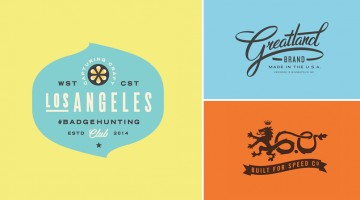
Here's a gorgeous collection of retro/vintage-style logos and badges by Minneapolis-based graphic designer Allan Peters. After a 3-year stint at BBDO as Sr. Art Director, Peters worked at Target's in-house studio as Associate Creative Director for 5 years. He quit in 2015 and now runs Peters Design Co. which caters to clients like Nike, ESPN, Amazon and Johnson & Johnson. … [Read more...]
Clever Animal Logos That Show Their Shapes Within Their Names
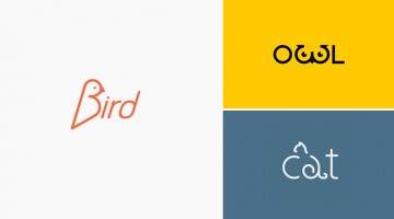
What if a logo didn't just represent an animal — it became one? That's exactly the idea behind this clever series of animal wordmarks by Shibu PG, a graphic designer based in Kochi, India. Each design uses custom typography and carefully placed symbols to hide the silhouette of the animal within its own name. The 'e' in eagle sweeps into a pair of wings. The 'g' in frog … [Read more...]
36 Brilliant Logos With Hidden Meanings
There's a reason certain logos with hidden meanings stick with you long after everything else fades. You forget the tagline, forget the campaign, but the mark stays. Usually because there's something in it you almost missed. A second shape hiding inside the first, a meaning that only clicks after a beat. That's the whole game with clever logo design. The designers behind … [Read more...]
Clever Flag-Colored Icons Of Countries Based On Their Popular Products And Phrases
Here's an interesting visual project by Russian art director Kirill Zaytsev, that showcases minimalist flag-colored icons of various countries based on common phrases, products and stereotypes associated with them. For example, the icon for France is a pair of luscious lips colored blue, white and red, representing the term "French kiss". The icon for US is a dream bubble … [Read more...]
45 Awesome Logo Animations
They're smooth, they're slick, they're cool and they're quick. Check out these 45 brilliant logo animations that pop right off the screen. … [Read more...]
If Doctors Drew Famous Logos, This Is What They Would Look Like
Doctors are known for their illegible handwriting which can only be understood by pharmacists and chemists. Today's post shows how famous brand logos would look if they were scribbled/doodled by doctors. Guess the 13 logos and cross-check with the answers given below. … [Read more...]
45 Clever Typographic Logos Of Common Words We Use Every Day
California-based design studio Quillo Creative has come up with a series of impressive typographic logos of common words we use every day. They've combined, altered, and replaced letters with visuals that symbolize the word. For example, the letters 'H' and 'A' in the word SHAVE have been designed to look like a razor. The 'M' in CAMP looks like a tent. The words 'H' and 'E' … [Read more...]
Beautiful, Hand-Lettered Logos Of Countries From A To Z
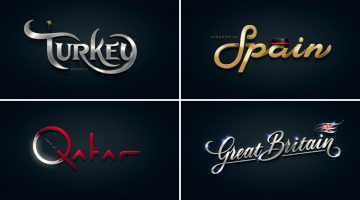
Alphabet of the Countries™ is a non-commercial, just-for-fun project by art director Pavel Zertsikel at Zergutdesign Studio. The idea was to make 26 hand-lettered logotypes, from A to Z, based on common notions of a particular country. The logos were to be hand drawn and created without the use of fonts (allowed for small captions only). The end result is a beautiful … [Read more...]
30 Honest Logos Of Famous Companies
What Clif Dickens did to advertising slogans, Viktor Hertz has done to popular brand logos. In a hilarious project titled 'Honest Logos', the Swedish designer shows us what famous company logos would look like if they were brutally honest about their product(s). Some are funny, some brash and some brilliant. Check them out below. … [Read more...]
10 Clever Animal Logos Created With Negative Space
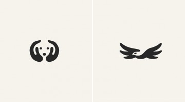
Using negative space with subtle perfection, NY designer George Bokhua has created an adorably clever collection of animal logos. Most of these would make great tattoo designs as well. If you're a design freak and an animal lover, this will make your day. … [Read more...]
Designer Creates Beautiful Logo For 2020 Tokyo Olympics And The Internet Is Loving It
Spain-based Japanese graphic designer KanKan has created a brilliant logo concept for the 2020 Tokyo Olympics, that's winning the internet. Check it out below. … [Read more...]
25 Clever Logos Of Common Words You Use Every Day
Using typography and clever symbolism, Spanish graphic designer Lucas Gil-Turner has created a series of impressive logos for the 25 most commonly used nouns in the Oxford English Dictionary. The list was released by Oxford University Press researchers after the analysis of over a billion words. Typographic logos are always fun to look at and Lucas has done a fantastic job … [Read more...]
Veteran Designer Cracks Logo Design Challenge In 15 Mins; Shares Tricks Of The Trade
Aaron Draplin runs a one-man design shop called Draplin Design Co. in Portland, Oregon. He's known for his no-nonsense, straightforward approach to design and has worked with clients like ESPN, Nike, New York Times, Wired, Old Spice and Obama Administration to name a few. When online education company Lynda.com challenged him to create a logo for a fictional construction … [Read more...]
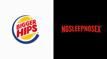
17 Famous Ad Slogans That Work For Condom Brands As Well
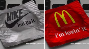
Here's an interesting observation - almost all famous advertising slogans can be used for a condom brand as well. To prove it, Los Angeles-based designer Max Wright came up with these hilarious condom wrappers that give Nike's "Just Do It" and KFC's "Finger lickin' good" a whole new meaning. Check them out below. … [Read more...]
- « Previous Page
- 1
- …
- 3
- 4
- 5
- 6
- Next Page »