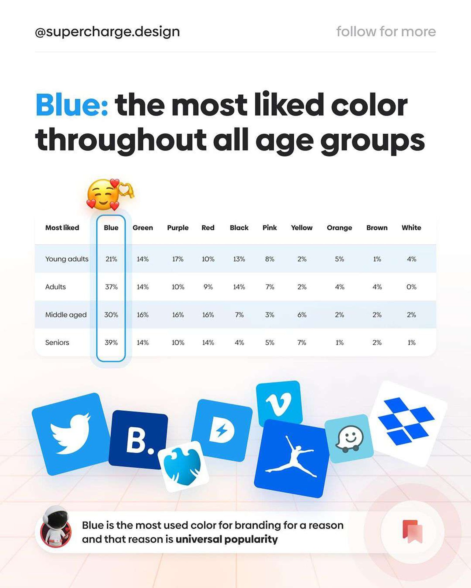
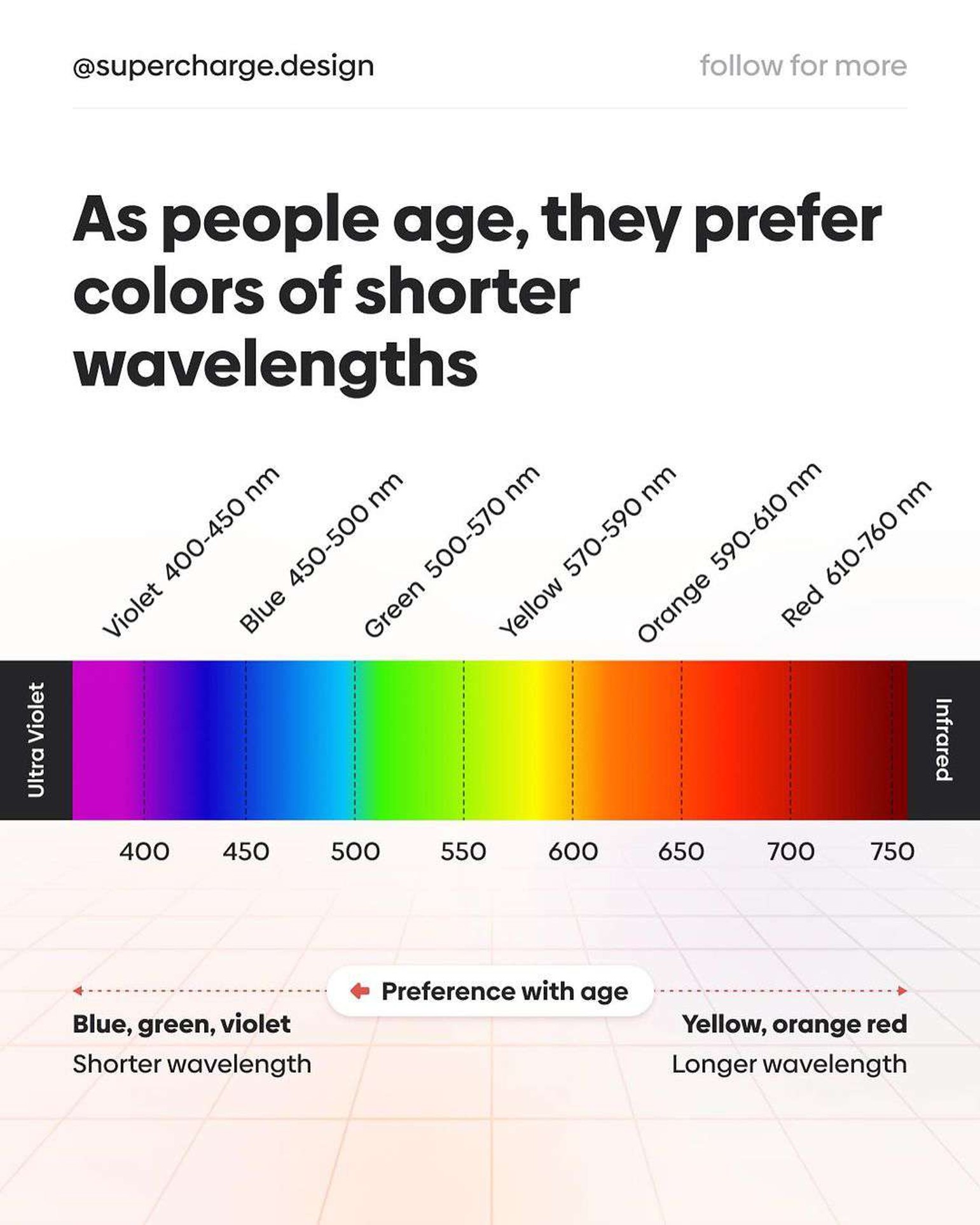
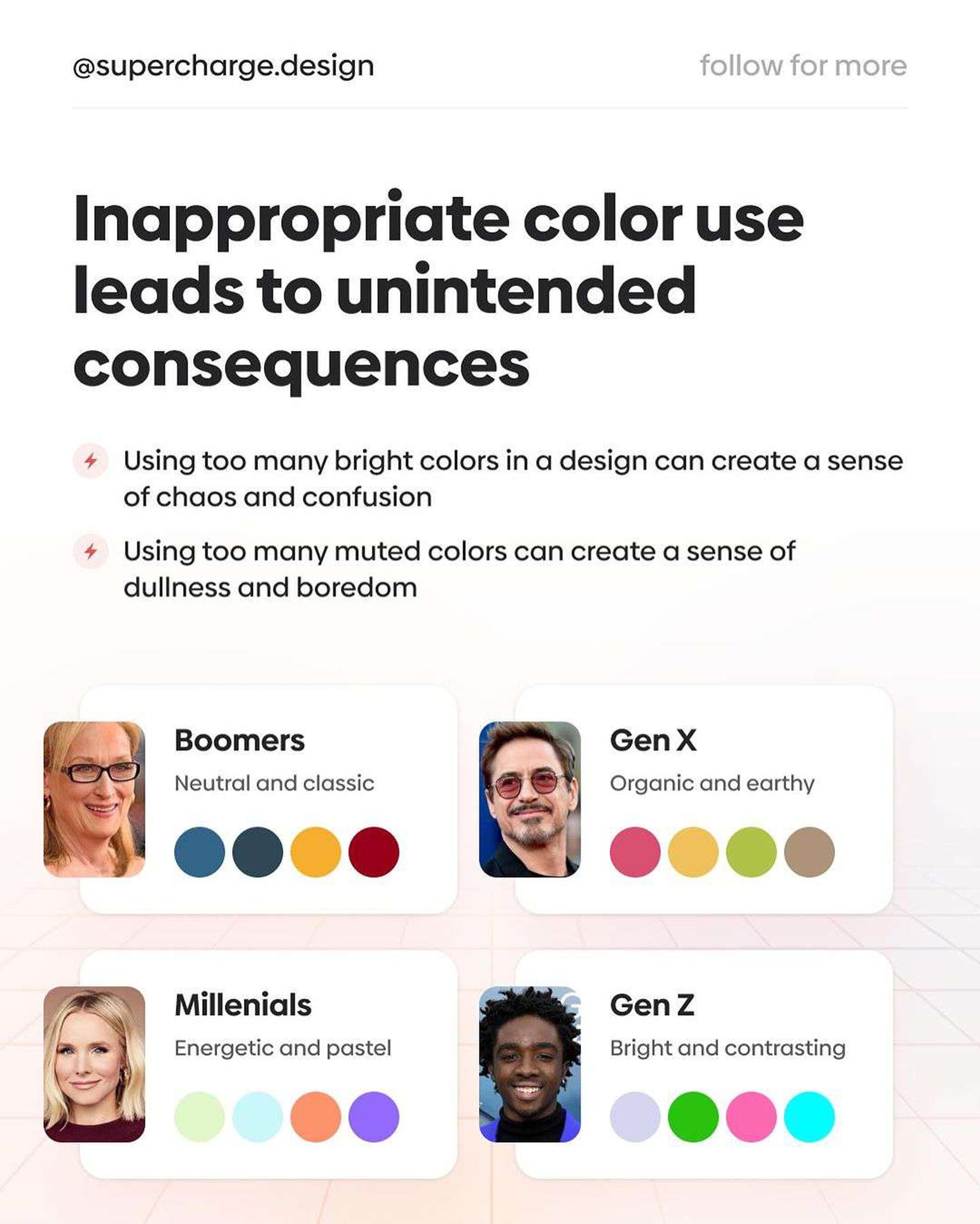
Did you know that our color choices don’t remain the same throughout our lives? Research indicates that as we mature, there’s a noticeable shift in color preference, with a growing inclination towards hues with shorter wavelengths, suggesting a complex evolution of taste that transcends mere aesthetics.
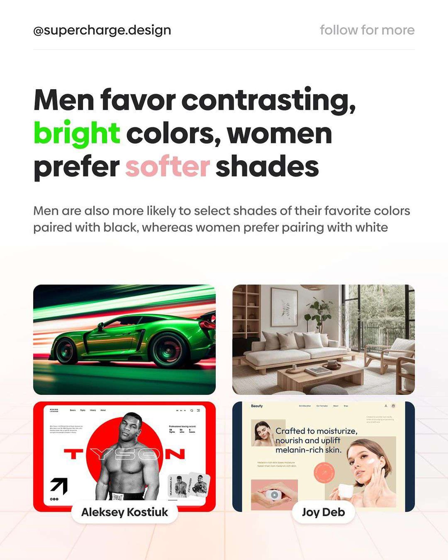
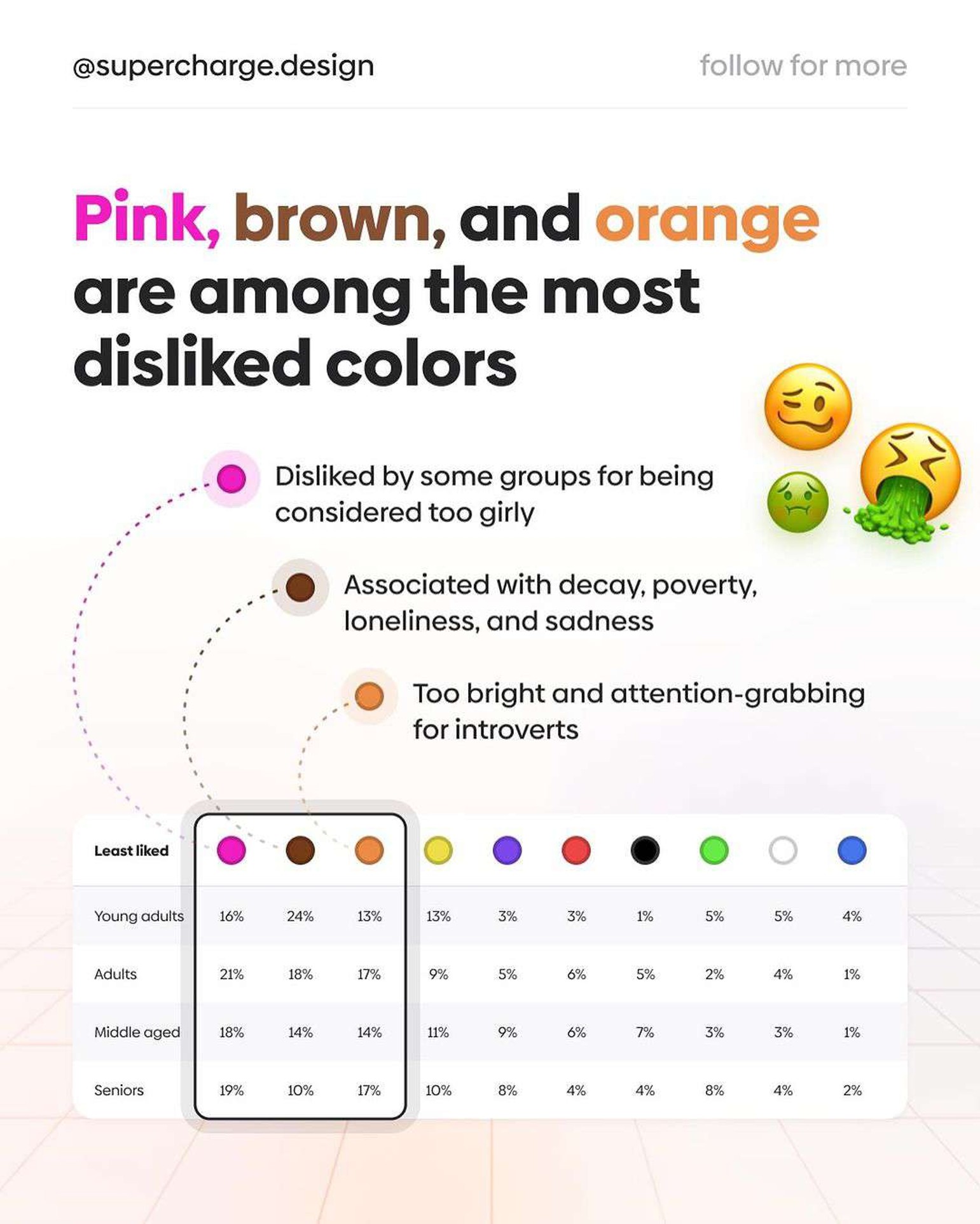
Interestingly, gender differences play a significant role in color preferences, with men generally favoring vibrant, contrasting colors and women gravitating towards softer, more soothing tones. Despite the widespread appeal of certain colors, shades like pink, brown, and orange often rank lower in popularity, underscoring the subjective nature of color perception.
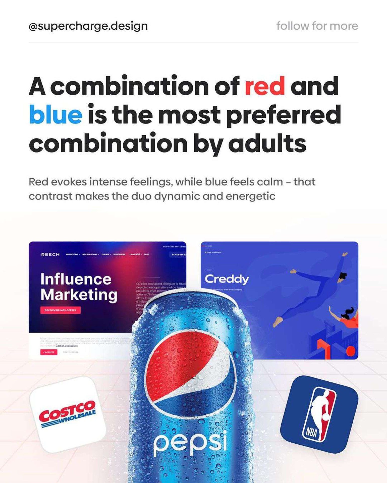
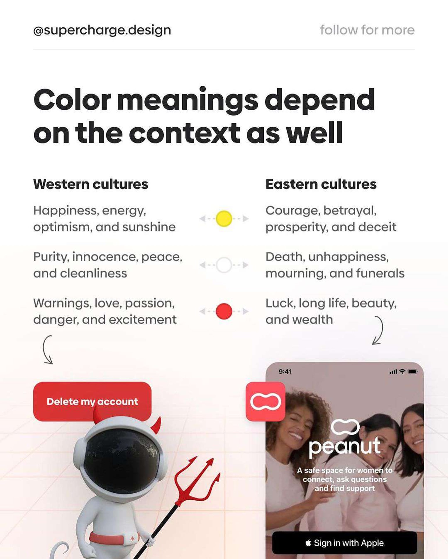
The combination of red and blue emerges as a particularly favored mix, highlighting the importance of balance in color choices. However, the impact of color extends beyond preference, with its misuse potentially leading to adverse effects, emphasizing the need for careful consideration in the application of color theory to avoid unintended consequences.
Supercharge.design has come up with a great list of color theory tips using data from a YouGov study. Check them out below.
1.
2.
3.
4.
5.
6.
7.
8.
Share this post with a designer friend and voice your views in the comments below.