Smooth, Clean Animations Of Beautiful Hand-Lettered Logos For Design Inspiration
Russian designers Starov Evgeniy (lettering artist) and Alexey Dubnichenko (motion designer) have come up with a series of impressive animations of commercial lettering work they've created over the last year. The objective of this collection is to show lettering logos in a new perspective. … View Post ▸
Photographer Creates Epic Outdoor Scenes Using Miniature Models And Landscapes

Vatsal Kataria is a New Delhi-based commercial photographer and creative director. He loves doing conceptual photoshoots and his forte lies in miniature photography. His photos look like they've been shot at exotic locations on a high budget, but they're actually small scale models and landscapes made to look like the real thing. … View Post ▸
This Animated Video Brilliantly Explains Layout And Composition In Graphic Design
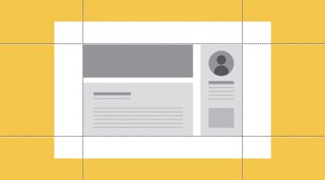
Layout and composition are the foundation of design. They give your work structure and make it easier to navigate. Without a well-composed layout, your elements would basically fall apart. GCFLearnFree has come up with an excellent animated tutorial on the five basic layout and composition principles that can help transform your work and sharpen your eye … View Post ▸
Work-From-Home Designer Earns $1 Million Selling Fonts and Graphics Online

Nicky Laatz is a designer, entrepreneur and stay-at-home mom who runs her business from her home in Cape Town, South Africa. She creates fonts, graphics, templates, add-ons, etc. and sells them on Creative Market, an online marketplace for community-generated design assets. She's the first person to have crossed $1 million USD in sales on Creative Market. … View Post ▸
Audi Hires Photographer To Shoot Their $40,000 Car, He Uses A $40 Toy Car Instead

Audi Middle East commissioned Mexican photographer and art director Felix Hernandez to shoot a series of photos of their $40,000 Audi Q2 crossover for Audi Magazine. Felix, known for his realistic miniature photography, created a small-scale desert and roadway in his studio and produced a series of striking images using a 1/43 scale model of the … View Post ▸
15 Clever Tear-Off Ads

"The difference between ordinary and extraordinary is that little extra." - Jimmy Johnson. Even something as mundane as tear-off advertising can be creatively executed if you get those brain juices flowing. Here are 15 fine examples. … View Post ▸
30 Great Font Combinations For Your Next Design Project
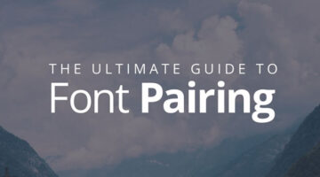
Designers often spend a lot of time deciding which typefaces to pair up and most sites don’t offer a real preview of what the text will look like. To make life easier for everyone, designer Poppie Pack from Canva has created a set of mock-ups that show different headline and body font combinations for a variety of design projects. Pack has also specified … View Post ▸
Designers Create Beautiful Animal Logos To Raise Awareness For Endangered Species

European designers Bodea Daniel, Cajvanean Alexandru, Petar Shalamanov and Martigny Matthieu have come together to create a series of striking animal logos to raise awareness about endangered species. They've used different design styles and techniques like golden ratio, negative space, blend modes and minimalism. Each logo is accompanied by a caption … View Post ▸
Beautiful, Minimal Photographs Of Sunsets For Color Inspiration

'Sky Series' is a gorgeous collection of sunrise and sunset photos by New York-based photographer Eric Cahan. He captures the natural polychromatic colors of the sky during dawn and dusk, and records the exact time and location of each photograph. … View Post ▸
How To Convert Your Hand Lettering From Paper To Digital In Adobe Illustrator

Yesterday, we featured Mackey Saturday's 60 second tutorial on how to create a custom logotype. Today, we'll be focusing in depth on the process of converting your hand-lettering to vector, with the help of this brilliant tutorial from designer Jenn Coyle at Hello Brio Studio. Watch below. … View Post ▸
25 Clever Logos Of Common Verbs We Use Every Day
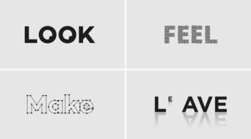
Following up to the previously published 25 adjective logo collection, Spanish designer Lucas Gil-Turner has created a series of impressive logos for the 25 most commonly used verbs in the Oxford English Dictionary. The list was released by Oxford University Press researchers after the analysis of over a billion words. Lucas has created illustrative and … View Post ▸
Designer Who Created The Instagram Logo Shows You How To Design A Logotype

A logotype is the name of a brand or a company designed in a visually unique way for use by that company. The logos of Google, Coca-Cola, Facebook, Disney, Cadbury, Nokia and Philips are examples of famous logotypes. The wordmarks are created using a custom or an existing typeface. If you're looking to create a custom logotype, check out this handy … View Post ▸
10 Tricks To Cut Out Anything In Photoshop
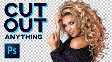
A young monk artist went up to his teacher who was reciting Photoshop keyboard shortcuts under a Himalayan tree and asked him “Teacher, when will I become a master artist like you?” The teacher replied “When you can select all the feathers of a morning sparrow without missing a single one, only then will you be a true Photoshop master.” (source) … View Post ▸
25 Images That Prove Why Good Design Is Important

“Good design is invisible. Bad design is everywhere.” is a well-known concept among designers. It means that you don’t always notice great design because it brings the focus on the product, business or service and enhances their value. Bad design, on the other hand, sticks out like a sore thumb. Today’s post is an epic list of design fails that validate … View Post ▸
50 Beautiful Color Combinations For Your Next Design Project

Looking for some nifty color combinations for your next project? The design team at Visme, an online tool for creating presentations and infographics, has created a list of 50 beautiful color schemes you can use in your designs. These color presets are available within Visme to use in any charts or graphics that you create with it. Check out the list below. … View Post ▸
Learn Basic Photoshop Tools And Tricks With This Handy Cheat Sheet For Beginners
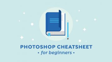
If you're using Adobe Photoshop for the first time without any training, all those tools and features can seem a bit daunting. Once you get used to the interface and spend a few hours on the program, you'll realize it's actually not that hard. To become a pro, you'll need practice, patience and an in-depth knowledge of most of the features the program has to … View Post ▸
Adobe Pokes Fun At Annoying Bosses Who Micromanage Their Designers

To promote their stock photography service, Adobe has come up with a witty ad that spoofs hovering art directors who micromanage their designers. The 1:44 clip features a stereotypical art director providing constant inputs to his designer, who uses Adobe Stock to keep up with his demanding boss. Watch below. … View Post ▸
Copywriter Challenges Himself To Create An Ad Every Day For A Year, And They’re Pretty Clever
Ukraine-based copywriter Andrii Mishchenko has undertaken a creative challenge titled "365 Days of Copy" that involves creating a print ad every day for a year. He chooses a well-known brand, analyses their communication and advertising, and creates a print ad in Photoshop every day, except weekends. … View Post ▸
Sketch vs. Photoshop
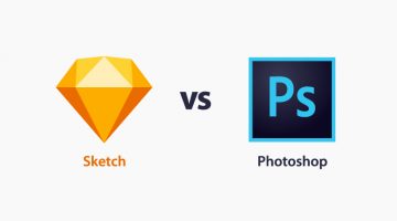
Blogger Helga Moreno has come up with a handy infographic that compares the time-tested Adobe Photoshop with the relatively new Sketch app, on the basis of their usability for web design and development. The infographic lists the key features of both apps and compares them on relevant parameters. … View Post ▸
Designer Creates Clever Pun-Filled Posters For Adobe Creative Software
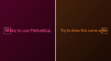
Georgian designer Sergi Devrisashvili has come up with a series of witty posters for popular Adobe creative software. Using their initials (Ai, Ps, Id, etc.), Sergi creates pun-based sentences that highlight the core features of the software. … View Post ▸
8 Illustrator Tips And Tricks For Faster Work
Did you know that the Symbols panel in Adobe Illustrator is a great way of building a collection of artwork that you can quickly draw from in-between projects? Also, the Graphic Styles panel lets you save and reuse an appearance (fill, stroke, opacity, etc.) that you've created. Ctrl/Cmd + D is useful for rapidly repeating the last transformation action … View Post ▸
Legendary Designer Brilliantly Explains How To Charge Clients For Logos And Other Design Services

Chris Do is an Emmy award-winning designer and the visionary founder of Blind—a respected brand strategy and design consultancy based in Santa Monica. With a wealth of experience in the design industry, Chris also leads The Futur, an online platform dedicated to empowering creative professionals with the business skills they need to succeed. In this … View Post ▸
22 Graphic Design Mistakes That Novice Designers Make
After a few years in the graphic design business, you realize how important it is to get the basics right. Like following a file naming convention, creating scalable logos, ensuring proper kerning and leading, using high-res images for printing, and so on. … View Post ▸
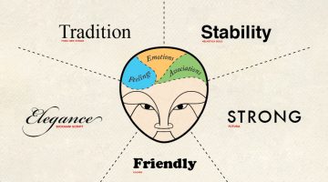
How Filmmakers Use Color Psychology To Shape Emotion In Movies
Before a character speaks, before the music swells, before the story reveals its hand, color has already started telling us what to feel. That feeling may arrive as a warning, a memory, a seduction, or a strange unease. Red can make a room feel dangerous, romantic or completely out of control. Pink can turn a scene soft, sweet, artificial or strangely … View Post ▸
10 Clever Typographic Posters Of Scientists And Their Achievements
To celebrate Science Day in India, Mumbai-based graphic designer Kapil Bhagat came up with a series of minimalist typographic posters featuring the names of famous scientists. Each name was designed in a way that it symbolized the invention, theory or achievement that the scientist is famous for. For example, the "a" in Pythagoras is in the shape of a … View Post ▸
30 Beautiful Color Gradients For Your Next Design Project

Looking for cool background gradients for your UI? Software and design company Itmeo has created a useful online tool called WebGradients – a free collection of 180 linear gradients that you can use as content backdrops in any part of your website. You can download a .PNG version of each gradient and copy their CSS3 cross-browser codes. Sketch and … View Post ▸
Designer Creates Clean, Minimalist Animal Logos And Shares His Design Process

Korean graphic designer Jahng Hyoung joon has come up with a series of minimalist animal pictograms and two short time-lapse videos that show his design process. Though the clips are sped up, it's always good to see the workflow used by the designer and pick up valuable pointers. Check them out below. … View Post ▸
10 Types Of Relationships Between Clients And Agencies
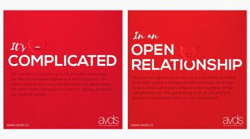
Valentine's day is over but the love-hate saga between clients and agencies continues. Arun Verma Design Studio has come up with a series of valentine-themed images that describe the different types of clients and the relationship they share with their agencies. Check it out below. … View Post ▸
10 Hilarious Examples Of How Punctuation Makes A Big Difference
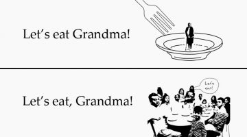
The absence or presence of a comma can change the entire meaning of a sentence. For example, there's a cannibalistic difference between "Let's eat grandma" and "Let's eat, grandma." The same holds true for apostrophes, hyphens, colons, and other punctuation marks. Curtis Newbold from The Visual Communication Guy has come up with a hilarious infographic … View Post ▸
5 Tips For A Killer Portfolio

Your portfolio should showcase only your best work. Don't use mediocre work as filler. Also, develop your skills using the "T-shaped" model, i.e., hold a thorough knowledge and strong skill-set in one subject, but also work beyond your area of expertise to collaborate in other fields. … View Post ▸
25 Clever Logos Of Common Adjectives You Use Every Day
Following up to the previously published 25 nouns logo collection, Spanish designer Lucas Gil-Turner has created a series of impressive logos for the 25 most commonly used adjectives in the Oxford English Dictionary. The list was released by Oxford University Press researchers after the analysis of over a billion words. … View Post ▸
These Chameleon Pens Change Their Ink Color So You Can Create Gradients, Blends And More
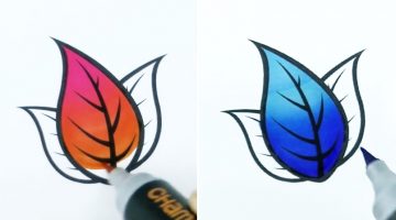
Chameleon Art Products have developed a set of alcohol-based markers that change their ink tone while drawing so you can create seamless color gradients, blends, highlights and shadows using a single pen. The inks are refillable and the nibs are replaceable.The pens cost $21.59 for a pack of 5 and $79.99 for a deluxe set of 22. Check them out below. … View Post ▸
What Different Types Of Fonts Mean And How To Use Them
Every font has a unique personality and purpose. While working on a project, it's imperative to know which font matches the intended tone of communication. Serif fonts portray tradition, sophistication and a formal tone. Sans serif fonts are modern, humanist and neutral. Slab serifs are bold and contemporary. Script fonts are elegant, classic, stylish and … View Post ▸
Adobe Illustrator ‘Pen Tool’ Cheat Sheet For Designers
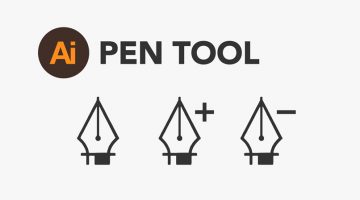
Paul Trani, Senior Worldwide Creative Cloud Evangelist for Adobe, has created a handy 'Pen Tool' cheat sheet for Adobe Illustrator. The 8-point visual guide covers the basics and shows you how to create straight and curved lines, add/delete/move anchor points and use bezier handles. We've also collated a few tutorials that Illustrator newbies might … View Post ▸
Artist Brings His Drawings To Life Using Simple Paper Folds
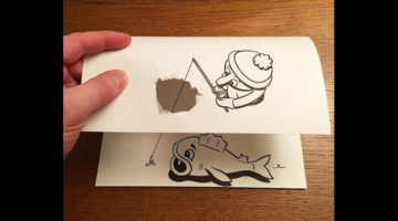
Danish artist HuskMitNavn turns his playful 2D black-and-white drawings to 3D using clever paper folding tricks and techniques. He cuts, tweaks and shreds sheets of paper in a way that they complete his sketches. For instance, he draws a clothes iron on the right side of the paper and crumples the left side to make it look like the iron is flattening the … View Post ▸
- « Previous Page
- 1
- …
- 15
- 16
- 17
- 18
- 19
- …
- 38
- Next Page »