Morocco-based brand designer Bachir Bachchar has come up with an interesting project titled "66 Smart Words" that showcases typographic logos of common words we use every day. The impressive bit is that the letters of each word have been designed in a way that they form a visual image associated with the meaning of the words themselves (a.k.a. calligrams). For example, the … [Read more...]
30 Brilliant Slider Animations For UI Inspiration

Sliders are the most commonly-used UI element, after buttons. From lock screens and image galleries to volume controls and app selections, we use sliders to navigate our way through different interfaces everyday. An effectively implemented slider enhances the user experience and makes the interface more engaging, dynamic, and memorable. … [Read more...]
What Do The Logos Of Successful Companies Have In Common?
56% of America's fastest growing companies use blue or dark colors (black and gray) as primary colors for their logos. 66% of these companies use both an icon and a wordmark. 94% of the logos are minimal. … [Read more...]
27 Beautiful Free Fonts For Your Next Design Project
As a designer, no matter how many fonts you own, you always want more. And then there's that heartbreaking moment when you've found a gorgeous typeface, only to see a big green button next to it that says "Buy Now for $75". Let's face it. We designers want freebies. We're drawn to them like a moth to a flame. … [Read more...]
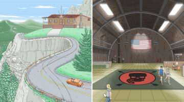
27 Cleverly Designed Products That Make Life Easier

"Great design is not just a solution, it is the elimination of the problem." - M. Cobanli. In today's post, we take a break from graphic/web/logo design to focus on innovative examples of product design that make every day tasks easier. Products that will make you ask yourself, "Why wasn't this invented earlier?" … [Read more...]
29 Beautiful Color Schemes From Award-Winning Websites
Looking for color schemes for your website or UI? The design team at Visme, an online tool for creating presentations and infographics, has created a list of beautiful color schemes from websites that have been recognized by Awwwards, the world's largest web design awarding body. The list includes a wide range of color schemes - natural, earthy, contemporary, bold, elegant, … [Read more...]
Cool, Disney-Style Animations Of Logos Of Popular Social Networks
The students at Motion Design School in Kharkov (Ukraine) have come up with a series of gorgeous animations of logos of popular social networks, messaging platforms, and portfolio sites. The list includes Facebook, Twitter, Instagram, LinkedIn, Google, Pinterest, Snapchat, Skype, Reddit, Tumblr, Flickr, Behance, Dribbble, Slack, and Telegram. The challenge was to create the … [Read more...]
Couple Asks The Internet To Photoshop A Shirtless Guy Out Of Their Engagement Pic, The Internet Does Not Disappoint

A couple, who recently got engaged, requested the internet to remove a shirtless guy from their photo. The internet, being the internet, responded in the only way it knows how - with an epic Photoshop battle. … [Read more...]
36 Beautiful Color Palettes For Your Next Design Project

Looking for color palettes for your UI? Color Hex is a useful online tool with a collection of almost 40,000 color palettes that you can use in your projects. You can copy hex codes and even download a .PNG version of each palette. Check out some our favourites below. … [Read more...]
This Animated Video Brilliantly Explains How To Choose The Right Colors For Your Designs
Choosing the right color palette is essential to the success of any design project. But how do we know which colors look good together and which ones don't? How do the pros do it? The answer is color theory. Artists and designers have used color theory for centuries, but anyone can learn more about it. … [Read more...]
These Clients Wanted To Pay Artists With “Exposure” Instead Of Money
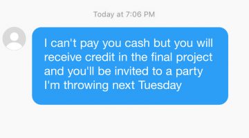
At some point or the other, every artist comes across a douchebag client who expects them to work for free. These requests usually come with promises of "exposure" or future collaborations. Rookie designers with little or no skill fall prey to them and ruin it for the rest of us. … [Read more...]
The Homepages Of America’s Fastest Growing Companies Have These Elements In Common

“You never get a second chance to make a first impression.” – Will Rogers. The homepage of your website is a user/customer’s first impression of your company. You have 0-8 seconds to engage a user, after which the majority of them leave. A one-second delay in your site speed can result in a 7% reduction in conversions. The key ingredients of an effective homepage are speed, … [Read more...]
25 Beautiful Free Fonts For Your Next Design Project
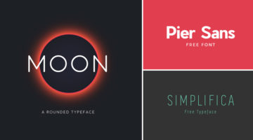
Fonts are to designers what shoes are to women. They can never have enough of them. And what's better than a beautiful font? A beautiful font that's available for FREE. We've compiled a list of 25 stylish and contemporary fonts that designers will love to get their hands on. Check them out below. … [Read more...]
8 Types Of Graphic Designers On Social Media, Which One Are You?
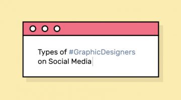
Do you critique Facebook’s UI every time they change it? Do you unfriend people who use Comic Sans? Or are you the ‘Hashtag Bomber’ who drops 20 design-related hashtags with every status update? Design resource site Pixelo has come up with a fun series of illustrations that list the different types of graphic designers on social media. Check them out below and tell us which one … [Read more...]
45 Brilliant Alphabet Logos With Hidden Meanings
Last week, we featured 50 monogram logos that merged two or more alphabets to form one unique symbol. In today's post, we focus on logos that use just one alphabet and typographical creativity to form a distinctive brand identity. Single-letter logos are trickier to execute than monogram logos because you just have one letter to play with. But the designers who crafted these … [Read more...]
Beautiful Logos Of Animals In Charging Positions
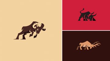
Bodea Daniel is a freelance graphic designer and illustrator based in Timișoara, Romania. A travel buff by nature, his love for beer is second only to his love for design. Bodea is also one of the most popular designers on Behance, with over 342,178 project views and 9,506 followers. One of our favourite projects from his portfolio is a series of animal logos in charging or … [Read more...]
How To Stay Creative, Even When You’re Not In The Mood
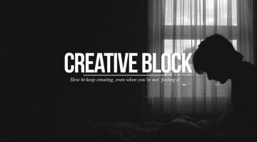
Every artist faces creative block at some point or the other. In this short video, filmmaker and photographer Sean Tucker discusses how he deals with the three major resistances to his creative work - perfectionism, rationalization, and fear. Watch below. … [Read more...]
7 Hidden Tricks That Could Change The Way You Use Photoshop
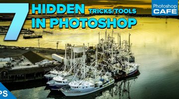
Did you know that the 'Recent Files' menu in Photoshop can show more than (the default) 10 files? You can change this number in Preferences > File Handling. Here's another tip: The tiny star (*) at the end of a document tab indicates that you have unsaved changes in that file. The forward arrow (▸) in the status bar at the bottom of every document provides a host of information … [Read more...]
Two Venezuelan VFX Artists Are Making Jaws Drop With Their Special Effects Videos

Alejandro Benzaquen and Kevin Lustgarten take everyday life situations and give them unexpected twists using visual effects. The duo, known as 2Venezolanos, use post production and VFX compositing to create crazy videos that'll make your jaw drop. Watch below. … [Read more...]
31 Brilliant User Interface Animations
Animated interface elements don't just attract attention, they enhance user experience and help guide user flow. They reveal the functionality and process of a user interface much better than static text. Like any other element of good design, UI animations should have a purpose without being too noticeable. They should be functional above everything else. If you're looking … [Read more...]
50 Brilliant Monogram Logos
A monogram is a motif or symbol made by combining two or more letters. The earliest known examples of monograms date back to 350BC when the names of Greek cities used to be engraved on coins. Over the centuries, monograms have been used in religion, architecture and in royal symbols to denote power and authority. In the late 19th century, companies and businesses started … [Read more...]
25 Funny Illustrations That Designers And Agencies Will Relate To
The Instagram artist known as Cauliflower Time undertook a 100-day project where she illustrated funny problems that designers and creatives face on a daily basis. Titled 100 Days of Pencils, the series is an accurate representation of agency life and the bowel-numbing experiences that come with it. The artist uses a pencil as the primary product of her pitches to showcase … [Read more...]
Artist Shares His Everyday Life With Wife Using Comic Illustrations
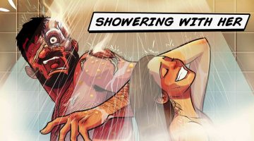
Picture this: It’s a cold winter night. You’re snuggled up in your quilt with the TV remote in one hand and a tub of popcorn in the other. Life couldn’t be better. Suddenly, out of nowhere, your wife presses her ice-cold feet against the warmest part of your body and you scream like a banshee, much to her sadistic delight. Situations like these, and more, are perfectly … [Read more...]
You Can Get Sued For Using These 7 Colors In Your Designs
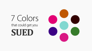
Companies can trademark colors, granting them exclusive use in their industry. For example, Mattel's Barbie Pink (Pantone 219 C) is trademarked in over 100 categories. Tiffany & Co.'s blue color has been trademarked since 1998. Its custom Pantone number, 1837, is the year the company was founded. … [Read more...]
11 Famous Logos That Look Ridiculously Similar
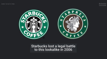
In logo design, it's inevitable that ideas will be repeated. But some of them are a little too close for comfort. Business Insider has come up with an intriguing list of famous logos that are eerily similar. Check them out below. … [Read more...]
35 Creative Invoices Designed To Leave A Good Impression On Clients
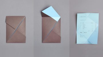
A good last impression is as important as the first one. In the design/creative business, every single item of stationery you present to a client speaks volumes about your capabilities and attention to detail. Most designers, agencies and studios put a lot of thought into designing creative business cards, letterheads and envelopes. But when it comes to invoices, few of them … [Read more...]
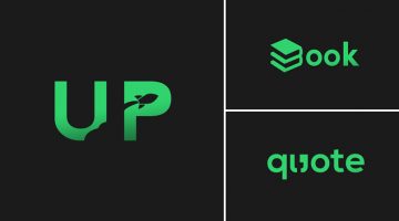
41 Minimal Logos With Double Meanings
When it comes to logo design, minimalism can be tricky to achieve. If executed improperly, the logo can come across as too simple or boring. In the process of removing unnecessary elements, you have to ensure that your logo remains memorable and distinctive. … [Read more...]
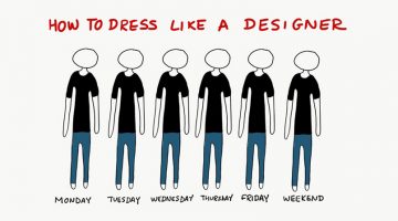
A Day In The Life Of A Designer
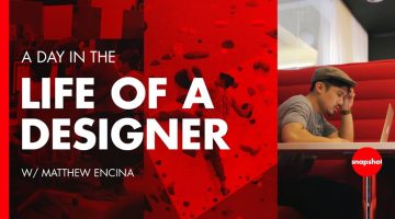
What does a day in the life of a designer look like? YouTube channel The Futur has released a short video that takes you through 24 hours in the life of Matthew Encina, creative director at Santa Monica-based design consultancy Blind. You get an un-romanticized look at the everyday hustle of a designer/creative director, the routines, the challenges, the tools they use, and … [Read more...]
Gorgeous Animations Of Hand-Lettered Logos Where Every Frame Is Hand-Drawn
Mantas Grauzinis is a freelance illustrator and animator based in Vilnius, Lithuania. He loves good stories and "splashy, smoother than butter movements". His passion for the latter can be observed in a series of slick animations of hand-lettered logos created by him, that are extremely satisfying to watch. … [Read more...]
The Winners Of The A’ Design Awards Have Been Announced And They’re Brilliant
The A’ Design Award & Competition have announced their list of winners for 2016-2017 and most of them are pretty damn cool. The categories included packaging, furniture, architecture, interiors, apparel and more. We've shortlisted some of our favourites below. … [Read more...]
A Useful Guide To Different Font Formats That Every Designer Should Know
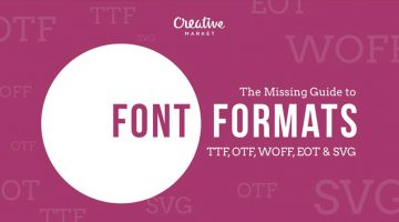
There are many choices of font formats but not a single one works across all browsers. You will have to use multiple font formats to deliver a consistent experience. These include TrueType Font (TTF), OpenType (OTF), Embedded OpenType (EOT), Web Open Font Format (WOFF) and Scalable Vector Graphics font (SVG). … [Read more...]
This Guy Sucked At Photoshop, He Spent 10 Years Mastering Microsoft Paint To Illustrate His Book
"Creativity involves breaking out of established patterns in order to look at things in a different way." - Edward de Bono Boston-based artist Patrick Hanes has worked exclusively in Microsoft Paint for over 10 years. By his own admission, he "sucks at Photoshop and other programs". He honed his craft in MS Paint working long overnights at a hospital reception … [Read more...]
Beautiful, Colorful Animal Logos Based On Circular Geometry
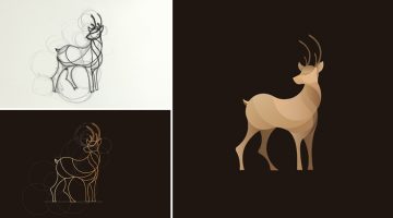
California-based designer Anuja Kanani has come up with a series of colorful animal logos using circle geometry. Being an animal lover, she wanted to undertake this design experiment to highlight their elegant structure and form. For each logo, Anuja initially sketched a basic structure guided by circles. She then defined the animal using just line forms. Programs used were … [Read more...]
Dad Photoshops His Baby Into Dangerous Situations To Freak Out Relatives

Dublin-based designer and dad Stephen Crowley decided to use his Photoshop skills to have some fun with his family and relatives. He photoshopped his 18-month-old daughter Hannah into situations that would give anyone a heart attack - like driving a car, holding a kitchen knife, climbing a ladder alone, etc. The images went viral online when Stephen shared them on Reddit where … [Read more...]
Google AutoDraw Turns Your Rough Scribbles Into Beautiful Icons For Free
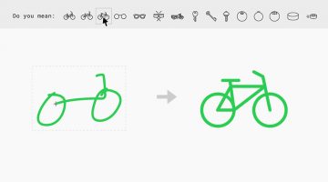
Google's latest A.I. experiment is a web-based drawing tool called AutoDraw that converts your rough scribbles and doodles into beautiful, symmetrical icons/clipart that you can download for free. It works on your phone, computer or tablet and uses artificial intelligence to guess and suggest a more polished icon or symbol to replace your drawing. … [Read more...]
- « Previous Page
- 1
- …
- 11
- 12
- 13
- 14
- 15
- …
- 23
- Next Page »