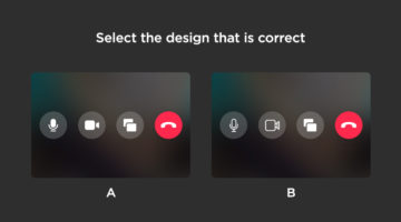
How sharp is your eye for UI/UX design details? Seattle-based UX designer Alex Kotliarskyi has created an addictive UI design quiz called Can’t Unsee that challenges your eye for detail. The web-based game presents two versions of iOS interface screens and asks you to pick which one is correct. Each right answer earns you coins, making the experience both fun and … [Read more...]
Free Photoshop Pack Of Beautiful Gradients For All Your Design Needs
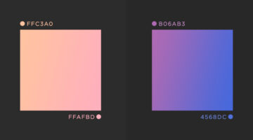
Vibrant colors and gradients are one of the major trends in graphic, web, and UI design nowadays. To make life easier for designers everywhere, Paris-based graphic designer Leo Simon has compiled a set of 300 beautiful gradients into a Photoshop gradient file (GRD), available for free. We've shortlisted some of our favourites from Leo's collection and shared them below with … [Read more...]
How To Turn White Into Any Color In Photoshop

You can change the color of any object in Photoshop by creating a hue/saturation adjustment layer, and using the sliders and the eyedropper tool (here's a one-minute tutorial on the same). However, when the object is white, a hue/saturation adjustment layer doesn't convert it realistically no matter how high you turn up the saturation. In this handy tutorial, Photoshop … [Read more...]
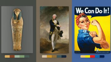
What Logo Styles Do Consumers Trust Most?
SurveyMonkey and infographic maker Venngage surveyed over 1000 adults living in the U.S. on what logo styles they trusted the most. The respondents were shown a series of logos for imaginary companies in six different industries: Jewellery retail, education, financial services, law firm, news/media, and technology. Six variations of each logo were presented: Icon dominant, … [Read more...]
This Free Online Tool Resizes Any Image To Over 50 Sizes In Just One Click

The team at video editing app Promo has come up with a useful online tool that resizes any image to over 50 web and social media sizes with the click of a button. Simply upload your image or enter its url, and the app gives you a preview of what your image will look like across different formats like profile photos, cover photos, stories, newsfeed images, ads, email headers, … [Read more...]
This Brilliant Free Tool Can Remove The Background From Your Photo In Five Seconds
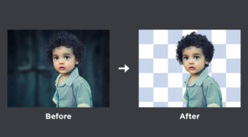
AI photo filter maker Kaleido has come up with a powerful online tool called Remove.bg that erases the background from any image in five seconds or less, and gives you a transparent PNG of the person/people in the image. It works 100% automatically, you don't have to mark the person or select the background and foreground layers manually. Just upload your image or enter its … [Read more...]
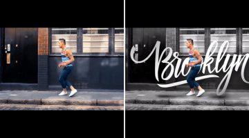
Learn In One Minute How To Wrap Text Around Any Image In Photoshop

How do you wrap text around images in Photoshop? Do you manually adjust the length of each line? In this one-minute tutorial, Photoshop instructor Unmesh Dinda from PiXimperfect shows you a simple technique to wrap text around any object, image, or shape, using a custom path created with the Pen tool. With this technique, you don't have to manually adjust the length of … [Read more...]
Simple, Useful Design Tips For UI/UX Designers
'Sparklin Design Tips' is a series of short, useful UI/UX tips by New Delhi-based digital agency Sparklin, shared every Tuesday on their social media channels. Using before-and-after mockup images, the team at Sparklin explains good UI/UX practices with visual examples, making them easy to understand and comprehend. Whether you're a newbie or a seasoned designer, these … [Read more...]
5 File Sharing Tips To Keep Your Group And Project Organized

Tackling a large project as a group has never been easier with online file sharing communities, but don’t let the convenience derail your organization By Rachel Lombardo Taking on a group project - whether it be for work, school, or a local organization you are part of - can be one of the more rewarding tasks you will work on. You’ll have the opportunity to work with … [Read more...]
Adobe ‘Good Bones’ Lets You Change Vector Shapes Easily By Adding A Skeleton Structure

When you create artwork in Adobe Illustrator, the underlying geometry of the vector graphics can be quite complex. If you need to change the appearance of your vector figure, you'll need to edit each anchor point individually, which can be quite a task. For example, if you want to open the mouth of a vector dinosaur that you've created, you'll need to tweak each anchor point … [Read more...]
Adobe ‘Fast Mask’ Lets You Quickly Select And Mask Any Moving Object In A Video
In After Effects, if you want to add text or an effect behind an object in a video, you can use the Roto Brush to select the object, and then apply a mask. However, the current Roto Brush is not a very intuitive tool and in most cases the mask breaks after the first frame, specially if the object is fast-moving (like a dancer or a person running). You can spend hours manually … [Read more...]
Short, Useful Animations To Help You Create Icons Easily In Adobe Illustrator
Melbourne-based designer and entrepreneur Marc Edwards has come up with a series of speedrun videos that show you simple techniques to create vector icons in Adobe Illustrator. Each video lasts only a few seconds and takes you through an optimal (and sometimes surprising) method to create common UI icons like bluetooth, headphones, inbox, settings, hourglass, lightning … [Read more...]
Adobe ‘Moving Stills’ Turns Static Images Into 3D Animated Photos And Videos
When you're browsing through old photos do you sometimes wish you could view a video or a 3D animation of the same scene? Although companies like Apple and Samsung let you capture Live Photos or Motion Photos with their mobile devices, those are just flat video recordings taken a few seconds before you click a picture. The images don’t really give you a 3D perspective – … [Read more...]
This Brilliant Free Tool Tests Your Logo For Balance, Scalability, Color Blindness, And More
Kentucky-based designer Brandon Shepherd from Studio Bros. has come up with a useful online tool called Logo Lab that assesses your logo on 10 key factors like balance, scalability, color blindness, recognizability, etc. All you have to do is upload your logo in PNG or SVG format, and the app will display what your logo looks like under each parameter. You can then evaluate … [Read more...]
Adobe Fontphoria Can Capture Text In Images And Convert Them To Fonts
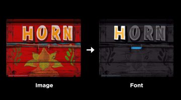
How many times have you wanted to know the name of a font used in a particular design or artwork? In some cases, the letters have been hand-drawn and the font doesn't actually exist. But imagine if there was a technology that could scan the text in an image and create an entire font out of it. Well, Adobe is working on a brilliant new tool called Fontphoria – a glyph … [Read more...]
10 Great Fonts You Should Use, And 9 Awful Fonts You Should Avoid
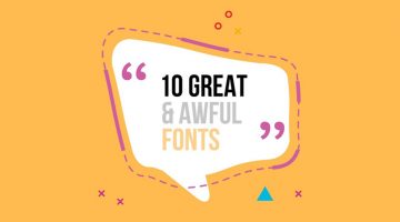
"Typography is an art. Good typography is art." - Paul Rand. Font and typography choices can make or break your design. But with so many fonts to choose from nowadays, which ones should you use, and which ones should you avoid? Tom Cargill from Satori Graphics has come up with an excellent video that features ten prominent fonts used by professional designers, along with … [Read more...]
Incredible Video Shows Artificial Intelligence Creating A Website Just By Looking At The Wireframe

Artificial Intelligence is now being used to create front-end designs from wireframe to HTML code. TeleportHQ, a platform of open-source tools for UI professionals, has released a video demonstrating real-time code generation using TensorFlow machine learning and computer vision image recognition. … [Read more...]
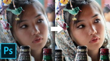
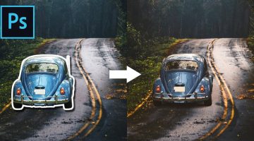
This Hidden Tool In Photoshop Lets You Remove Backgrounds With Ease

Did you know that there is an actual tool in Photoshop that allows you to erase backgrounds from your photos? We're not talking about any selections or masks, we're talking about the Background Eraser Tool located under the Eraser Tool in the Photoshop Toolbar. You'll be surprised to see how powerful, customizable, and easy-to-use this tool can be. In this brilliant … [Read more...]
Photoshop’s New, More Powerful ‘Content-Aware Fill’ Can Realistically Remove Any Object From Your Photos
Adobe Photoshop's Content-Aware Fill is a useful tool to remove unwanted objects from your photos, but sometimes the results can fall short and there are no options to customize the results. Well, all that has changed in the latest version of Photoshop CC (20.0). Content-Aware Fill has received a powerful new upgrade that gives the tool its own workspace and additional … [Read more...]
This Handy New Tool Shows You Color Palettes Of Artworks From Different Eras
Kentucky-based graphic designer Brandon Shepherd has released a handy online tool called Color Leap that showcases a collection of color palettes used in paintings and artworks throughout different eras in history - from ancient Egypt to the 1960s. The tool consists of 180 palettes spread over 12 different time periods. You can select any time period, browse through … [Read more...]
This Brilliant Free Tool Is Like Google Search For Colors
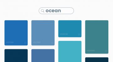
Swedish digital studio Future Memories has launched an excellent tool called Picular that lets you search for colors by keyword and displays a range of colors based on the top 20 Google Image search results for that keyword. For example, if you search for ‘ocean’, Picular analyzes the top 20 Google Images for ‘ocean’ and displays the most prominent color in each image and … [Read more...]
Learn In One Minute How To Change The Color Of Anything In Photoshop

Did you know that you can use the Hue/Saturation Adjustment Layer in Photoshop to target a specific color in your image and change it to any color you want? In this handy one-minute tutorial, Photoshop instructor Unmesh Dinda from PiXimperfect shows you a simple technique to change the color of any object in your image by using the hand tool in the Hue/Saturation Adjustment … [Read more...]
Learn In One Minute How To Make Skies Gorgeously Dramatic In Photoshop

Did you know that you can use Adjustment layers and the Blend If mode in Photoshop to enhance skies and make them look more dramatic in your photos? In this one-minute tutorial, Photoshop instructor Unmesh Dinda from PiXimperfect shows you a simple technique to add details and definition to clouds by using Adjustment Layer, Mask, Brush Tool, and Blend If: Underlying Layer. … [Read more...]
This Clever Photoshop Trick Lets You Add Realistic Light Or Shine To Any Object
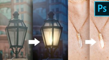
Did you know that you can add realistic-looking lights and shine to images of lamps and jewellery by using the magic of blend modes in Photoshop? In this tutorial, Photoshop instructor Unmesh Dinda shows you how to use color dodge and layer styles to mimic the properties of light and shine. He takes you through five different image examples and shares two different methods … [Read more...]
19 Graphic Design Mistakes That Novice Designers Make
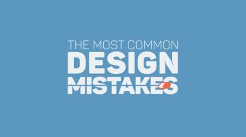
After a few years in the graphic design business, you realize how important it is to get the basics right. Like using proper font and color combinations, implementing visual hierarchy, using grids, alignment, white space, and so on. The team at Visme, an online tool for creating infographics and presentations, has come up with an excellent visual list of 19 graphic design … [Read more...]
This Simple Chart Explains What Common Terms In A Logo Design Brief Mean
What do clients mean when they say their logo needs to be modern, luxurious, or subtle? Dubai-based logo designer Jefferson Pascual has created a handy infographic that uses an illustration of a bird to explain common terms used in logo design briefs. The chart features bird logos designed in different styles (eg. young, modern, feminine) with their visual opposites on the … [Read more...]
This Clever Photoshop Trick Lets You Generate Unlimited Filters With Just One Click

Did you know that the Gradient Editor in Photoshop has a 'Randomize' feature that lets you browse through unlimited gradients which you can use as filters on your photos? In this tutorial, Photoshop instructor Unmesh Dinda shows you how to combine the concepts of Gradient Fill, Gradient Maps, and Blend Modes to create beautiful color combinations and filters automatically in … [Read more...]
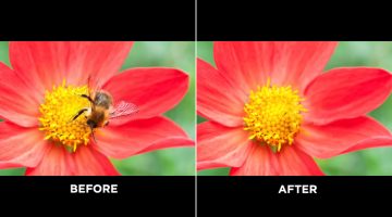
Fix And Sharpen A Blurry Photo With This Clever Photoshop Technique
Most cameras nowadays have 'image stabilization' or 'anti-shake' features to reduce the likelihood of taking blurry photos. It works by moving the camera lens automatically to compensate for handheld movements. But once in a while, you do end up with a great capture that's slightly blurred and you don't really want to delete that image. What do you do then? Mumbai-based … [Read more...]
10 Best Uses Of Color In Movies

Right from the first scene, color sets the mood and tone of a film before any of the actors have uttered a word. Since the dawn of colored cinema, filmmakers have used color to convey drama and emotion in storytelling. Visual-minded directors and cinematographers have created color palettes almost as memorable as the films themselves. The Wachowskis used a green color … [Read more...]
8 Beautiful Flat Color Palettes For Your Next Design Project

UI/UX designer Ebtihaj Khan has created a series of minimalist flat color palettes for graphic, web, and UI projects. Each palette consists of five colors with their hex codes mentioned alongside. Khan has included both linear and contrasting color schemes. The beautiful presentation of these palettes, with the blurred vignette effect in the background, was inspired by … [Read more...]
How To Rotate Or Straighten A Tilted Image In Photoshop Without Cropping The Edges
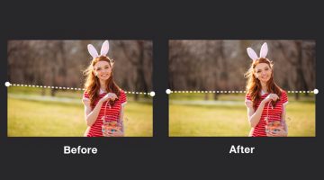
Usually, when you try to rotate or straighten a tilted image in Photoshop, you end up cropping and losing a bit of the corners and edges. Well, not anymore. Mumbai-based Photoshop instructor Unmesh Dinda has come up with an excellent tutorial that shows you how to straighten an image in Photoshop without cutting out the edges. He shows you how to use the straighten and … [Read more...]
Photoshop’s Patch Tool Does More Than You Think, Watch Here
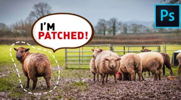
Mumbai-based Photoshop educator and commercial retoucher Unmesh Dinda has come up with a handy tutorial that offers an in-depth look at the Patch Tool in Photoshop. Apart from the basic functions of the tool, Unmesh shares some interesting tips and techniques that can be of great help when working with images. Watch below. … [Read more...]
How To Pair Fonts That Complement Each Other (With Examples)
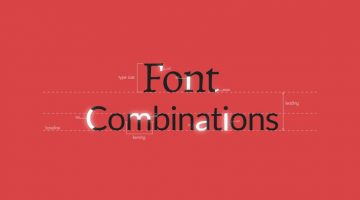
Good font pairing is one of the key differentiators between amateur and professional design. Rookie designers often use more fonts than required and there is lack of typographical contrast in their design. It's tricky because there are no fixed rules as to what kind of fonts work well together, but there are certain guidelines that can help you pick fonts that complement each … [Read more...]
Designer Fixes Ugly Interfaces, Shares Valuable UI Tips In The Process

Previously, we featured designer Steve Schoger's Little UI Details project in which he shares short, useful design tips for UI/UX designers. Steve has now come up with another excellent project titled 'Refactoring UI' in which he uses Sketch to fix websites and interfaces submitted by developers, and teaches you valuable UI design concepts in the process. The series is just … [Read more...]
How To Blend Images Seamlessly And Create A Perfect Composite In Photoshop
One of the most skillful tasks in Photoshop is to blend objects from multiple images that have different colors, tones, and lighting, into one single image and make it look perfect. This is one of the key differentiators between the work of a professional designer and an amateur. Photoshop instructor Unmesh Dinda from PiXimperfect has come up with a brilliant tutorial that … [Read more...]
- « Previous Page
- 1
- …
- 6
- 7
- 8
- 9
- 10
- …
- 13
- Next Page »