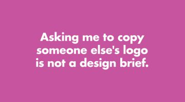
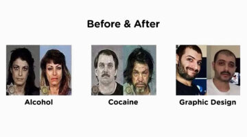
How many times have you received a design brief that asks you to copy someone else's logo? Or a brief that says "Just come up with a few quick logos." Has a client ever asked you to use Comic Sans? London-based product designer Anneke Short has come up with a series of minimalist posters titled "Confessions of a Designer" that feature nine things every graphic designer would … [Read more...]
Honest Meanings Of Flag Colors Of 15 Countries
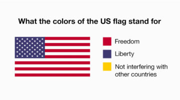
Every country has an official explanation for its flag colors, something about history, heritage, unity, all that. And then there’s… this version. People online have been giving those same colors completely different meanings, based on what each country is actually known for right now. Not the textbook version, the real-world one. The kind shaped by headlines, memes, … [Read more...]
13 Things Client Servicing Executives Should Never Say To Graphic Designers
If you've ever worked in a creative agency, you must be aware of the love-hate (or hate-hate) relationship between client servicing executives and designers. CSEs have to manage client expectations and their primary objective is to keep the client happy. Designers want to keep the client happy too, but they don't want to compromise on aesthetics and creativity. Taking a … [Read more...]
25 Memes Designers And Agencies Will Relate To
Feeling bored at work? Have 5 minutes to spare before your boss comes back from a meeting? If yes, then check out these 25 epic memes that every mouse-weilding, client-bashing, font-loving designer will relate to. Warning: Some of these memes might make you question your choice of profession. This is perfectly normal. If symptoms persist after 48 hours, please talk to a … [Read more...]
29 Images That Prove Why Good Design Is Important
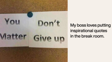
Regular readers of DS know that most of our posts are about inspirational art and design. But once in a while, we like to sneak in a post about design blunders, just to keep the humour alive. Previously, we shared some epic logo disasters, letter-spacing fails, ad-placement blunders, and more. Today's post features some more design fails that are bound to make you laugh at … [Read more...]
What Your Font Choices Say About You
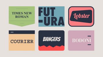
Every designer has a set of favourite fonts that they prefer to use in a majority of projects. These are the first fonts that come to your mind every time you start a new project. In our previous posts, we've explained how every font has a unique personality, a purpose, and an emotion. But did you know that the font you choose says a lot about you as well? GetVOIP has come … [Read more...]
New Oscar Envelopes Have Huge Fonts To Avoid Last Year’s Design Fail
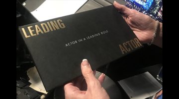
The most cringeworthy part of last year's Academy Awards was when Warren Beatty and Faye Dunaway announced the wrong winner for Best Picture. It wasn't their fault, someone backstage gave Beatty the envelope for Best Actress in a Leading Role (Emma Stone, La La Land) instead of the envelope for Best Picture (Moonlight). … [Read more...]
Graphic Designer Pranks Restaurant Owner With Phallic Logos In Response To Job Ad
A couple who opened an Italian restaurant placed an ad on Craigslist looking for a graphic designer who could design their restaurant logo, menu, and various other things. A ‘cocky’ graphic designer (pun intended) decided to prank the restaurant owners with a series of phallic logos that left them speechless. Check out the conversation below. … [Read more...]
These 20 Packaging Designs Are The Reason I Have Trust Issues
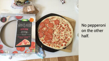
How many times have you opened a bag of chips just to find it half-empty? The bag deflates faster than a pin-pricked balloon and you realise that 50% of the bag was just air. But that's nothing compared to what some brands do to mislead consumers. Imagine a pizza box that's shows you pepperoni toppings on the visible side, but when you open it, there's no pepperoni on the … [Read more...]
Magazine’s Epic Photoshop Fail Leaves Oprah Winfrey With 3 Hands, Reese Witherspoon With 3 Legs
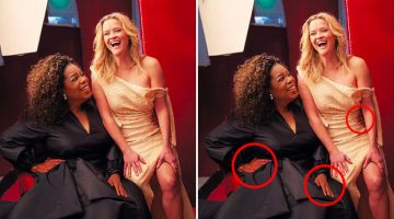
From acting, directing, and producing, to running companies and businesses - how do Hollywood A-listers Oprah Winfrey and Reese Witherspoon manage to play so many different professional roles? How are they able to multitask and get so much done in 24 hours? Turns out that, unlike the rest of us mere mortals, Oprah and Reese are gifted with an extra set of limbs. Vanity Fair … [Read more...]
Top 20 Logo Placements That Had The Whole City Laughing

Vehicle advertising can be a branding goldmine or a complete disaster. Ad and logo placements on vans and buses, especially those with sliding doors, require serious visual foresight. What looks perfectly aligned in a static mockup can fall apart the moment the doors open, turning a smart campaign into an accidental punchline. Any experienced graphic designer knows that … [Read more...]
Los Angeles Is Looking For Graphic Designers, And Their Ad Proves They Desperately Need One
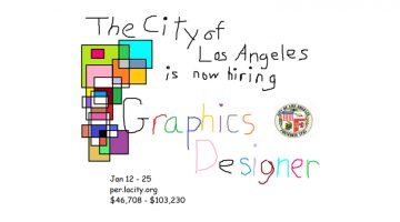
The City of Los Angeles is looking for a full-time graphic designer to create ads, brochures, displays, and exhibits for informational, educational, and promotional purposes. The remuneration offered is $46,708 - $103,230 annually. To advertise this position, the official Facebook page of the 'City of Los Angeles - Job Opportunities' posted an ad that looks like it was drawn … [Read more...]
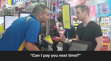
9 Funny WhatsApp Conversations Between Clients And Designers
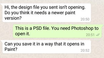
Conventional wisdom says that you should avoid work-related conversations with a client on WhatsApp. All professional communication should take place via email. Not only does that avoid confusion and unaccountability, but it also saves you from the headache of having an unreasonable client breathing down your neck with a message every five minutes. On that note, Egypt-based … [Read more...]
Funny Agency Memes That Designers And Creatives Will Relate To
You know the feeling when a client asks you why the button in your mock-up JPG isn't working. Or when the account manager tries to brief you on a Friday at 6 PM. How about the mornings when your creative director walks in with a constipated look on his/her face and you know he/she's going to take a dump on all the work you've done so far? The Incumbent Agency, an online … [Read more...]
17 Memes Every Graphic Designer Will Relate To
Having a long day at work? Boss giving you a hard time? Client being a prick? Then indulge in some meme therapy and brighten up your day. Memes stimulate the release of endorphins in your brain, which reduces stress levels and makes you forget about work problems and deadline-related anxiety. In a study of more than 150 working professionals, scientists found that when … [Read more...]
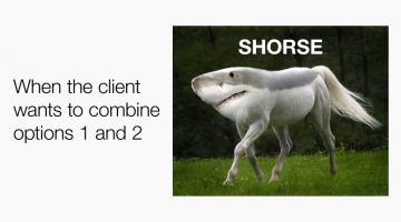
8 Types Of Clients You Never Want To Work With
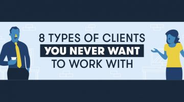
Which type of clients do you find the most difficult to work with? The design experts who think they have an eye for design? The penny pinching visionaries with tiny budgets and huge expectations? Or the workaholic clients who work round the clock and expect you to do so as well? GetCRM has put together a relatable infographic that lists the eight types of difficult clients … [Read more...]
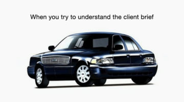
Guy Creates Spoof Ad To Sell His Girlfriend’s Crappy Car, And The Price Goes Up 300 Times

Max Lanman is a writer and director based in Los Angeles, California. When his girlfriend needed to sell her 1996 Honda Accord, he decided to help her out by putting his skills to use and creating a professional commercial. He hired an entire creative team - an actress, a cinematographer, stunt driver, voice artist, music composer, and a sound designer. Max wrote and directed … [Read more...]
This Guy Photoshopped Himself Into His Childhood Pics To Hang Out With His Younger Self

What would it be like to meet your childhood self? Until time travel is invented, we'll probably never know. But Montreal-based photographer Conor Nickerson used a handy little time machine called Photoshop to travel back in time photographically and hang out with his younger self. He photoshopped his present self into his childhood photos from 1997-2005, and by the looks of … [Read more...]
150 People Were Asked To Draw 10 Famous Logos From Their Memory, And The Results Are Hilarious
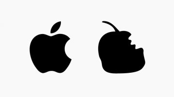
The logos of global brands like Apple, Starbucks, and Adidas are seen and recognized by billions of people every day. Their logos have become iconic to the point that they create an instant brand association in the minds of consumers. But how well do consumers know the exact shape and colors of these famous logos? … [Read more...]
This Guy Keeps Photoshopping Himself Into Celebrities’ Lives, And It’s Hilarious

Everyone wants to hang out with celebs but not everyone is as lucky as digital artist Robert Van Impe a.k.a. Average Rob. Rob goes to red carpet events with Kanye West and Kim Kardashian. He enjoys scooter rides with Brad Pitt and Angelina Jolie. When he gets time off, Rob also hangs out with Obama and Joe Biden. He describes himself as a "mediocre dude from Belgium" but it … [Read more...]
What People Say In Meetings Vs. What They Actually Mean
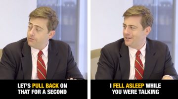
The best way to kill an idea is to take it to a meeting. How many times have you found yourself in a meeting or a brainstorming that has no purpose? What's even funnier is how people use industry jargons to impress their bosses and look like experts. Fast Company brought together some of New York's finest comedians to show what it really means when people use phrases like … [Read more...]
19 Memes Only Graphic Designers Will Understand
Having a long day at work? Client giving you a hard time? Boss being a prick? Then indulge in some meme therapy and brighten up your day. Memes stimulate the release of dopamine in your brain and make you forget about work problems and deadline-driven stress. In a study of more than 200 working professionals, scientists found that when co-workers receive memes from you, it … [Read more...]
Designer Shows How People In Other Professions React When Asked For Free Stuff
Josiah Brooks is an animator, game designer, and musician based in Victoria, Australia. He spends most of his time creating content on his Youtube Channel Jazza, where he teaches people how to draw, animate, and paint. Josiah loves his work, but like most artists, he gets a lot of requests from people asking him to work for free. Frustrated with such requests, Brooks wanted … [Read more...]
12 Messages That Designers And Creatives Want To Send Clients On Sarahah
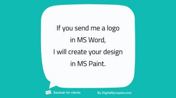
Unless you've been living under a rock, you know what Sarahah is - an app to send and receive anonymous feedback from your colleagues, bosses, friends, and anyone else. Created by Saudi developer ZainAlabdin Tawfiq, the app is meant for constructive feedback, but has come under scrutiny after people started sending lewd messages and death threats under the mask of anonymity. … [Read more...]
Fun, Quirky Animated Loops That Graphic Designers Will Like
Gal Shir is a product designer and art director based in Tel Aviv, Israel. With over 117,000 followers on Dribbble, he is one of the most popular designers on the site. He also runs Color Hunt, a social platform that lets you create and browse a collection of beautiful color palettes. When Gal finds time off, he creates fun, quirky animated loops that designers love to … [Read more...]
Clever Ads By Smart Car Show How Situations Change When You Reach Your Destination On Time
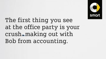
The Smart ForTwo micro-car is only 2.69 metres in length, so finding a parking spot for it won’t take too much time. Based on this insight, BBDO Germany came up with a witty print + film campaign that shows how the Smart ForTwo can help you save time and turn a negative situation into a positive one. … [Read more...]
23 Memes Every Graphic Designer Will Relate To
Bored at work? Have five minutes to spare before your boss comes back from lunch? If yes, then check out these graphic design memes that every client-bashing, mouse-weilding, Photoshop-loving designer will relate to. … [Read more...]
If Game Of Thrones Characters Worked In A Creative Agency, This Is What They Would Do
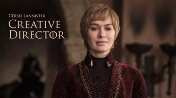
Indian digital agency Chimp&z has come up with a series of images titled "Game of Agencies" that imagines Game of Thrones characters as advertising professionals. The project draws parallels between the characters of Westeros and the ‘characters’ we find in every creative agency. … [Read more...]
31 Funny Photos Taken One Second Before Disaster
A picture of a dog in a pool is cool. But a picture of a dog diving into a pool…is priceless. Photographers wait days, weeks and months to capture the perfect shot but sometimes, the most epic moments are captured by accident. And the timing is so damn perfect that those photos can never be recreated. … [Read more...]
How Cool Is The Art Direction In These Award-Winning Ads For JBL Headphones?

To promote JBL's noise-cancelling headphones, agency Cheil Worldwide (Hong Kong) came up with a brilliant print/outdoor campaign titled "Block Out The Chaos" that uses optical illusions to get the message across. The first ad features illustrations of two whiny kids fighting and screaming into the ears of their mother, but she has a calm expression on her face. The white … [Read more...]
Couple Asks Social Media To Photoshop A Shirtless Guy Out Of Their Engagement Pic, The Results Are Hilarious
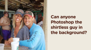
When a woman posted a sweet photo of her best friend’s newly engaged sister and her fiancé, the bride-to-be had just one wish — to keep the picture forever. But there was one problem: a shirtless man in swim trunks casually lingering in the background, unintentionally stealing the spotlight. Unable to Photoshop him out herself, the poster turned to social media for help, … [Read more...]
These Clients Wanted To Pay Artists With “Exposure” Instead Of Money
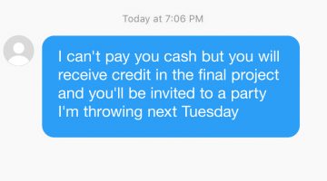
At some point or the other, every artist comes across a douchebag client who expects them to work for free. These requests usually come with promises of "exposure" or future collaborations. Rookie designers with little or no skill fall prey to them and ruin it for the rest of us. … [Read more...]
8 Types Of Graphic Designers On Social Media, Which One Are You?
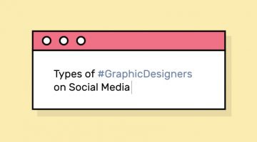
Do you critique Facebook’s UI every time they change it? Do you unfriend people who use Comic Sans? Or are you the ‘Hashtag Bomber’ who drops 20 design-related hashtags with every status update? Design resource site Pixelo has come up with a fun series of illustrations that list the different types of graphic designers on social media. Check them out below and tell us which one … [Read more...]
Two Venezuelan VFX Artists Are Making Jaws Drop With Their Special Effects Videos
Alejandro Benzaquen and Kevin Lustgarten take everyday life situations and give them unexpected twists using visual effects. The duo, known as 2Venezolanos, use post production and VFX compositing to create crazy videos that'll make your jaw drop. Watch below. … [Read more...]
Funny Ads For Digestive Pills Show Food Items As Characters In Troublesome Situations
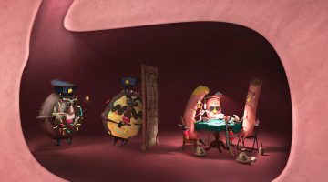
Agency Dhélet Y&R in Buenos Aires has come up with a cracker of a campaign for Hepachofa Digestive Pills. The 3-ad series imagines food items as characters inside the stomach, that are about to face a troublesome (or should we say gut-wrenching) situation. For example, the first ad shows a 'pizza husband' coming back home from a long day at work, and his 'pizza wife' is in bed … [Read more...]
- « Previous Page
- 1
- 2
- 3
- 4
- 5
- …
- 10
- Next Page »