28 Creative Tea Bag Designs For Tea Lovers
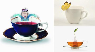
Which is the world's most widely consumed drink after water? It's not coffee or Coke. It's tea. And we're not surprised. Not only is it healthier and cheaper than coffee but also predates it by about 3000 years. It even keeps Mother Earth happy by leaving a smaller carbon footprint and wasting fewer resources in trade. … View Post ▸
Color Palettes From Famous Movies Show How Colors Set The Mood Of A Film
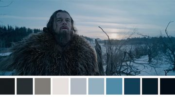
Color sets the tone and mood of a film before any of the actors have even uttered a word. Directors Lilly and Lana Wachowski used a green tint in The Matrix (1999) to create a mood palette that was suggestive of the early monochrome computer monitors. Yellow was used in Kill Bill (2003) to depict Uma Thurman’s character’s madness and instability. Romantic … View Post ▸
Brilliant Campaign From Getty Images Shows Famous Faces Made Entirely Out Of Stock Photos

Brazilian agency AlmapBBDO has come up with a gem of a campaign called "Endless Possibilities" for stock image site Getty Images. Consisting of four print ads and a video, the campaign shows the collaged faces of Prince Charles, the Dalai Lama, Pope Francis and Angela Merkel made entirely out of creative images available on the site (no editorial images). … View Post ▸
Designer Challenges Himself To Create 30 Animal Logos In 30 Days Using The Golden Ratio

Ukranian designer Andriy Yurchenko took on a 30-day logo challenge to create one animal logo each day, using the principles of the golden ratio. The Kyiv-based artist specialises in web, UI/UX, and identity design. For this project he used Adobe Illustrator, Photoshop, and experimented with different color schemes to get the desired look. Check it … View Post ▸
27 Beautiful Sci-Fi GIFs That Will Leave You Mesmerized
New York-based artist Carl Burton blends elements of science fiction and surrealism to create stunning monochromatic GIFs/cinemagraphs that have a hypnotic, dream-like feel to them. He uses Cinema 4D, Photoshop and After Effects to create these animated illustrations that are "influenced by nature, architecture, mundane environments and the news," he says. … View Post ▸
PETA’s New Leather Store Has A Shocking Twist If You Look Inside The Products

To show consumers how animals are treated to produce leather goods, PETA Asia teamed up with Ogilvy & Mather Advertising to launch this shocking pop-up store in one of Bangkok's shopping malls. Customers walked in, picked up something they liked, opened it and ... watch below. … View Post ▸
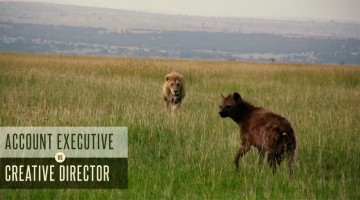
15 Signs You Need To Let Your Client Go
We creative types are not known for our patience. We freak out over what to eat when we see an ugly menu at a restaurant. We don't follow road signs if they're written in Comic Sans. But when it comes to clients, we listen, we hear and we understand. We're patient because (a) we want to use our creative skills to solve their problems and (b) they're paying … View Post ▸
This Graphic Designer Uses Her Design Skills To Make The Most Awesome Cookies
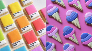
Los Angeles-based graphic designer Holly Fox combines her passion for design and baking by creating these yummy sugar cookies that are adorable to look at. Her culinary creations double as aesthetic delights, turning each bite into a colorful visual feast. Holly started baking in 2011 to try and see if she could figure out royal icing. After experimenting … View Post ▸
24 Useful Design Tips That’ll Help You Create A Better Logo
Most small scale businesses on modest design budgets end up with amateurish logos that use stock art, are overly complex or follow trends that look outdated in a year. No use blaming the cheap freelancer, the owners themselves don’t know what they want. … View Post ▸
19 Pun-Filled Posters That Graphic Designers Will Relate To
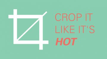
Here's a cool collection of funny posters about graphic design and typography from Dubuque-based marketing executive Sara Heffernen. Using puns on design terms and font names, Sara tells you to "Crop it like it's hot" and have a "Helvetica good time". The posters also advise you to practice safe sex design by using a condom concept and to choose sensibly … View Post ▸
CEO Falls Asleep At Work, Employees Photoshop Him Into Funny Memes

When Lightricks CEO and co-founder Zeev Farbman decided to catch some shut-eye between meetings, his employees decided to have a little fun. They took a picture of him and using Lightricks’ Photoleap app, they made a meme out of their boss by placing him in movie scenes, classic art paintings, inside a hot dog, a toothpaste tube, and even in Leonardo … View Post ▸
20+ Clever Illustrations That Have The Weirdest Twists
If you like witty visual humour you'll love these illustrations by Chinese artist Shanghai Tango that take the most unexpected turns in the final frame. Tango, whose real name is Gao Youjun, graduated from Tsinghua University's Academy of Arts & Design. He's been working in advertising since 1995 and now runs an agency of his own. Alongside his day … View Post ▸
25 Amazing Sculptures That Will Make You Go Wow
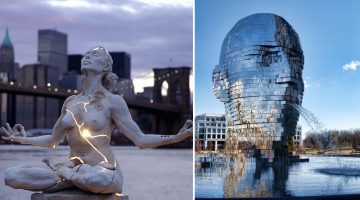
Cities across the globe are home to beautiful modern works of art, forged out of stone and metal by master sculptors and artists. No matter where you are or where you travel, you’ll find awe-inspiring sculptures that demonstrate the creative capacity of the human mind. From Singapore to Switzerland, New York to New Zealand, here’s a list of 25 such … View Post ▸
Coffee Changes Nightwear To Workwear In These Clever Ads With Brilliant Art Direction
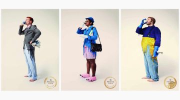
Agency Y&R Paris has come up with a nifty print campaign for Pronto Café that shows how coffee makes people go from sleep mode to work mode. The four-ad series shows a businessman, a traffic policewoman, a fisherman and a baker sipping on coffee, and in the process, their outfits change from nightwear to workwear. The tagline reads "Pronto Café - Ready … View Post ▸
Artist Uses Everyday Objects To Complete His Sketches
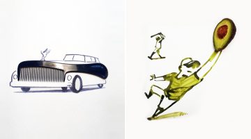
Renowned illustrator and graphic designer Christoph Niemann draws a fun series of doodles he calls 'Sunday Sketches'. He uses everyday objects like fruits, cutlery, household tools, etc. as the centrepiece and draws the artwork around them in a way that the item completes the sketch. So, a comb becomes the front grill of a Rolls Royce, an avocado becomes … View Post ▸
A Beautiful Reminder Of The Strength And Contribution Of Mothers In Our Lives

With Mother's Day around the corner, P&G and agency Wieden + Kennedy, Portland, have come up with a brilliant commercial for the Rio Olympics that salutes mothers for their strength, sacrifice and contribution in making us who we are. … View Post ▸
What Do The World’s Most Popular Logos Have In Common?
Logos may look different at first glance, but many of the world’s most successful brands share disciplined design choices. Across industries, clear patterns emerge in color, typography, shape, and structure. Strong logos are not accidental. They are built for clarity, memorability, and long term recognition. … View Post ▸
5 Color Choices You Must Avoid When Designing For The Web
When it comes to web design, colors play a vital role in increasing conversions, reducing bounce rate and ensuring a smooth user experience. We often see websites compromising on readability by using light-colored text on light backgrounds. Also, it's never ok to use red and green in excess, even if you're making a Christmas-themed website. … View Post ▸
Pun-Based City Logos Created Using Words Within Their Names
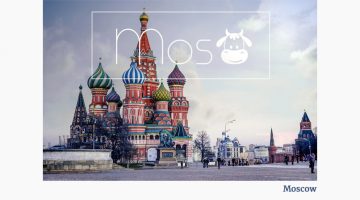
Bucharest-based designer/photographer Raluca Popescu was trying to create a representative banner for a travel agency, when she came up with the idea of creating pun-based city logos using words within their names. So the logo for Moscow has a cow in it, the logo for Cambridge has a bridge, Budapest has Buddha, and so on. Check them out below. … View Post ▸
Honest Graphs That Show What Group Brainstorming Is Really Like
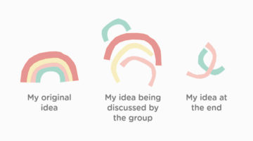
Are you lonely? Tired of working alone? Do you hate coming up with ideas on your own? Then hold a brainstorming session. You can see people, show charts, feel important, point with a stick, eat donuts, and impress colleagues - all on company time. On that note, the cool folks at Creative Market have come up with a series of graphs that show what most … View Post ▸
Incredible Illustrations Of Zodiac Signs By Andreas Preis
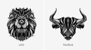
Whether you believe in astrology or not, these stunning illustrations of Zodiac signs by German artist Andreas Preis will leave you gobsmacked. Preis created this series while recovering from a knee surgery over a period of two months. He drew the artwork on paper and used Photoshop for post production. Preis' skill set includes illustration, murals, tape … View Post ▸
Elegant Typography Posters That Give You Font And Color Ideas For Your Next Project
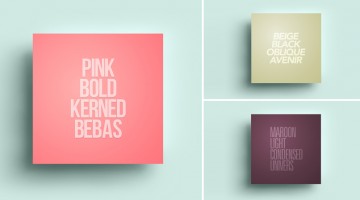
Lisbon-based designer/copywriter Filipe de Carvalho has created a series of self-descriptive posters titled MetaType that show the colors, fonts and text-styles used in them. Filipe works as a copywriter for excentricGREY and has created award-winning work for brands like Vodafone, Volvo, Samsung, Chevrolet and Heineken to name a few. … View Post ▸
Watch How Similar Agency Life Is To Wildlife
We at DS have always tried to give you a glimpse into the madness and chaos that goes on in a creative agency. But here's an analogy that'll give you a clearer picture. North Carolina-based agency The Variable has created a series of parody videos that compare agency life to surviving in the wild. Titled Adland Adventures, the videos use relevant wildlife … View Post ▸
Beautiful, Vibrant Animal Logos Based On The Golden Ratio

Here's a gorgeous collection of animal logos by Tom Anders Watkins, a half Finnish, half English, self-taught designer from Lincoln, UK. The 21-year-old is a multi-disciplined advertising creative and has won numerous awards such as Student of the Year from the Art Directors Club of Europe, D&AD New Blood and Adobe Photoshop's 25 Under 25. … View Post ▸
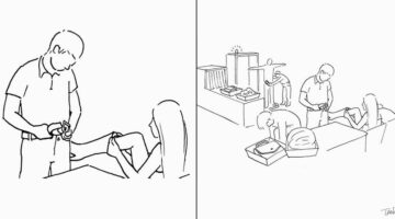
How To Cut Anything Out In Photoshop

A young monk artist went up to his teacher who was reciting Photoshop keyboard shortcuts under a Himalayan tree and asked him "Teacher, when will I become a master artist like you?" The teacher replied "When you can select all the feathers of a morning sparrow without missing a single one, only then will you be a true Photoshop master." (source) … View Post ▸
50 Photos You Won’t Believe Were NOT Photoshopped

Forced perspective is a technique that manipulates human visual perception to make an object appear larger, smaller, closer or farther away than it actually is. In simple terms, those photos you see of people ‘holding’ the top of the Eiffel Tower or ‘pushing’ the Tower of Pisa, are all examples of forced perspective photography. Today’s post is a … View Post ▸
What Designers Think Of You Based On Your Font Choices
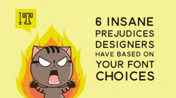
A designer's tolerance for bad design is inversely proportional to his/her skill level. The higher the skill, the less tolerant they are to poor design. That's why good designers won't be caught dead eating at a restaurant that uses Comic Sans on the menu. Or attending a wedding where the hosts used Papyrus on the invite. … View Post ▸
Vibrant, Beautiful Logos And Illustrations Made With Blend Modes And Transparency
Russian graphic designer Ilya Shapko has created a series of vibrant icons using blend modes and transparency in Adobe Illustrator. The project, titled 'Overlays', showcases colorful illustrated shapes cleverly placed over each other to form abstract animals and human figures against light and dark backgrounds. Shapko resides in Saratov and is a … View Post ▸
This Beautiful Sculpture Shows The Inner Child Trapped Inside All Of Us
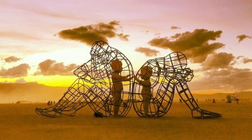
"Love" is a fascinating art-project by Ukrainian artist Alexander Milov. It demonstrates the outer and inner expression of human nature. The protagonists are a man and a woman sitting in disagreement with their back to each other. Their inner selves are depicted in the form of children trapped inside metal adult bodies, holding their hands out to each … View Post ▸
The Amusing Decisions That Designers Have To Make Every Now And Then
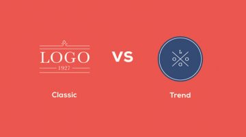
Classic logo or trendy logo? Helvetica or Bebas? Client request or designer sense? Strangle the client or don't strangle the client (ok, ignore that one). DesignTAXI has released a series of relatable illustrations that show the many dilemmas we designers face every now and then. Check them out below. … View Post ▸
What Different Colors Mean And How To Use Them
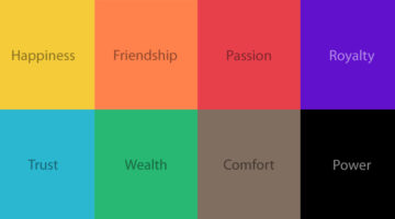
Did you know that blue is used for corporate and business designs because it represents dependability, trustworthiness and security? Orange is used to give a friendly impression without being overpowering. Darker shades of purple characterize wealth and luxury. TechKing has come up with a handy infographic that covers the psychology of different colors, … View Post ▸
20 Things You Should Never Say To A Graphic Designer
You wouldn't ask a doctor to deliver your baby "real fast for 50 bucks", right? Or a lawyer to show you 20 different versions of a contract before you sign it? If you expect your designer to bear with such nonsense, expect a Photoshopped picture of yourself in Kanye West's lap on some random meme aggregator website. … View Post ▸
10 Useful Kerning Tips To Improve Your Typography
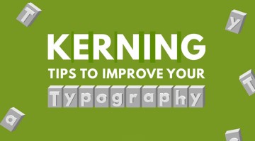
“Typography is an art. Good typography is art.” – Paul Rand. If you’re a typography freak like us, you’ll enjoy this handy infographic by Creative Market that shares some useful kerning tips and tricks to improve your typography. It covers some good points like kerning each letter individually, using visual space not actual space, and even a few … View Post ▸
Cool Magazine Ad From Porsche Brings Their Car To Life As A 3D Hologram

To promote the new 911, Porsche has come up with a cool print + digital integration in about 50,000 copies of Fast Company's April issue. Targeted primarily at affluent subscribers, the four-page spread includes an acetate prism with instructions for using it. Once assembled, users need to log on to 911hologram.com and place the prism upon the tablet. The … View Post ▸
8 Dos and Don’ts Of Creating Pixel Icons In Illustrator
Chennai-based UI/UX Designer M.A. Kather has created an eight-point visual guide that covers some basic dos and don’ts of creating pixel icons in Adobe Illustrator. Kather’s visual comparison of Photoshop vs Illustrator was previously featured on our site. This new series offers a few tips and tricks that’ll come in handy for design students, beginners and … View Post ▸
- « Previous Page
- 1
- …
- 20
- 21
- 22
- 23
- 24
- …
- 38
- Next Page »