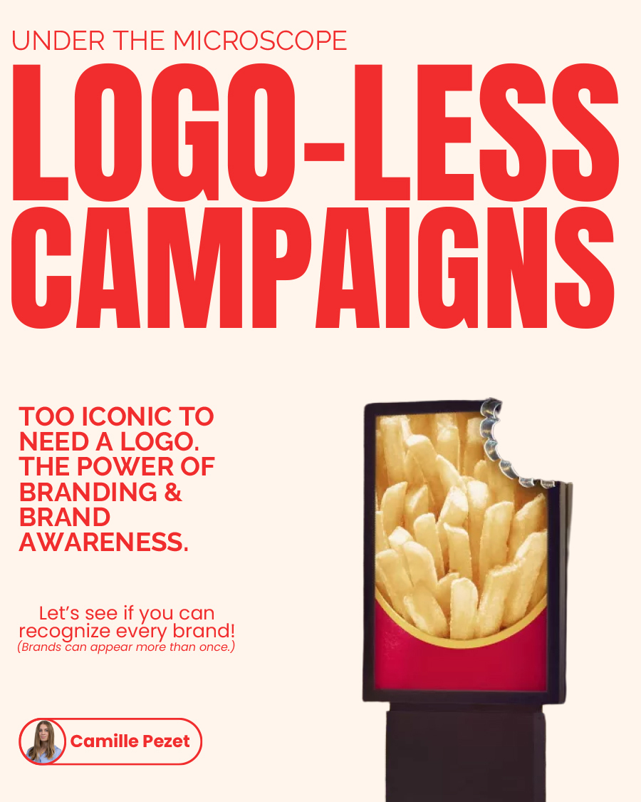
12 Ad Campaigns So Clever, You Know The Brand Without Seeing The Logo
The most powerful ads on the street right now are missing something: the logo. No wordmark, no swoosh, no golden arches spelled out in full. And yet you know exactly who’s talking to you. That’s not an accident, it’s the payoff of decades spent drilling a brand so deep into public memory that a colour, a shape, or a half-eaten fry does the work a logo used to.
These logo-less ad campaigns are the ultimate expression of brand equity: the confidence to remove your own name and lose nothing. What remains is a distilled visual identity, built over years of brand consistency and no small marketing spend, that the audience has been quietly trained to read. Colour, typography, product shape, tone of voice, each one a recognition cue doing the logo’s job. The brands that pull this off aren’t being clever for its own sake. They’re cashing in brand awareness they spent decades building, and trusting the consumer to complete the thought.
Paris-based brand strategist Camille Pezet has put together a standout showcase of logo-less ad campaigns, highlighting just how powerful great branding and awareness can be. See how many you can identify from the visuals alone, and notice what gives each one away. That instant of recognition is the whole game in brand marketing, and it’s the hardest thing in advertising to buy.
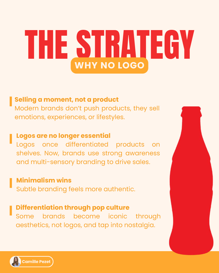
The Strategy
1.
2.
3.
4.
5.
6.
7.
8.
9.
10.
11.
12.
Answers
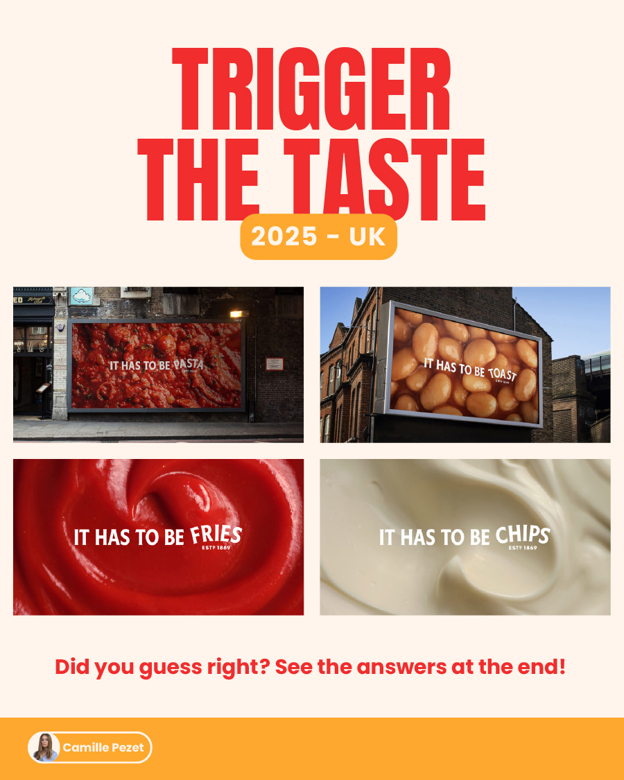
01. Heinz – Trigger the Taste – 2025 UK
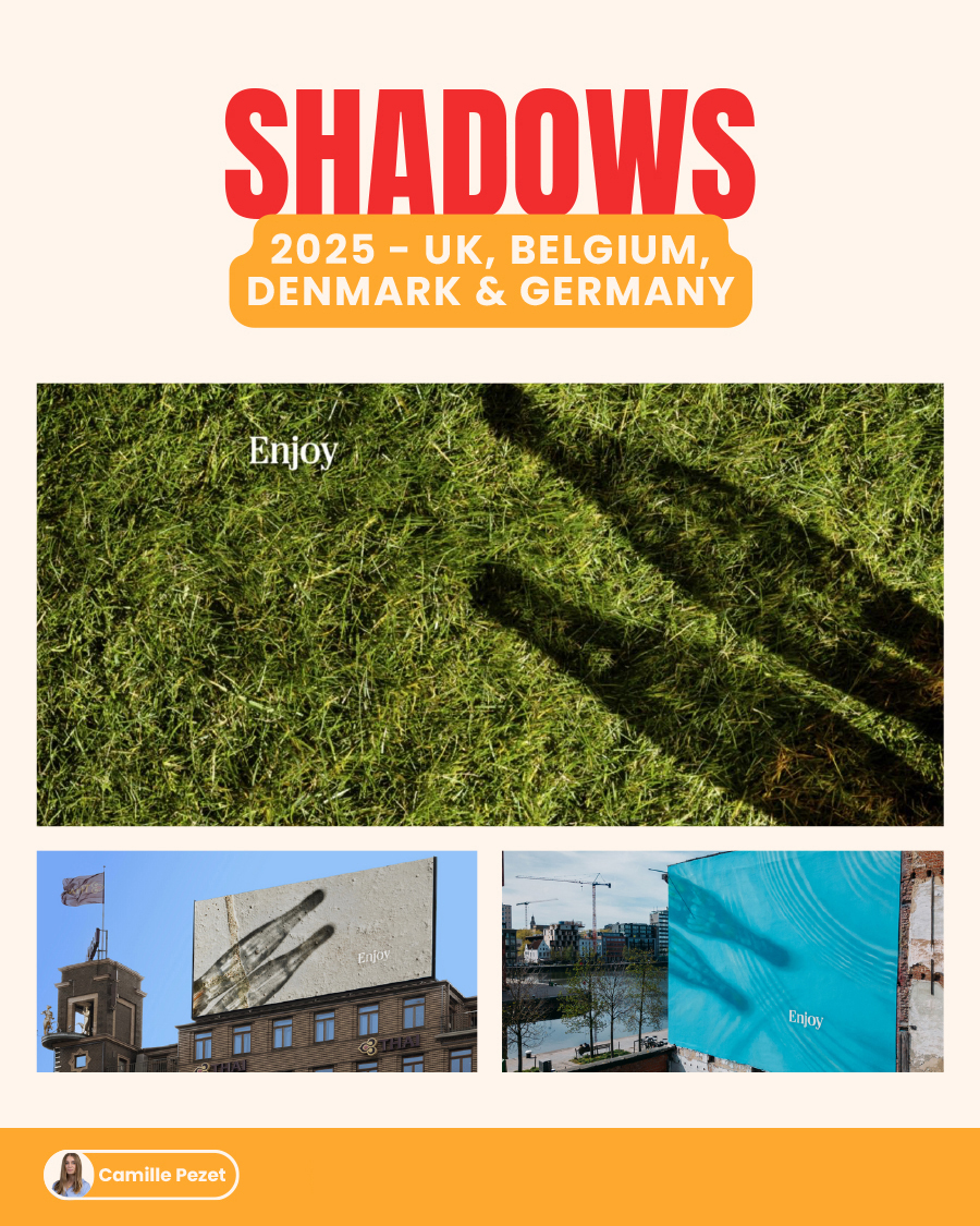
02. Coca-Cola – Shadows – 2025 UK, Belgium, Denmark & Germany
03. Danette – On Se Lève Tous Pour – 2025 France
04. Kellogg’s – The OG – 2025 Europe
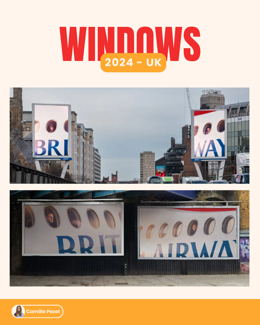
05. British Airways – Windows – 2024 UK
06. McDonald’s – Iconic Stacks – 2020 UK
07. McDonald’s – No Logo (bitten fries) – 2020 France
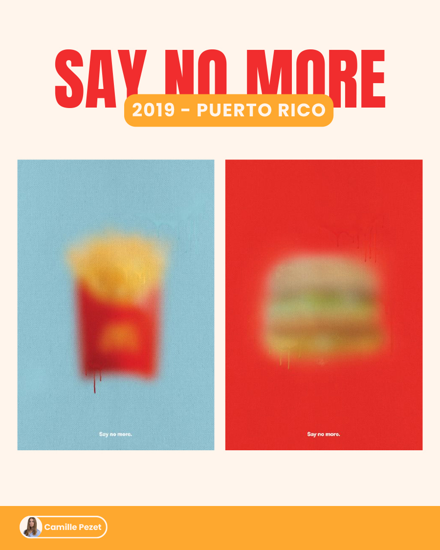
08. McDonald’s – Say No More – 2019 Puerto Rico
09. Doritos – Anti-Ad – 2019 US
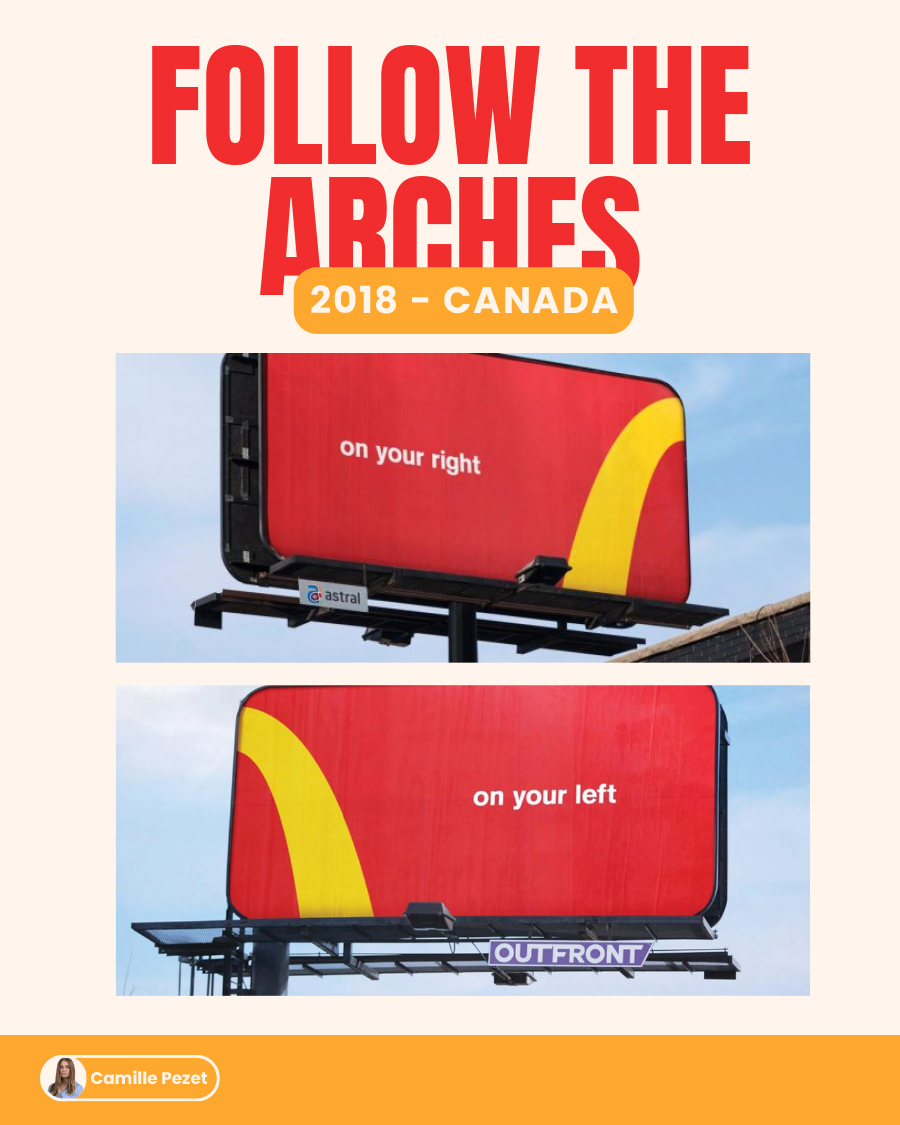
10. McDonald’s – Follow the Arches – 2018 Canada
11. McDonald’s – No Logo (fries and burger close-ups) – 2013 France
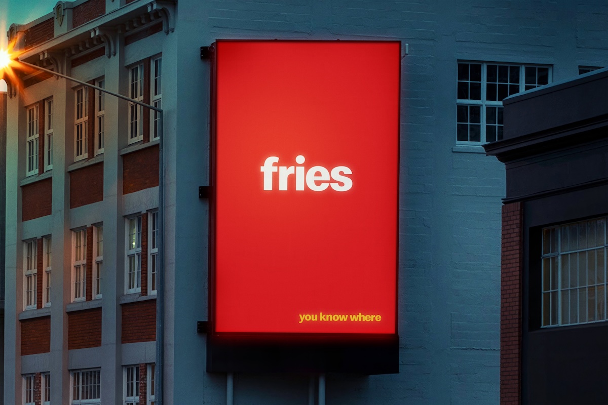
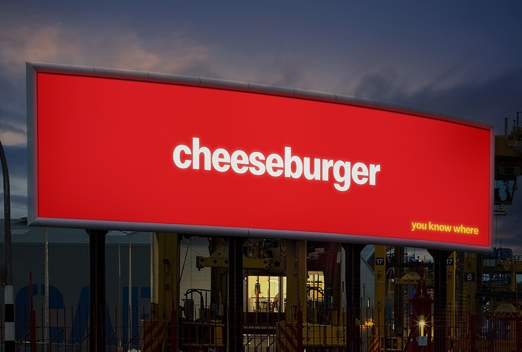
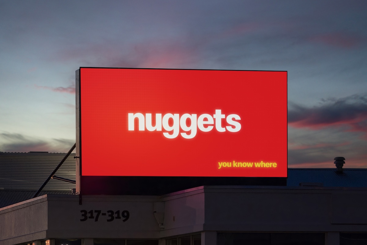
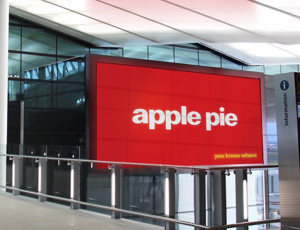
12. McDonald’s – You know where – 2026 New Zealand
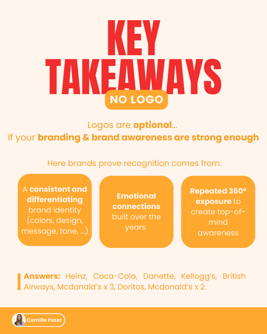
Key Takeaways
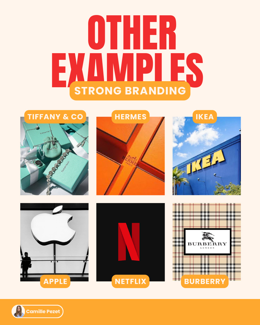
Other Examples
Question
These campaigns are a testament to branding done right. Build a brand identity strong enough and the logo becomes optional, because recognition stops living on the label and starts living in the details: the colour, the shape, the tone, the years of brand consistency your audience has quietly memorised. That is what brand equity actually looks like. Not a logo anyone can copy, but a presence no one can mistake.
So which other brand do you think has the brand awareness to pull this off? Tell us in the comments, and send this article to a designer friend.