
The brain gives abstract meaning to many different shapes in a consistent way and filmmakers use this phenomenon to tell their story. In animation, for example, evil characters have sharper features, pointy noses and long curly fingers. The lovable characters are designed soft and round. … [Read more...]
15 Surprising Things That Can’t Be Copyrighted
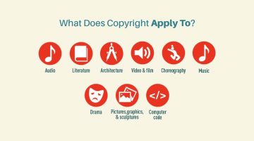
Copyrights are an essential legal tool for artists, writers, musicians and inventors to protect their work. However, not everything can be copyrighted. The ingredients of a recipe can't be copyrighted. Neither can a domain name, or the title of a book. … [Read more...]
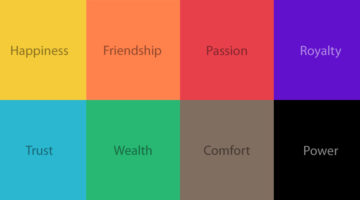
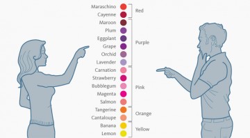
The Psychology of Colors in Marketing (Infographic)
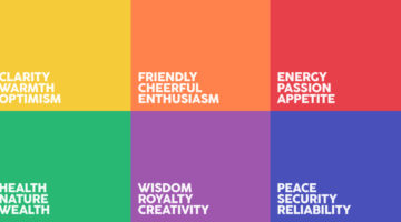
When buying a product, 93% of buyers focus on its visual appearance. 84.7% of buyers claim that color is the primary draw card. Different colors have different psychological effects on consumers - red encourages appetite, blue provides a sense of security, green stimulates harmony, orange promotes enthusiasm, purple is associated with royalty, and so on. Homestead has … [Read more...]
5 Things Every Designer Should Know When Dealing With Clients
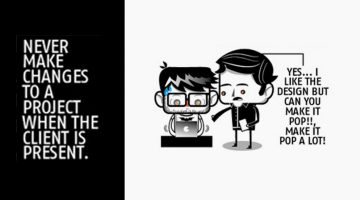
If you're making changes to a project in front of a client, you're doing it wrong. You might think you're saving time, but you end up making the design process look simpler than it actually is. Here's a handy infographic by Basekit and Josuedric that shares five such important tips you should keep in mind when dealing with design clients. … [Read more...]
Tips To Make Your Website User-Friendly For People With Disabilities
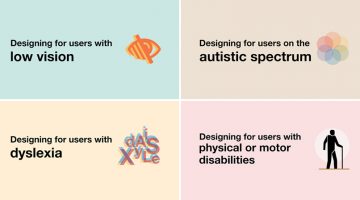
A website should be user-friendly for everyone, including those with poor vision, dyslexia, autism or physical disabilities. UK-based interaction designer Karwai Pun has created a set of six infographics that highlight the dos and don'ts of designing for accessibility. … [Read more...]
21 Funny Illustrations That Show The Cultural Differences Between The East And The West

There's a 13-year-old girl standing at a Berlin bus stop in 1990, freshly arrived from Beijing, watching people queue in a perfectly straight line. She finds it both baffling and oddly funny. That girl is Yang Liu. Thirteen years later, those observations became "East Meets West." Liu, now a graphic artist and professor of Communication Design at UE Berlin, spent her … [Read more...]
The 100 Best Web Design Tools And Resources
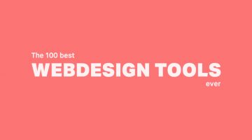
As a designer, it's imperative that you know your tools like an artist knows their paintbrushes. But with so many new apps and resources around, which ones should you bookmark? … [Read more...]
If You Want To Sound Smarter, Use These Words Instead Of “Very”
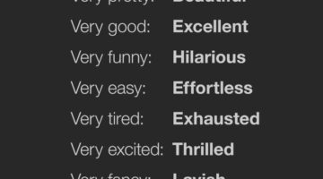
"Very" is vague and weak. People often use "very" as a lazy replacement for a more appropriate word. Proof Reading Services have come up with an excellent infographic that lists 128 words you can use instead of "very". For example, instead of "very colorful", you can use "vibrant". Instead of "very funny", use "hilarious". Instead of "very excited", use "thrilled". Know … [Read more...]
A Useful, Comprehensive List Of Typography Terms For Designers
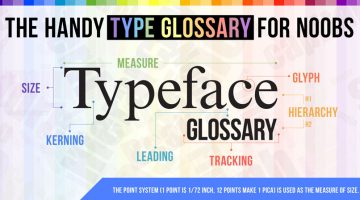
Do you know the difference between kerning and tracking, beak and serif, baseline and descender line? As a designer, it's imperative that you know what different typography terms mean, even if you don't use them every day. Here's a brilliant typeface glossary/infographic by DesignMantic that explains the meanings of terms like kerning, leading, tracking, glyph, serif, etc. and … [Read more...]
How To Structure URLs To Make Your Web Pages Rank Higher
Short and clean URLs don't just improve usability and user experience but they also help your pages rank higher in search results. Keep your URLs to under 60 characters, match them to their page titles and avoid keyword repetition and stop words like 'the', 'and', 'but', 'of', etc. FME Modules has created a handy infographic that offers URL structuring tips and suggestions to … [Read more...]
14 Graphic Design Terms That Most Designers Get Wrong
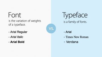
Most amateur designers don't know the difference between a font and a typeface. They use the two terms interchangeably. A font is the variation of weights (bold, italic, thin) of a typeface. A typeface is a family of fonts, like Arial, Helvetica, Bebas, etc. Another example is the usage of the terms 'color' and 'hue'. Color is an all-encompassing word referring to a hue, … [Read more...]
A Closer Look At Web Designers And Their Funny Habits
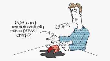
We web designers are a peculiar species. We like to do things with <style>. We refuse to eat at restaurants where the <table> layout sucks. We search for the Ctrl/Cmd Z button every time we spill our coffee. Our relationship with developers is similar to Donald Trump's relationship with immigrants. We like to keep 'other' humans at a distance, unless they know the … [Read more...]
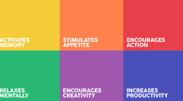
The Best Colors For Productivity And Creativity In Your Workplace
Did you know that yellow induces a sense of optimism and is a good color for high energy creative spaces? Red boosts heart rate, increases brain activity and is good for places where people work at night. Green boosts creativity, promotes harmony and is a good choice for brainstorming spaces. If you’re working remotely or looking to redesign your home office, platforms like … [Read more...]
Interesting Facts About Flag Colors And Design That You Probably Didn’t Know
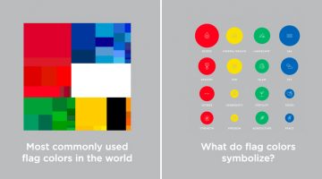
Flag Stories is an award-winning data visualisation project by Danish designers Jeppe Morgenstjerne and Birger Morgenstjerne, co-founders of Copenhagen-based infographic agency Ferdio. The project consists of a series of infographics that share interesting facts and trivia about flag colors, layouts, design, history and more. … [Read more...]
40 Little Things You Can Do To Break Your Creative Block
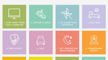
We're all short of creative juice sometimes. Panic-driven deadlines, unreasonable clients/bosses and lack of proper rest can sap the positivity out of your system, leaving you in a frame of mind that is seldom productive. The key is to (re)find your inspiration, trust your abilities and distance yourself from all things negative. … [Read more...]
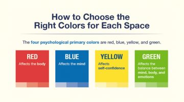
How To Choose The Best Colors For Your Logo
Picking colors for your logo is not just an artistic decision based on personal preference. Different colors elicit different psychological responses that impact consumer behaviour. Red stands for excitement, passion, appetite and urgency. Green is associated with nature, wealth and conservation. Blue stands for confidence, trust and reliability. Yellow is associated with … [Read more...]
16 Tips For Better Brainstorming Sessions
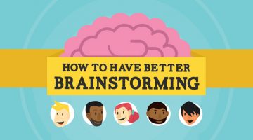
The best ideas come from great minds working together. But group brainstormings can be tricky. Senior members can end up dominating. People can be wary of contributing due to lack of involvement or fear of rejection. Every year, more than $37 billion is spent on unproductive meetings according to research compiled by online meeting service provider Fuze. … [Read more...]
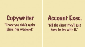
Copywriter vs. Art Director vs. Developer – 11 Clever Posters That Show The Differences
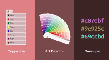
Even though they work towards a common objective, copywriters, designers, and developers could not be more different to each other. They all come with their own set of quirks and idiosyncrasies. Recently, we published a cool series of illustrations on Copywriters vs. Art Directors. Someone shared that article with Imgur user PickAndWhammy, after which, he decided to add a … [Read more...]
What Do The World’s Most Popular Logos Have In Common?
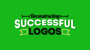
Logos may look different at first glance, but many of the world’s most successful brands share disciplined design choices. Across industries, clear patterns emerge in color, typography, shape, and structure. Strong logos are not accidental. They are built for clarity, memorability, and long term recognition. … [Read more...]
5 Color Choices You Must Avoid When Designing For The Web
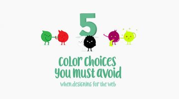
When it comes to web design, colors play a vital role in increasing conversions, reducing bounce rate and ensuring a smooth user experience. We often see websites compromising on readability by using light-colored text on light backgrounds. Also, it's never ok to use red and green in excess, even if you're making a Christmas-themed website. … [Read more...]
What Different Colors Mean And How To Use Them
Did you know that blue is used for corporate and business designs because it represents dependability, trustworthiness and security? Orange is used to give a friendly impression without being overpowering. Darker shades of purple characterize wealth and luxury. TechKing has come up with a handy infographic that covers the psychology of different colors, their appropriate … [Read more...]
10 Useful Kerning Tips To Improve Your Typography
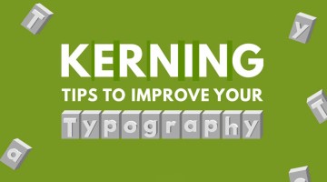
“Typography is an art. Good typography is art.” – Paul Rand. If you’re a typography freak like us, you’ll enjoy this handy infographic by Creative Market that shares some useful kerning tips and tricks to improve your typography. It covers some good points like kerning each letter individually, using visual space not actual space, and even a few unconventional hacks like … [Read more...]
8 Dos and Don’ts Of Creating Pixel Icons In Illustrator
Chennai-based UI/UX Designer M.A. Kather has created an eight-point visual guide that covers some basic dos and don’ts of creating pixel icons in Adobe Illustrator. Kather’s visual comparison of Photoshop vs Illustrator was previously featured on our site. This new series offers a few tips and tricks that’ll come in handy for design students, beginners and professionals alike. … [Read more...]
Have You Been Pronouncing These 30 Brand Names Incorrectly?
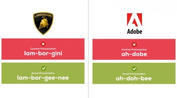
If your friend wants to buy a "porsh" someday, tell him or her to at least pronounce the name right. Here's a handy infographic by UK printing company Oomph that shows you the correct pronunciation of 30 famous brand names that most people get wrong. … [Read more...]
15 Graphic Design Terms That Most Designers Get Wrong
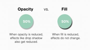
Graphic design has its own language, and most designers use it every day without thinking twice. But some of the most common graphic design terms are also the easiest to mix up. Font and typeface, letterspacing and kerning, opacity and fill, crop and trim — they sound similar, but they don’t always mean the same thing. Getting these terms right matters, especially when … [Read more...]
8 Positive Habits That Will Boost Your Creativity
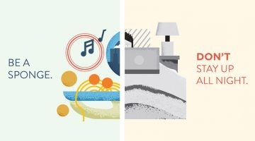
Creativity is a way of life. You can't have a negative mindset 24/7 and expect to be brimming with ideas and solutions. Today's high pressure environment and erratic work lifestyle makes everyone run out of creative juice once in a while, but if you want to spring back into action, maintaining an optimistic outlook is key. … [Read more...]
10 Ways To Annoy A Graphic Designer
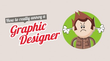
Are you a design client looking for ways to de-stress? Do you believe people perform best under pressure? Is your designer producing top quality work with too much ease? Here's a handy infographic by UK printing company Print-Print that shows you how to play havoc with your designer's mind and show him/her who's boss. Check it out below. … [Read more...]
10 Funny Charts That Show The Life Of A Designer
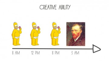
The only thing peaceful in a designer's life is the sound of the morning bird after a long night of creative ideation and execution. In the 4-5 hours of sleep that follow, designers are subconsciously evaluating font options and color changes after picturing the client dressed as the grim reaper playing a violin in the background. … [Read more...]
22 Funny Handmade Graphs That Show The Reality Of Adulthood
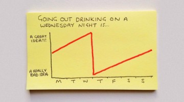
Lending visuals to the phrase "Don't grow up, it's a trap", Instagrammer Chaz Hutton has found a way to depict the perils of adulthood with a series of brutally honest graphs that will make you chuckle. Check them out below. … [Read more...]
Male Vs Female Color Perceptions And Preferences
Traditionally, baby boys are wrapped in blue and baby girls in pink. A few years later, you can tell a boy's room from a girl's room just by observing the color combos (and the cleanliness ;) ). As we grow up, gender color preferences are visible in everything from wardrobes to cars (though nowadays the line is thinning). … [Read more...]
How Humans React To Different Colors
Did you know that green is used for night vision goggles because the human eye is most sensitive to, and able to recognise most shades of that color? Pink makes us crave sugar. Red increases enthusiasm. People are often more productive in rooms painted blue. Grey represents non-involvement, giving it a formal authority. Ript Apparel has created a comprehensive infographic … [Read more...]
Signatures Of 25 Famous Entrepreneurs And Their Hidden Meanings
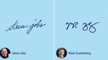
Handwriting has fascinated psychologists, historians, and branding experts for decades. But signatures? They're something else entirely. From the sharp, controlled strokes of corporate leaders to the flamboyant flourishes of creative visionaries, the way someone signs their name often feels like a window into who they really are, and that's exactly what graphology, the study of … [Read more...]
LOL: 18 Things You Should Never Say To Agency Employees
Agency employees get a fair share of cliché feedback from clients, co-workers and everyone else. In an interesting exercise, Adweek asked veterans from the industry to share the most annoying comments they get to hear on a daily basis. Here's what they had to say. … [Read more...]
9 Cool Posters That Show The Differences Between Adobe Illustrator And Photoshop

Chennai-based designer M.A. Kather has created a cool series of minimalist posters that explain the differences between Adobe Illustrator and Adobe Photoshop. The intent of this comparison is to show the process and purpose of each program, not to prove which one is better (because they both have different uses). Check out the series below. … [Read more...]
20 Motivational Quotes That Will Inspire You To Succeed
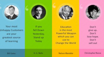
We all need a dose of motivation from time to time and today we have 20 successful and iconic figures to deliver it to you. This wonderful infographic from Success Story shares inspiring quotes from Bill Gates, Steve Jobs, Richard Branson, Aristotle, Nelson Mandela and more. … [Read more...]