Designer Redraws 44 Famous Logos Without Lifting His Pen, And The Results Are Brilliant
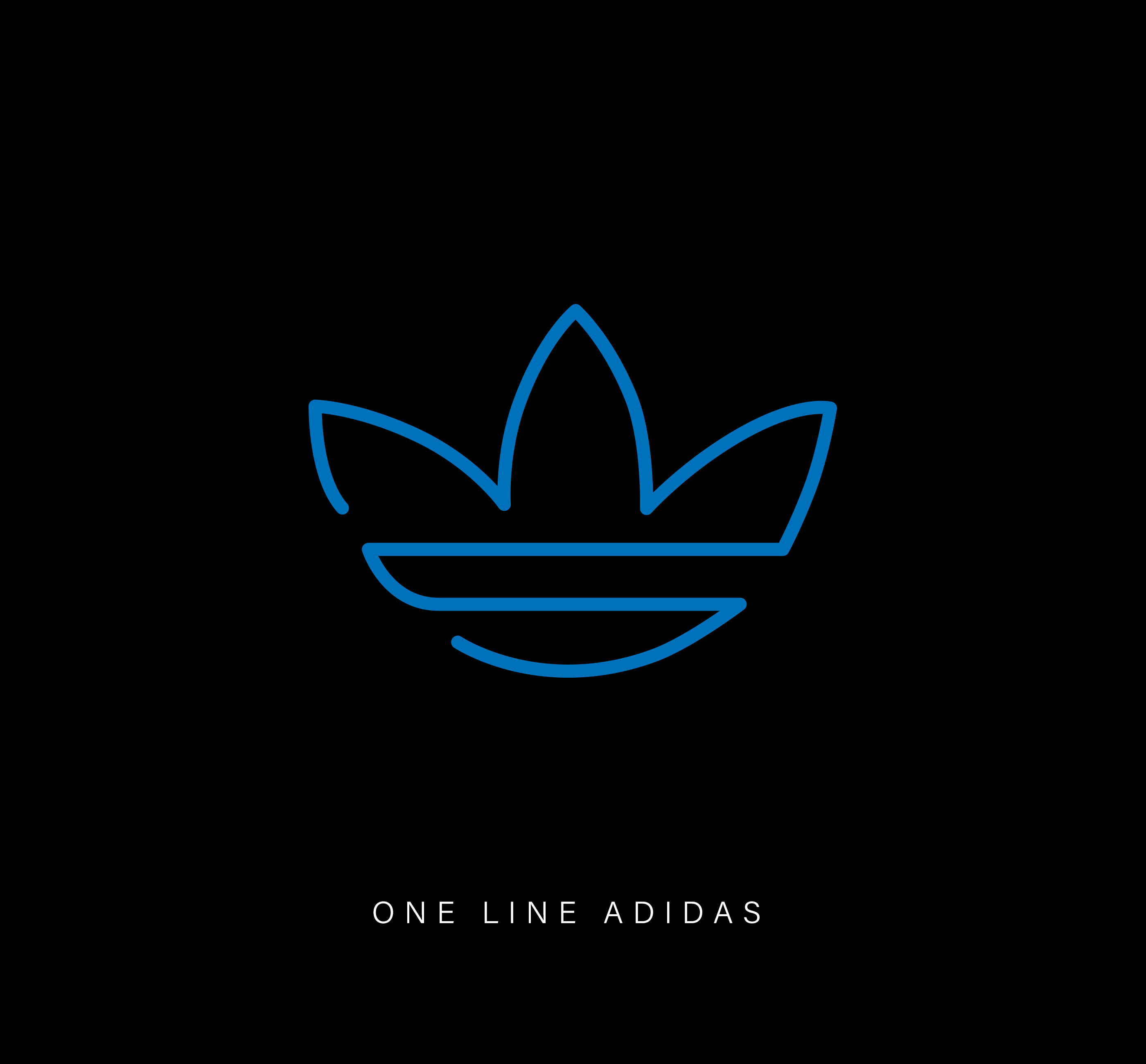
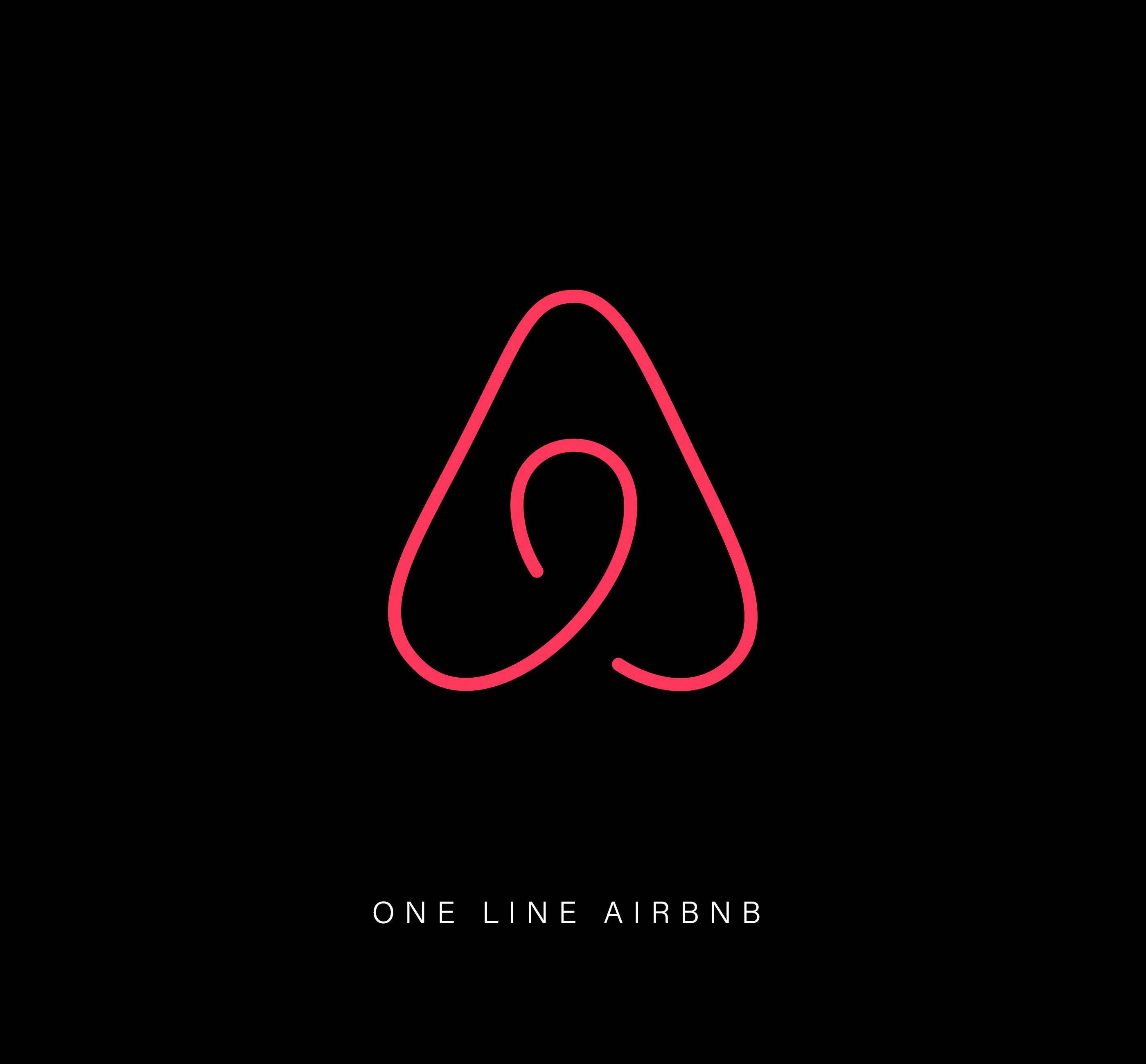
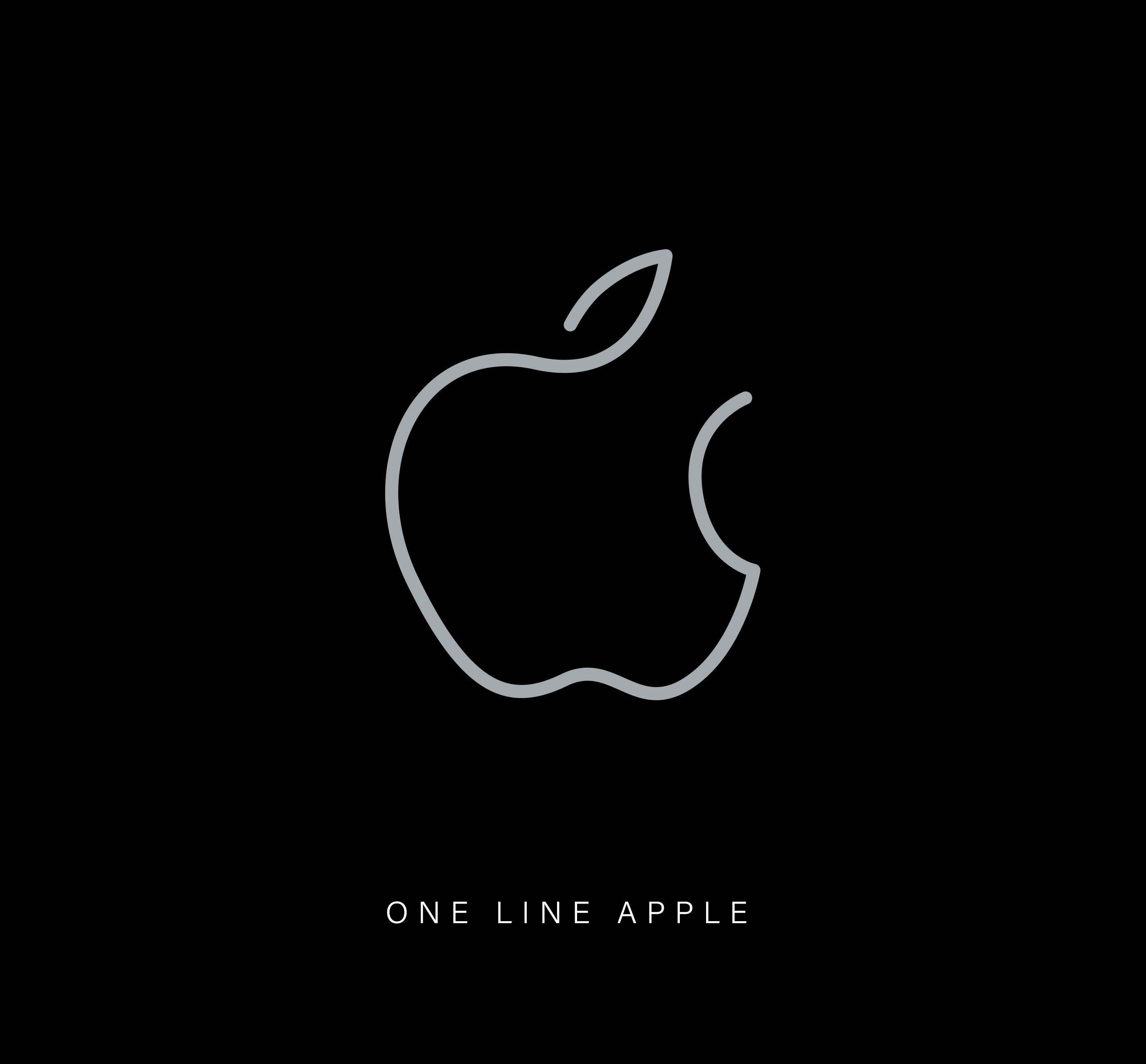
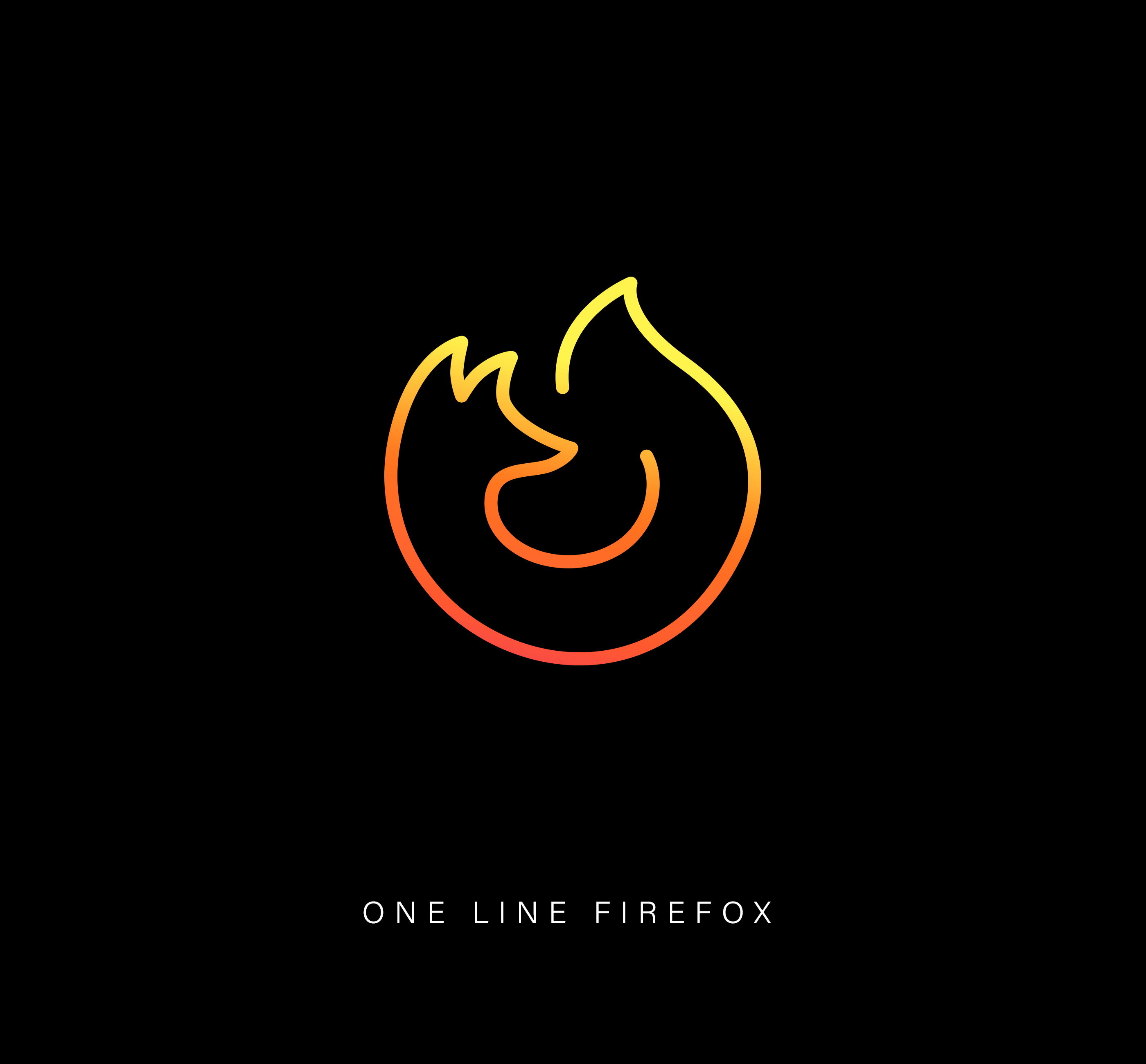
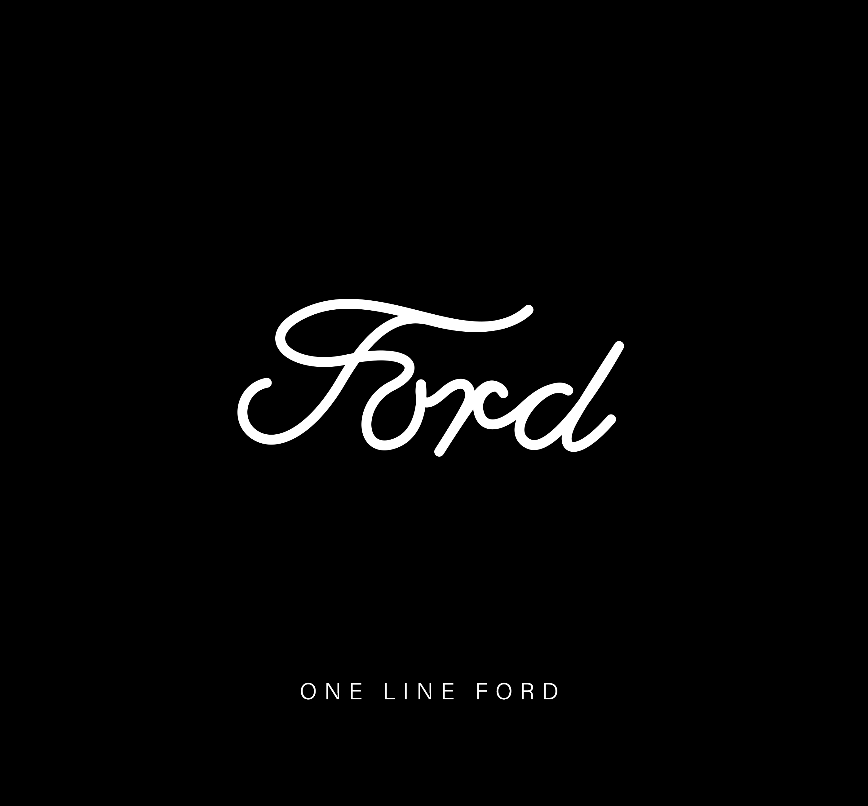
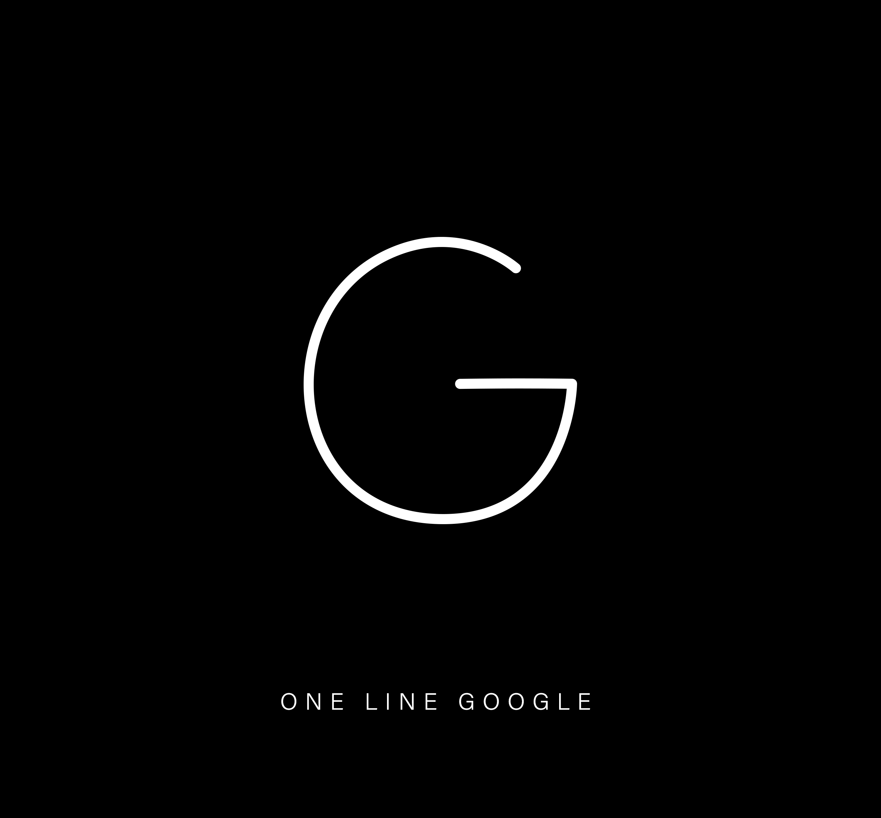
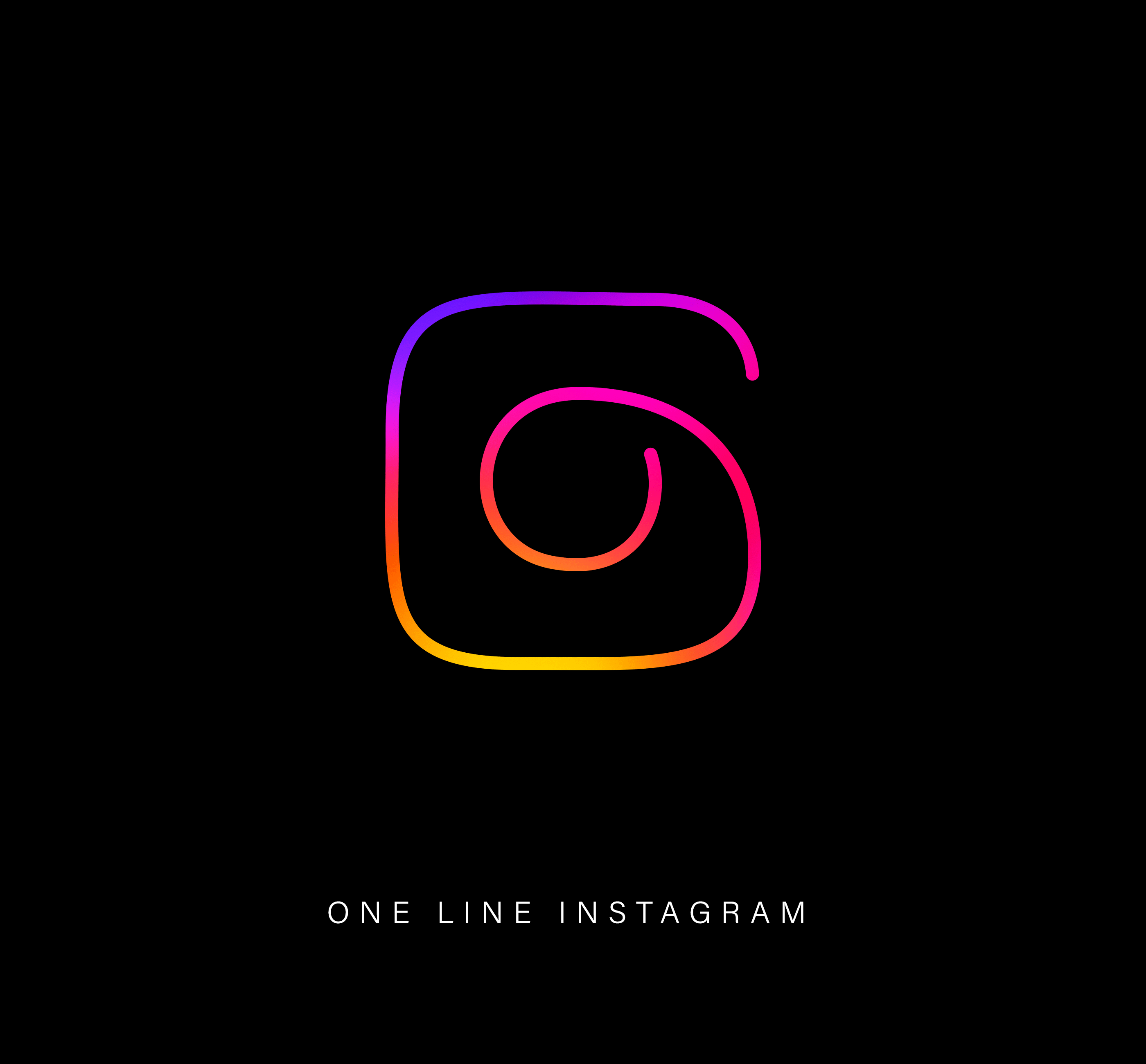
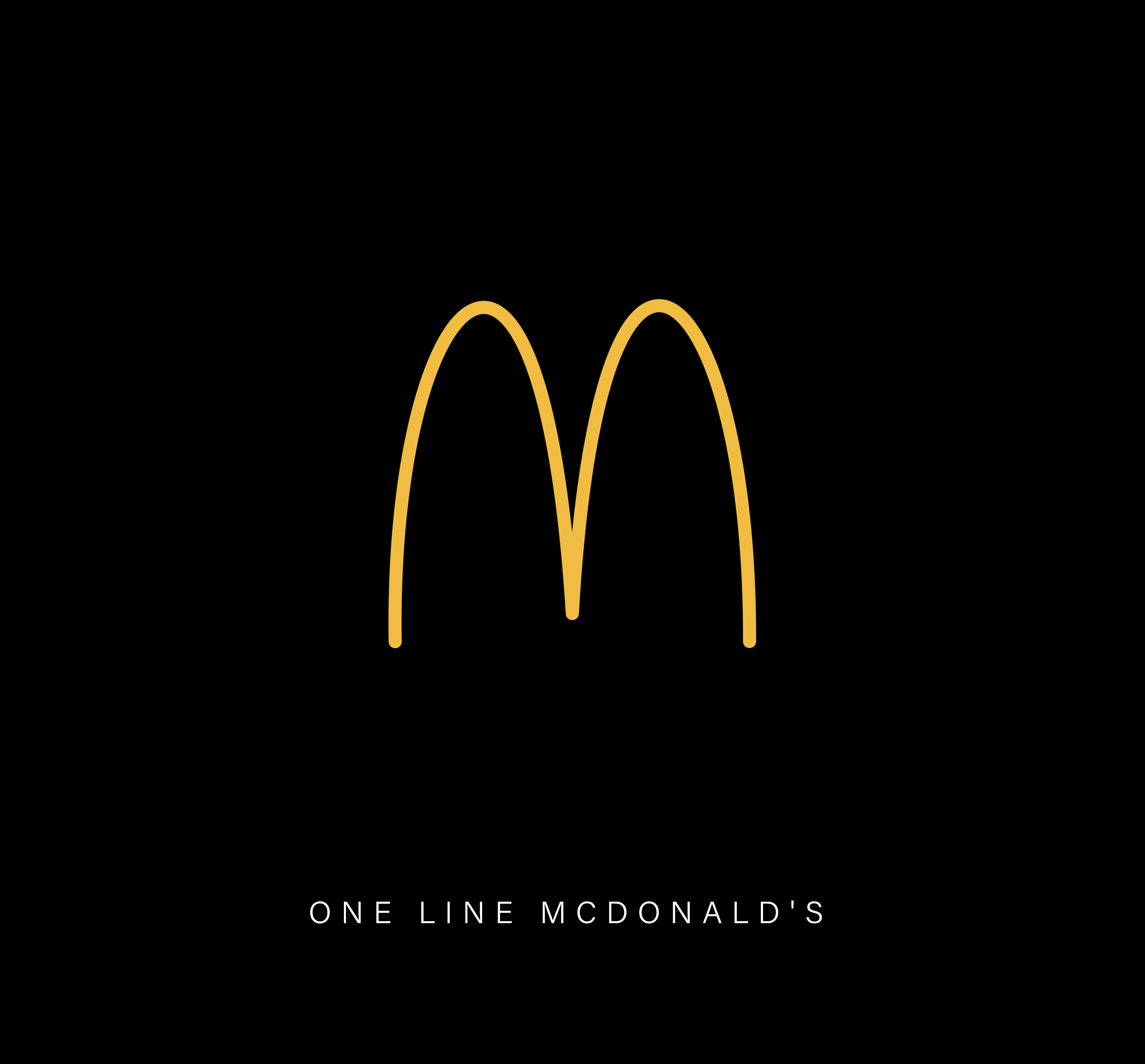
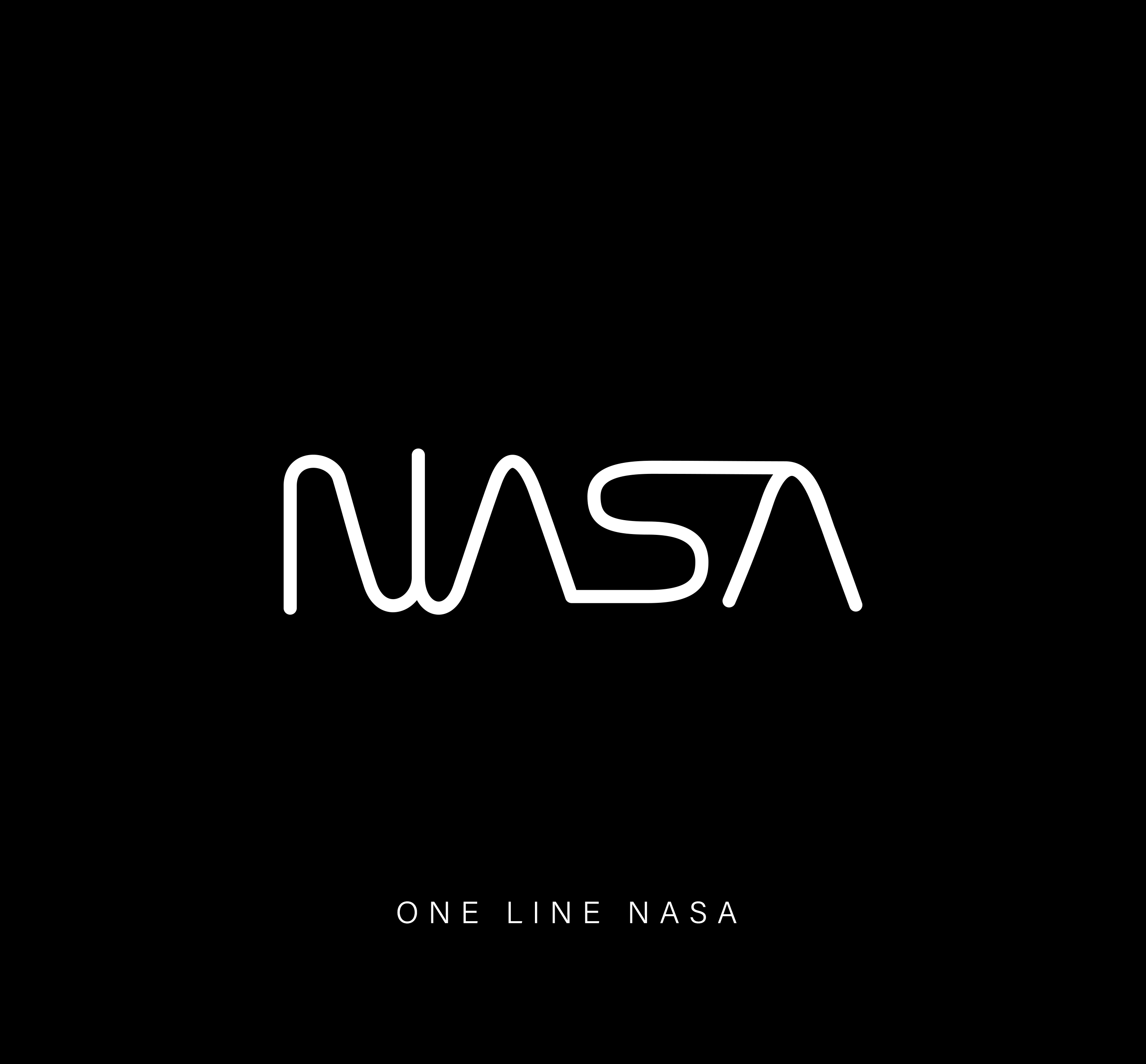
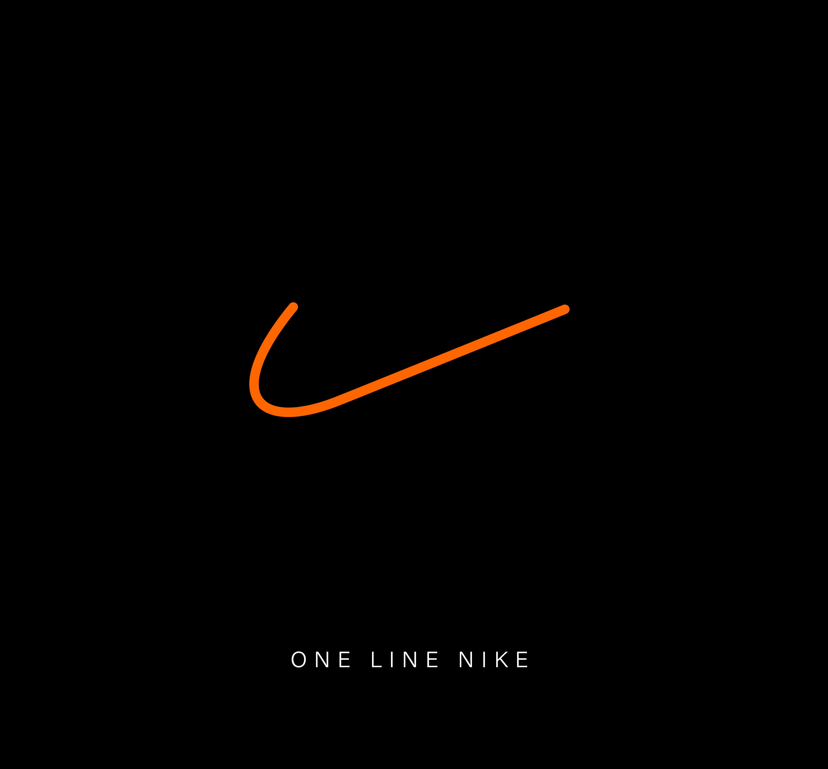
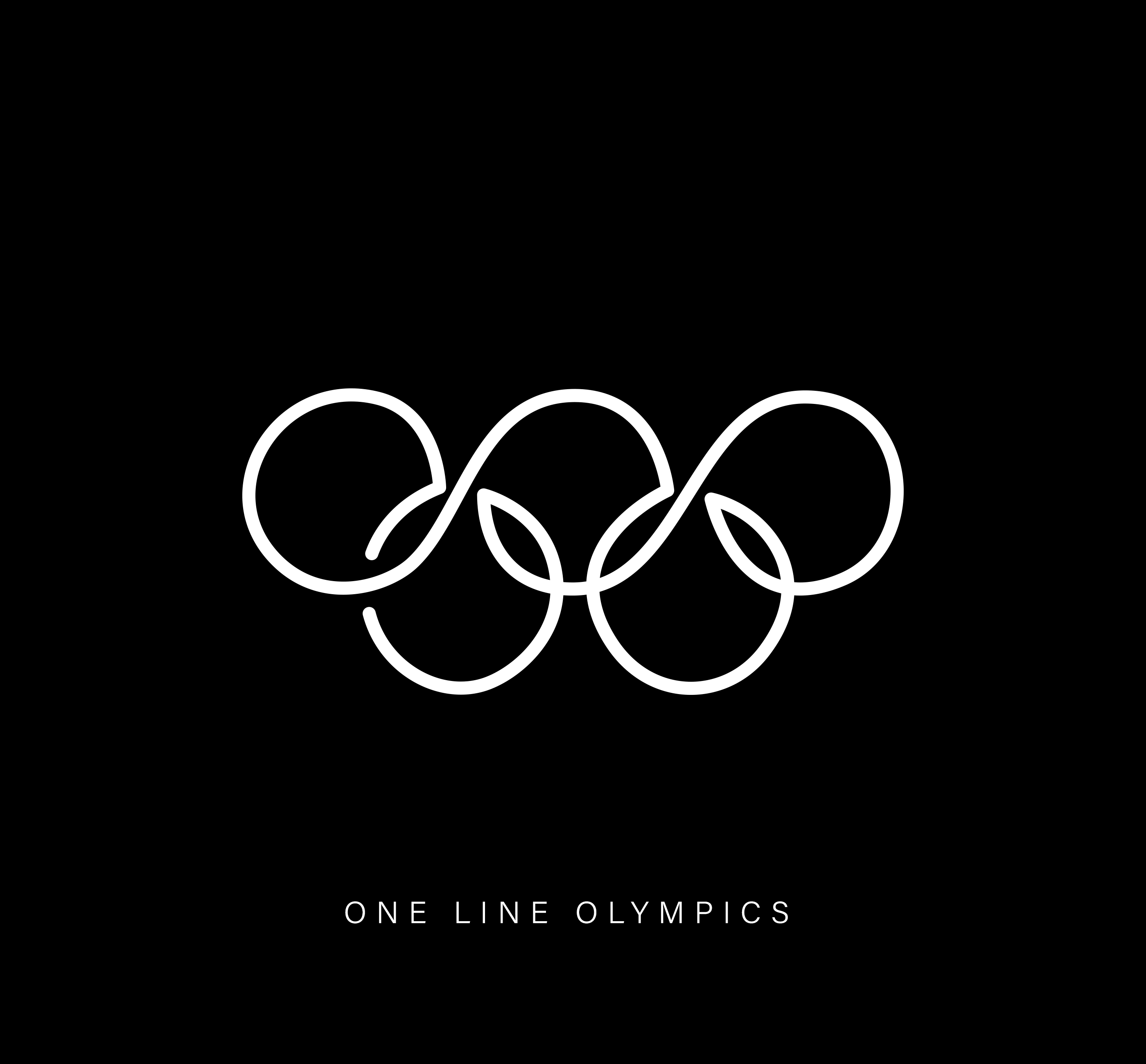
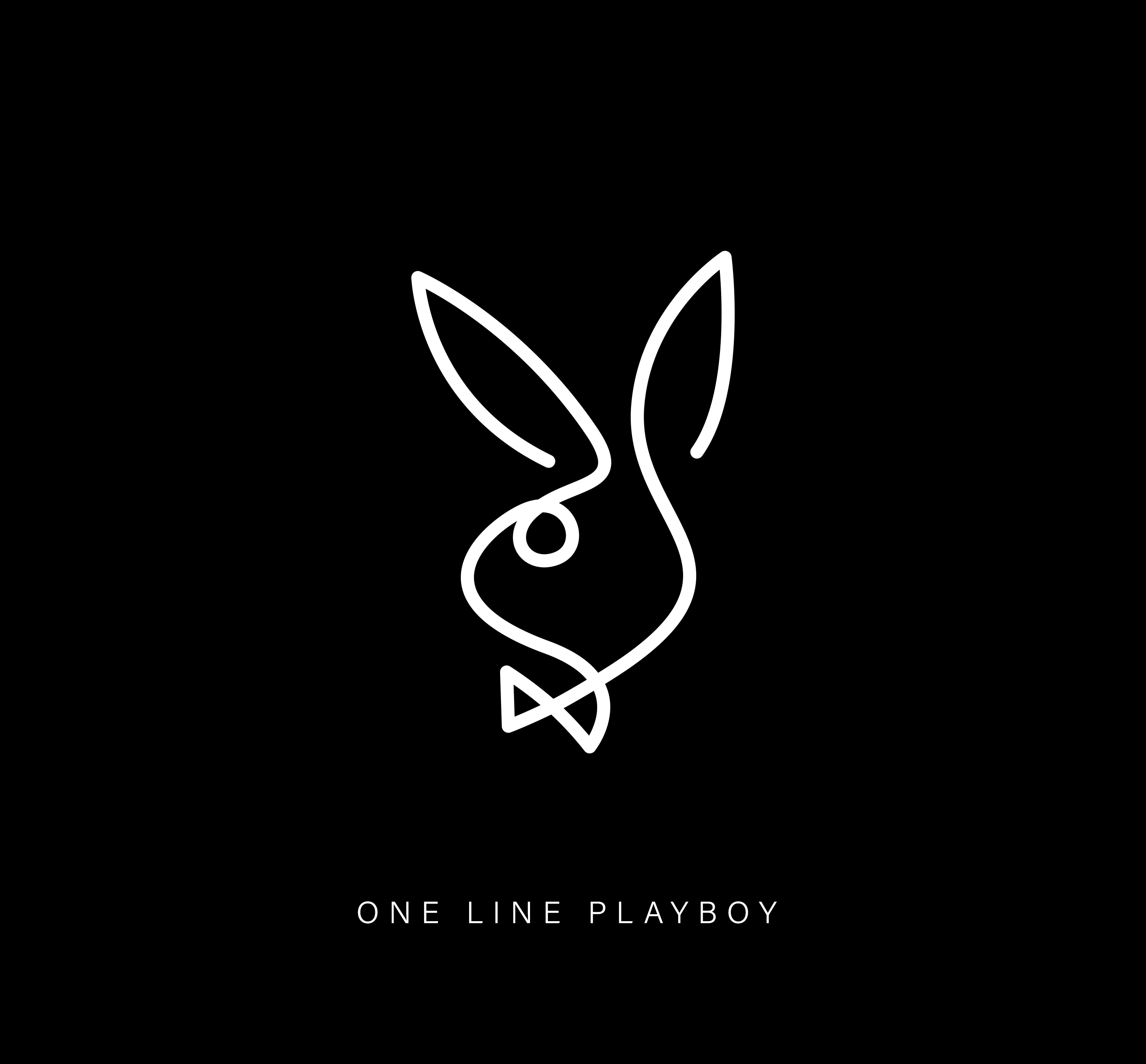
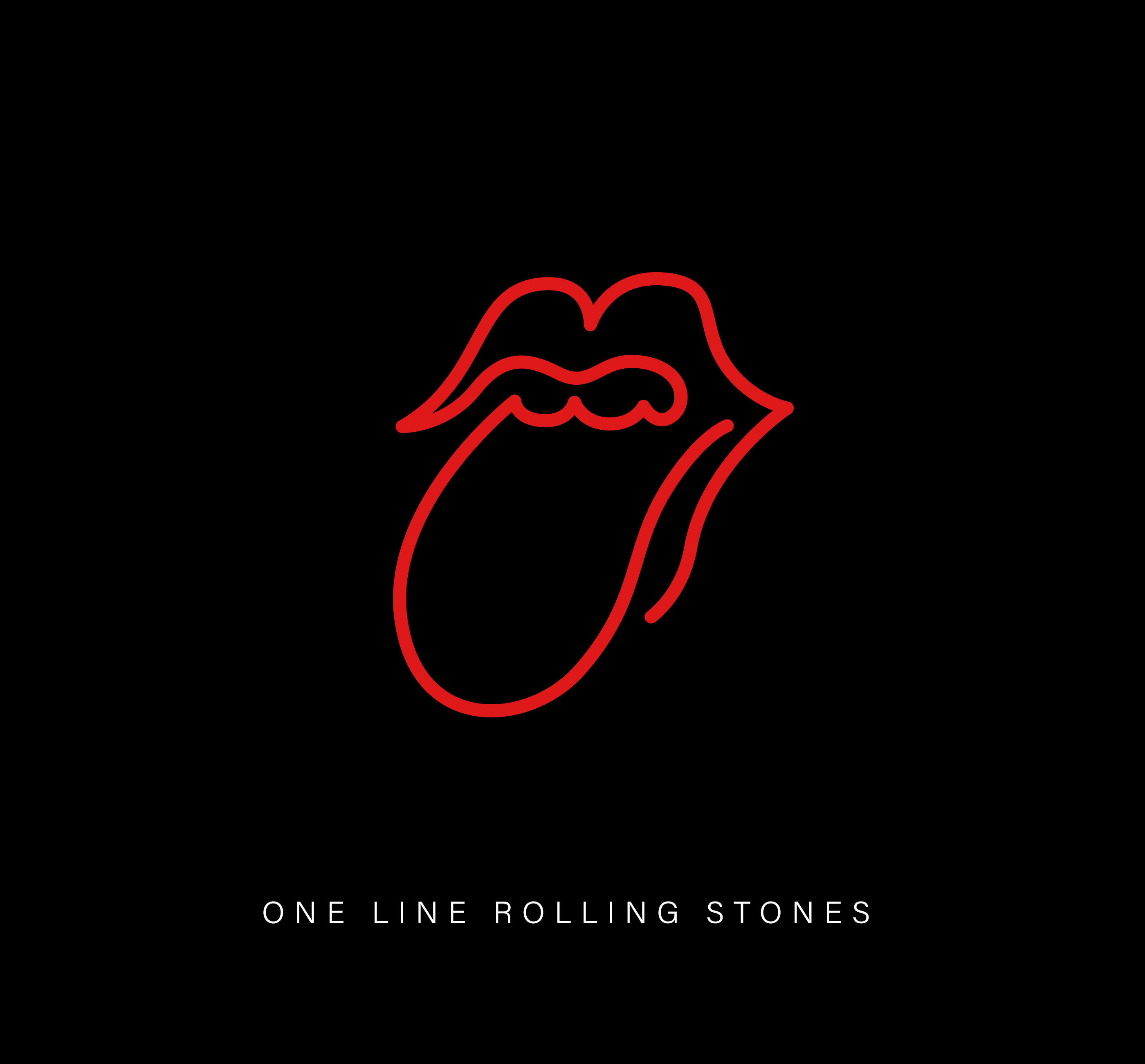
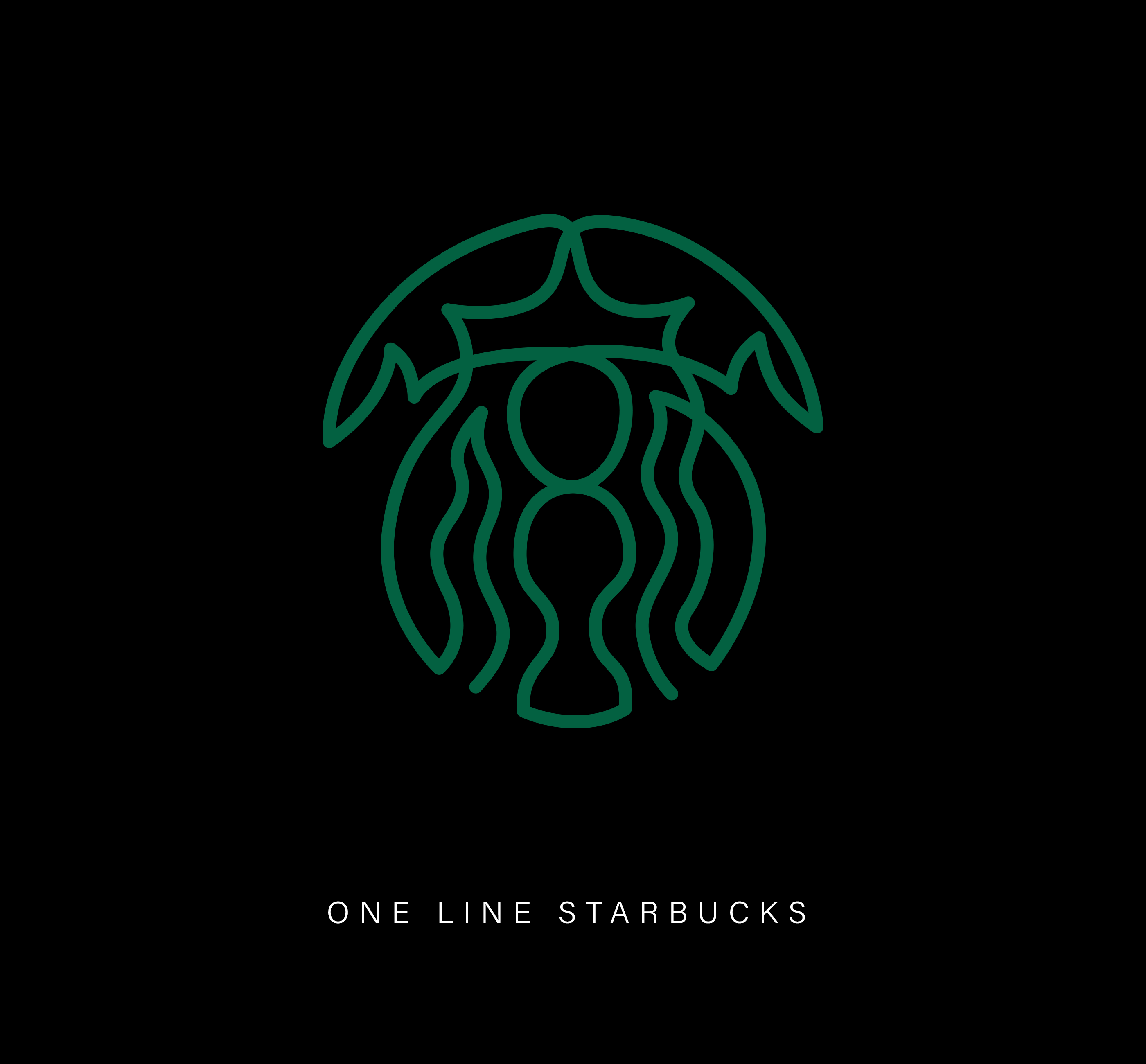
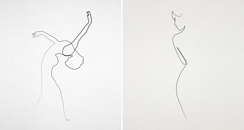
Few things test a logo like reduction. Strip away colour, fill and detail, and you find out quickly whether a mark was built on a strong idea or just good styling. French designer Stephane Leopold, co-founder of Loooop Studio, takes that test to an extreme in “One Line Famous Logos,” a series of 44 iconic brand logos reimagined as single-line drawings, each made from one continuous stroke.
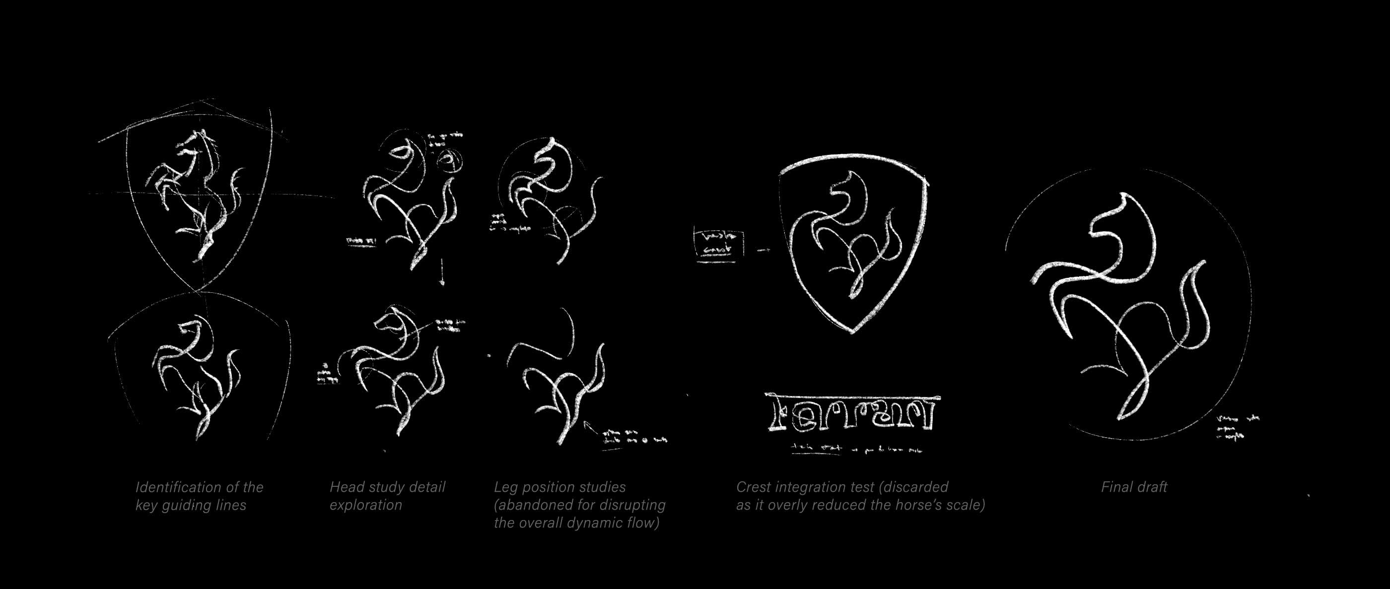
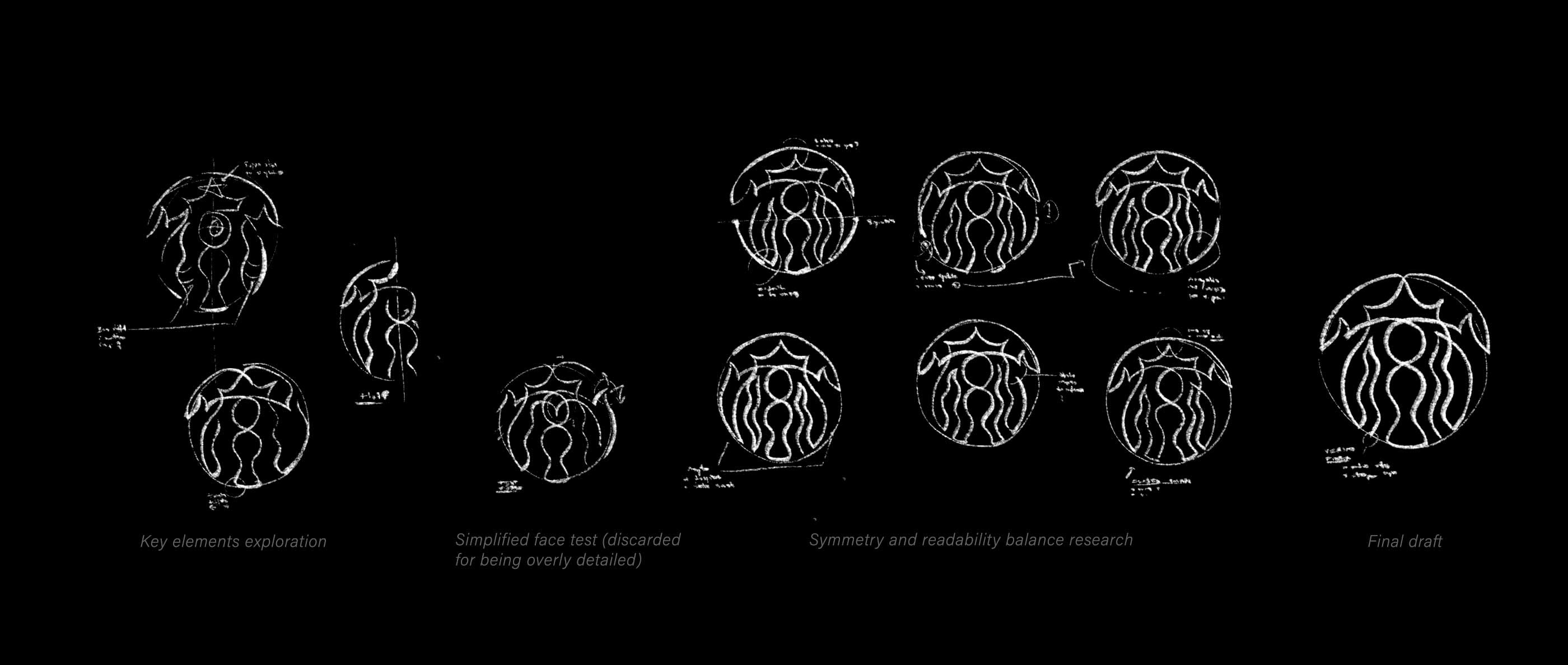
Harder than it looks. Continuous line drawing is an old discipline, but applying it to logos is a different problem. A logo has fixed proportions, and people know it on sight. Get one curve wrong and the whole thing falls apart. Leopold starts with loose sketches that trace the essential movement of each mark, then edits ruthlessly until a single line carries the full identity. The Nike swoosh barely needs the help. Ferrari’s prancing horse and the Starbucks siren are another matter entirely.
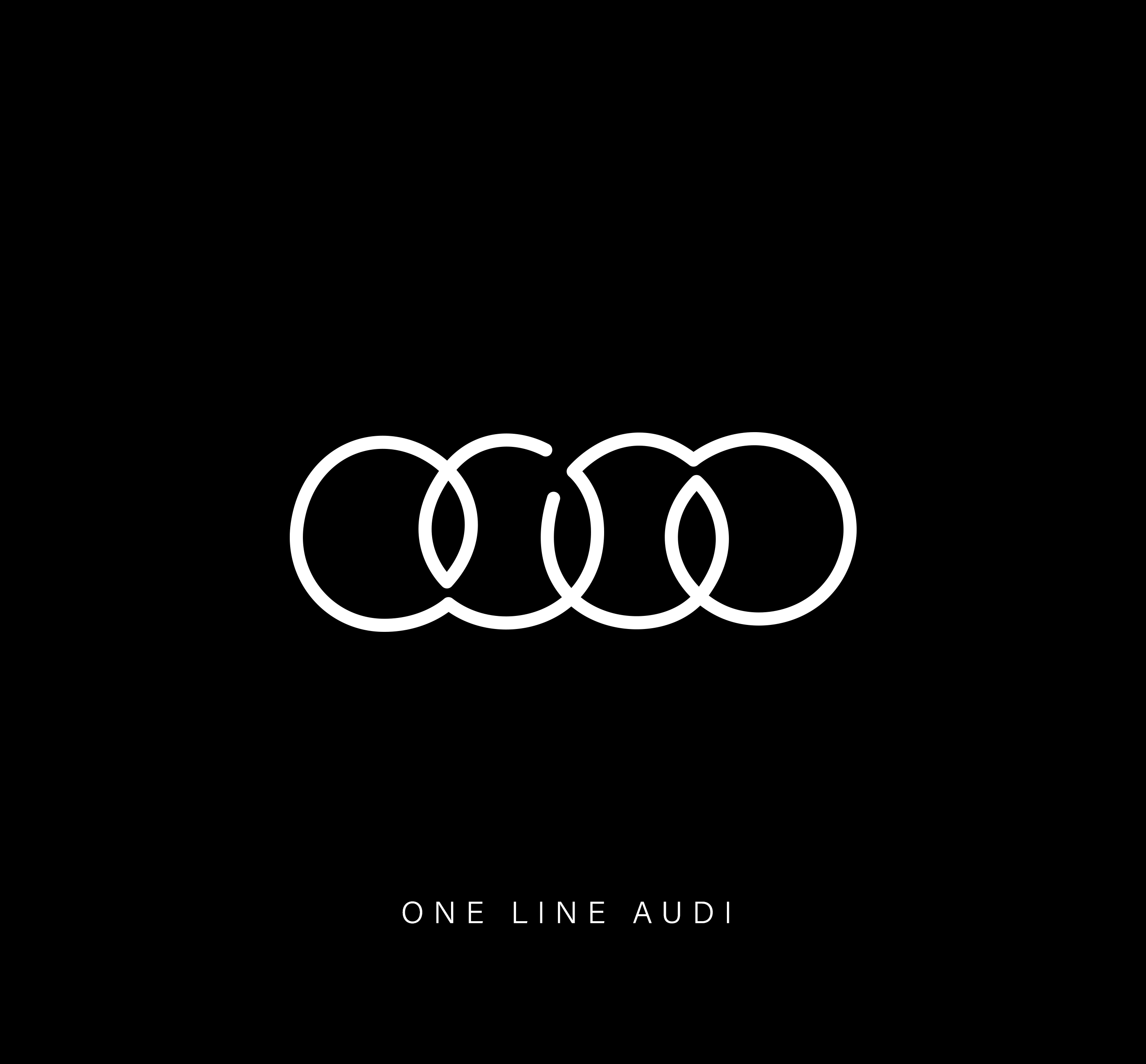
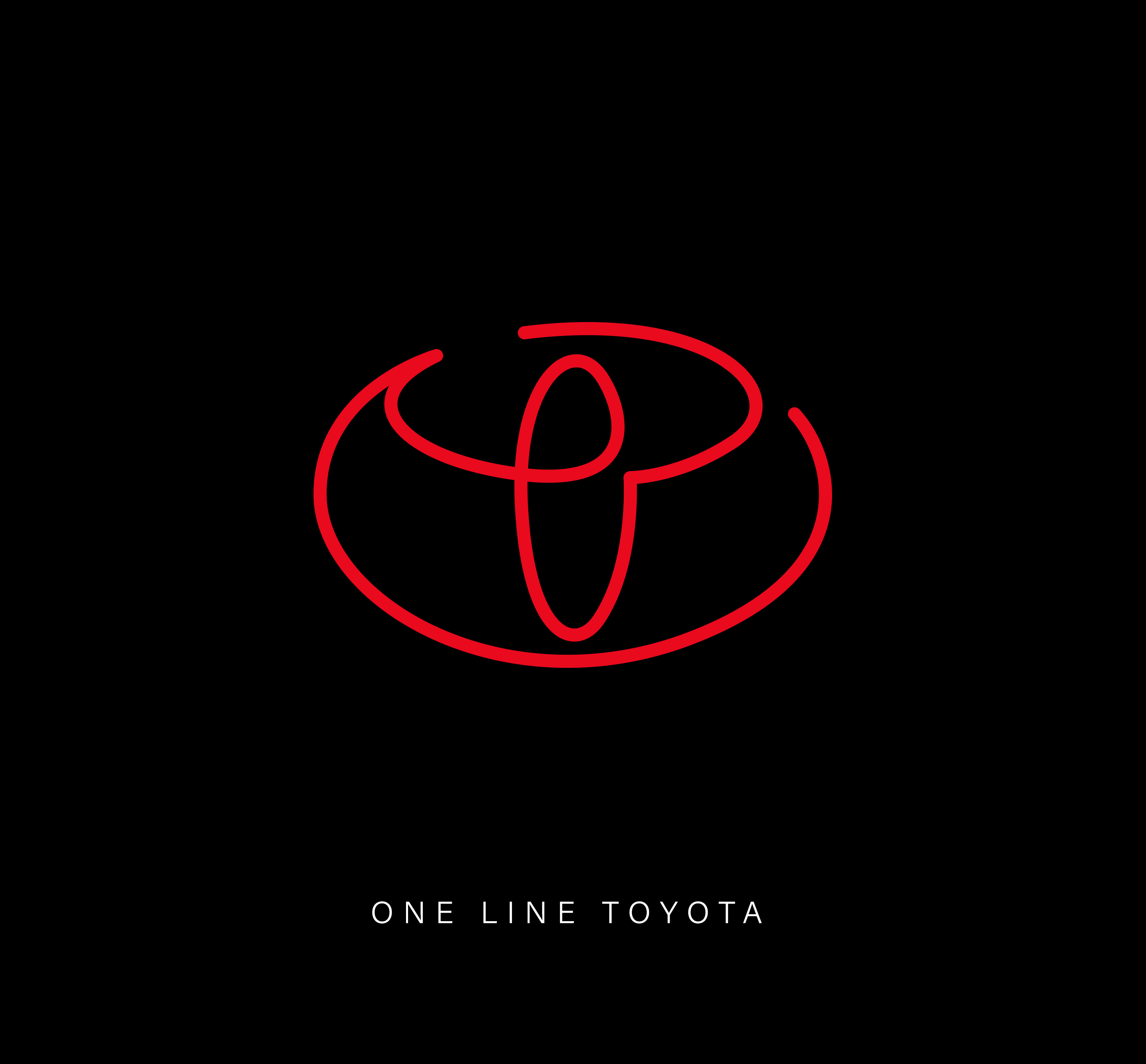
What survives the line. The results say a lot about how these logos were designed in the first place. Geometric marks like Audi, Toyota and Volkswagen remain remarkably recognizable, showing just how much of their identity comes from their underlying structure. Script logos like Coca-Cola and Disney go a step further and arguably look more natural as one flowing line, which makes sense given their roots in handwritten lettering.
A lesson in minimalist logo design. Not every great logo needs to work as a single line, but this experiment shows how far a strong mark can be pared back without losing its character. Scroll through all 44 single-line logos below and see which ones pass the test.
1. Adidas
2. Airbnb
3. Amazon
4. Apple
5. Audi
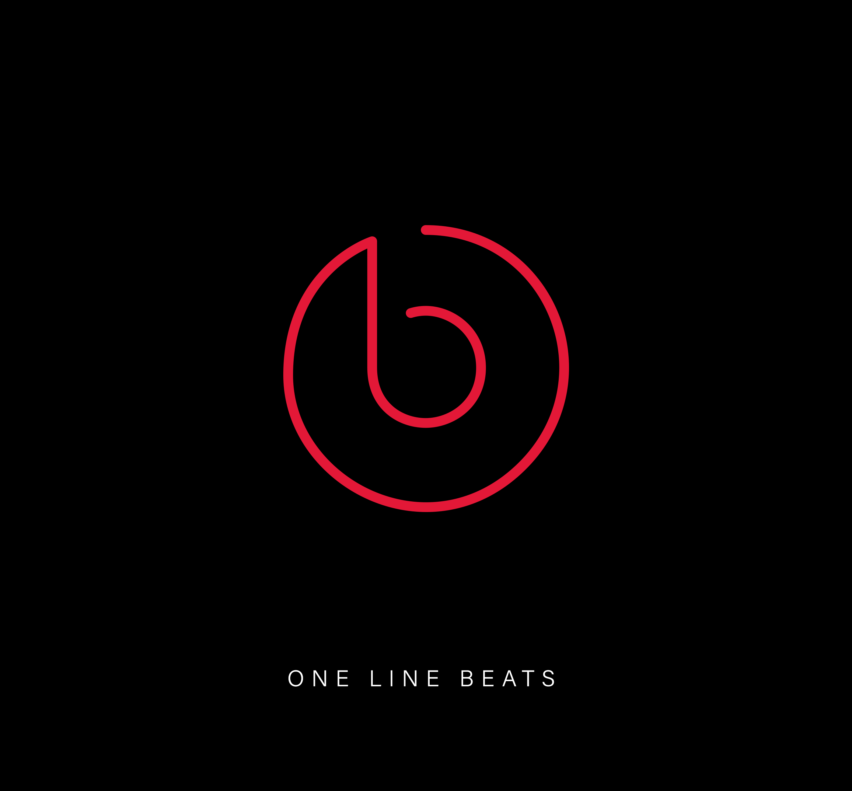
6. Beats
7. Coca-Cola
8. Disney
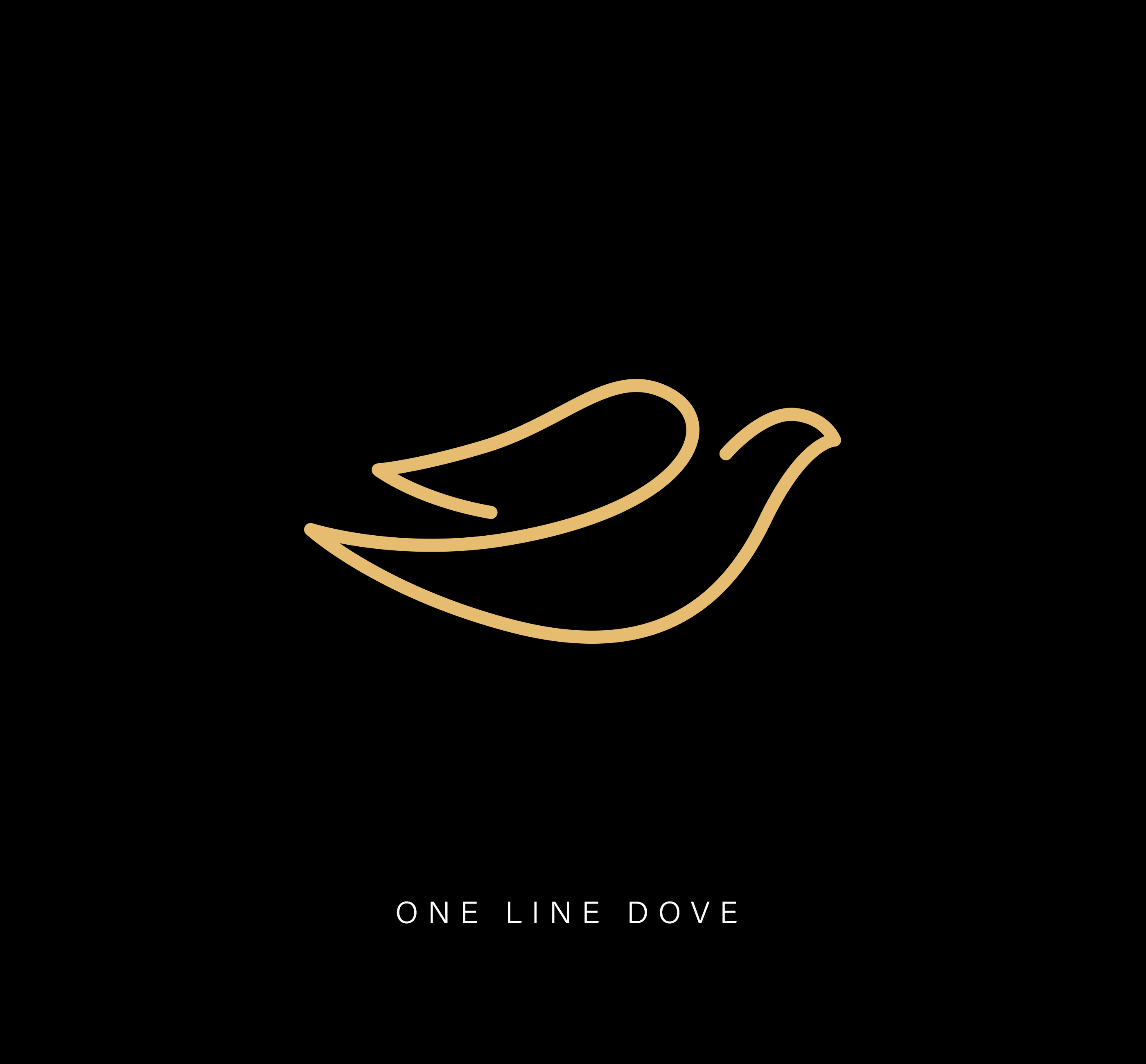
9. Dove
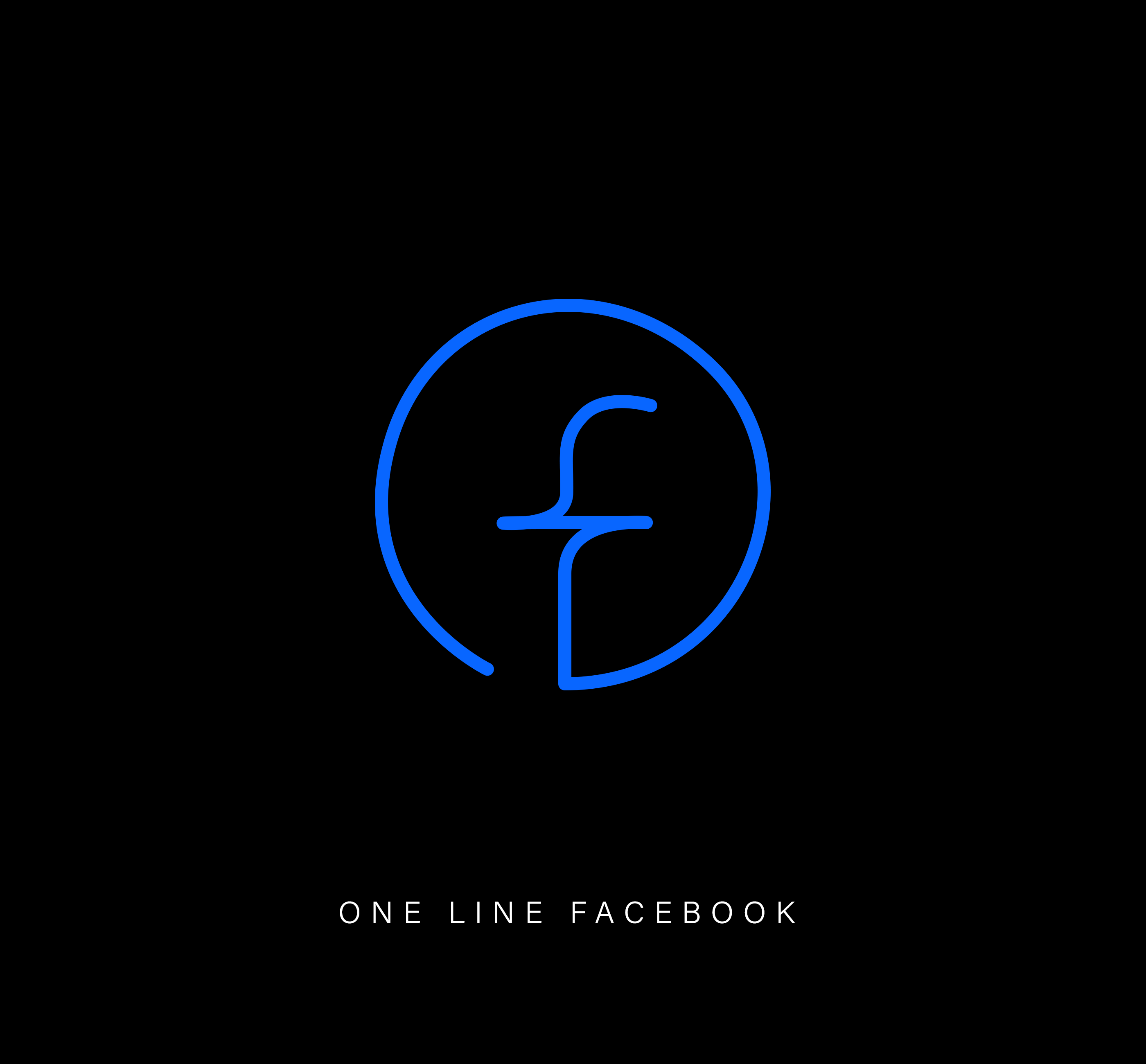
10. Facebook
11. Ferrari
12. Firefox
13. Ford
14. Google
15. HP
16. Instagram
17. KFC
18. Lacoste
19. LEGO
20. Louis Vuitton
21. McDonald’s
22. NASA
23. Nike
24. Olympics
25. PayPal
26. Pinterest
27. Playboy
28. Puma
29. Rolex
30. Rolling Stones
31. Spotify
32. Starbucks
33. Tesla
34. TikTok
35. Toyota
36. Twitter
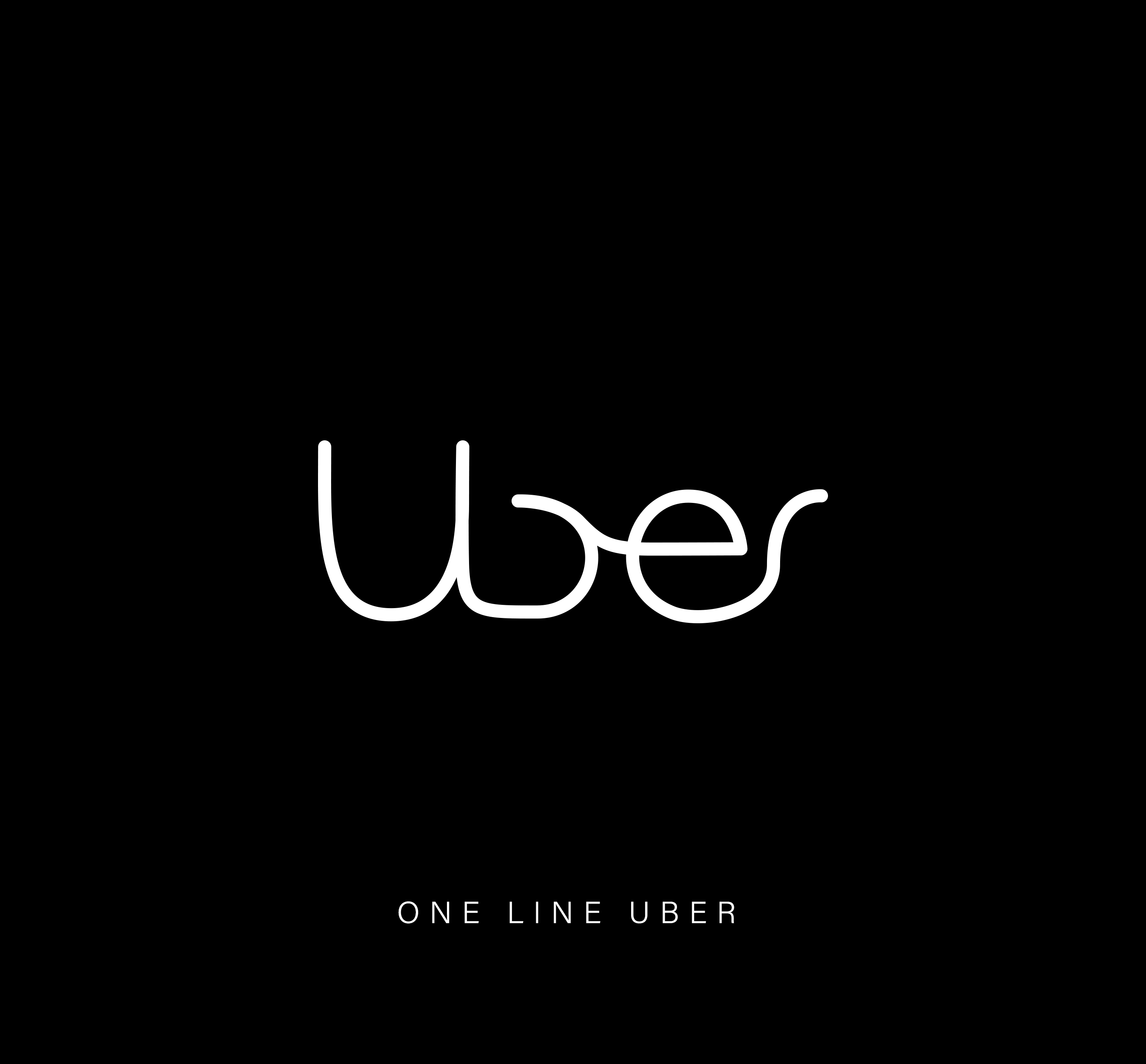
37. Uber
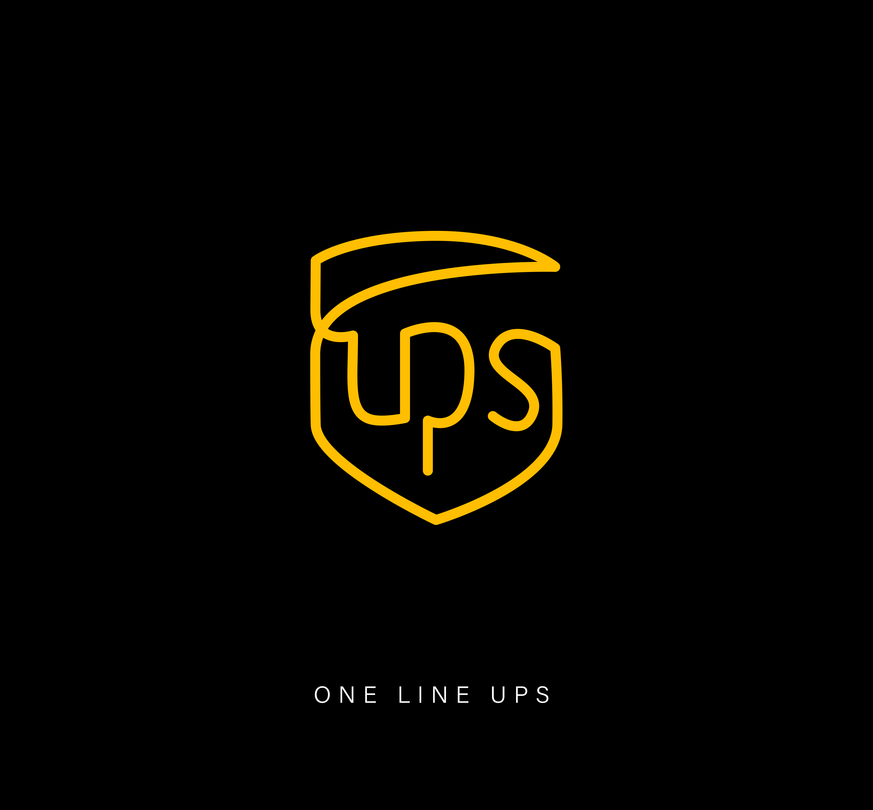
38. UPS
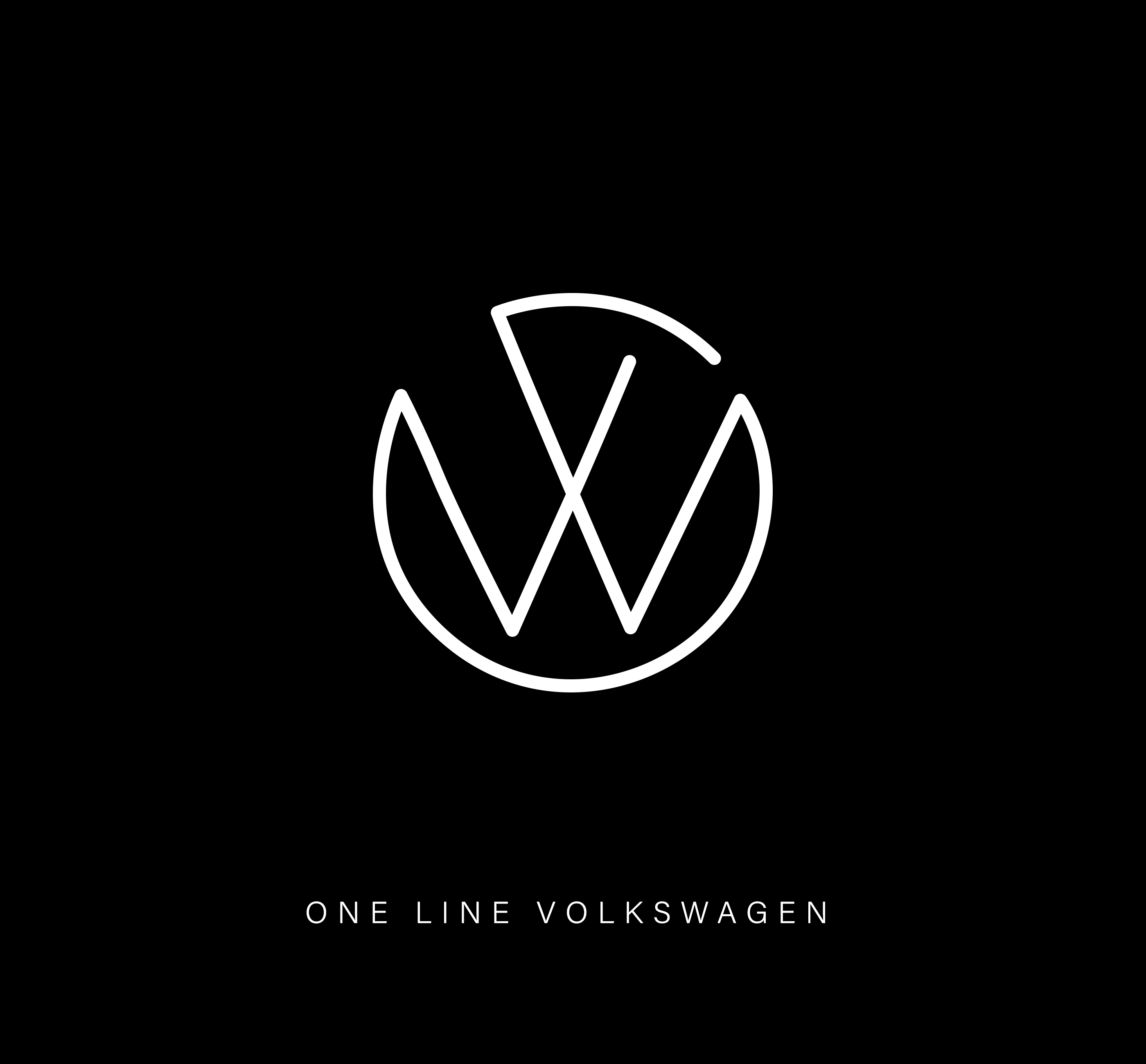
39. Volkswagen
40. Warner Bros.
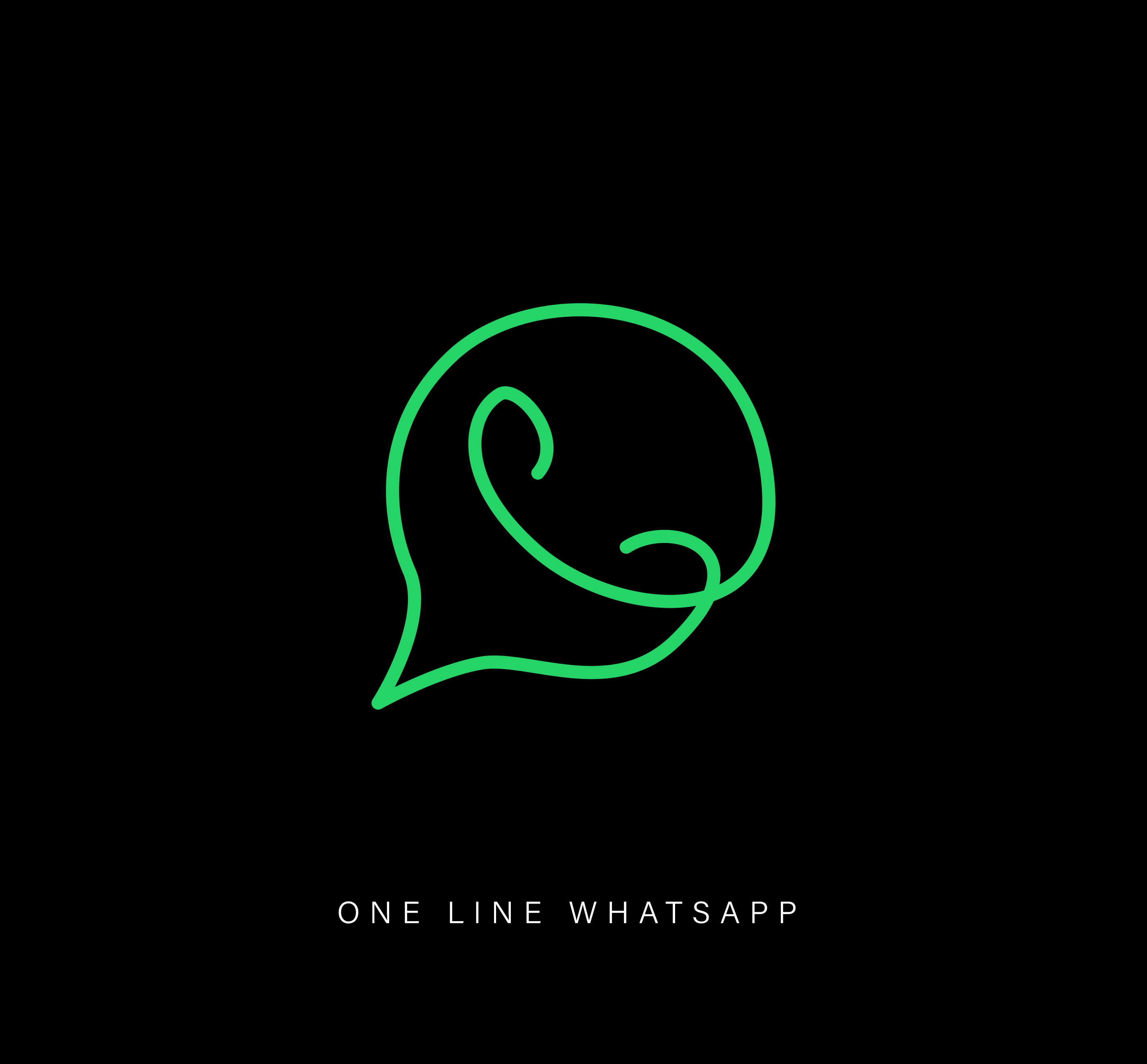
41. WhatsApp
42. WWF
43. X
44. YouTube
There’s a practical lesson in this series. A logo today has to work at 16 pixels in a browser tab, stitched onto a cap, or etched into metal. Single-line drawing isn’t a universal test of logo quality, but the marks that survive it tend to be built on simple, confident shapes, and those same qualities help a logo remain recognizable across different sizes and applications.
Share this article with a designer friend, and tell us in the comments which famous logo you think would be impossible to draw in a single line.