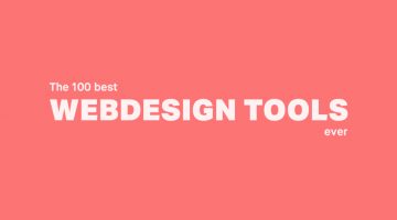
As a designer, it's imperative that you know your tools like an artist knows their paintbrushes. But with so many new apps and resources around, which ones should you bookmark? … [Read more...]
If You Want To Sound Smarter, Use These Words Instead Of “Very”
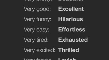
"Very" is vague and weak. People often use "very" as a lazy replacement for a more appropriate word. Proof Reading Services have come up with an excellent infographic that lists 128 words you can use instead of "very". For example, instead of "very colorful", you can use "vibrant". Instead of "very funny", use "hilarious". Instead of "very excited", use "thrilled". Know … [Read more...]
This Brilliant Font Lets You Create Graphs Quickly By Converting Numbers To Visuals
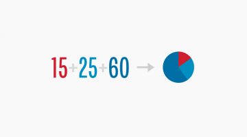
FF Chartwell is a handy typeface that lets you create charts and graphs out of numerical data with just a few keystrokes. Designed by Travis Kochel, the typeface transforms simple strings of numbers into a graph with corresponding values. The visualized data remains editable, allowing for updates and styling. Here's how it works: … [Read more...]
15 Great Google Font Combinations For Your Next Design Project
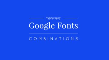
Designers often spend a lot of time deciding which typefaces to pair up and most sites just give one-sentence examples that don't offer a real preview of what the text will look like. To make life easier for everyone, the team at Milo Themes has created a set of mock-ups that show different Google Font combinations for headline and body copy. They've used filler text from … [Read more...]
This Powerful Photoshop Trick Lets You Remove Unwanted Objects In Just 3 Simple Steps

To remove unwanted objects from an image, we usually use the Clone Stamp Tool to duplicate elements from the surrounding area. But here's a Photoshop hack that makes it even simpler. … [Read more...]
A Useful, Comprehensive List Of Typography Terms For Designers
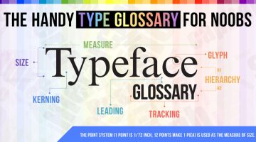
Do you know the difference between kerning and tracking, beak and serif, baseline and descender line? As a designer, it's imperative that you know what different typography terms mean, even if you don't use them every day. Here's a brilliant typeface glossary/infographic by DesignMantic that explains the meanings of terms like kerning, leading, tracking, glyph, serif, etc. and … [Read more...]
How To Remove Your Ex-Boyfriend Or Girlfriend From A Photo Using Photoshop

Picture this: You're browsing through your old photos and come across a fabulous picture of yours that you want to share on social media. There's just one problem. Your ex is in it too. What do you do? If you have Photoshop on your system, Aaron Nace from Phlearn offers a handy tutorial that shows you how to remove unwanted people and objects using the pen tool, clone stamp … [Read more...]
How To Structure URLs To Make Your Web Pages Rank Higher
Short and clean URLs don't just improve usability and user experience but they also help your pages rank higher in search results. Keep your URLs to under 60 characters, match them to their page titles and avoid keyword repetition and stop words like 'the', 'and', 'but', 'of', etc. FME Modules has created a handy infographic that offers URL structuring tips and suggestions to … [Read more...]
14 Graphic Design Terms That Most Designers Get Wrong
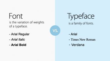
Most amateur designers don't know the difference between a font and a typeface. They use the two terms interchangeably. A font is the variation of weights (bold, italic, thin) of a typeface. A typeface is a family of fonts, like Arial, Helvetica, Bebas, etc. Another example is the usage of the terms 'color' and 'hue'. Color is an all-encompassing word referring to a hue, … [Read more...]
Beautiful, Inspiring Hand-Lettered Tips For Designers And Creatives
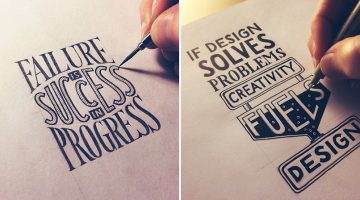
Sean McCabe is a hand lettering artist, type designer, and illustrator based in San Antonio, Texas. He runs a media company called seanwes by day and creates gorgeous hand-lettered typography by night. Using Pigma Micron pens, Sean weaves his magic on paper, offering inspiring tips and mantras for artists, designers, creatives, and just about anyone. He has spent over 9000 … [Read more...]
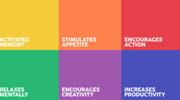
The Best Colors For Productivity And Creativity In Your Workplace
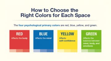
Did you know that yellow induces a sense of optimism and is a good color for high energy creative spaces? Red boosts heart rate, increases brain activity and is good for places where people work at night. Green boosts creativity, promotes harmony and is a good choice for brainstorming spaces. If you’re working remotely or looking to redesign your home office, platforms like … [Read more...]
How To Transform A Face Into A Powerful Text Portrait In Photoshop

You've seen typographic portraits of famous luminaries like Muhammad Ali, Steve Jobs, John Lennon, Audrey Hepburn, etc., but do you know how to create them? Marty from Blue Lightning TV shows you how to transform a photograph into a striking text portrait in these nifty Photoshop tutorials below. … [Read more...]
40 Little Things You Can Do To Break Your Creative Block
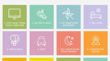
We're all short of creative juice sometimes. Panic-driven deadlines, unreasonable clients/bosses and lack of proper rest can sap the positivity out of your system, leaving you in a frame of mind that is seldom productive. The key is to (re)find your inspiration, trust your abilities and distance yourself from all things negative. … [Read more...]
How To Choose The Best Colors For Your Logo
Picking colors for your logo is not just an artistic decision based on personal preference. Different colors elicit different psychological responses that impact consumer behaviour. Red stands for excitement, passion, appetite and urgency. Green is associated with nature, wealth and conservation. Blue stands for confidence, trust and reliability. Yellow is associated with … [Read more...]
16 Tips For Better Brainstorming Sessions
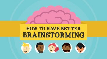
The best ideas come from great minds working together. But group brainstormings can be tricky. Senior members can end up dominating. People can be wary of contributing due to lack of involvement or fear of rejection. Every year, more than $37 billion is spent on unproductive meetings according to research compiled by online meeting service provider Fuze. … [Read more...]
Designer Shares 10 Lessons He Learnt From Working In An Agency
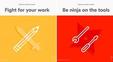
Agency life is not for everyone. The fast-paced, deadline-driven environment saps your creative juices faster than you can say "brand positioning". You do however learn a lot - like how to go three days without a shower, how to claim free meals by billing them to the client, etc. It's definitely an experience that every creative should go through before switching to the client … [Read more...]
24 Useful Design Tips That’ll Help You Create A Better Logo
Most small scale businesses on modest design budgets end up with amateurish logos that use stock art, are overly complex or follow trends that look outdated in a year. No use blaming the cheap freelancer, the owners themselves don’t know what they want. … [Read more...]
What Do The World’s Most Popular Logos Have In Common?
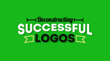
Logos may look different at first glance, but many of the world’s most successful brands share disciplined design choices. Across industries, clear patterns emerge in color, typography, shape, and structure. Strong logos are not accidental. They are built for clarity, memorability, and long term recognition. … [Read more...]
5 Color Choices You Must Avoid When Designing For The Web
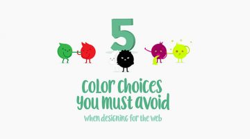
When it comes to web design, colors play a vital role in increasing conversions, reducing bounce rate and ensuring a smooth user experience. We often see websites compromising on readability by using light-colored text on light backgrounds. Also, it's never ok to use red and green in excess, even if you're making a Christmas-themed website. … [Read more...]
How To Cut Anything Out In Photoshop

A young monk artist went up to his teacher who was reciting Photoshop keyboard shortcuts under a Himalayan tree and asked him "Teacher, when will I become a master artist like you?" The teacher replied "When you can select all the feathers of a morning sparrow without missing a single one, only then will you be a true Photoshop master." (source) … [Read more...]
What Different Colors Mean And How To Use Them
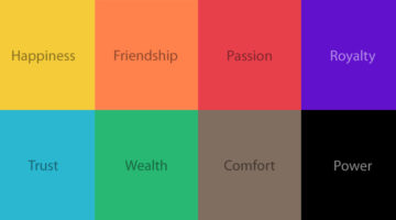
Did you know that blue is used for corporate and business designs because it represents dependability, trustworthiness and security? Orange is used to give a friendly impression without being overpowering. Darker shades of purple characterize wealth and luxury. TechKing has come up with a handy infographic that covers the psychology of different colors, their appropriate … [Read more...]
10 Useful Kerning Tips To Improve Your Typography
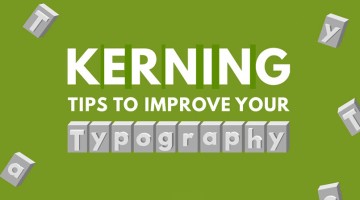
“Typography is an art. Good typography is art.” – Paul Rand. If you’re a typography freak like us, you’ll enjoy this handy infographic by Creative Market that shares some useful kerning tips and tricks to improve your typography. It covers some good points like kerning each letter individually, using visual space not actual space, and even a few unconventional hacks like … [Read more...]
8 Dos and Don’ts Of Creating Pixel Icons In Illustrator
Chennai-based UI/UX Designer M.A. Kather has created an eight-point visual guide that covers some basic dos and don’ts of creating pixel icons in Adobe Illustrator. Kather’s visual comparison of Photoshop vs Illustrator was previously featured on our site. This new series offers a few tips and tricks that’ll come in handy for design students, beginners and professionals alike. … [Read more...]
Have You Been Pronouncing These 30 Brand Names Incorrectly?
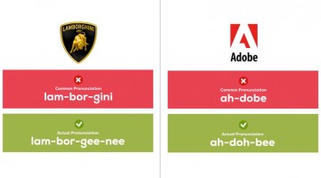
If your friend wants to buy a "porsh" someday, tell him or her to at least pronounce the name right. Here's a handy infographic by UK printing company Oomph that shows you the correct pronunciation of 30 famous brand names that most people get wrong. … [Read more...]
The Amazing Ways Color Can Alter Your Mind (Infographic)
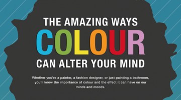
Whether you're a painter, a graphic designer, or just doing up your home, it's essential to know the significance of various colors and the effect they have on our mind and moods. Here's an interesting infographic by Vanessa Arbuthnott Fabrics that shows us what different colors represent, their effects, usability and more. … [Read more...]
15 Graphic Design Terms That Most Designers Get Wrong
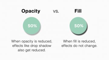
It's cool to use design jargons with clients and co-workers but not if you're getting them wrong. Here's a brilliant infographic by Creative Market that helps you remember the differences between 15 common design terms like font and typeface, opacity and fill, px and em, trim and crop, etc. … [Read more...]
8 Positive Habits That Will Boost Your Creativity

Creativity is a way of life. You can't have a negative mindset 24/7 and expect to be brimming with ideas and solutions. Today's high pressure environment and erratic work lifestyle makes everyone run out of creative juice once in a while, but if you want to spring back into action, maintaining an optimistic outlook is key. … [Read more...]
This Incredible Drawing Pen Lets You Scan And Pick Colors From Objects Around You

An artist's tool is only as good as the artist. But a great tool can help an artist see things in a different light. Introducing Scribble, a color picker pen and stylus that let's you scan colors from any object and use them in your drawings. Check it out below. … [Read more...]
8 Beautiful Color Palettes For Your Next Design Project
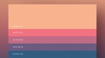
Milan-based creative director Duminda Perera has created a series of minimalist color palette posters that are both handy and beautiful. Not only do they give you color ideas (with hex codes) for your next project, you can use these posters to decorate your studio, office or home. Check them out below. … [Read more...]
36 Inspiring Quotes On Typography That Every Designer Should Live By
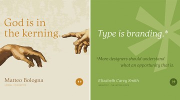
Los Angeles-based graphic designer Bill Dawson has designed a wonderful collection of posters featuring typography quotes from famous designers and type artists. Titled 'Typethos', the project shares tips and words of wisdom from design greats such as Paul Rand, Erik Spiekermann, John Boardley and more. Check it out below. … [Read more...]
27 Useful Design Tips Explained With Beautiful, Inspiring Graphics

Poppie Pack, senior graphic designer at Canva, has put together a handy list of design tips complemented by beautiful images with inspiring quotes. From typography and layout to image editing and color usage, the list covers some crucial aspects of design that both newbies and professionals will appreciate. We've shortlisted 27 of our favourites to share with you. Check them … [Read more...]
Male Vs Female Color Perceptions And Preferences
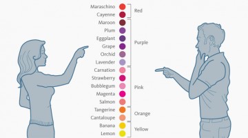
Traditionally, baby boys are wrapped in blue and baby girls in pink. A few years later, you can tell a boy's room from a girl's room just by observing the color combos (and the cleanliness ;) ). As we grow up, gender color preferences are visible in everything from wardrobes to cars (though nowadays the line is thinning). … [Read more...]
How Humans React To Different Colors
Did you know that green is used for night vision goggles because the human eye is most sensitive to, and able to recognise most shades of that color? Pink makes us crave sugar. Red increases enthusiasm. People are often more productive in rooms painted blue. Grey represents non-involvement, giving it a formal authority. Ript Apparel has created a comprehensive infographic … [Read more...]
9 Cool Posters That Show The Differences Between Adobe Illustrator And Photoshop

Chennai-based designer M.A. Kather has created a cool series of minimalist posters that explain the differences between Adobe Illustrator and Adobe Photoshop. The intent of this comparison is to show the process and purpose of each program, not to prove which one is better (because they both have different uses). Check out the series below. … [Read more...]
JPEG, GIF or PNG? Which File Format Should You Use When Saving Images
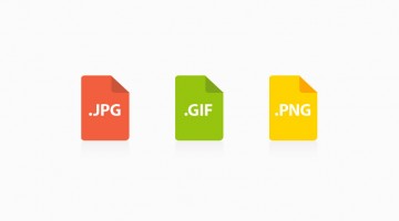
When saving images for web, it's crucial to know which file format to use - JPEG, GIF or PNG? Using the wrong format makes images blurry, increases file size and page loading time, which not only affects user experience but is bad for SEO as well. This handy infographic by WhoIsHostingThis.com acts as an excellent reference guide when it comes to selecting the right format … [Read more...]
- « Previous Page
- 1
- …
- 9
- 10
- 11
- 12
- 13
- Next Page »