Top 10 Netflix Documentaries For Graphic Designers
When we're looking for creative ideas and inspiration, we usually browse our favourite websites, blogs, and social media channels. But did you know that Netflix is packed with inspiring documentaries on all kinds of creative topics? The only challenge is finding them. Creative Bloq, InVision, and we at Digital Synopsis have shortlisted some of the best … View Post ▸
12 Visual Hierarchy Principles Every Designer Should Know
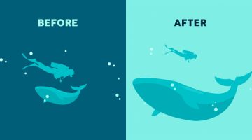
Visual hierarchy is the arrangement and presentation of design elements in order of their importance. It influences the order in which the human eye perceives the information that is being displayed. A simple example would be a business card - the name of the organisation is usually the most prominent element, followed by the name of the card holder, job … View Post ▸
This Simple Chart Explains What Common Terms In A Logo Design Brief Mean
What do clients mean when they say their logo needs to be modern, luxurious, or subtle? Dubai-based logo designer Jefferson Pascual has created a handy infographic that uses an illustration of a bird to explain common terms used in logo design briefs. The chart features bird logos designed in different styles (eg. young, modern, feminine) with their … View Post ▸
32 Beautiful Color Palettes With Their Corresponding Gradient Palettes
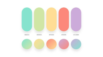
Looking for color palettes for your graphic, web, or UI design? Mr.Pugo is a handy Instagram account that shares beautiful color palettes (with hex codes) and also their corresponding gradient palettes. We’ve shortlisted some of the best ones in terms of aesthetic appeal, usability, and current design trends. Check them out below and tell us your favourites … View Post ▸
30 Great Font Combinations For Your Next Design Project
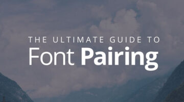
Designers often spend a lot of time deciding which typefaces to pair up and most sites don’t offer a real preview of what the text will look like. To make life easier for everyone, designer Poppie Pack from Canva has created a set of mock-ups that show different headline and body font combinations for a variety of design projects. Pack has also specified … View Post ▸
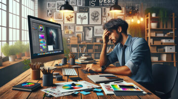
“How Much Are You Getting Paid As A Graphic Designer?” — Designers Share Their Salaries
As designers, one of the most elusive topics we face is salary — what are others making, and how does our own pay compare? In a thought-provoking Reddit post, user Waste-Dark-8356 asked the design community to share their earnings, years of experience, and whether they work freelance, in-house, or for an agency. It’s a refreshingly open conversation that … View Post ▸
13 Simple Charts That Brilliantly Explain The Principles Of Design
Design isn't just about making things look good; it’s about digging into the 'why' behind every choice. Design principles go beyond mere guidelines - they mirror the balance, harmony, and intention we strive for in life itself. The most striking designs often emerge from simplifying the complicated, choosing boldly, and staying true to creative vision while … View Post ▸
“Which Current Graphic Design Trend Will Age Badly?” – Here Are The Top Replies
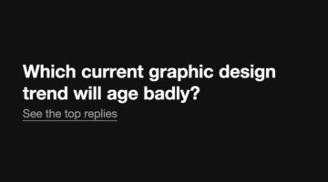
In the ever-changing world of graphic design, every trend carries an expiration date. Some styles manage to capture the zeitgeist and remain relevant for decades, while others quickly fade into the backdrop of dated aesthetics. On a popular Reddit thread initiated by theGrowthDesigner, the community has come together to scrutinize the current design … View Post ▸
17 Brilliant Ads With Clever Art Direction
Good art direction is the secret sauce that elevates a basic concept to an iconic visual feast that grabs the audience's attention. In the bustling world of ads, it's the fine line between the mundane and the mesmerizing. Done right, it transforms a mere ad campaign into a vivid experience, stirring emotions and weaving narratives that stick with viewers … View Post ▸
Boost Design Quality And Engagement: Why Aiarty Image Enhancer Is One Of The Best

High-quality images are absolutely essential for effective design and advertising in today's visually-driven digital landscape. They play a crucial role in conveying messages, increasing visual appeal, capturing audience attention, and enhancing brand image. Poor-quality images can detract from your message and potentially harm your brand's reputation. … View Post ▸
“This Is My Daughter’s Boyfriend. Please Photoshop Him Into Something Funny. I Will Tip The Best Work”
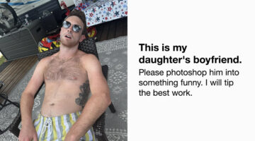
It's a tale as old as time: the protective father sizing up his daughter’s boyfriend. But in the digital age, this rite of passage gets a humorous twist on the Photoshop Request subreddit. When Reddit user sonofadkins posted a photo of his daughter's boyfriend, who had fallen asleep shirtless and with his mouth agape in a chair, he invited the community … View Post ▸
A 3D Artist Has Created An Ad That Hits Way Harder Than You’d Expect, And People Have Watched It Over 200 Million Times
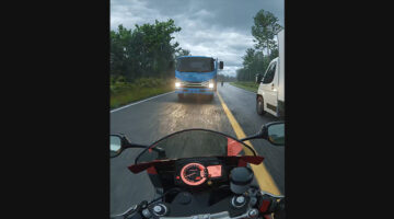
A recent video on social media has delivered a critical message about road safety through some truly spectacular 3D animation. Crafted by 3D artist and animator Majid Mousavi, this powerful video has not only caught the eye of millions with its impressive visuals but has also ignited important discussions on the need for vigilant driving and adherence to … View Post ▸
What’s One Design Skill You Think Is Underappreciated But Crucial? Here Are The Best Answers
In graphic design, it's often the overlooked skills that separate good designers from great ones. While tools and techniques often receive the most attention, there are other, equally important abilities that don't get the recognition they deserve. Curious to find out more, we asked our Instagram followers to share the most underrated skills that are also … View Post ▸
Can You Spot The Hidden Shark In This Brilliant Movie Poster For Jaws?
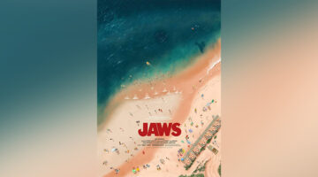
In the ocean of movie posters, Andrew Swainson's rendition of "Jaws" is a deep dive into creative subtlety. The artwork intricately camouflages a great white shark in the shallows, challenging viewers to spot not only the predator but also other cleverly embedded easter eggs from the movie. While some enthusiasts revel in uncovering these hidden details, … View Post ▸
How To Use Photoshop AI To Avoid Going To Work
Content creator Madeline Salazar recently turned heads on social media by demonstrating just how effective Photoshop's latest AI-powered Generative Fill tool can be. In her widely viewed TikTok video, which has racked up over 10.4 million views, Salazar crafts a compelling visual fib to avoid moving day duties. She cleverly converts a plain selfie into a … View Post ▸
8 Must-Have Tools For Designers To Boost Creativity
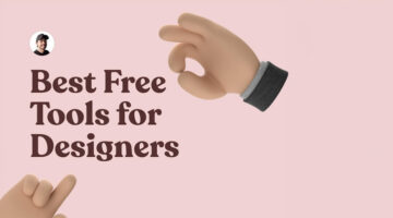
In the fast-paced world of design, having the right tools can be the difference between good and great work. Whether you're sketching, prototyping, or refining visuals, the proper resources can significantly boost your creativity. Product designer Sergio Cardenas has come up with a useful list of tools every designer should have in their arsenal to … View Post ▸
8 Super-Useful Websites Every Designer Must Know

In today's dynamic design landscape, keeping abreast of essential tools and resources can greatly boost your creative output and efficiency. Whether you are an experienced designer or a newcomer, being aware of key sources for inspiration, tools, and advice is vital. Product designer Sergio Cardenas has come up with a handy list of websites and online … View Post ▸
“What’s The Most Fraudulent Thing You’ve Done As A Graphic Designer?” – Here’s What Designers Are Saying
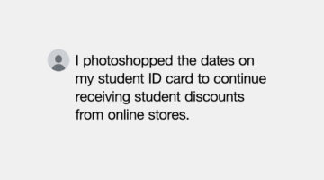
Ah, the secret life of graphic designers, it's not all about making pretty pictures. A recent Reddit thread revealed some of the sneaky things designers have done with their skills. It all started with a designer who altered a friend's kid's birth certificate to make her look younger, scoring cheaper Disneyland tickets. Turns out, many designers have … View Post ▸
Adobe Introduces Supercharged Photoshop With Incredible New AI Features
Adobe has rolled out a significant update for Photoshop (beta) that integrates generative AI technology to enhance the software's design and image editing functionalities. The update introduces a collection of new tools designed to streamline complex operations, allowing graphic designers to concentrate more on their creative expressions rather than the … View Post ▸
What Has Coca-Cola Done To Their Iconic Logo?
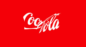
Coca-Cola's timeless logo, a global symbol since 1941, is taking on a new role to promote recycling. Their latest "Recycle Me" campaign, launched in Latin America, showcases the iconic red-and-white logo in a crushed and distorted form, resembling a recycled can. This visual twist aims to leverage the logo's massive recognition—known by 94% of the world—to … View Post ▸
“70 Years Later The Fire’s Still Burning” – Burger King’s Ingenious Ads Spark A Flame Of Nostalgia
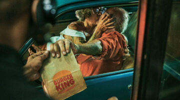
Celebrating 70 years of flame-grilled burgers, Burger King is turning up the heat with a whimsical advertising campaign that's as fiery as its grills. Straight out of Brazil, this fresh twist on advertising, whipped up by Room23, captures hearts with a simple yet profound message: love—and burgers—burn brighter with time. Through captivating visuals … View Post ▸
This Joker 2 Poster Broke All Records On Twitter

A new golden age for movie poster aesthetics is here, embracing the exuberant and illustrative essence of the 1980s. This resurgence has seen the promotional material for the highly anticipated sequel to Joker draw widespread admiration from both audiences and graphic designers. Joker: Folie à Deux stars Joaquin Phoenix and Lady Gaga in the principal … View Post ▸
“My Ex-Boyfriend Is Copying My Design Portfolio. Please Help.”

In a candid account shared on Reddit, a graphic designer recounts her ongoing ordeal with her ex-boyfriend who, after their breakup, has embarked on a surprisingly parallel career path in graphic design. Initially aspiring to be a firefighter, her ex switched gears dramatically, showcasing a portfolio eerily similar to hers, down to the minutest details. … View Post ▸
Affinity Responds With 4 Bold Pledges After Facing Backlash For Canva Acquisition
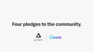
Following the acquisition of Affinity design software by Canva, concerns emerged over the possibility of a shift from its one-time purchase pricing model to a subscription-based format. In response, the two entities have made a commitment, reassuring their user base that the transition to a subscription model will not be mandatory. On Wednesday, a joint … View Post ▸
Canva Acquires Affinity Suite In Landmark Deal To Challenge Adobe’s Dominance. See Details And Reactions From Designers.
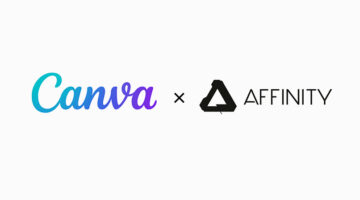
In a strategic move to fortify its position in the creative software market, Canva Inc. has completed its acquisition of the widely admired Affinity suite, targeting a broader competition with Adobe Inc. This marks Canva's most substantial purchase to date, underlining its commitment to challenge the long-standing dominance of Adobe in the creative software … View Post ▸
Designers Are Discussing Their Issues With The Design Of Google App Icons, What Are Your Thoughts?
A graphic designer on Reddit initiated an interesting debate over the design of Google app icons, bringing to light a critical issue in the realm of UI/UX design: the delicate balance between aesthetic allure and functional clarity. Feedback from various designers revealed a shared frustration: the current icons, that use all four Google brand colors, … View Post ▸
This Is Probably The Greatest Ad For A Men’s Grooming Product

We may be living in the golden era of below-the-waist grooming products but advertising them still requires a 'delicate and sensitive' approach (pun intended). One example of successful advertising in this category is a recent advertisement by California-based male grooming company Manscaped, that has gone viral across social media. The 30-second … View Post ▸
19 Things That Were Designed Without Women In Mind, And Need To Be Upgraded

In the ever-evolving world around us, it's intriguing to notice how many everyday items and concepts were crafted without fully considering half the population: women. From the transparency of glass staircases to the practicality of pocket sizes and the security offered by safety gear, there's a fascinating array of things ripe for a thoughtful redesign. … View Post ▸
“Do We Designers Complain Too Much?”
A graphic designer recently turned to Reddit to raise a thought-provoking question: Do we, as designers, complain too much? The conversation goes beyond personal grievances, addressing the broader issues of misunderstanding by clients, undervaluation by peers, and the fear of new technologies disrupting the industry. This brings up an important point: … View Post ▸
11 Best And Worst Redesigns Of Famous Logos
In the dynamic world of branding, the decision to redesign a logo represents a pivotal moment in a company's journey, signaling evolution, reinvigoration, or sometimes, a return to its roots. The outcomes of such endeavors vary widely, offering a variety of lessons on what resonates with the target audience and what falls flat. As we go through … View Post ▸
These Brilliant Ads By Heinz Show How Loyal Customers Are To Their Ketchup

In today's fast-paced world, patience at a restaurant is a gesture of affection. You endure the wait to be seated, to be served, and for your meal to arrive. And then, to wait some more? Heinz has come up with a campaign highlighting their vital role in this scenario. No matter if you're starving, if your meal is cooling down, or if others at your table … View Post ▸
8 Color Theory Secrets Every Designer Should Know
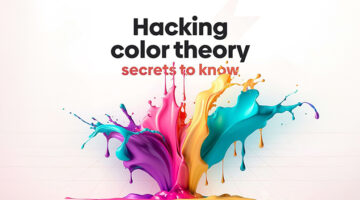
Did you know that our color choices don't remain the same throughout our lives? Research indicates that as we mature, there's a noticeable shift in color preference, with a growing inclination towards hues with shorter wavelengths, suggesting a complex evolution of taste that transcends mere aesthetics. Interestingly, gender differences play a significant … View Post ▸
Pepsi Has Found A Hidden Design Flaw In Coke Cans And They’re Trolling Them
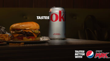
Pepsi Max's new "Tastes OK" campaign in Australia is a clever twist on their established "Tastes Better" messaging, this time putting a spotlight on a subtle detail in the competitor's name that many of us might have overlooked. By focusing on the word "OK" found in Coke's branding on Diet Coke cans, Pepsi Max is inviting consumers to think twice about … View Post ▸
“How Do I Center Texts Correctly Vertically?”
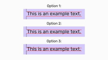
In a recent engaging post on Reddit, a user shared an intriguing image that presented three distinct methods for vertically centering text, using key typographical elements - capital letters, ascenders (the parts of letters that extend above the baseline, such as in "h" or "d"), and descenders (the portions that drop below the baseline, found in letters like … View Post ▸
Design Roles: The 10 Types Of Designers And Their Super Powers
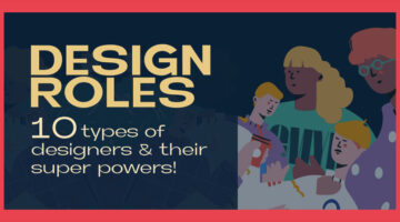
In the ever-evolving landscape of design, the roles and skills of designers have diversified, catering to every imaginable aspect of visual and experiential creation. From the meticulous crafting of brand identities to the intricate art of making data digestible through design, the spectrum of design roles speaks to a world where aesthetics meets … View Post ▸
Find Your ‘Typographic Soulmate’ With This Font-astic New Quiz
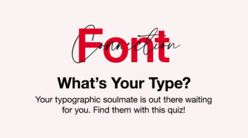
Monotype has rolled out a clever game right before Valentine's Day, serving as a matchmaker between you and your "typographic soulmate," and injecting a fresh vibe into the hunt for your ideal font. The quiz, titled Font Connection, begins with a collection of easy-going questions aimed at understanding your personality, from picking your ultimate holiday … View Post ▸
“Client Used AI To Tweak My Logo Designs And Create Their Own Logo For Free. What Do I Do?”
In the ever-evolving landscape of creative work, the advent of artificial intelligence has introduced new challenges and ethical dilemmas. A recent experience shared by a graphic designer on Reddit highlights the complexities of AI in the freelance world. After creating two rounds of logo designs for a friend, the designer discovered that their work had … View Post ▸
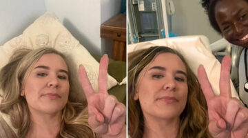
Dad Pranks Wife Before Family Photoshoot By Giving Their Kid A Photoshop Haircut
In the realm of matrimonial mischief, one daring dad has raised the bar for pranks to a hair-raising height, quite literally. With a family photoshoot on the horizon, the prankster dad messages his wife asking whether the shoot can be rescheduled. The wife, a trauma nurse by profession, senses something wrong with the tone of the message and asks him … View Post ▸
8 Thought-Provoking Illustrations That Put Men In The Place Of Women
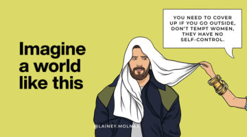
In 2020, during the lockdown, Lainey Molnar began sharing her experiences as a woman through her art, quickly gaining recognition for her compelling portrayals of challenging social issues. Now, with over 1 million followers on social media, Molnar has released a new series that has caught the public's eye. The series, named 'Imagine a World Like This,' … View Post ▸
“I’m A Graphic Design Student And I Feel Like I Picked The Wrong Field. What Do I Do?”

A design student recently turned to Reddit to voice their concerns about their future in graphic design, amidst widespread concerns over the industry's downturn and tales of job dissatisfaction. With graduation looming, they're worried about their job prospects, especially since their education didn't cover the wide range of skills listed in job … View Post ▸
- « Previous Page
- 1
- 2
- 3
- 4
- …
- 38
- Next Page »