Ever been in the middle of a eureka moment when a sudden interruption by an annoying colleague screwed everything up? Fear no more. Creative Market has come up with 10 brutally honest door hangers for designers to hang outside their offices/workstations and express their true feelings. Check them out below. … [Read more...]
Search Results for: color
30 Comic Strips That Perfectly Describe The Life Of A Designer
Designers are like gladiators, battling ugliness in the client's colosseum. Creative Market depicts the best and worst parts of being a designer with #DesignerProblems, a weekly comic strip written and illustrated by Seth Roberts and Brian Hawes. Check it out below. … [Read more...]
10 Funny Charts That Show The Life Of A Designer
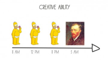
The only thing peaceful in a designer's life is the sound of the morning bird after a long night of creative ideation and execution. In the 4-5 hours of sleep that follow, designers are subconsciously evaluating font options and color changes after picturing the client dressed as the grim reaper playing a violin in the background. … [Read more...]
Artist Uses Paper Cut-Outs To Transform Famous Landmarks Into Something Else Entirely
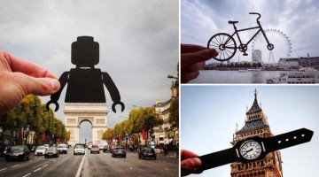
British photographer Rich McCor uses paper silhouettes to playfully transform famous European landmarks into something else entirely. So the London Eye becomes the front wheel of a bicycle, the Arc de Triomphe becomes the lower body of a Lego man, the Big Ben becomes a wrist watch, and so on. Check it out below. … [Read more...]
36 Brilliant User Interface Animations
Animated interface elements reveal the process and functionality of a UI much better than static text. They enhance user experience and help guide user flow. Like any other element of good design, UI animations should have a purpose. They should be functional without being overly flashy. … [Read more...]
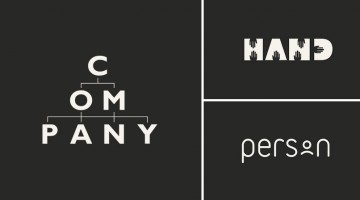
30 Honest Logos Of Famous Companies
What Clif Dickens did to advertising slogans, Viktor Hertz has done to popular brand logos. In a hilarious project titled 'Honest Logos', the Swedish designer shows us what famous company logos would look like if they were brutally honest about their product(s). Some are funny, some brash and some brilliant. Check them out below. … [Read more...]
Design Student Creates Stress Ball Map That You Can Squeeze To Zoom In
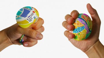
Here's one of those crazy, innovative ideas you wish you'd thought of. Hungarian student Dénes Sátor has come up with a unique stress ball-shaped map that you can squeeze to zoom in and find your way around. Titled 'EggMap', the gadget has a map of a city printed on it with information about sights, public transport and nearby restaurants. Each quarter has a different color so … [Read more...]
For Designers And Art Lovers – A Beautiful, Informative Video On How Ink Is Made
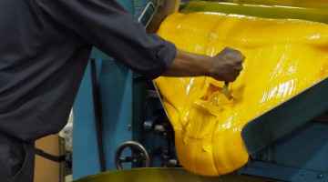
Here's a wonderful short film by The Printing Ink Company in Canada that takes us through the process, techniques and craft of ink creation. The company shares the methods they use to create every color in the PANTONE spectrum, the challenges they face and the attention to detail that goes into making every jar of ink. The film brings to life the passion and joy of color … [Read more...]
Designer Creates Beautiful Logo For 2020 Tokyo Olympics And The Internet Is Loving It
Spain-based Japanese graphic designer KanKan has created a brilliant logo concept for the 2020 Tokyo Olympics, that's winning the internet. Check it out below. … [Read more...]
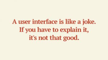
27 Useful Design Tips Explained With Beautiful, Inspiring Graphics
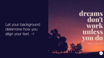
Poppie Pack, senior graphic designer at Canva, has put together a handy list of design tips complemented by beautiful images with inspiring quotes. From typography and layout to image editing and color usage, the list covers some crucial aspects of design that both newbies and professionals will appreciate. We've shortlisted 27 of our favourites to share with you. Check them … [Read more...]
45 Cool T-Shirts For Designers And Creatives
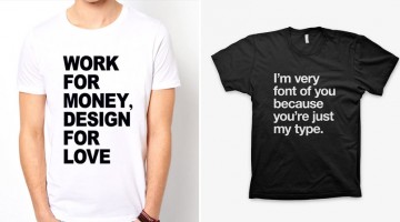
Show some love to a designer today by gifting him or her one of these cool t-shirts for a job well done. Even better, gift these before the project starts and watch them burn midnight oil willingly and turn your logo/website/ad/brochure into the next Mona Lisa. … [Read more...]
WWF Uses Photos Taken By Animals And Birds To Raise Money For Endangered Species
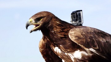
To raise funds for the preservation of endangered species, WWF Spain and stock photography site Latinstock came up with a brilliant project titled Animal Copyrights. They mounted lightweight harnesses with tiny cameras on to animals and birds and captured breathtaking views of their natural environment. They then selected the best photos and created a collection that was put up … [Read more...]
JPEG, GIF or PNG? Which File Format Should You Use When Saving Images
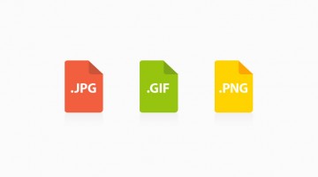
When saving images for web, it's crucial to know which file format to use - JPEG, GIF or PNG? Using the wrong format makes images blurry, increases file size and page loading time, which not only affects user experience but is bad for SEO as well. This handy infographic by WhoIsHostingThis.com acts as an excellent reference guide when it comes to selecting the right format … [Read more...]
14 Habits Of Exceptionally Likeable People (Infographic)
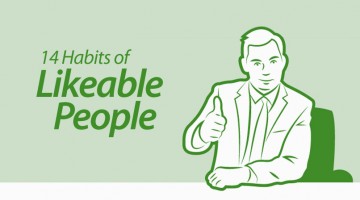
Having a charismatic personality is as important as talent and hard work when it comes to achieving professional success. In every office, there are those who are liked by one and all and those who are despised. Business Insider has come up with a great infographic that lists 14 habits of exceptionally likeable people. Needless to say, these tips apply as much to your personal … [Read more...]
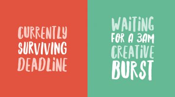
15 Funny Confessions From Designers; Which One Can You Relate To?
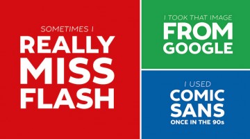
Be honest, have you ever used Comic Sans in your designs? Or a copyrighted image from Google Images? Do you really like the 'flat design' trend that's taken over every interface these days? How often do you actually kern? Creative Market has come up with a series of 15 typographic posters filled with funny confessions from designers who want take a load off their chest. Check … [Read more...]
25 Clever Logos Of Common Words You Use Every Day
Using typography and clever symbolism, Spanish graphic designer Lucas Gil-Turner has created a series of impressive logos for the 25 most commonly used nouns in the Oxford English Dictionary. The list was released by Oxford University Press researchers after the analysis of over a billion words. Typographic logos are always fun to look at and Lucas has done a fantastic job … [Read more...]
50 Memes Designers And Developers Will Relate To
Few weeks back, we shared 27 funny posters and charts that graphic designers will relate to. The post was a huge hit with over two million views so far. Most of our readers wanted us to do a web designer/developer version of the same. Which is why today's post for our web-savvy friends is almost double the size of the previous one. Check out these 50 funny comics, memes, … [Read more...]
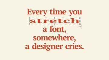
34 CSS Puns That Prove Designers Have A Great Sense Of Humor
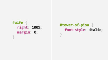
Cascading Style Sheets (CSS) is a stylesheet language that defines how the content on a web page is to be displayed with colors, borders, fonts, backgrounds, etc. Inspired by this Reddit thread, today's post showcases 34 CSS puns that'll put a smile on every web designer's face. The interesting bit is that even if you have no clue about the technicalities, you'll still … [Read more...]
Creative Pick Up Lines To Use On Designers And Filmmakers
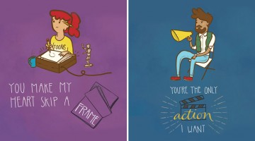
Conventional pick up lines are for conventional people. We creative types are different. To celebrate Valentine's Day this year, Mumbai-based digital production company Supari Studios came up with "Filmmaker's Pick Up Lines" - a series of five illustrations featuring clever one-liners that can be used on/by directors, cinematographers, graphic designers, editors and animators. … [Read more...]
22 Clever Posters That Show The Differences Between Copywriters And Art Directors
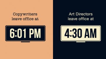
In the late 1950s, advertising legend Bill Bernbach came up with the idea of pairing art directors and copywriters into teams. The strategy worked and DDB ended up creating some of the most iconic work of that era. Since then, the art-copy team structure came into existence at most, if not all, agencies. … [Read more...]
Canada’s Passport Is The Coolest In The World, Just Look At These Ultraviolet Artworks
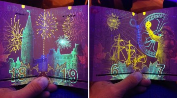
The Canadian passport has a series of hidden artworks embedded in its pages since the past few years but most Canadians don't know about it. The truth came to light (pun intended) when this Imgur user posted pictures of his friend's Canadian passport. Apparently, the pages consist of beautiful national icons and images created with optically variable ink that glows when placed … [Read more...]
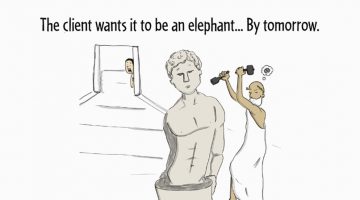
27 Funny Posters And Charts That Graphic Designers Will Relate To
We at DS come across a lot of memes, comics and artworks that offer a hilarious look into the life and mind of a graphic designer. So we thought, why not collate a few good ones into one cool post? Who knows, it might even drive some sense into an unreasonable client and make him/her change his/her attitude? Wishful thinking, we guess. Enough talk, check them out below. … [Read more...]
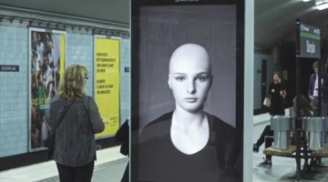
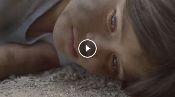
How UNICEF Shocked Everyone At A Gaming Event With This Eye-Opening Message

To raise awareness about the appalling condition of children in South Sudan, UNICEF sent an actor and two South Sudanese youth to a gaming convention in Washington D.C. to pitch a new game idea. A film crew captured the audience's reaction as they were offered a preview of 'Elika's Escape' - a first person shooter set in an extreme war zone with a 7 year old girl as the … [Read more...]
LOL: Watch What An ‘Honest’ Business Card Exchange Looks Like

Exchanging business cards is normally a pleasant experience with both sides trying to be as polite and courteous as possible, even if the exchange is of little to no value. This hilarious video clip from Vooza takes a satirical jab at this essential networking process and shows us what an honest business card exchange looks like. … [Read more...]
Press ‘R’ And This Incredibly Brilliant Honda Ad Switches To A Parallel Storyline
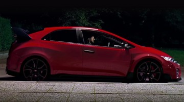
Honda and Wieden + Kennedy London have come up with an interactive dual-story video for the Civic and it's sportier version, the Civic Type R. Titled "The Other Side", the film tells the tale of an ordinary guy who leads an intriguing double life. The original video featuring the Civic switches to a parallel storyline featuring the Type R when you press and hold 'R' on the … [Read more...]
Watch How This Photoshop Artist Makes A Japanese Celeb Lose 60 Kgs In No Time

Here’s proof that the Photoshop diet works better than any other diet on the planet. YouTube channel Real Retouch has come up with an incredible video that shows a photograph of Japanese TV personality and cross-dresser Matsuko Deluxe being retouched to a level that he looks at least 60 kgs (132 lbs) lighter. It’s interesting to see how the artist uses various Photoshop … [Read more...]
Beautiful Anti-Alcoholism Ad Shows A World Where Kids Can Choose Their Parents
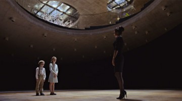
Finnish charity Fragile Childhood and Havas Worldwide Helsinki have come up with this beautiful but heartbreaking public service ad for alcoholism among parents. Titled The Orphanage, the film shows a futuristic world where the roles are reversed. Parents are the orphans and children get to choose who they want to take home. They're guided around the sci-fi orphanage by a … [Read more...]
60 Powerful Social Issue Ads That’ll Make You Stop And Think
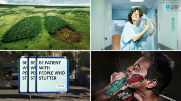
We've seen some great public service announcements recently which made us wonder - why not do a post on the best PSA campaigns in the last couple of years? We scoured the internet, filtered the not-so-great ones and came up with this list of 60 hard-hitting ads that deal with social, environmental, health and other issues. From ad school assignments to Cannes-winners, these … [Read more...]
This Digital Billboard Delivers A Powerful ‘Hair-Raising’ Message Every Time A Train Passes By
Earlier this year, pharmacy brand Apotek promoted their hair products with a digital billboard in a Swedish subway that showed a woman's hair being blown by the wind every time a train arrived. The ad was a viral success and has now prompted this Swedish Foundation to deliver a powerful public service announcement using the same idea. Watch below. … [Read more...]
How Clever Is This ‘Invisible’ Packaging From Scotch Magic Tape?
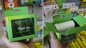
Unlike conventional adhesive tape that stands out due to its glossiness, Scotch's Invisible Tape mends paper tears without looking too obvious. The task was to demonstrate this product USP and make the packaging and POS materials stand out amongst the competition. … [Read more...]
50 Incredibly Creative Logos With Hidden Meanings
Looking for some logo design inspiration? Here are 50 ingenious examples that carry dual meanings in their design. The hidden symbols explain either the nature of the business or are a clever visual representation of its name. The symbolism is obvious in some cases but skillfully subtle in most. All in all, the designers behind these logos seem to have nailed the art … [Read more...]
This Anti-War Video Plays Backwards And Is Probably The Most Impactful Ad Of The Year
We've seen some great public service announcements this year, but this one is a notch above the rest. Titled 'In Reverse', the 1½-min film starts with the aftermath of a bombing in a Syrian playground. The events are shown in reverse slow-motion, going back to the point before the impact of the explosion.The entire film has been shot brilliantly and towards the end, we see the … [Read more...]
30 Ad Placements That Didn’t Turn Out As Expected
Companies pay millions of dollars a year to get the perfect ad placements on TV, print, radio, outdoor, digital, etc. But sometimes, due to visual and contextual reasons, these placements turn into advertising disasters. While the visual blunders are more common, the contextual ones are funnier. Whatever the reason, these 30 epic fails will make you laugh all day. … [Read more...]
What An Epic Way To Promote A Good Cause…The Ending Will Surely Make You Smile
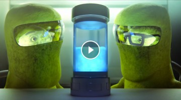
This has to be one of the best public service announcements we've seen all year. Titled "It's Payback Time", the 2-minute animated clip from Nexus Productions UK tells the apocalyptic tale of a world inhabited by certain bean-like creatures. A mysterious blue substance arrives and causes the massive destruction of their entire existence. Towards the end, the viewer realises … [Read more...]
IKEA Spoofs Apple And Shows You Why Its New Catalogue Is The Best Gadget Ever
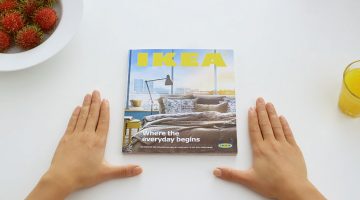
IKEA Singapore's promo video for its 2015 catalogue is sure to make you smile for at least two reasons. Firstly, its an excellent parody of Apple's (already heavily parodied) product ads. Secondly, it uses digital catch-phrases like "original touch interface", "eternal battery life" and "loads instantly with zero lag" to remind us that traditional mediums like print are … [Read more...]