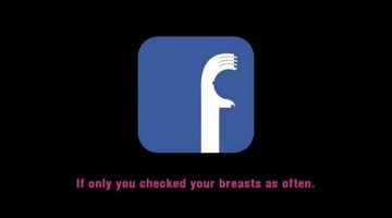
DDB Singapore has come up with a witty campaign for the Breast Cancer Foundation by leveraging social media in more ways than one. The three-ad series shows the Facebook, Twitter and Instagram logos tweaked to resemble the shape of a hand touching a breast. The tagline at the bottom reads: "If only you checked your breasts as often" with supporting body copy urging women to do … [Read more...]
50 Incredibly Creative Logos With Hidden Meanings
In branding, a logo isn't just a visual mark—it's a storyteller. A well-crafted logo carries a narrative, often through clever symbolism that's not immediately obvious. This article delves into the world of logo design, revealing the dual meanings hidden in some of the most well-designed logos. These logos go beyond simply identifying a brand; they captivate viewers with … [Read more...]
Top 25 Most Epic Logo Fails Of All Time
These impeccable works of art are the direct result of what happens when: (1) Clients take design matters into their own hands (2) You want a quick logo on a budget that's less than the price of a hamburger (3) Phallus-loving designers get panicky with a fast approaching deadline around the corner. Whatever the reason, these 25 masterpieces will bring a smile to your face … [Read more...]
40 Honest Advertising Slogans

What if brand slogans were brutally honest about the products they represent? That's the question Nashville-based graphic designer Clif Dickens wanted to answer. So he came up with Honest Slogans - a series of tongue-in-cheek taglines of famous brands, most of which, make more sense than the real ones. Check them out below. … [Read more...]
15 Types Of Difficult Clients And How To Handle Them Effectively
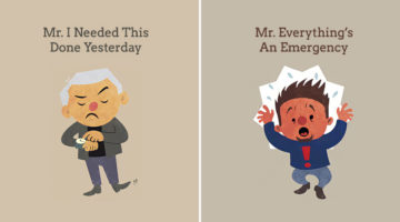
Every agency has that one client from hell. The one who monopolizes your time, frustrates the entire staff, and makes unreasonable demands. If you've got more than one, you probably spend three out of four weekends in office. If we apply the Pareto principle (or 80:20 rule) to the agency-client relationship, 80% of an agency's resources are utilized in managing 20% of its … [Read more...]
Microsoft’s New Logo – Opinions And A Different Approach
Microsoft unveiled a new logo after 25 years and everyone seems to have an opinion. The new logo has two components - the symbol and the logotype which uses the Segoe font used across all Microsoft products and marketing communications. The symbol is intended to express the company's diverse portfolio of products. … [Read more...]
Olympic Logos From 1924 – 2024, Which One’s Your Favourite?
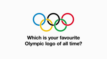
For a century, the logos of the Summer Olympics have evolved, each encapsulating the spirit and culture of its host city. From the early designs of Paris 1924 to the contemporary aesthetics of Paris 2024, these emblems are more than just symbols; they are visual stories of their times. Each logo captures the essence of its era, reflecting the unique characteristics and … [Read more...]
- « Previous Page
- 1
- …
- 4
- 5
- 6