• Home
  • Design
  • Advertising
  • Inspiration
  • Tools
  • Buzz
  • Follow Us ▾
    • Facebook
    • Facebook Group
    • LinkedIn
    • LinkedIn Group
    • Threads
    • Instagram
    • Pinterest
    • Twitter / X

Digital Synopsis

Design, Advertising & Creative Inspiration

  • Photoshop
  • Logo Design
  • UI/UX
  • AI
  • Web Design
  • Typography
  • Photography
  • About Us
  • Advertise

This Clever Digital Tweak By The World Health Org. Resulted In A Huge Increase In Blood Donations

Like many countries, Namibia suffers from a shortage of blood donations with only 0.6% of the population participating as donors. On June 14, World Blood Donor Day, the World Health Organisation and agency Advantage Y&R decided to use the power of digital media to ‘share’ the message and turn things around.

Objective:

Raise awareness about blood donation and get more people to donate across Namibia.

Insight:

When people are online, they share articles, posts and updates all the time. What if, at that moment, they could analogously be made to realise the importance of ‘sharing’ something much more valuable? Something that could save a person’s life.

Idea:

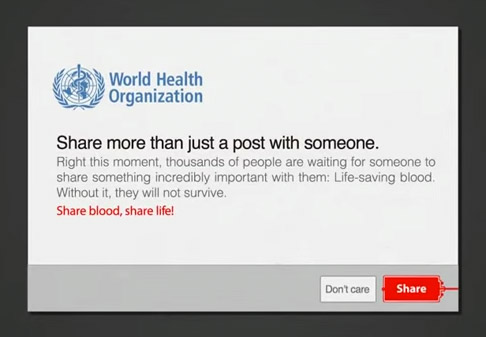
WHO tweaked the share button on Namibia’s major news and entertainment websites for 24 hours on World Blood Donor Day. Whenever someone tried to share a post, this blood donor awareness message would appear:

world-health-organization-blood-donor-day-share-message

The pop-up led the user to WHO’s Facebook page where they were provided with relevant information about blood donation and the current shortage in the country, as well as locations of stations where they could go and donate.

Results:

Within the first 12 hours, WHO’s Facebook page likes increased by 250%. More importantly, the new share button led to a change in people’s attitude which resulted in a significant rise in blood donations. Watch this case study to know more:

If WHO could release a before-after data comparison, it would really help put things in perspective. Great use of the digital medium nonetheless. What do you think? Share this post and your views in the comments below.

Don’t Miss:

  • What An Epic Way To Promote A Good Cause…The Ending Will Surely Make You Smile
  • IKEA Spoofs Apple And Shows You Why Its 2015 Catalogue Is The Best Gadget Ever
  • 40 Honest Advertising Slogans That’ll Make You Laugh

Don't Miss:

  • unicef-roly-poly-donation-box
    Just 10 Of These Cleverly Designed Donation Boxes Resulted In Over 10,000 Donations For UNICEF
  • mad-men-don-draper-modern-digital-integrated-gifs
    25 GIFs That Show What Don Draper And Mad Men Would Be Like In Today's Ad World
  • children-with-children
    AMREF Uses Pinterest To Help 13-Year-Old African Mother Share Her Story
  • the-invisible-threat-smile-condoms-namibia
    Smile Condoms Shocks Party-Goers With Crazy Stunt To Raise Awareness Of STDs
  • curitiba-city-hall-safety-crossing-elderly-pedestrians
    This Genius Device Makes It Easier For Elderly And Disabled People To Cross The Road
  • creative-tear-off-ads
    15 Clever Tear-Off Ads

Share Your Views:

Comments for this post are now closed.
Share your thoughts with 433,000+ design lovers on our Facebook Page.

Popular

  • Graphic Designer Fixes The 9 Worst Logos Ever
  • 50 Incredibly Creative Logos With Hidden Meanings
  • 11 Best And Worst Redesigns Of Famous Logos
  • Top 10 Netflix Documentaries For Graphic Designers
  • 11 Differences Between Designers And Clients

TRENDING

  • Top 20 Graphic Design Trends For 2026
  • Top 10 Logo Design Trends For 2026 And How To Use Them
  • Portfolios Of Designers Who Have Worked At Apple, Google, Meta, And More
  • Designers Are Sharing Their Redesigns Of Famous Logos And Some Of Them Are Better Than The Original
  • “Which Current Graphic Design Trend Will Age Badly?” – Here Are The Top Replies

Follow Us On

  • Facebook
  • Facebook Group
  • LinkedIn
  • LinkedIn Group
  • Threads
  • Instagram
  • Pinterest
  • X / Twitter

Copyright © 2012-2026 Digital Synopsis | Privacy Policy | Affiliate Disclosure | Advertise With Us