7 Japanese Design Principles Every Designer Should Know
Every designer learns to recognize a certain kind of restraint before they have a word for it. A composition that holds its ground without raising its voice. A single form given space that lesser work would rush to fill. Trace much of contemporary design’s fascination with that instinct, and the path repeatedly leads to Japan.
Japanese design principles are the grammar beneath much of what we now call refined. Kanso, Fukinsei, Shibumi, Shizen, Yūgen, Datsuzoku, and Seijaku were never meant as rules of style. They are ways of seeing — each one concerned with a different relationship between beauty, purpose, and the space around a thing. Together, these seven concepts offer designers a framework rooted in Japanese aesthetic thought rather than any passing visual trend, and understanding them gives a designer something no passing trend can offer.
Their worth lies in application, not admiration. When every element in a layout has to justify its place, clutter falls away on its own. When the eye learns to read asymmetry, composition loosens and begins to breathe. These are the principles quietly at work behind the packaging, the branding, and the interfaces you already admire — from the label on a soy sauce bottle to the signage on a Tokyo platform.
What follows is a considered survey of all seven. Each principle is explored through its meaning and a series of design examples chosen to be felt rather than merely explained. @mockiro has put together a quietly excellent series pairing each principle with the work that captures it best. Some will confirm instincts you have long trusted. Others may change the way you approach your next project.
1. Kanso (簡素)
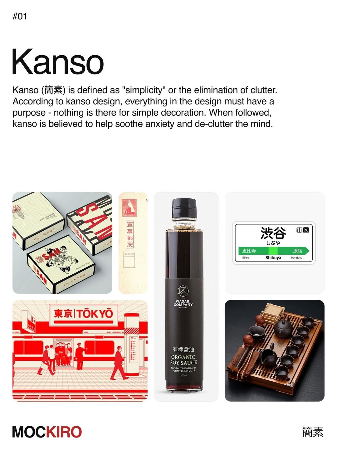
Kanso is simplicity understood as elimination. Clutter is not thinned; it is removed. Under this principle, nothing survives in a design unless it serves a purpose, and decoration for its own sake has no claim to a place. The reward is not only visual but mental — a composition stripped to its essentials is believed to quiet anxiety and clear the mind, and the eye rests where it is meant to rest.
Look for it in the quiet workhorses of design. A soy sauce label that lets one line of type carry the weight. A transit sign that reads a station in a glance. Kanso is rarely the loudest work in the room, and that is exactly the point.
2. Fukinsei (不均整)
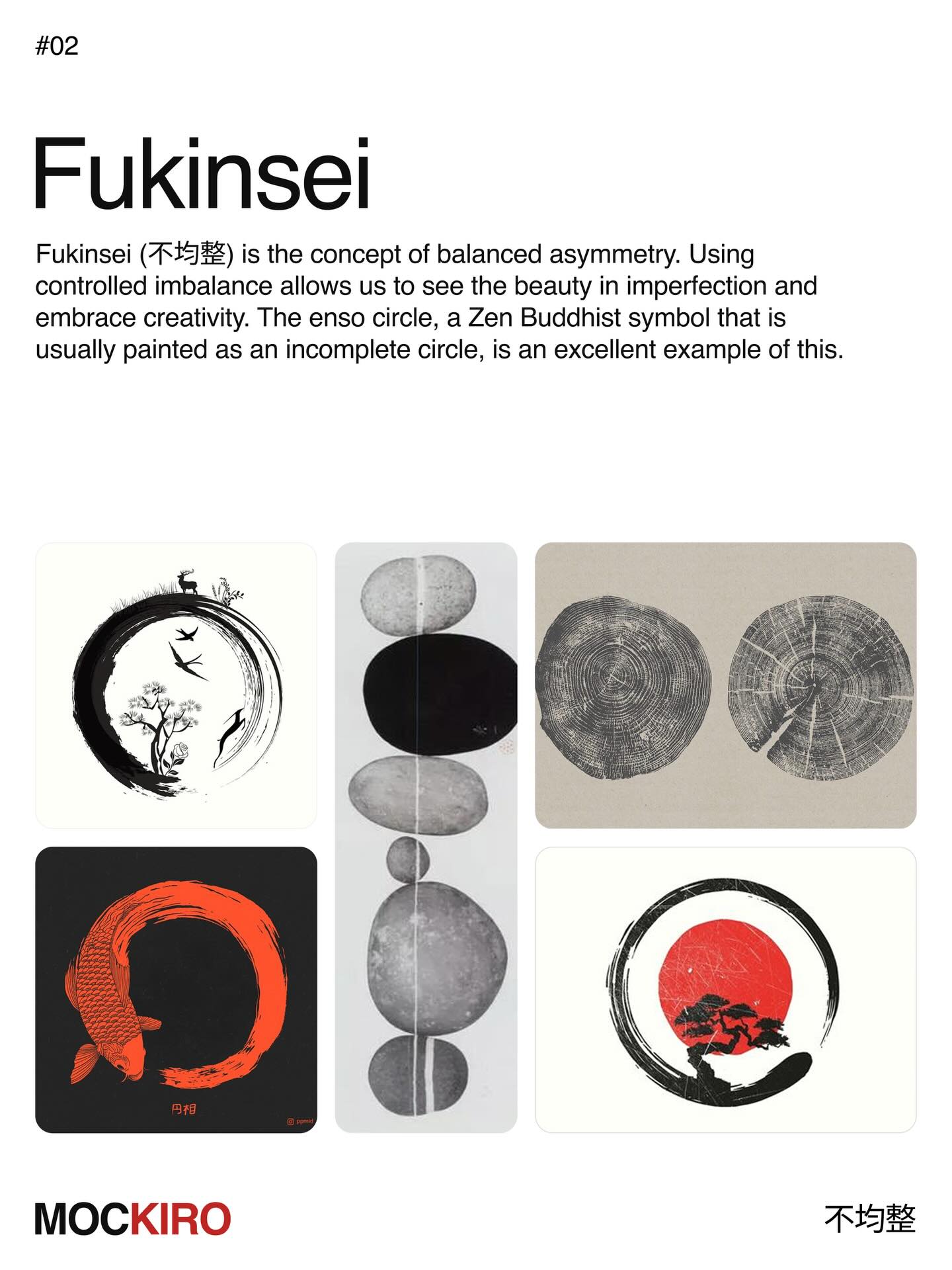
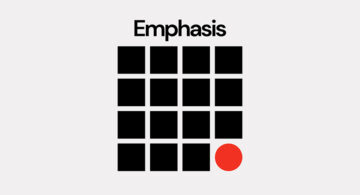
Fukinsei is balanced asymmetry — the deliberate use of controlled imbalance to reveal beauty in imperfection. Symmetry closes a composition; asymmetry keeps it alive. The open ensō, a Zen circle drawn in one fluid breath and intentionally left incomplete, is its clearest emblem: complete precisely because it refuses to be.
It teaches the eye to trust the off-center. A form weighted to one side, a gap left open, a line that stops short of resolution — each invites the viewer to complete the work, and in doing so, to look longer.
3. Shibui / Shibumi (渋い / 渋み)
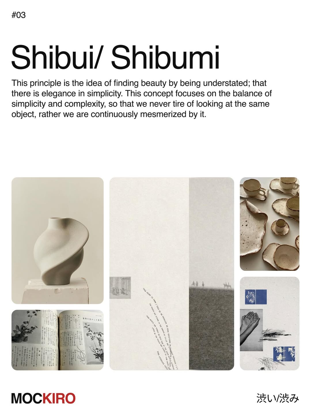
Shibui is beauty that stays understated — elegance that never raises its voice. Its power lies in the balance of simplicity and complexity: an object plain enough to live with every day, yet layered enough that the eye never tires of it. What seems quiet at first reveals more the longer it is held.
This is the beauty of the well-worn and the well-made. A hand-thrown vessel, a muted palette, a surface that rewards a second and third look. Shibumi does not seek attention; it earns a lasting place.
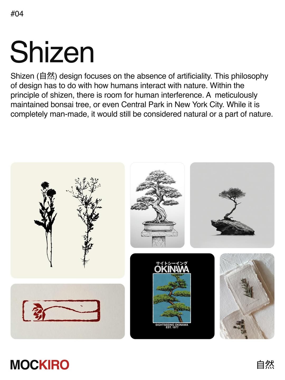
4. Shizen (自然)
Shizen is design without artifice — the absence of the forced or the contrived. It does not, however, exclude the human hand. There is room within shizen for intention: a bonsai shaped over decades, or even a park laid out entirely by design, remains a part of nature. What matters is that the result feels natural, not that it arose untouched.
It asks for the deliberate that reads as inevitable. A composition that appears to have grown into place rather than been arranged, so that the effort disappears into ease.
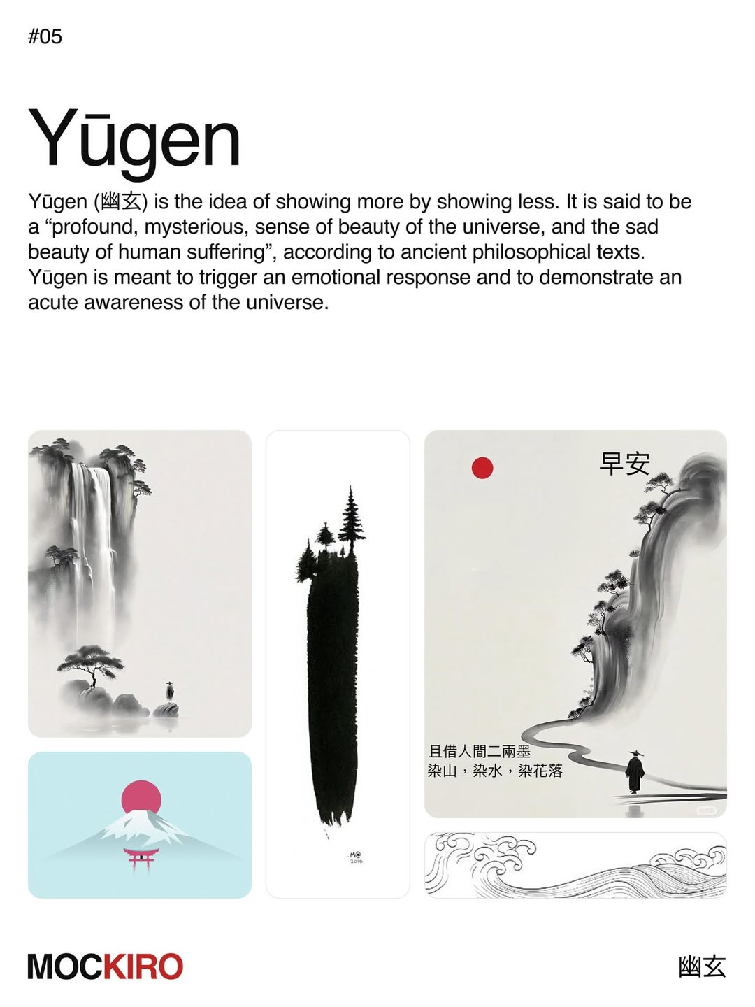
5. Yūgen (幽玄)
Yūgen is showing more by showing less. Described in older philosophical texts as a profound, mysterious sense of the beauty of the universe — and of the quiet sorrow of human life — it works by suggestion rather than statement. What is withheld does the work; the mind completes what the image only implies.
It reaches for feeling over description. Mist that conceals more than it reveals, a horizon left open, a single figure dwarfed by the scale around them. Yūgen aims not to depict, but to stir an awareness of something larger.
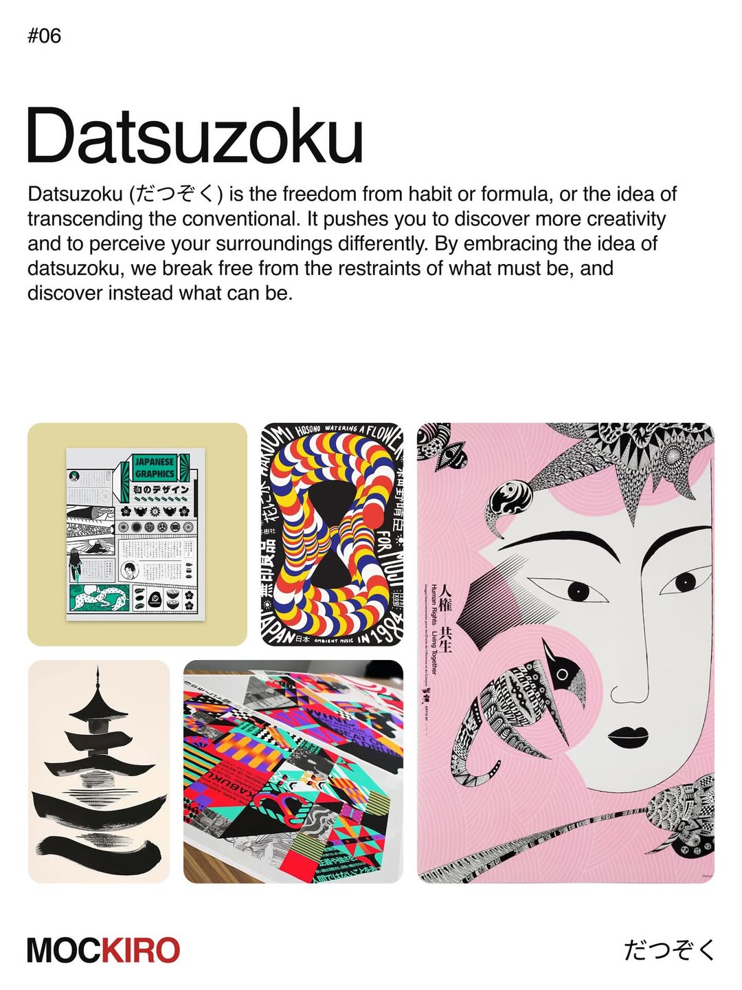
6. Datsuzoku (脱俗)
Datsuzoku is freedom from habit and formula — the act of transcending the conventional. It is the principle that presses a designer to break a familiar pattern and see their surroundings anew. In embracing it, we step away from what must be and turn toward what might be, and creativity opens where routine once closed it.
It is the deliberate rule broken well. A jolt of unexpected color, a composition that abandons the grid, a surprise placed exactly where the eye expected order. Datsuzoku is the moment a design stops obeying and starts speaking.
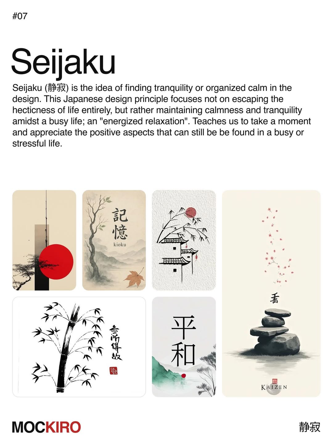
7. Seijaku (静寂)
Seijaku is tranquility found within activity — an organized calm rather than an escape from the world. It does not ask us to flee the pace of life but to hold a stillness inside it, a kind of energized repose. The lesson is to pause amid the noise and notice what remains beautiful within a busy, demanding life.
It is stillness made active. Generous space, an unhurried rhythm, a composition that exhales. Seijaku is the calm at the center of the work, and the calm it leaves in the viewer.
Seven principles, and not one of them is about making a thing look Japanese. Each is a way of designing with intention — of letting emptiness do real work, of finding beauty in the asymmetrical, the understated, the withheld. They belong to no single era because they were never bound to one, and that is why they keep surfacing, quietly, in the work we most admire.
A designer need not master all seven at once. To carry even one into the next project — to let a single element earn its space, or to leave a circle unclosed — is enough to change how everything after it is seen.
Share this post with a designer friend, and tell us which principle speaks most strongly to you.