Every few years, design goes through a visible shift — not a sudden break, but a gradual reorientation of what feels current versus what feels tired. What’s interesting about the trends making the rounds right now is that many of them aren’t new inventions. They’re revivals, recombinations, and reactions — to digital fatigue, to the sterility of AI-generated imagery, and to audiences who increasingly reward personality over polish.
The examples below, curated by designer Wajeeha Saleem, capture more than twenty visual directions making their way through brand identities, editorial design, and visual culture at large. Some are typographic. Some are textural. Some are rooted in cultural specificity, and a few are deeply atmospheric — concerned less with how something looks and more with how it makes you feel. What they share is an energy that feels considered rather than reactive, which is the clearest marker that a trend has moved from novelty into practice.
What follows is a closer look at each, grouped by visual logic. The range here is genuinely wide — from the ornate grandeur of Regency Feels to the clinical precision of Glass Refraction, from Desi Maximalism’s unapologetic cultural density to the quiet warmth of Human In-Action. Taken together, they form a fairly accurate picture of where visual design stands at this moment: pulled in multiple directions at once, and more interesting for it.
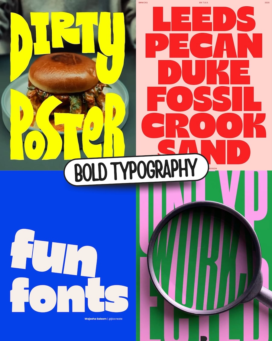
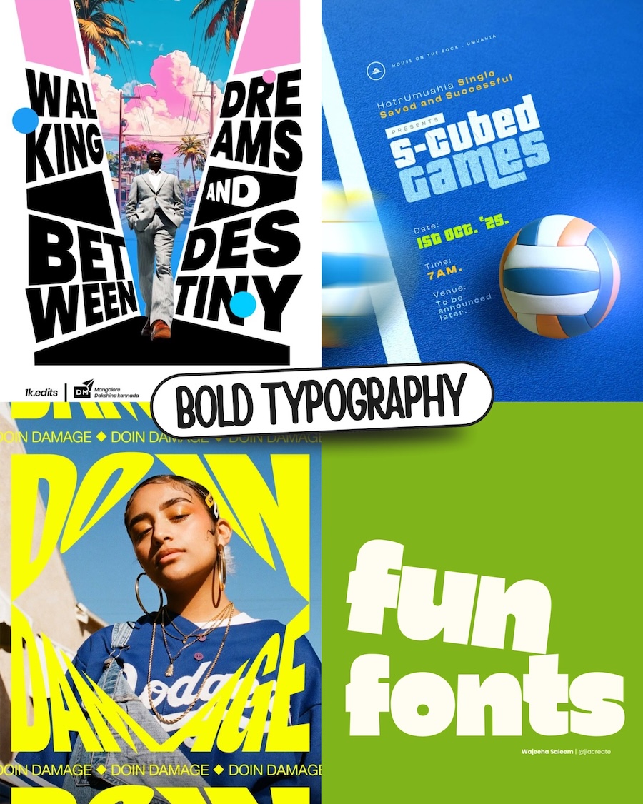
Bold Typography
Type is no longer supporting the design — it is the design. Chunky, characterful, and unapologetically large, bold typography treats letterforms as visual objects first and communication tools second. The font choice carries as much meaning as the words themselves, and designers are leaning into that with increasing confidence.
Here, type isn’t placed on a layout — it fights for territory within it. Letters overlap subjects, repeat across backgrounds, and cut through imagery with the confidence of a design that has nothing to prove. The composition and the typography are inseparable, each one incomplete without the other.
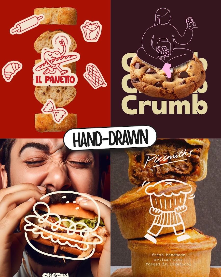
Hand-Drawn
There’s a reason this aesthetic keeps showing up across branding, editorial, and packaging — a sketched illustration or a loose line character says something that a photograph or a clean vector simply can’t. It suggests that someone actually cared enough to draw it. The imperfection is deliberate; it makes a brand feel built by people rather than assembled by a system. When executed well, it doesn’t look unfinished — it looks considered.
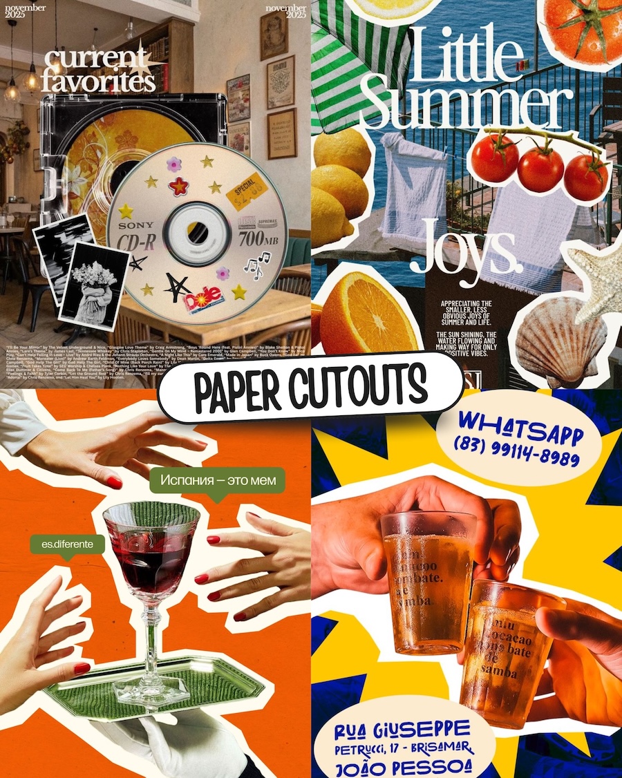
Paper Cutouts
The appeal of this aesthetic isn’t nostalgia for its own sake — it’s the way layered, clipped elements create a sense of density and human touch that clean digital layouts rarely achieve. Objects lifted from their original context and placed against flat color or other imagery carry a visual restlessness that holds attention. It’s a technique that rewards the viewer for looking closely, because there’s always more going on than the first glance suggests.
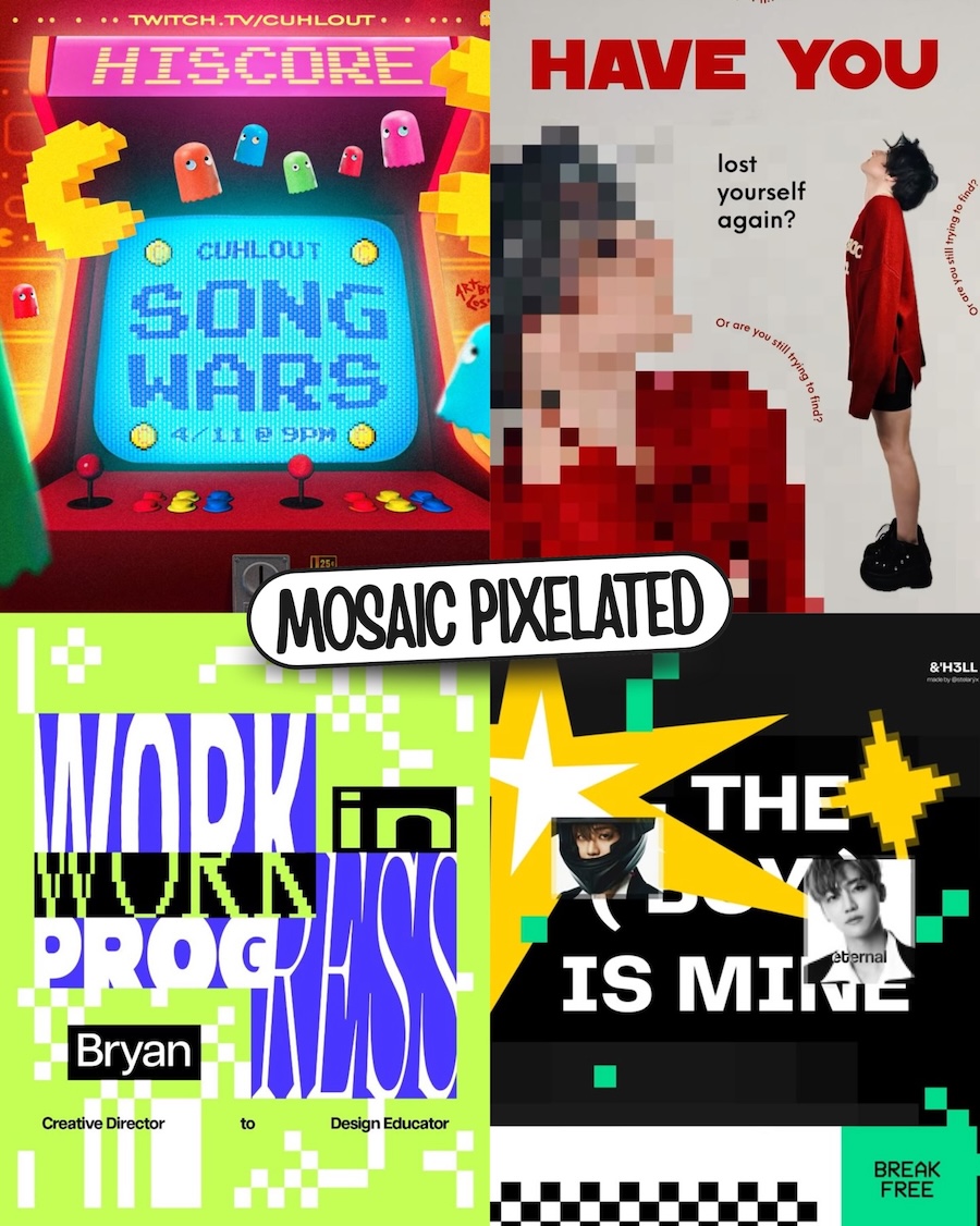
Mosaic Pixelated
The pixel used to be something designers worked around. Now it’s the whole point. Chunky grids, 8-bit references, deliberate fragmentation — this aesthetic borrows from early computing not because the past was better, but because it carries a rawness that polished digital work has long since lost. The screen stops pretending to be invisible. It becomes the subject.
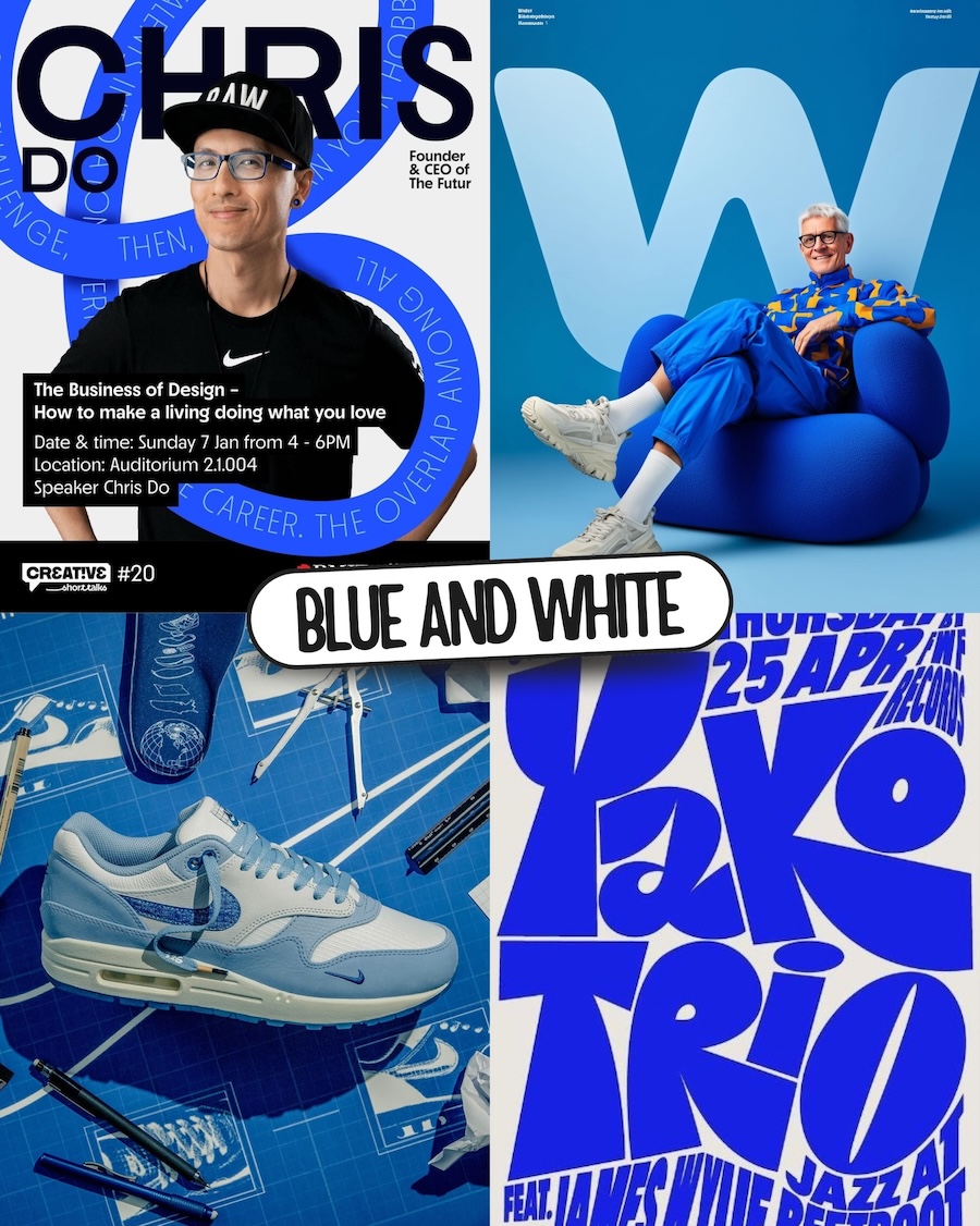
Blue and White
Blue and white is one of the oldest color combinations there is. It shouldn’t feel this current — and yet here we are. Across editorial layouts, product shoots, and poster design, designers keep arriving at the same two colors independently of each other. There’s something about this pairing that reads as confident without tipping into aggression, classic without feeling safe. Hard to engineer. Easy to recognize when it’s working.
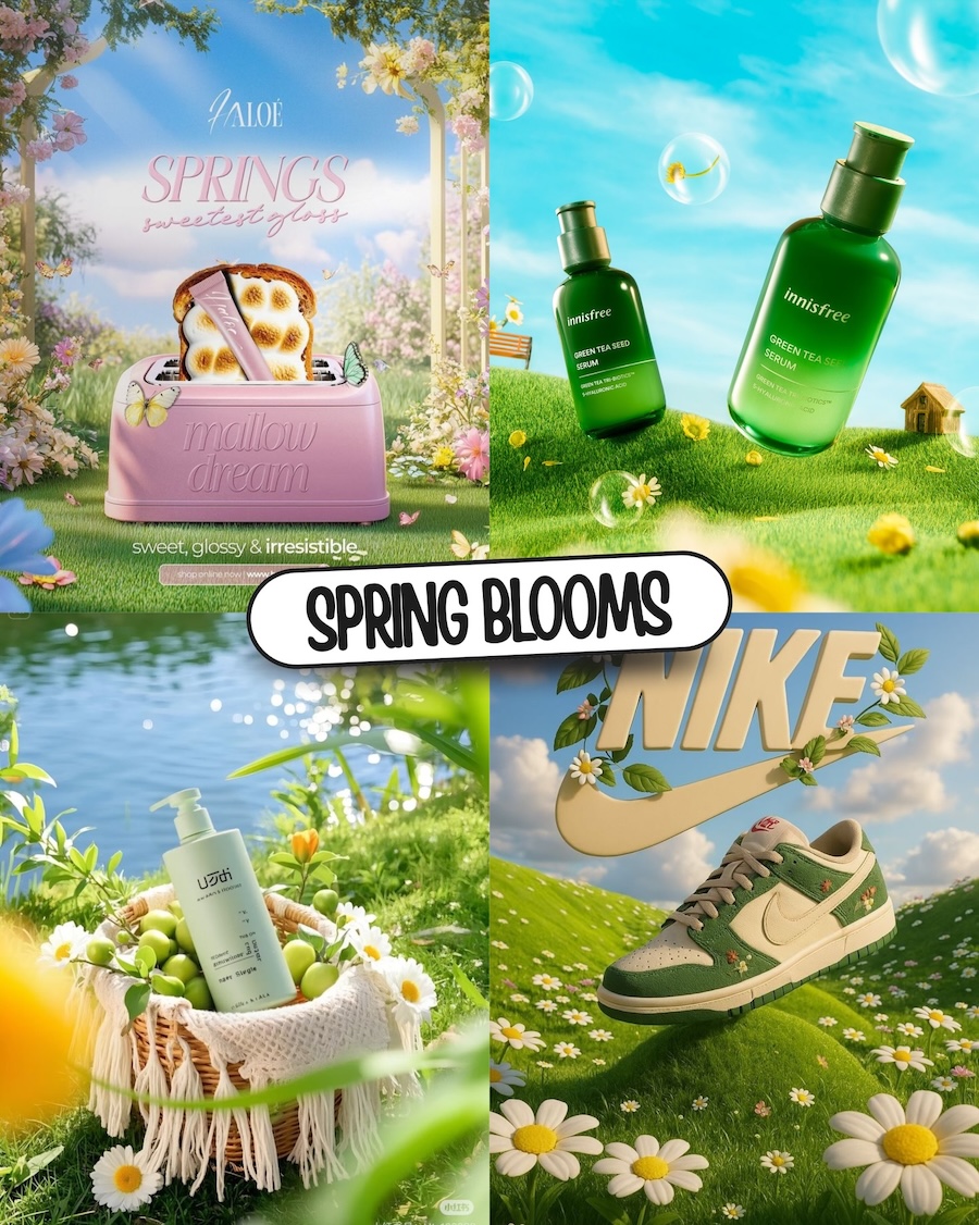
Spring Blooms
Product visualization has found a new grammar — lush meadows, soft light, botanical details, and skies that exist nowhere in nature. The aesthetic borrows from CGI animation and AI generation equally, placing everyday objects inside environments that feel more like mood than location. What it communicates is uncomplicated: freshness, optimism, the sensory pleasure of something new. For beauty, skincare, and lifestyle brands, that emotional register is exactly the brief.
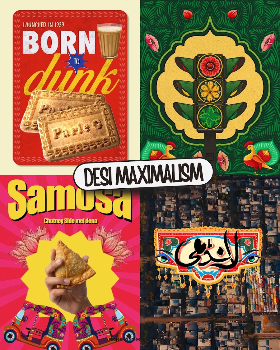
Desi Maximalism
Abundance is the aesthetic. Rooted in truck art, Mughal ornamentation, Bollywood color, and Arabic calligraphy, this is a visual tradition where every surface is treated as an opportunity rather than a problem. Western design spent decades equating restraint with sophistication — this challenges that assumption directly, and does it with enough confidence that the argument is hard to dismiss. It arrives on its own terms, not as an exotic reference but as a legitimate design language with centuries of craft behind it.
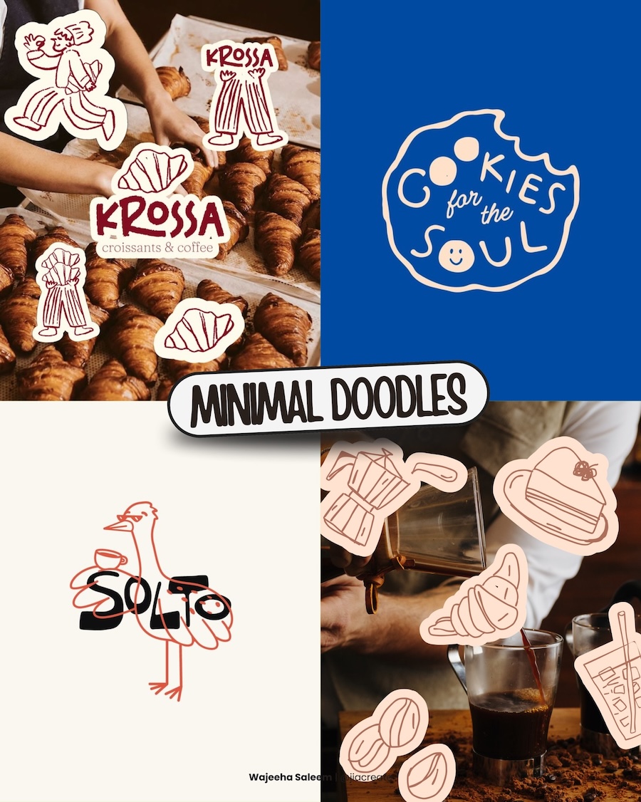
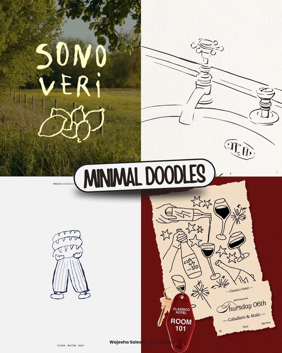
Minimal Doodles
A single line can carry a brand identity. That’s the quiet confidence behind this aesthetic — stripped-back illustration that communicates character through economy rather than detail. The less a doodle tries to explain, the more personality it tends to have.
The application range is wider than it looks. The same visual logic that works for a bakery logo works equally well for editorial collateral, event design, and lifestyle photography. Restraint in illustration turns out to be surprisingly versatile — which is why this approach keeps showing up across categories that have nothing else in common.
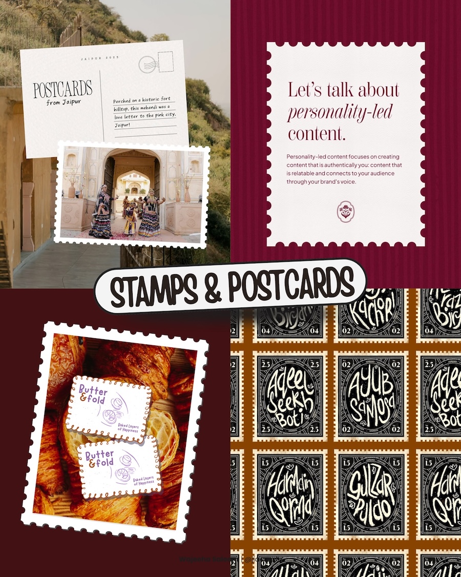
Stamps & Postcards
Framing content inside a stamp or postcard border does something quite specific — it creates an instant sense of occasion. The serrated edge, the postmark, the handwritten address field all carry associations with deliberate communication, something sent rather than scrolled past. Designers are using these frames to give everyday content a sense of provenance and care that flat layouts simply don’t carry. Small format, outsized feeling.
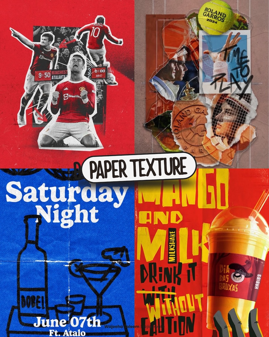
Paper Texture
Grain, fold lines, halftone dots, the slight warp of a surface that has been handled — these are the details that paper texture brings to work that lives entirely on screens. It’s a way of introducing physical memory into digital design, a reminder that print culture existed and left behind a visual vocabulary worth borrowing. The result feels lived-in rather than produced, which in an era of frictionless digital output is increasingly difficult to fake convincingly.
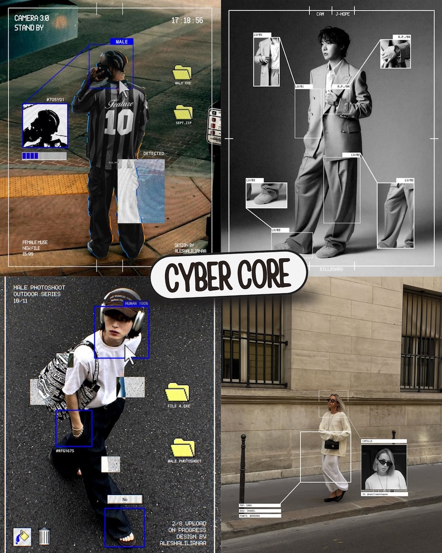
Cyber Core
We’re all being tracked, tagged, and filed somewhere. This aesthetic knows that and leans into it — surveillance boxes, OS interfaces, detection labels, camera metadata laid over fashion photography and editorial work. What could feel dystopian ends up feeling curiously stylish. The tension between being watched and looking good is apparently very productive creative territory.
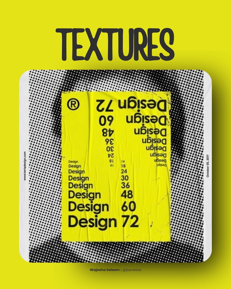
Textures
Halftone dots, wrinkled surfaces, glue residue, screen-print grain — texture is the design world’s way of putting friction back into work that would otherwise be frictionless. A flat digital file has no physical history. Layer in enough texture and suddenly it does. The eye reads it as something that has existed in the world rather than something that was just rendered.
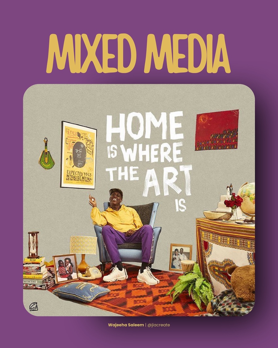
Mixed Media
No single medium gets to dominate here. Photography sits next to hand-lettering, illustration lives alongside found objects, cultural references share space without hierarchy. The skill isn’t in picking the right elements — it’s in knowing how much tension the composition can hold before it stops working. Get that balance right and the result feels lived-in. Get it wrong and it just looks busy.
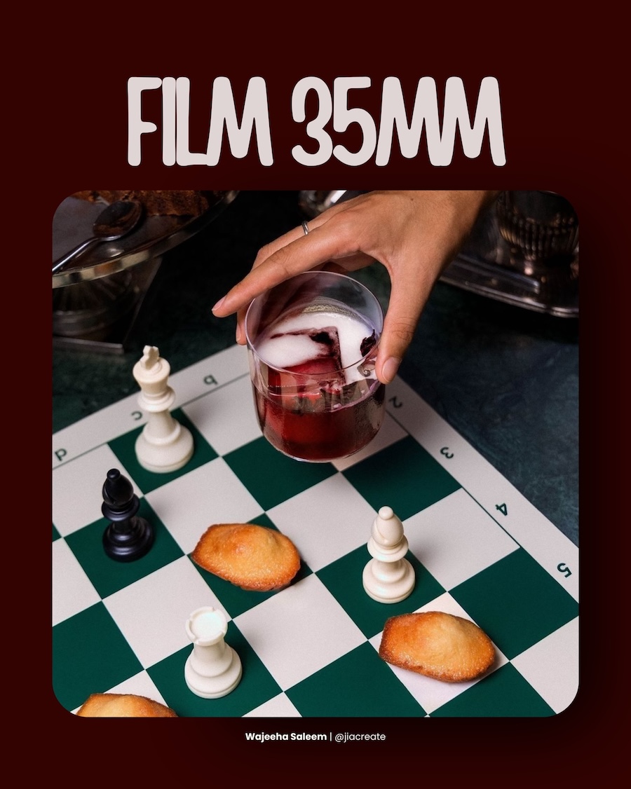
Film 35mm
There’s a specific quality of light that digital cameras have spent decades trying to replicate and never quite managed. Film photography has it naturally — the slight warmth, the grain, the sense that the moment was caught rather than captured. Brands and designers reaching for this aesthetic are buying into something that no filter fully delivers: the feeling that the image has a physical past.
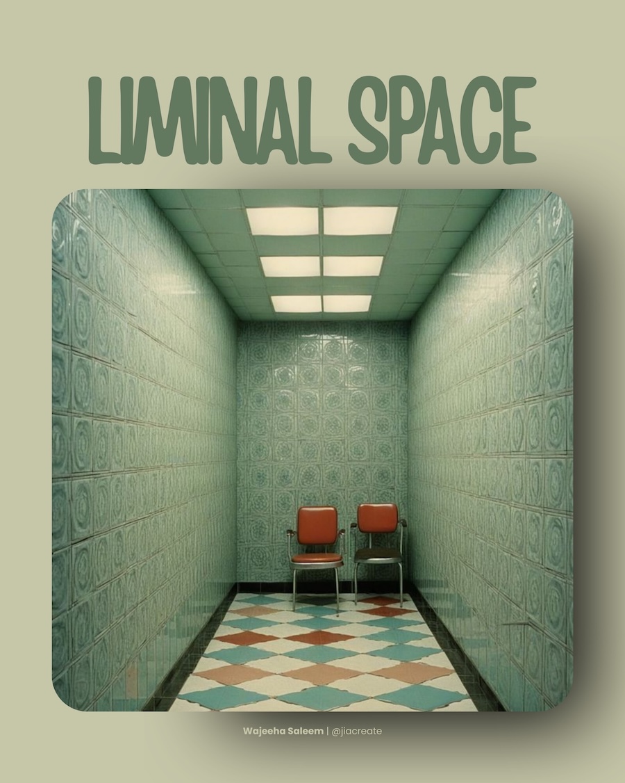
Liminal Space
Empty corridors, waiting rooms, spaces that exist between one thing and another — the liminal aesthetic is built on the specific unease of a place that should have people in it but doesn’t. It started as an internet phenomenon and has since moved steadily into brand visual language, editorial photography, and AI-generated imagery. The appeal is harder to explain than it looks. Something about the absence is doing a lot of work.
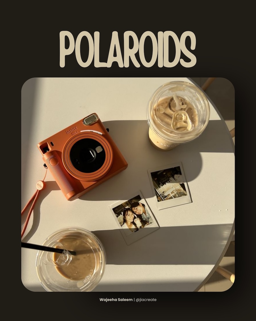
Polaroids
Some formats just refuse to die gracefully — they outlast the technology that created them and end up meaning something else entirely. The polaroid is one of those. The white border and washed tones stopped being a limitation a long time ago. Now they’re a feeling. Instant, personal, slightly imperfect. In a visual culture drowning in high-resolution everything, that imperfection is doing real work.
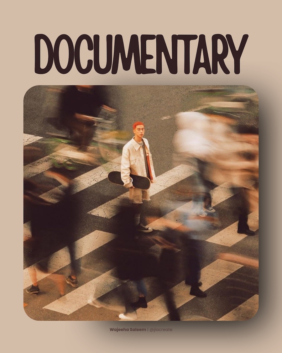
Documentary
Unposed, unhurried, shot like something was actually happening and the camera happened to be there. The documentary aesthetic is a direct reaction to the over-produced visual language that dominated brand photography for years — the perfect lighting, the perfect expression, the perfect nothing. Audiences have become remarkably good at detecting artifice, and this style works precisely because it doesn’t try to hide the fact that it’s a photograph.
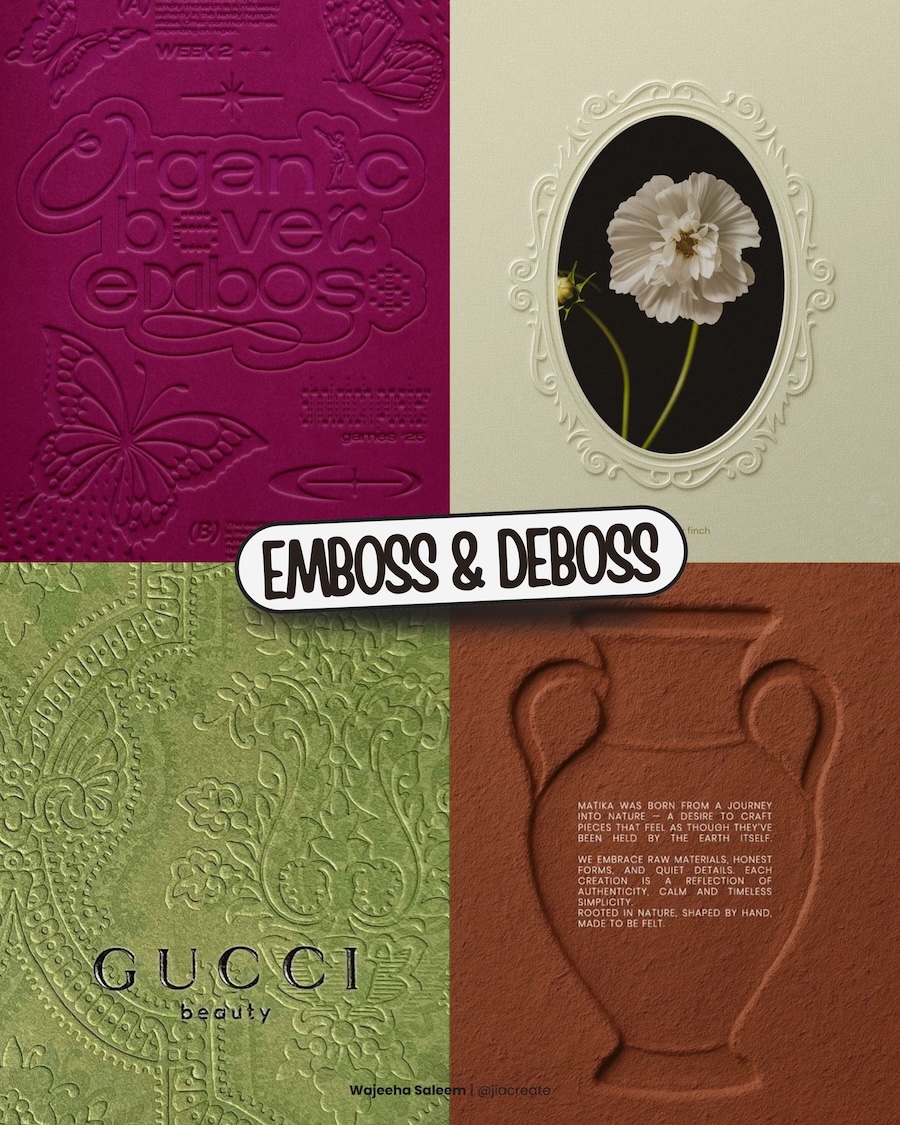
Emboss & Deboss
Raising or pressing a surface to reveal a design rather than printing it on top — emboss and deboss is about restraint taken to its logical extreme. The image and the material become the same thing. What makes it compelling as a digital aesthetic is the tension involved: a technique defined by physical touch, rendered on a screen, still somehow communicating weight and craft. That’s a difficult thing to fake, which is exactly why it keeps appearing on work that wants to signal quality.
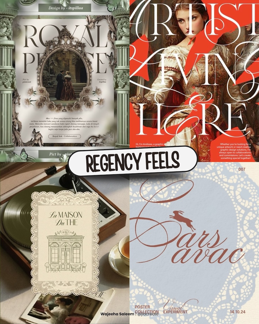
Regency Feels
Ornate serifs, gilded frames, lace borders, the compositional gravity of oil painting — this aesthetic isn’t recreating a historical period so much as borrowing its emotional register. The Regency era probably never looked this considered in practice. What designers are reaching for is the idea of it: slow, deliberate, unhurried. Against the pace of everything else on a screen, that reads as a genuine point of difference.
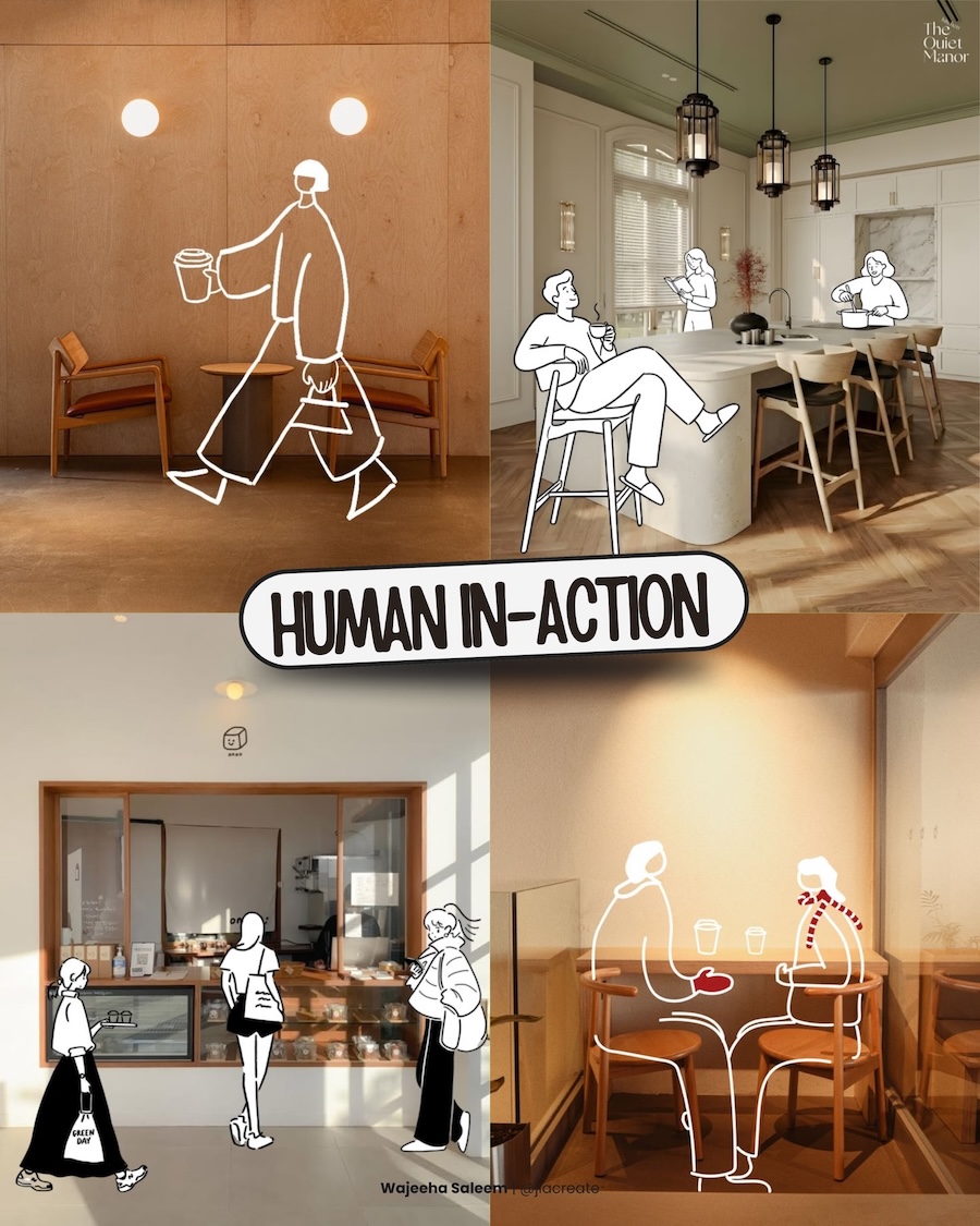
Human In-Action
Line-drawn figures dropped into real spaces — walking, sitting, ordering, existing. It’s a deceptively simple technique that solves a genuine problem: how to suggest human presence without the cost or complexity of a photoshoot. But beyond the practical case, there’s something warm about it. The illustrated figures are loose enough to feel universal, specific enough to feel like someone. Spaces that would otherwise read as cold architecture suddenly feel inhabited.
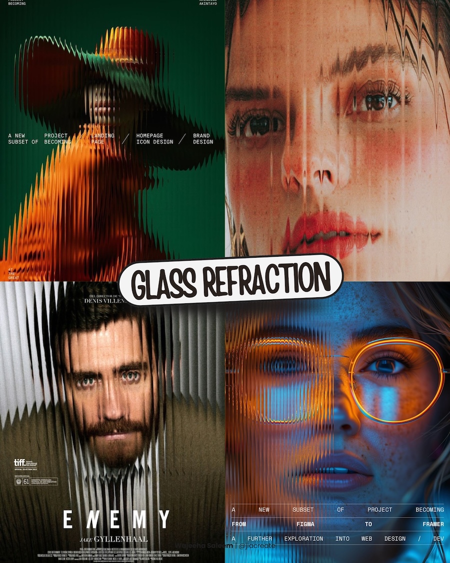
Glass Refraction
Faces pulled apart by prismatic distortion, forms fragmented through ribbed glass, images bent into something that hovers between recognition and abstraction. The effect is technically simple but visually arresting — it makes the familiar strange without making it unreadable. Portrait photography in particular benefits from this treatment, introducing psychological tension into images that would otherwise be straightforward. The subject is still there. Just not entirely.
What connects all of these directions — across their obvious differences — is a shared resistance to effortlessness. Each trend, in its own way, shows its work. Whether that’s the grain of a halftone texture, the imprecision of a doodle, the weight pressed into an embossed surface, or the cultural density of Desi Maximalism, the underlying message is consistent: design that carries evidence of thought and process tends to hold attention longer than design that doesn’t.
The question for any practitioner isn’t which of these to adopt wholesale, but which of them is honest to the work at hand. A trend applied without conviction is just decoration. Applied with intention, it’s a point of view.
Share this with a designer friend and voice your views in the comments below.