The most memorable logos reward a second look. A strong identity does more than identify a brand. It folds meaning, personality, and a little visual intelligence into a form you grasp in about a second, and in the best logos with hidden meanings, that second layer is not a bonus. It is the whole point of the mark.
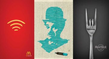
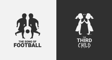
Negative space does most of the heavy lifting here. Designers use the gaps between shapes, letters, and symbols to embed a second image, one you often miss on the first pass. A bottle surfaces between canyon walls. A card suit sharpens into view between a pair of antlers. An everyday object turns out to be hiding a completely different silhouette once your eye knows where to look.
The clever ones are always about the brand, never just decoration. A hidden shape only works when it connects naturally to the company’s name, product, industry, location, or character. Get that relationship right and a visual trick becomes meaningful brand identity design. Get it wrong and the idea becomes little more than a puzzle.
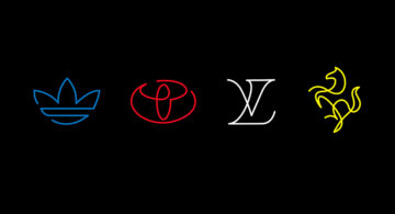
Typography can hide just as much as illustration, sometimes more. Letterforms double as objects. Initials collapse into symbols. A carefully constructed wordmark says two things at once and makes it look easy, which it absolutely is not. That restraint, knowing what to leave out, is one of the hardest skills in logo design.
The best of these make hard look effortless. Whether the idea lives in negative space, symbolism, double imagery, or custom typography, the mark still has to read clearly at a glance and stay in your memory afterwards. Some examples click instantly. Others keep you staring for a few seconds longer. See how many you can decode before reading the reveal.