A logo has one chance to make a first impression. And a thousand ways to get it wrong. One awkward shape, an unfortunate alignment or a detail the designer overlooked can turn an otherwise innocent mark into something its owners never intended. People don’t study logos the way designers do; they glance, interpret and move on. Our collection of 25 epic logo design fails is a reminder that what designers intend and what viewers see aren’t always the same thing. And once something is spotted, it can’t be unspotted.
Most logo fails aren’t drawing mistakes. They’re perception mistakes. Even a simple logo can become a battle between figure and ground, a fundamental concept in Gestalt psychology, and the eye doesn’t always pick the side the designer had in mind. A gap between two letters becomes a shape of its own. A friendly human figure turns into something else entirely when it’s rotated, cropped or shrunk. The hidden meanings designers work hard to plant often go unnoticed, while the accidental ones jump straight out.
Fixing a bad logo means removing ambiguity, not adding cleverness. That’s the approach Italian graphic designer Emanuele Abrate took when he redesigned nine of the worst offenders as though each client had handed him a real brief. Instead of patching the originals, he went back to what each brand actually needed to communicate and rebuilt it from there. He kept the original brand colors as close as possible, reconsidered the typography and visual elements, and developed cleaner identities that communicate the intended message without unwanted distractions.
Squint at them, rotate them, then decide if they really work. Those are two useful ways to test a logo, and the original designs show just how easily a mark can go wrong. Run Abrate’s redesigns through the same scrutiny. Which one would you push further, and how would you improve it?
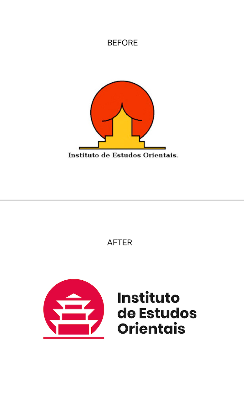
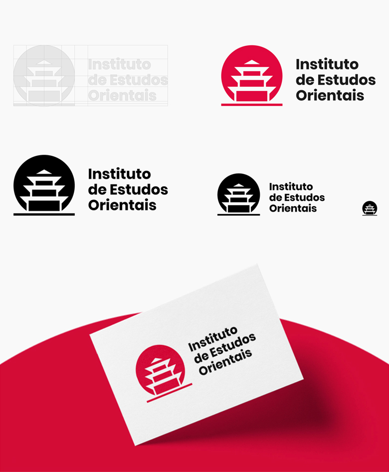
1. Institute of Oriental Studies – Santa Catarina University
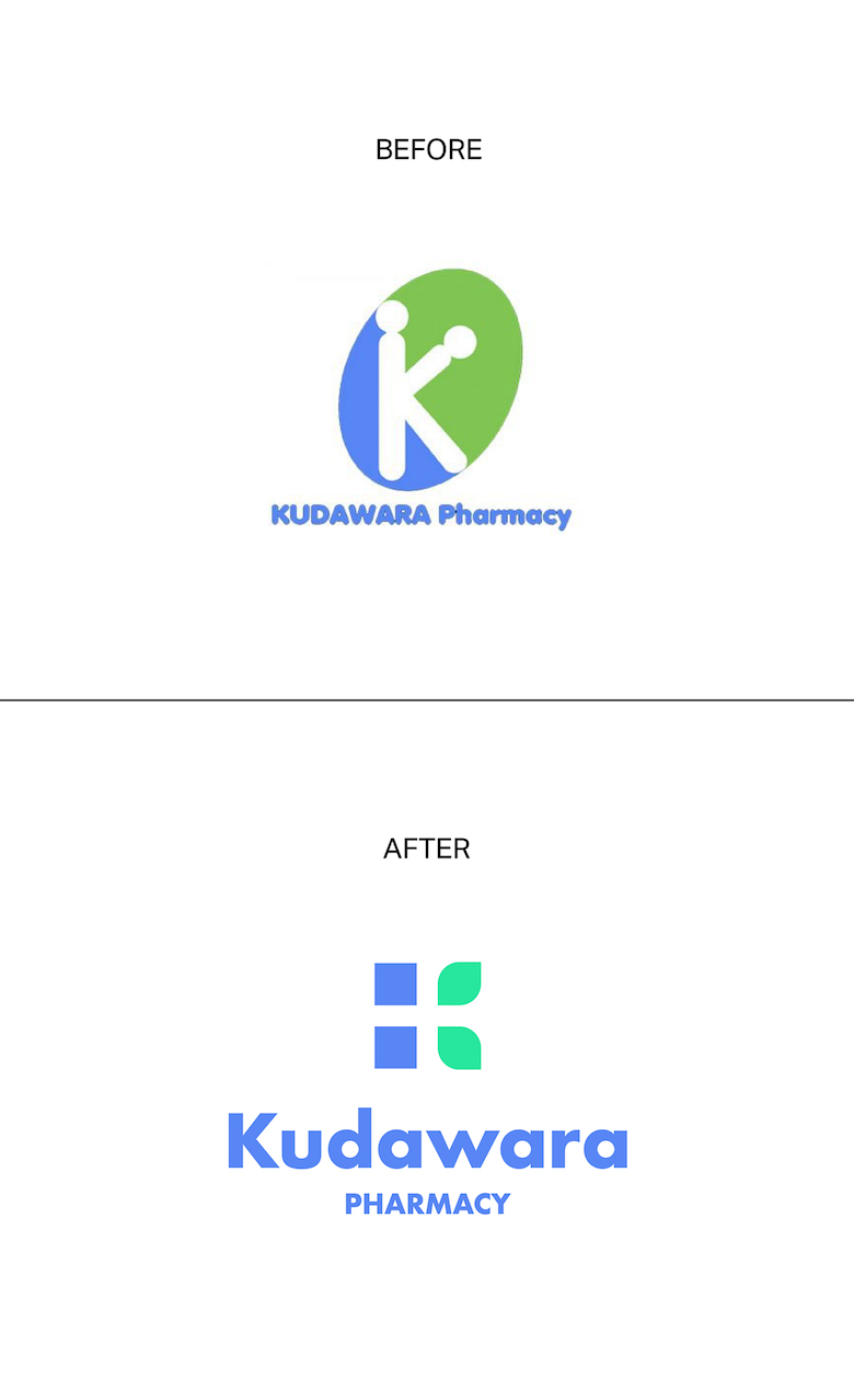
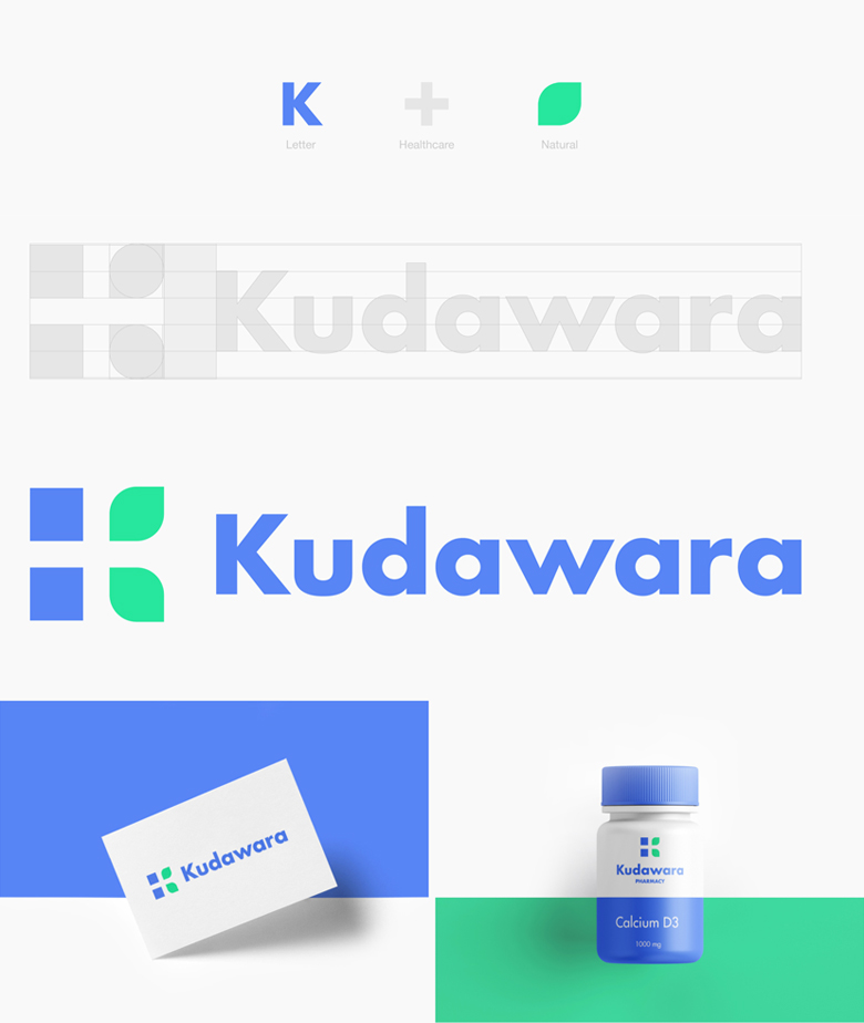
2. Kudawara Pharmacy
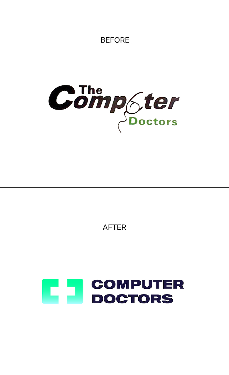
3. The Computer Doctors
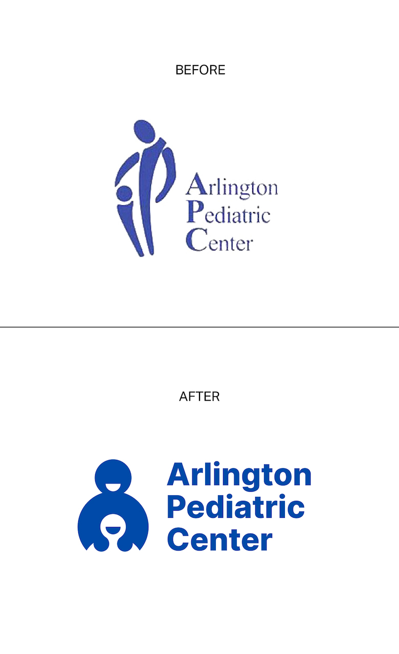
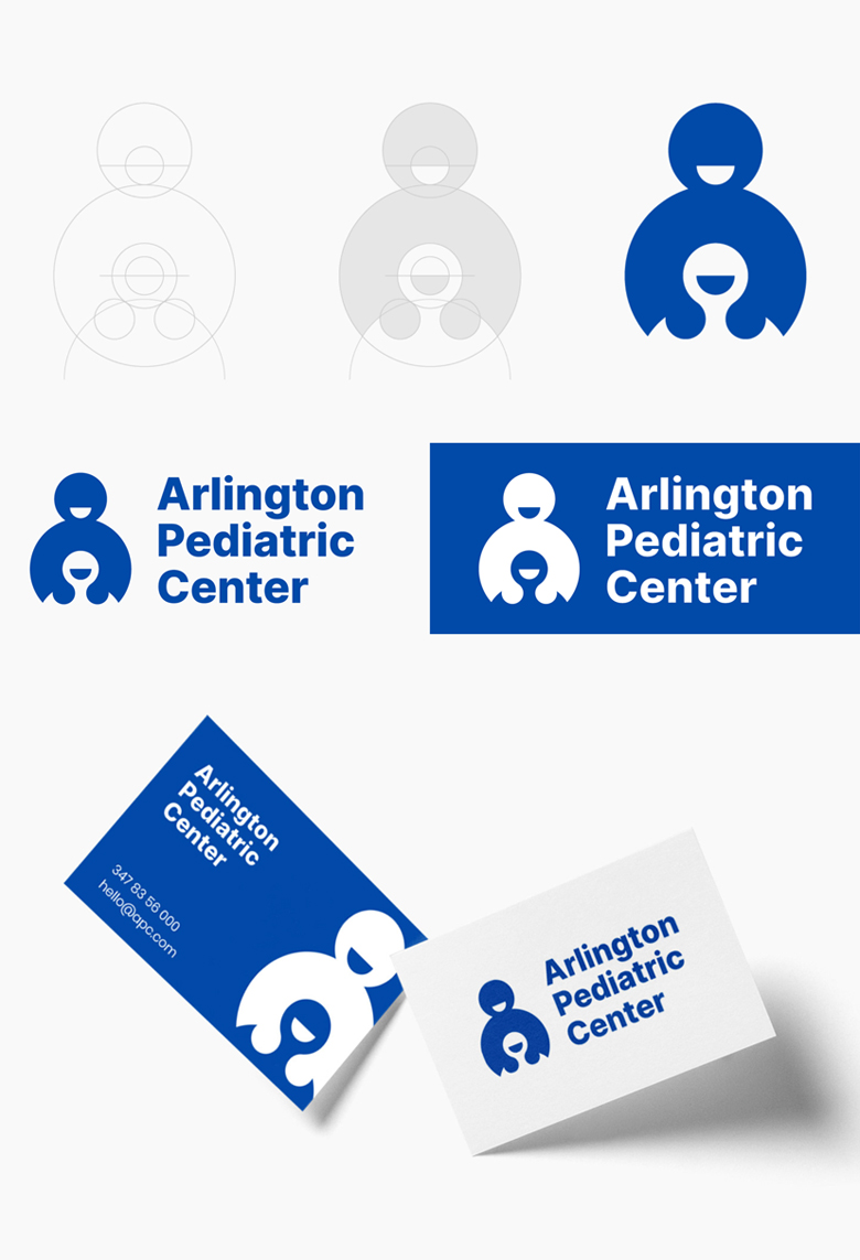
4. Arlington Pediatric Center
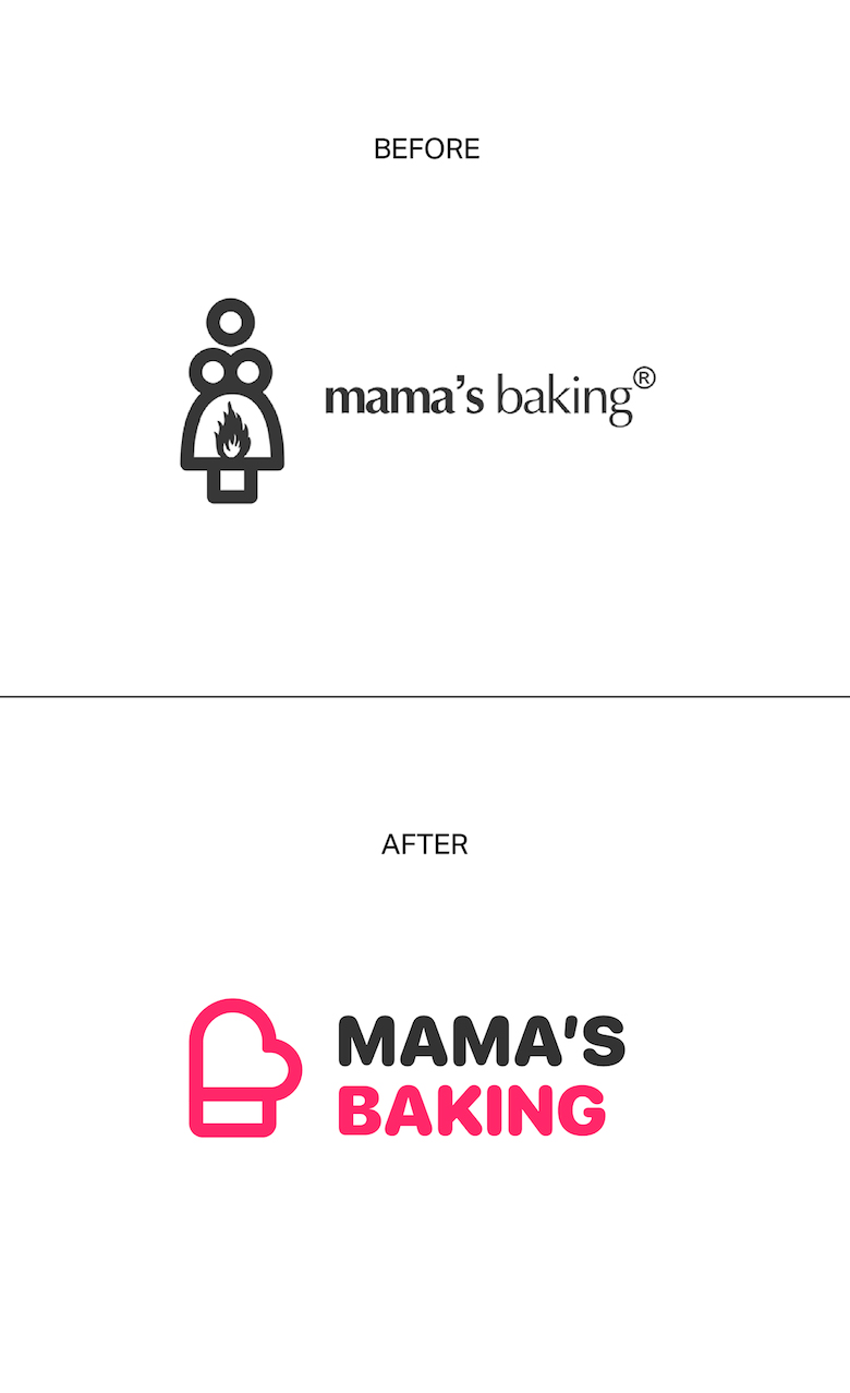
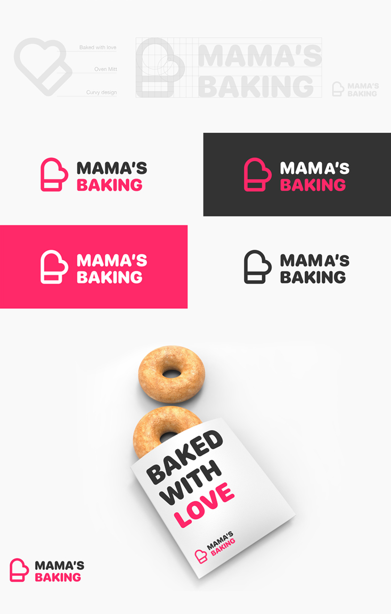
5. Mama’s Baking
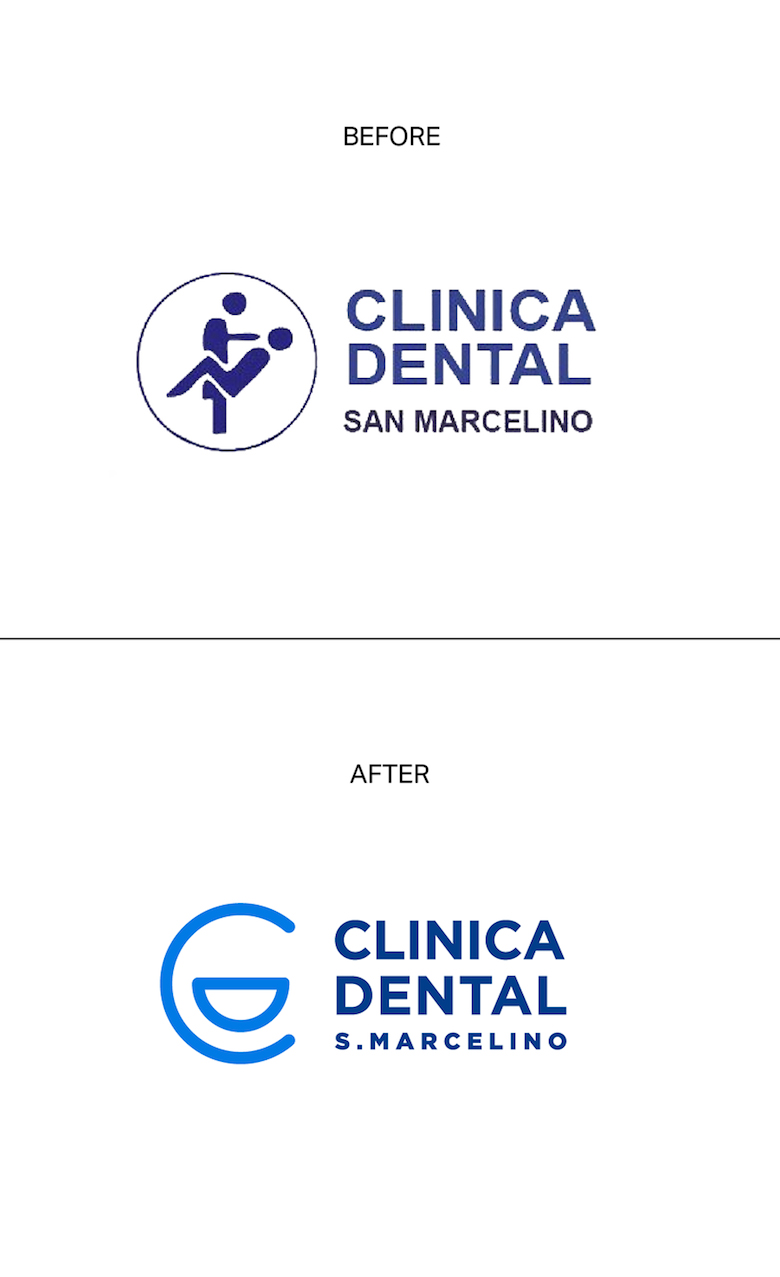
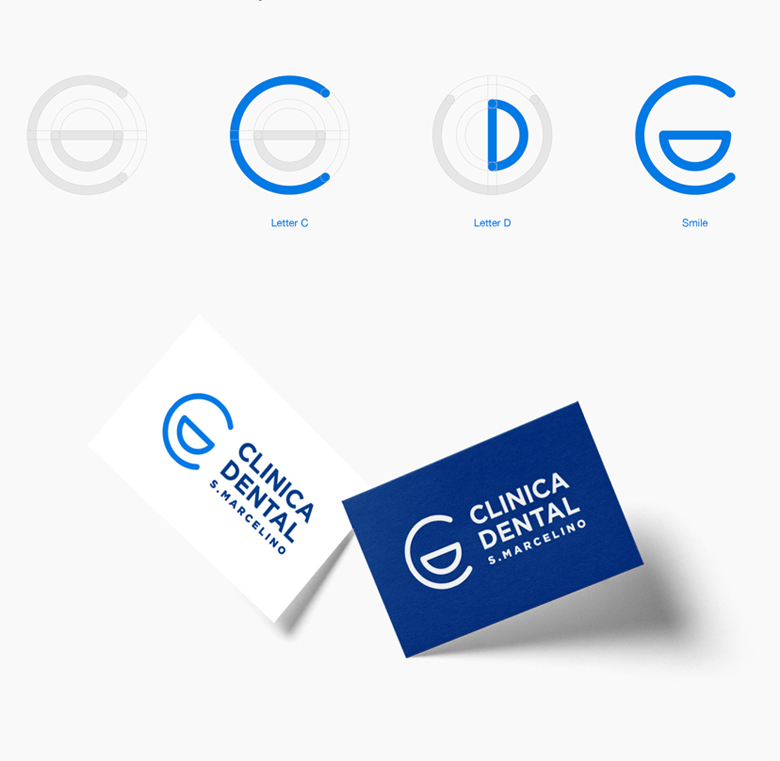
6. Clinica Dental
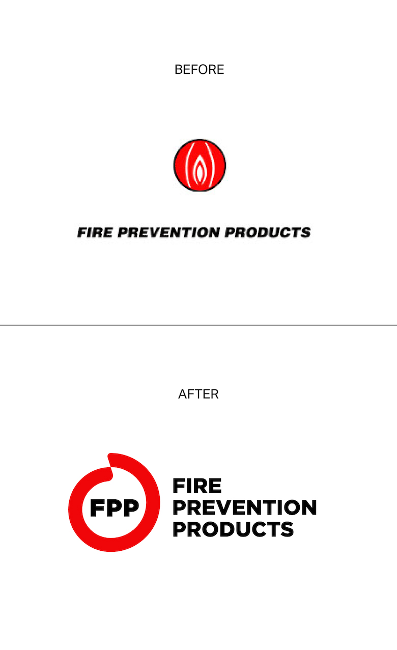
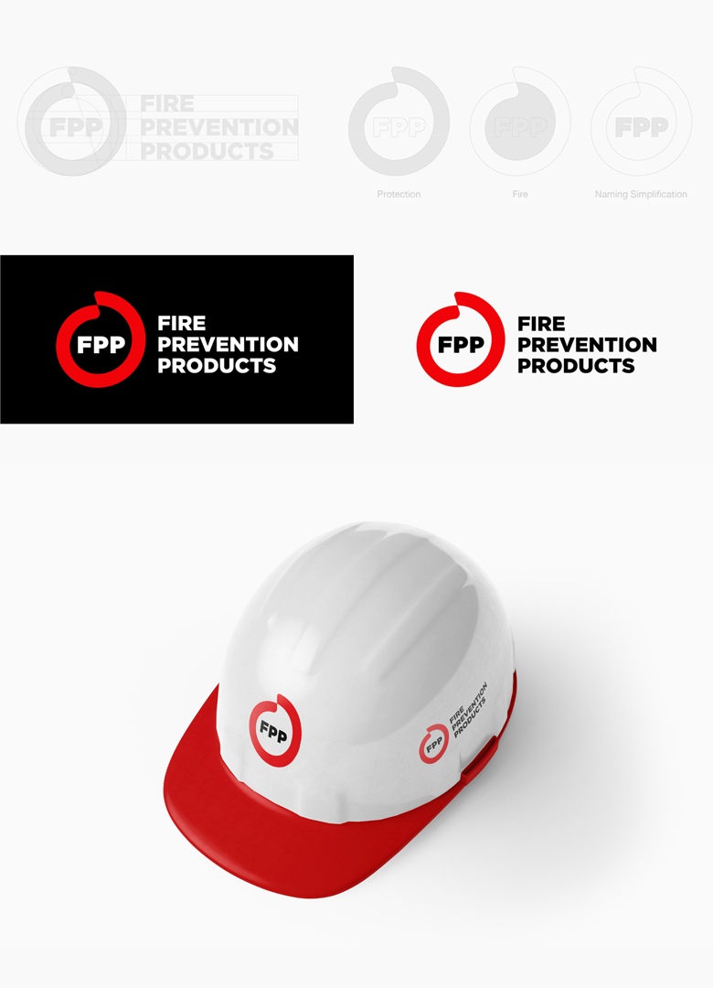
7. Fire Prevention Products
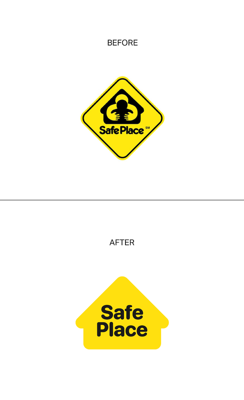
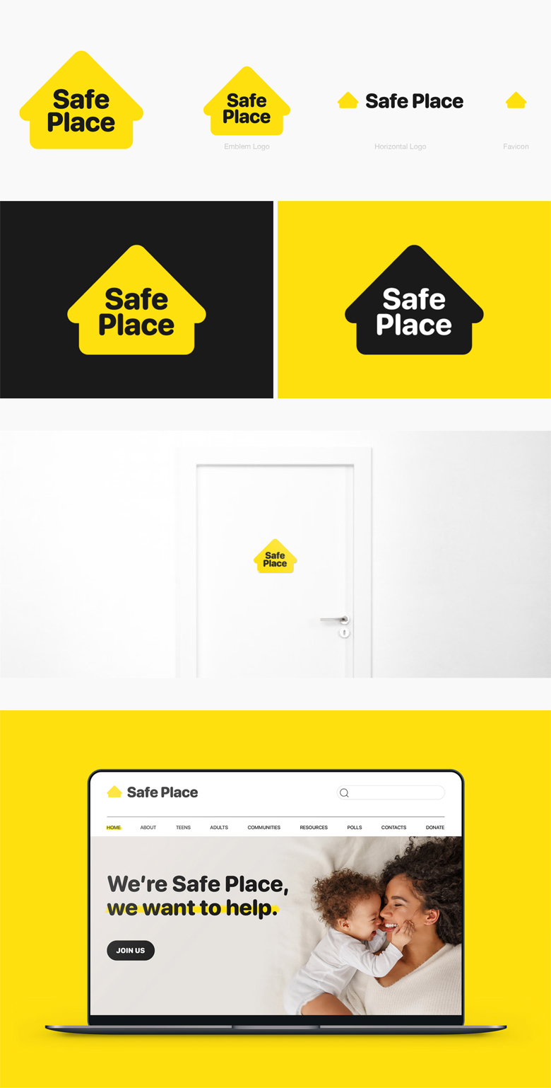
8. Safe Place
Safe Place is a national outreach program for youth in need of immediate help and safety.
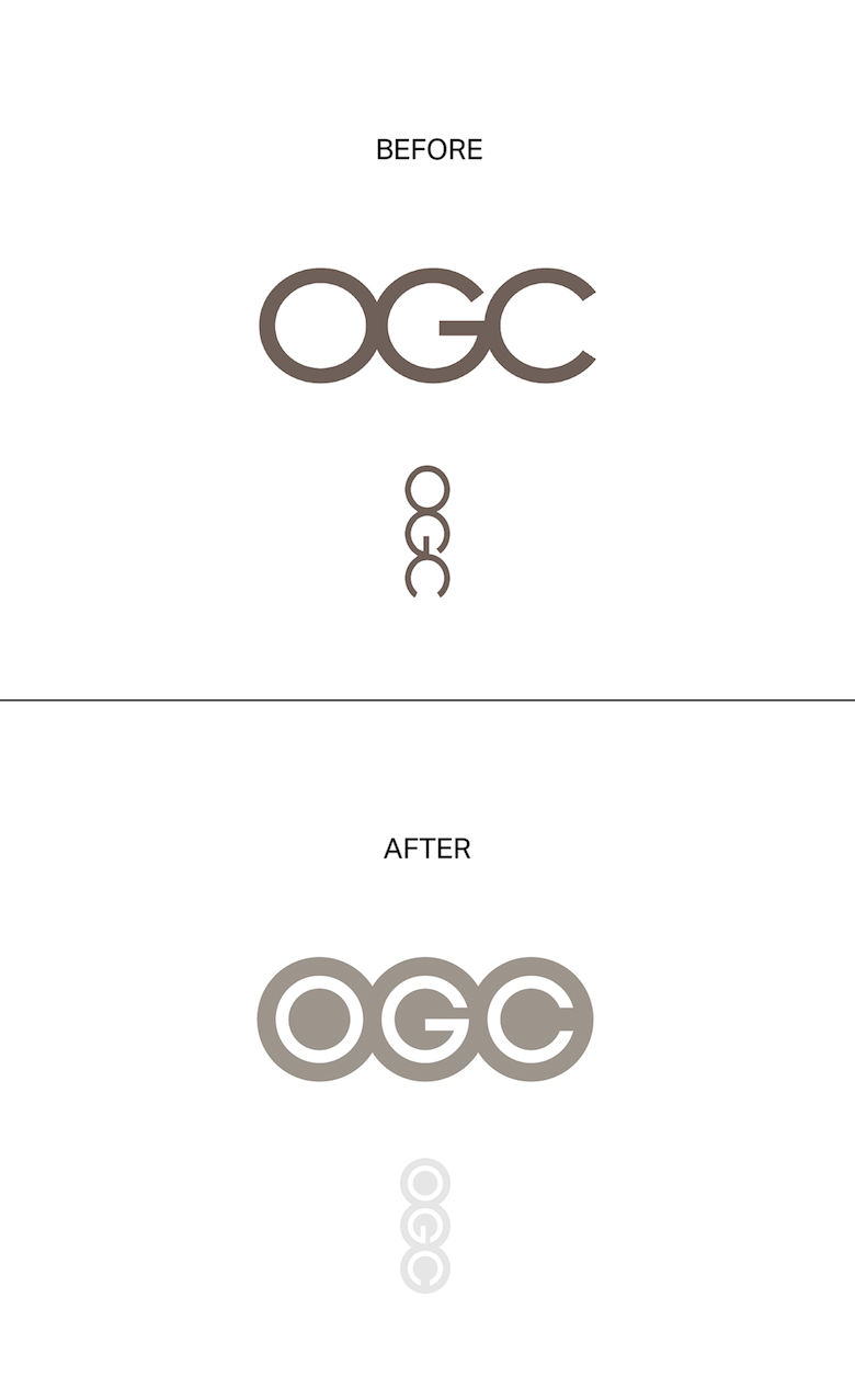
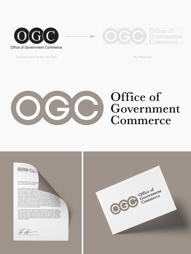
9. Office of Government Commerce
Every famous logo is one bad decision away from a fail list. Good identity design isn’t about avoiding mistakes entirely; it’s about catching them before the world does. That means looking at a mark upside down, at a distance, at the size of a favicon and through the eyes of someone who has never seen it before. And it never hurts to show it to the colleague with the dirtiest mind in the studio before it goes to print.
Share this post with a designer friend and tell us which logo you’d fix next, whether it’s one from this list or a famous brand you think has been getting away with it for years. Voice your views in the comments below.