How Cool Are These Beer Cans That Show The Pantone Color Of The Brew Inside?
Strip a beer of its logo, crest, founding date and medals, and it still tells you exactly what it is. Color was always the label.
Spanish designer Txaber built an entire packaging system around that idea. His Pantone color beer cans and bottles discard nearly every convention the category relies on and replace them with the exact color of the brew inside. The can becomes the swatch.
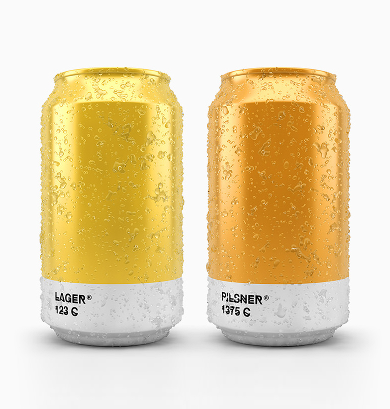
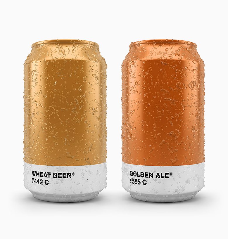
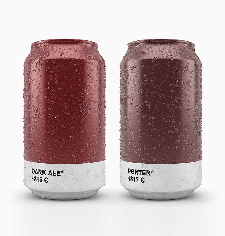
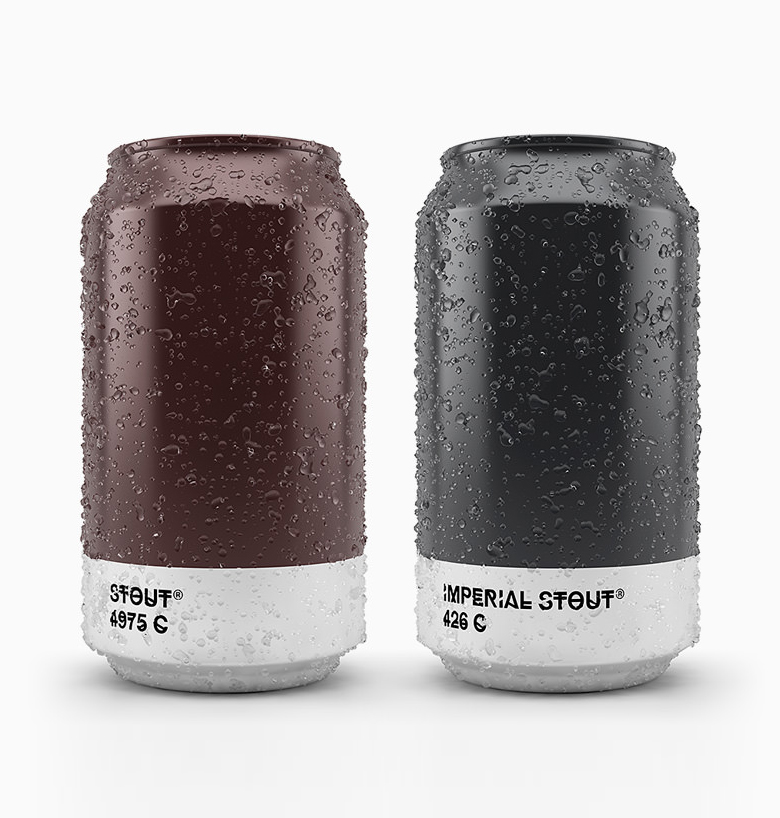
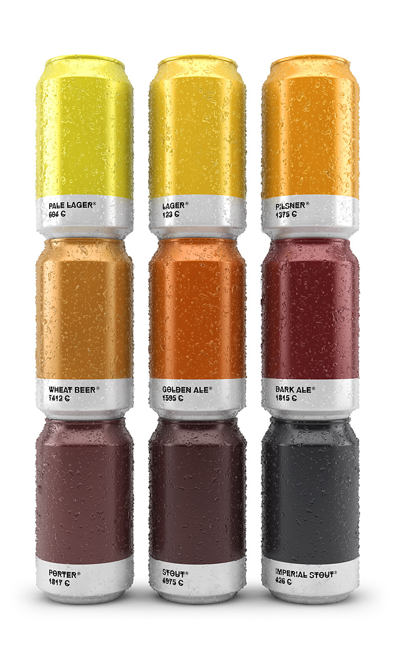
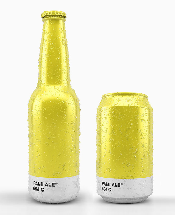
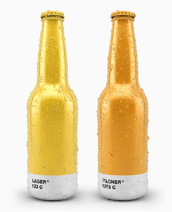
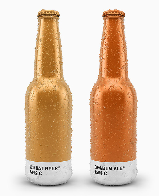
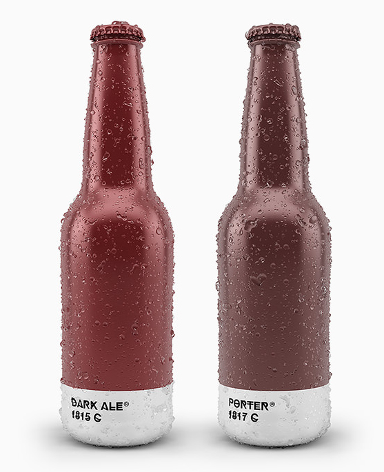
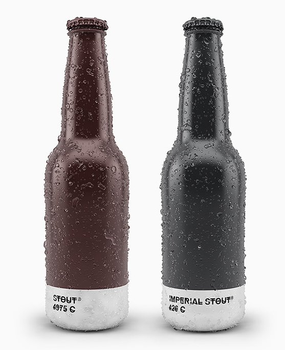
Each design follows the familiar Pantone format: a solid field of color, a white band at the base, the beer style in place of the color name, and its coated reference number underneath. Designers will recognize this minimalist beer packaging design instantly. Everyone else still understands the principle: the darker the can, the darker the beer.
Nine brews become nine color chips. The range runs from pale ale at 604 C down through lager, pilsner, wheat beer, golden ale, dark ale, porter and stout, ending with imperial stout at the near-black 426 C. The project won a Silver Pentaward in the Concept category.
It is an exceptionally clean idea. Whether it would work just as well on a crowded retail shelf is another question. First, take a look at the complete series.
1.
2.
3.
4.
5.
6.
7.
8.
9.
10.
Playing devil’s advocate, the typeface is the one element holding the concept back. Txaber chose Hipstelvetica, a deliberately blurred, hand-drawn take on Helvetica, and its softness works against the precision of everything around it. The Pantone system depends on typography that recedes and lets the color do the talking. Swap in Helvetica or Inter, and the illusion becomes complete.
There is a defense of the blur, though. Every can and bottle is photographed with beads of condensation, as though it has just been pulled from ice. In that wet, slightly out-of-focus world, the softened lettering makes visual sense. Whether that atmosphere is worth sacrificing the precision of the reference-book aesthetic is the more interesting argument.
As a design concept, it works. Whether it would survive on a real shelf is harder to answer. Remove the crest, founding date, medals and logo, and you also remove the visual shorthand shoppers use to identify a brand in seconds. The idea succeeds precisely because nothing is asking it to sell. A marketing team would immediately ask it to put everything back.
Share this with a designer or a beer lover, and tell us in the comments: would you actually buy the stout?