A logo redesign is one of the riskiest moves a brand can make. Get it right, and a company looks sharper, more confident and ready for its next decade. Get it wrong, and the internet will let you know within hours of the reveal.
History is full of both outcomes. Gap pulled its new Helvetica logo after barely a week of backlash in 2010. Tropicana’s minimalist redesign was followed by a reported 20% drop in sales before the old packaging returned. Kia’s 2021 wordmark sent so many people searching for a “KN car” that the confusion became a meme. Yet Google, Western Union and the Premier League each cut away the clutter and came out stronger, more flexible and better suited to the small screens where we now meet them most.
So what separates a great rebrand from a disastrous one? Two things: what a brand keeps, and what it has genuinely changed. The worst redesigns throw away the first and fake the second. The best protect the first and earn the second.
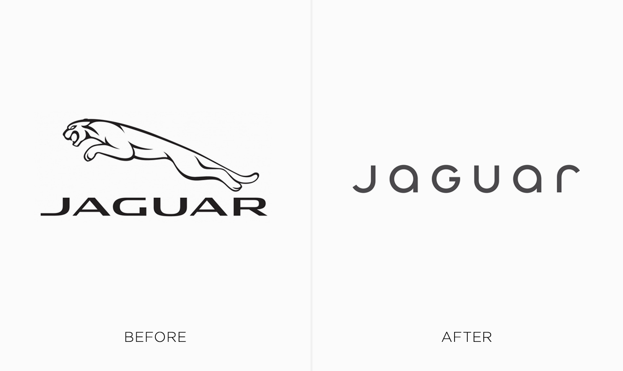
First, keep what people already recognise. Brand researcher Jenni Romaniuk calls these “distinctive brand assets”: the colours, shapes, symbols and characters people use to identify a brand without reading its name. They take decades to build, and a single launch can erase them. Tropicana’s orange with a straw in it was one, and when it disappeared, shoppers struggled to find the product on the shelf. Gap gave up its blue box. Jaguar retired the leaping cat. Compare that with Starbucks, which kept the Siren and removed everything around her, or the Premier League, which simplified its lion instead of dropping it. Successful rebrands are edits, not replacements.
Second, make sure something real has changed. A logo signals change; it can’t create it. Burger King’s retro redesign landed alongside a genuine push to remove artificial ingredients from its food, so the warmer, more honest look matched something customers could actually taste. Jaguar unveiled a new identity before it had a new car to show, so the logo had to carry the entire story by itself, and took every criticism of the strategy along with it.
Great rebrands refine what people already love; bad ones ask them to start over. Below, we’ve rounded up the best and worst logo redesigns of famous brands, with before-and-after comparisons side by side so you can judge for yourself. Some will have you nodding along. A few might make you wince.
The Worst Logo Redesigns:
1. Jaguar
In 2024, Jaguar swapped its capitalised wordmark and famous leaping cat for a mixed-case “JaGUar” logotype, moving a redrawn leaper into a supporting role. The launch campaign showed models in bright outfits but not a single car, and it arrived while Jaguar had no new models on sale. With nothing to anchor it, the logo had to explain the whole reinvention by itself, and most people saw a luxury carmaker walking away from the one symbol everyone recognised.
2. Gap
In October 2010, Gap replaced its blue box, which had been in use for two decades, with a Helvetica wordmark and a small gradient square. The backlash was immediate, and Gap made it worse by asking the public to submit their own designs. About a week later, the blue box was back. It’s still the textbook example of a brand underestimating how attached people are to a familiar mark.
3. Tropicana
Tropicana’s 2009 redesign went far beyond the logo. The new cartons dropped the orange with a straw in it, the image shoppers relied on to spot the brand in the aisle, and replaced it with a generic glass of juice. Sales reportedly fell 20% in under two months, and PepsiCo brought the old packaging back. Tellingly, when Tropicana refreshed its identity again in 2024, the orange and straw returned.
4. Burberry
In 2018, Riccardo Tisci and designer Peter Saville replaced Burberry’s elegant serif wordmark and Equestrian Knight with a heavy sans-serif. It was quickly grouped with a wave of luxury houses, including Balenciaga and Celine, that had adopted near-identical bold sans logos, a trend critics nicknamed “blanding.” Five years later, under creative director Daniel Lee, Burberry brought the knight back.
5. Baskin Robbins
Baskin-Robbins’ 2022 rebrand, its first in two decades, kept the hidden “31” inside the BR monogram but replaced the playful, tilted lettering with a heavier, more serious typeface and swapped the familiar blue for chocolate brown. The aim was to make the brand feel more grown-up, and it does. But for a brand built on fun, much of the charm that made the old logo so instantly likeable was lost in the process.
6. Pepsi
Pepsi’s 2008 “smile” globe, designed by Arnell Group, is remembered less for the design than for the document behind it. Titled “Breathtaking,” it connected the tilted white band to the Mona Lisa, the golden ratio and the Earth’s magnetic field, and was mocked across the industry after it leaked. Pepsi eventually returned to a bolder, more confident globe in 2023, which you’ll find on our best list below.
7. Nokia
Nokia unveiled its first new logo in decades at Mobile World Congress in 2023, signalling its shift from phones to networks and enterprise technology. The strategy made sense, but the fragmented letterforms drew criticism for poor legibility and comparisons with Kia’s similarly abstract wordmark. In one consumer test, respondents still rated the classic logo as more likeable and more trustworthy.
8. Johnson & Johnson
In 2023, Johnson & Johnson retired the script logo it had used since 1887, based on co-founder James Wood Johnson’s signature and one of the longest-running corporate emblems in the world. The reasoning was sound: after spinning off its consumer business as Kenvue, J&J became a pharmaceutical and medtech company. But the replacement is a clean, capable sans-serif that could belong to almost any healthcare firm, a steep price for more than 130 years of heritage.
9. Kia
Kia’s 2021 wordmark was designed to flow like a handwritten signature, but the letters run together so tightly that the “IA” reads as an “N.” Searches for a “KN car” reportedly reached tens of thousands a month in the US. To be fair, Kia’s sales haven’t suffered. But a logo that needs to be explained isn’t doing its most basic job.
10. Fanta
Fanta’s 2023 redesign, by Coca-Cola’s design team and Jones Knowles Ritchie, gave the brand its first single global logo and removed the orange and leaf so the mark could work across every flavour. The logic is understandable, but orange is the flavour and colour most people associate with Fanta. Without it, what’s left is a bold but anonymous blue shape that could belong to almost anything.
11. Twitter
In July 2023, Elon Musk replaced the Twitter bird, one of the most recognisable icons on the internet, with an “X” that critics noted closely resembled a standard Unicode character. The change came together within days and arrived with little explanation, discarding a name that had become an everyday verb. Years later, most people still call it Twitter.
The Best Logo Redesigns:
1. Premier League
Ahead of the 2016/17 season, as Barclays’ title sponsorship came to an end, the Premier League worked with DesignStudio to crop its crowned lion down to a bold head-and-mane icon and drop the ball from under its paw. Nothing people recognised was lost: the lion and crown stayed, just simplified. The result works equally well as an app icon, a sleeve badge or a broadcast graphic, and it gave the league an identity that no longer depended on a sponsor’s name.
2. Western Union
In 2019, Western Union retired the boxed wordmark it had relied on for decades and replaced it with a confident yellow “W” symbol next to a clean sans-serif. Importantly, it kept the black and yellow that customers already recognise from agent counters worldwide. The new mark feels at home on a phone screen, which matters for a 170-year-old company competing with digital-first money transfer apps.
3. US Open
Designed by Chermayeff & Geismar & Haviv in 2018, marking 50 years of the Open Era, the new logo replaced a flaming gold ball and serif type with a bold italic wordmark and a ball trailing speed lines. The fire became motion, so the idea of energy survived while the clip-art feel disappeared. It’s punchy enough for broadcast and simple enough to work at any size.
4. Starbucks
For its 40th anniversary in 2011, Starbucks removed its name and the outer ring entirely, freeing and enlarging the Siren. It was a bold call, but one the brand had earned: the Siren was already instantly recognisable, and dropping “Coffee” gave Starbucks room to grow beyond coffee. It remains a textbook example of trusting the most distinctive asset you own.
5. Google
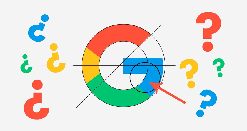
In 2015, Google replaced its serif wordmark with a custom geometric sans-serif while keeping its familiar four-colour sequence. The redesign was built for a world of phones, watches and tiny screens, where the old serifs struggled to stay crisp. It looked friendlier, scaled far better, and still read unmistakably as Google.
6. Burger King
In 2021, Burger King and Jones Knowles Ritchie replaced the glossy blue swoosh of the late ’90s with a warm, flat logo based on the bun-halves design the brand used from 1969 to 1999. The retro move worked because it matched a real change: Burger King had been removing artificial colours, flavours and preservatives from its food. The logo looks more honest because the promise behind it was real.
7. Switzerland Tourism
In 2024, Switzerland Tourism retired the golden edelweiss it had used for nearly 30 years and introduced a wordmark in which the Swiss cross replaces the “t.” The old flower was loved at home but meant little to many visitors abroad. The new mark uses the country’s most recognisable symbol, works seamlessly across digital platforms, and gives the entire Swiss tourism industry one brand to share.
8. US Soccer Federation
U.S. Soccer’s 2016 crest, developed with Nike, replaced a 1990s-era badge known for its flying soccer ball and cartoonish styling. The new design places “USA” front and centre above 13 red stripes and draws on the federation’s centennial crest, which fans had already embraced. Stars now appear above the crest only for World Cup wins, so they signal achievement rather than decoration.
9. Pepsi
Pepsi’s 2023 redesign corrected the 2008 “smile” from our worst list. It placed the wordmark back inside the globe, revived the bold, confident spirit of the logo many Pepsi drinkers grew up with, and added black and an electric blue to support its zero-sugar push. Sometimes the strongest step forward is reclaiming what you already owned.
10. eBay
eBay’s 2012 update kept everything people recognised, including the lowercase name and the four colours, and removed what had aged: the overlapping, bouncing letters of the dot-com era. With the letters now sitting on a single baseline, the logo feels cleaner and more trustworthy while staying instantly identifiable. It’s an edit, not a replacement, and that’s exactly why it worked.
11. Bolt
This is Bolt the one-click checkout platform, not the ride-hailing app. In 2023, Koto merged Bolt’s separate lightning-bolt icon and wordmark, hiding the bolt in the negative space between the “L” and the “T,” and replaced the category’s standard blue with an electric “Lightning Yellow.” The original symbol survived, now executed more cleverly, and the brand stands out in a sea of near-identical blue fintech identities.
12. Olive Garden
Olive Garden’s 2014 redesign was widely mocked at launch, with critics calling it flat and generic. But it replaced a dated, textured sign with a cleaner script and an olive branch that finally connected the logo to the name, where grapes had stood before. More than a decade later, when the chain swapped its Facebook profile picture for a minimalist “OG” monogram, customers rushed to defend the very logo critics had once ridiculed. Sometimes a rebrand just needs time.
Share this post with a designer friend and settle it in the comments: which redesign on our worst list would you defend, and which “best” do you think we got completely wrong?