• Home
  • Design
  • Advertising
  • Inspiration
  • Tools
  • Buzz
  • Follow Us ▾
    • Facebook
    • Facebook Group
    • LinkedIn
    • LinkedIn Group
    • Threads
    • Instagram
    • Pinterest
    • Twitter / X

Digital Synopsis

Design, Advertising & Creative Inspiration

  • Photoshop
  • Logo Design
  • UI/UX
  • AI
  • Web Design
  • Typography
  • Photography
  • About Us
  • Advertise

7 Useful Tips To Help You Create Beautiful Gradients

Gradients are a popular trend in graphic, web, and UI design nowadays, widely used in apps, websites, logos, illustrations, packaging, and more. However, the use of gradient as a design element can be tricky. If overdone, it can look tacky and cheap.

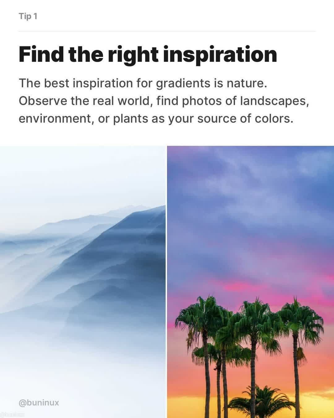
One of the best ways to find inspiration is to observe nature – the sky, sunsets, plants, landscapes, etc. Find the right mood for your gradient and then extract the colors. Also pay attention to the light source, direction, and text legibility.

Saint-Petersburg based UX Designer Dmitriy Bunin has come up with an excellent list of tips and tricks to help you create beautiful, effective gradients. Check them out below.

How to Design Sexy Gradients - Tips & tricks to help you make beautiful gradients


1.


2.

Tip 2 - Create your palette


3.

Tip 3 - Blend chosen colors


4.

Tip 4 - Use radial gradient to add depth to a linear scale


5.

Tip 5 - Use gradient direction that makes sense


6.

Tip 6 - Add noise to make it strike


7.

Tip 7 - Combine gradients with abstract shapes

SEE MORE DESIGN TIPS …

Share this post with a designer friend and voice your views in the comments below.

Don't Miss:

  • how-to-create-better-gradients
    6 Useful Tips To Help You Create Better Gradients
  • beautiful-gradient-color-palettes
    37 Beautiful Color Gradients For Your Next Design Project
  • beautiful-gradient-logo-designs
    31 Beautiful Gradient Logos For Design Inspiration
  • color-gradient-everyday-objects-photography
    Beautiful Images Of Everyday Objects Organized By Color
  • gradient-studies
    Designer Uses Beautiful Gradients And Abstract Shapes To Describe Meanings Of Words
  • copy-color-and-tone-of-an-image-in-photoshop
    How To Copy Colors From An Image And Apply Them On Another Image In Photoshop

Share Your Views:

Comments for this post are now closed.
Share your thoughts with 433,000+ design lovers on our Facebook Page.

Popular

  • Graphic Designer Fixes The 9 Worst Logos Ever
  • 50 Incredibly Creative Logos With Hidden Meanings
  • 11 Best And Worst Redesigns Of Famous Logos
  • Top 10 Netflix Documentaries For Graphic Designers
  • 11 Differences Between Designers And Clients

TRENDING

  • Top 20 Graphic Design Trends For 2026
  • Top 10 Logo Design Trends For 2026 And How To Use Them
  • Portfolios Of Designers Who Have Worked At Apple, Google, Meta, And More
  • Designers Are Sharing Their Redesigns Of Famous Logos And Some Of Them Are Better Than The Original
  • “Which Current Graphic Design Trend Will Age Badly?” – Here Are The Top Replies

Follow Us On

  • Facebook
  • Facebook Group
  • LinkedIn
  • LinkedIn Group
  • Threads
  • Instagram
  • Pinterest
  • X / Twitter

Copyright © 2012-2026 Digital Synopsis | Privacy Policy | Affiliate Disclosure | Advertise With Us