Japanese Artist Turns Product Packaging Into Amazing Artworks
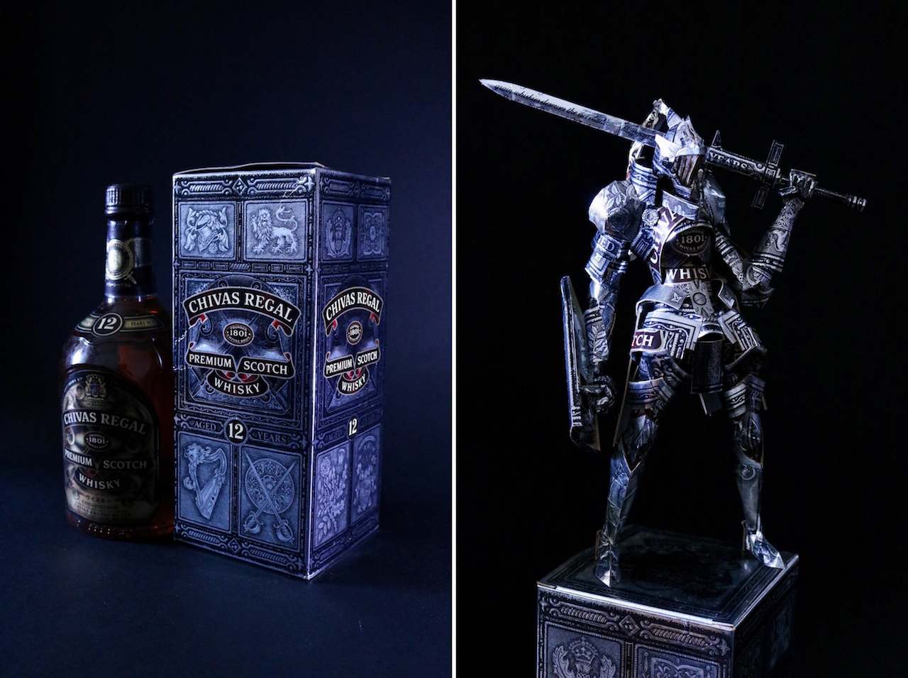
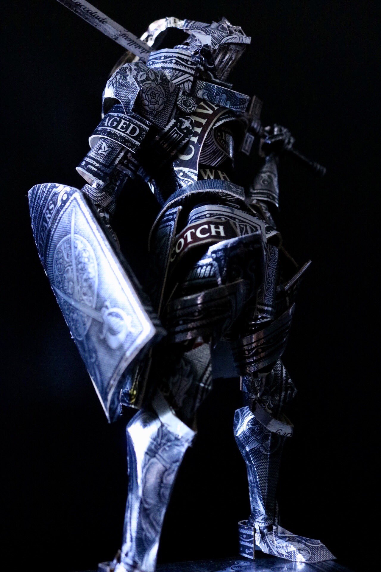
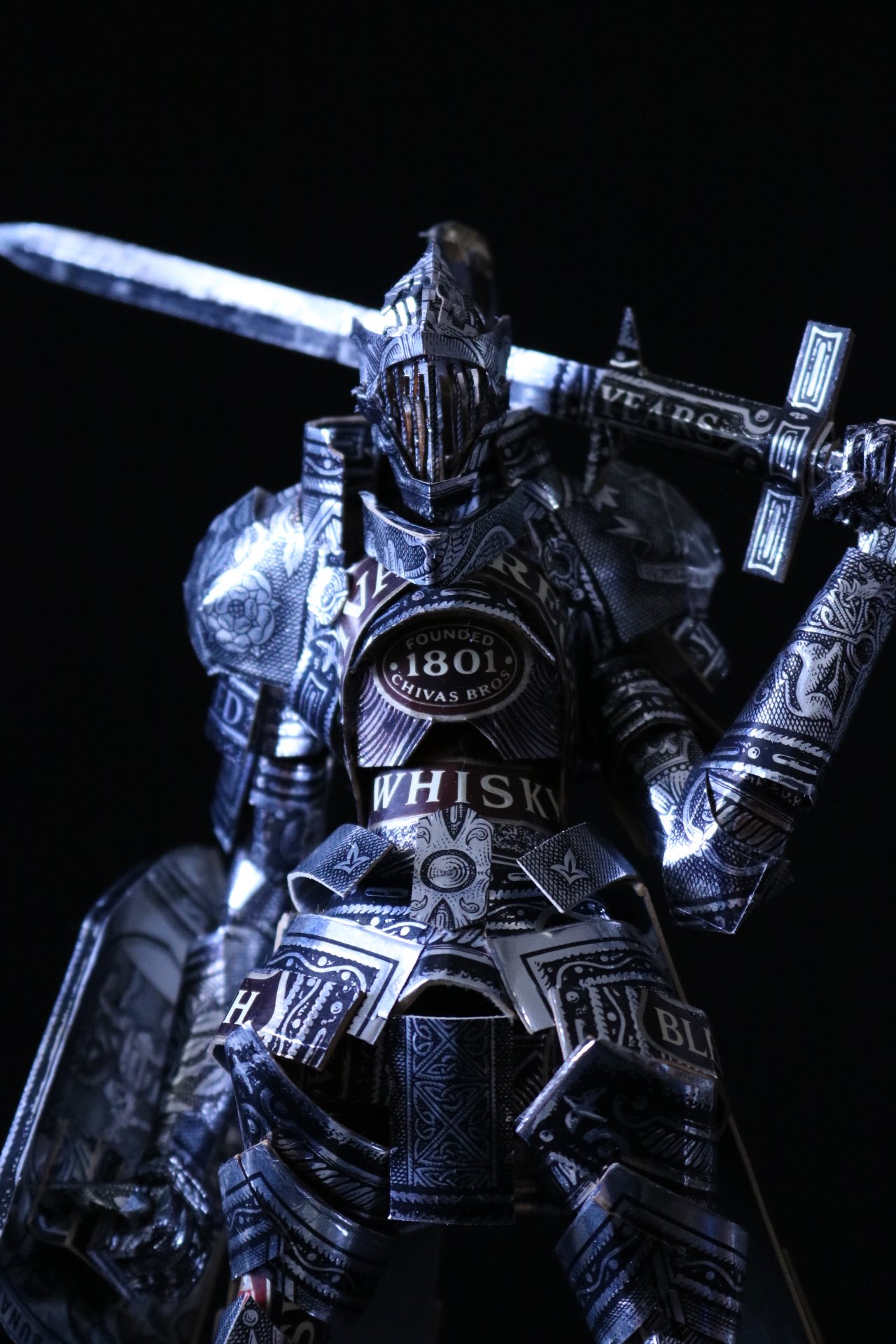
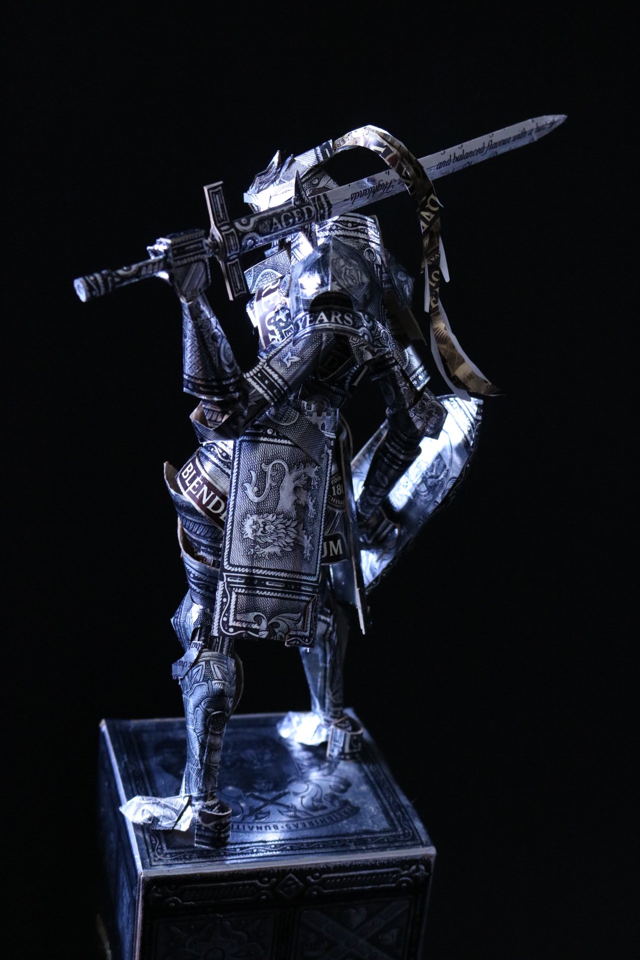
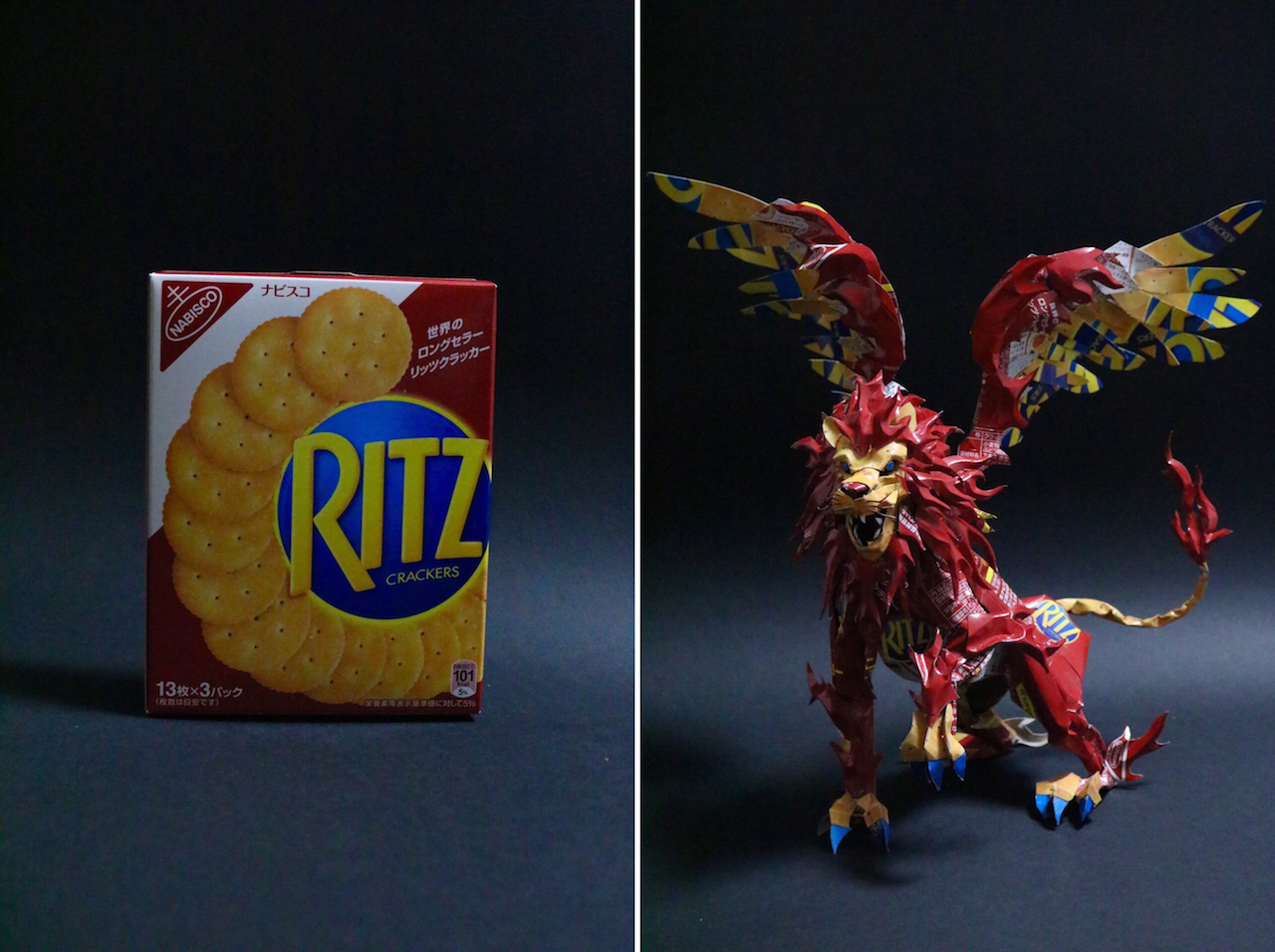
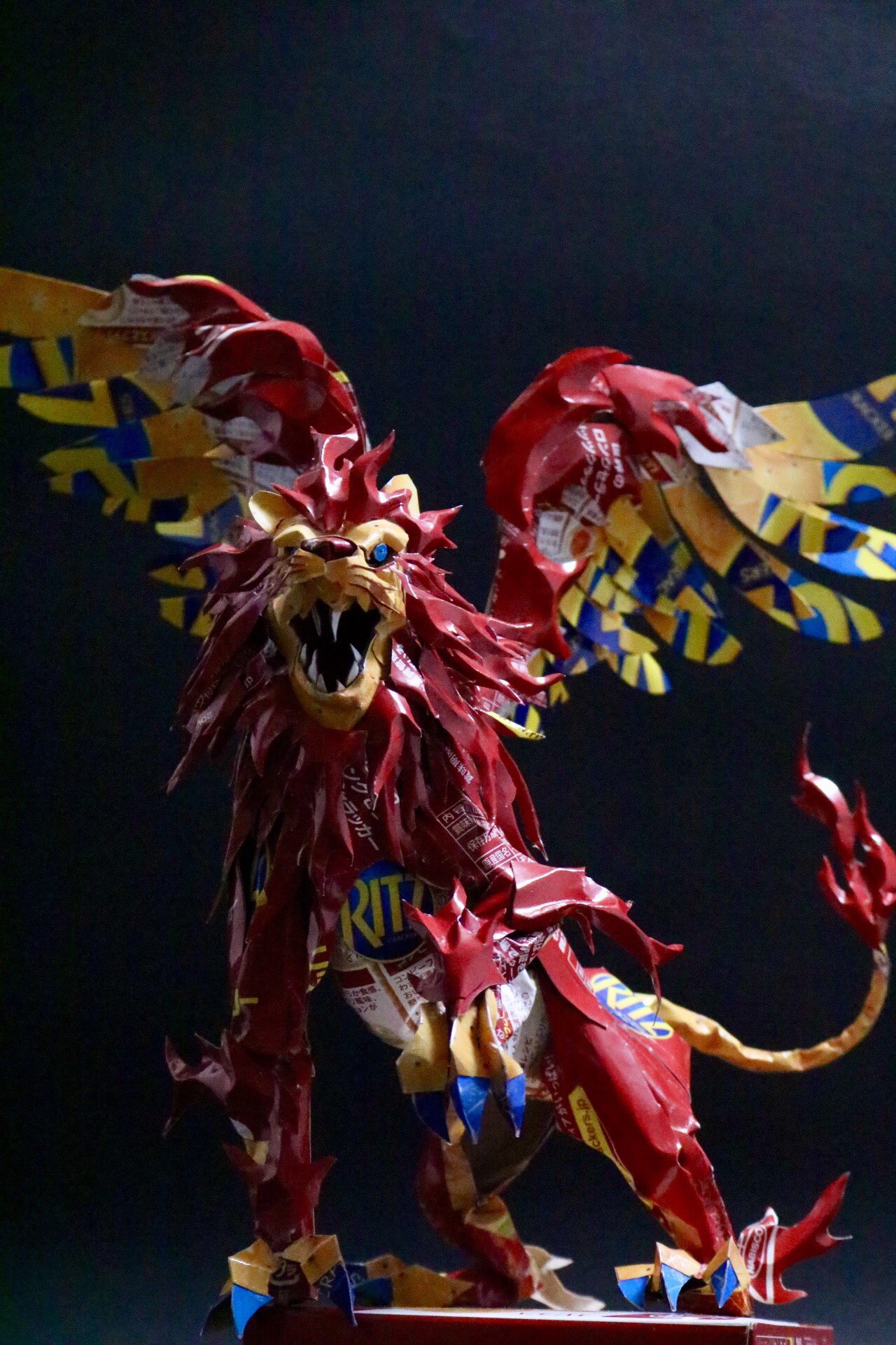
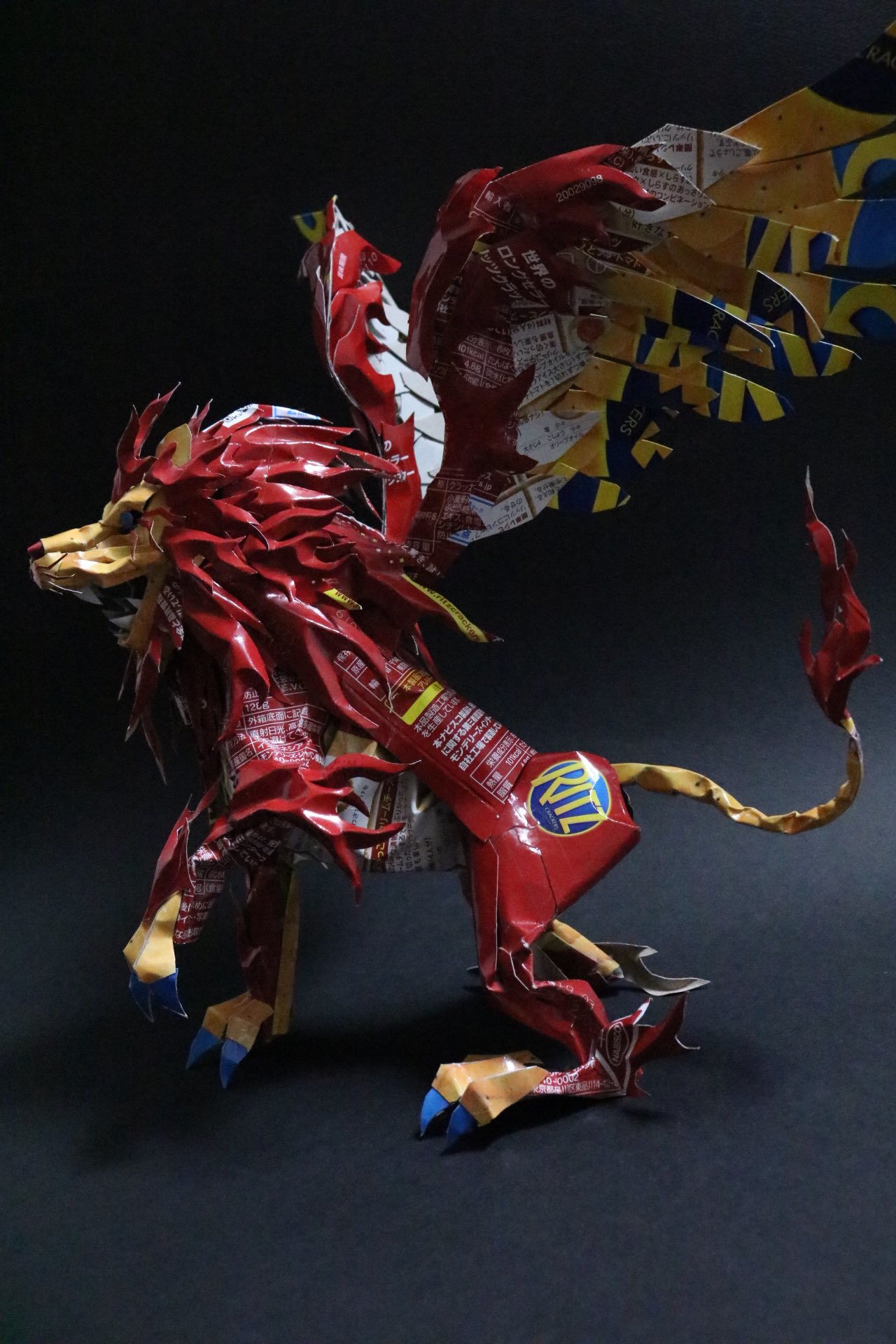
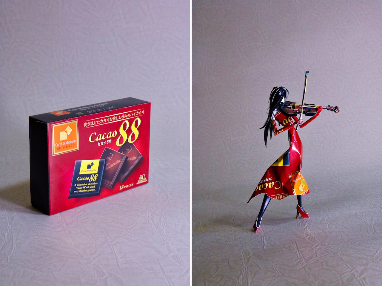
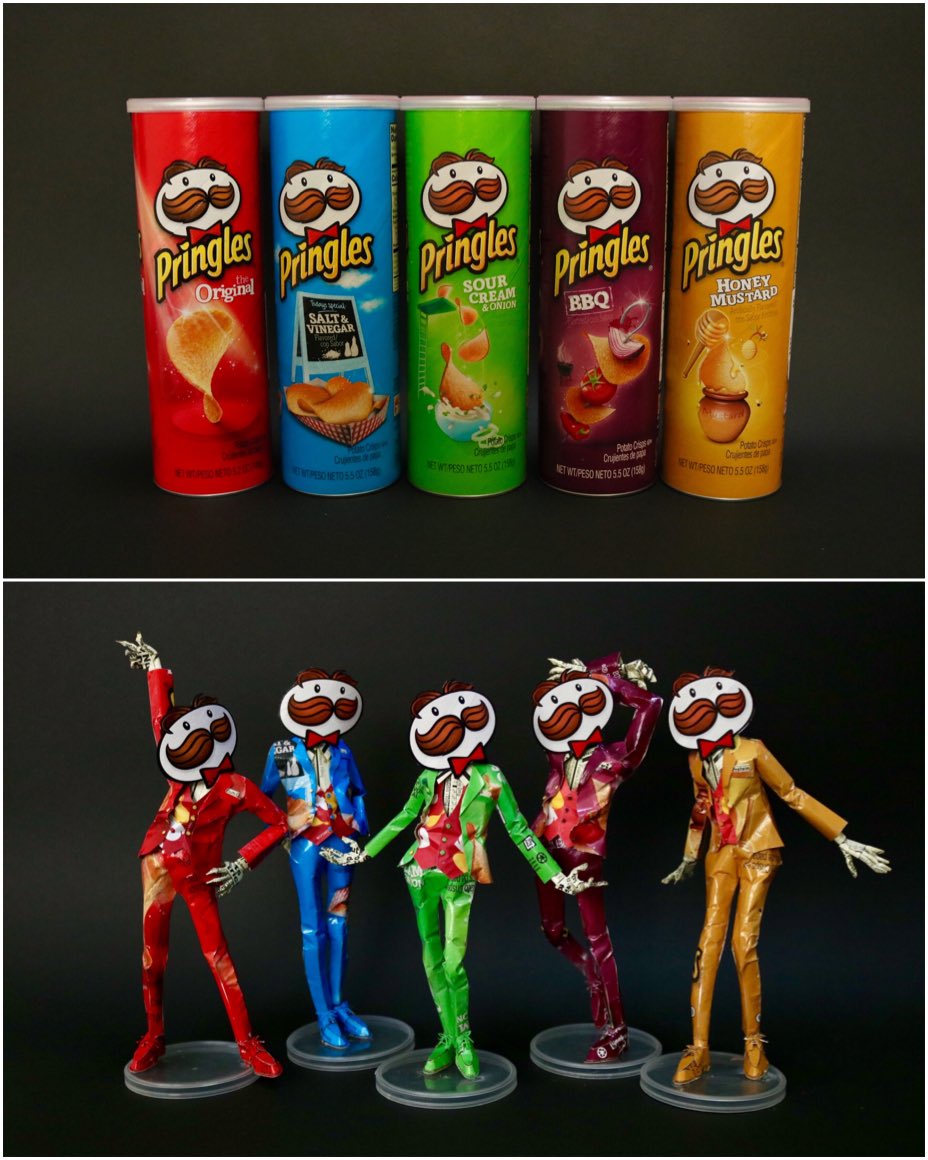
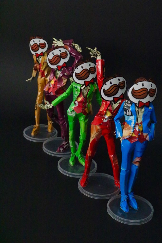
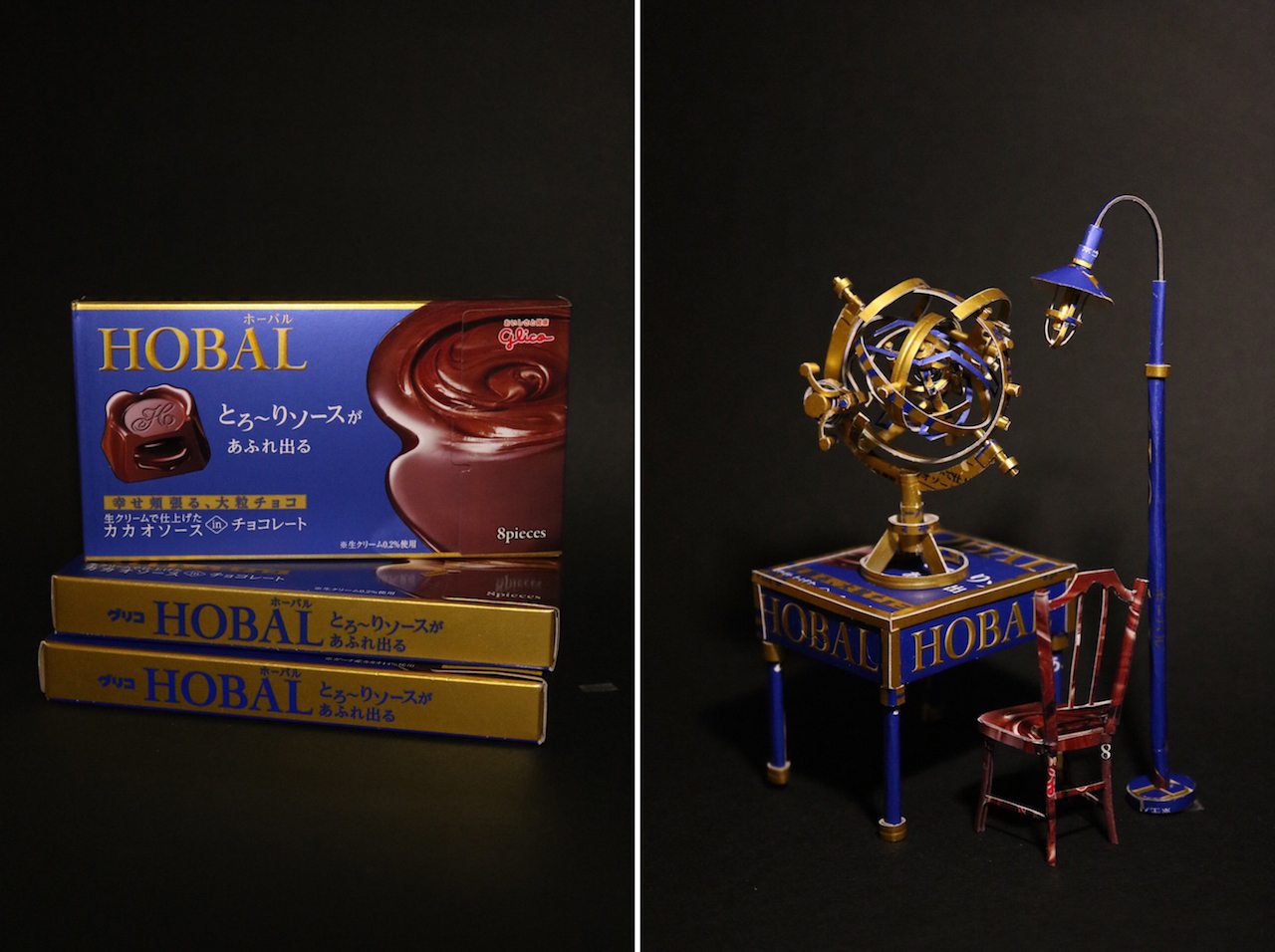
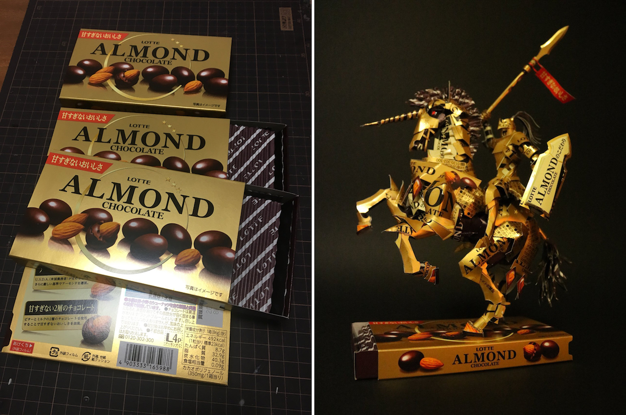
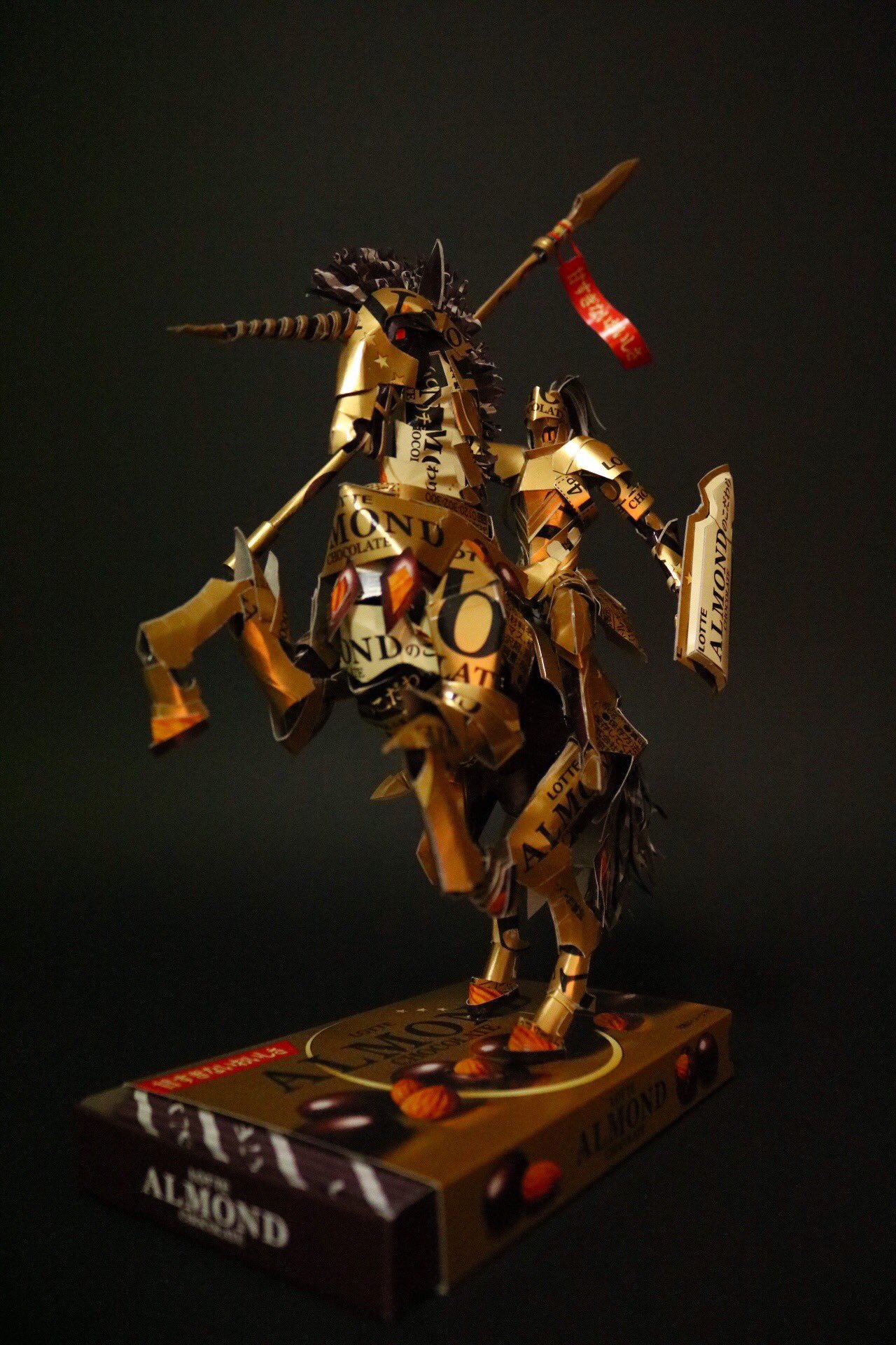
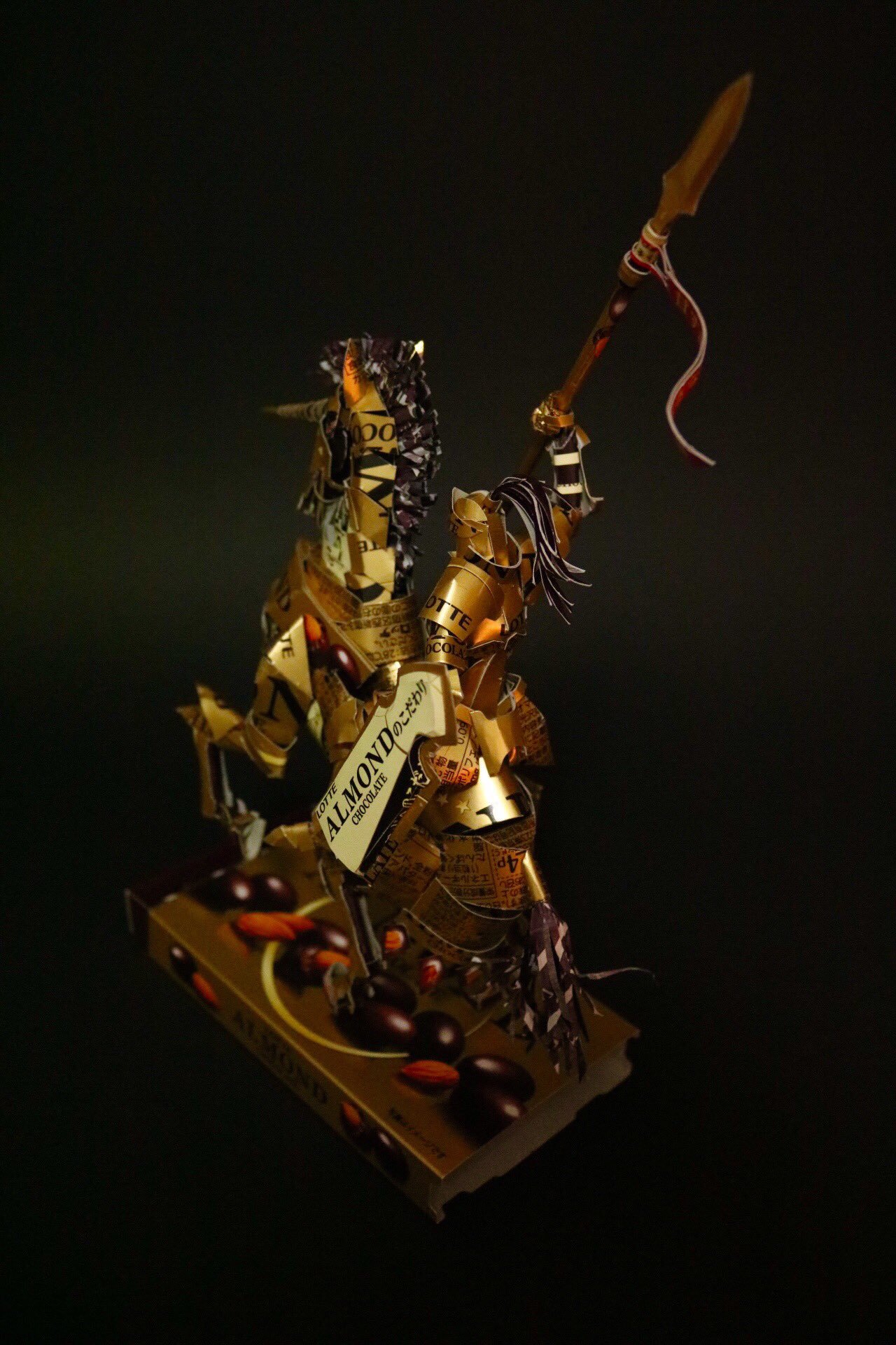
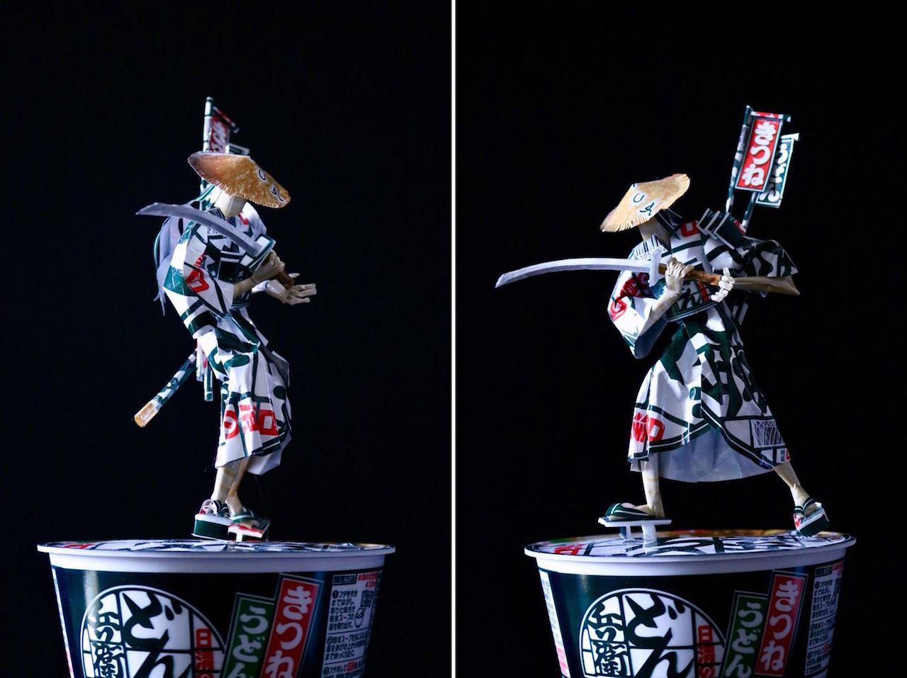
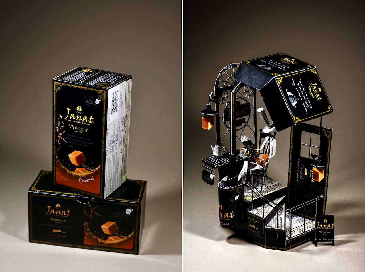
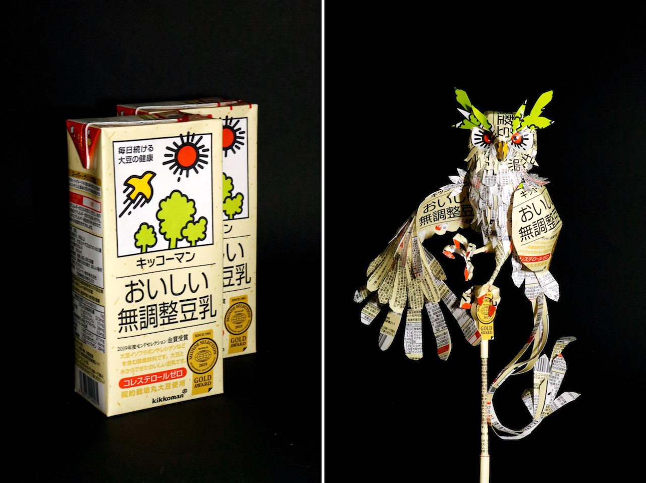
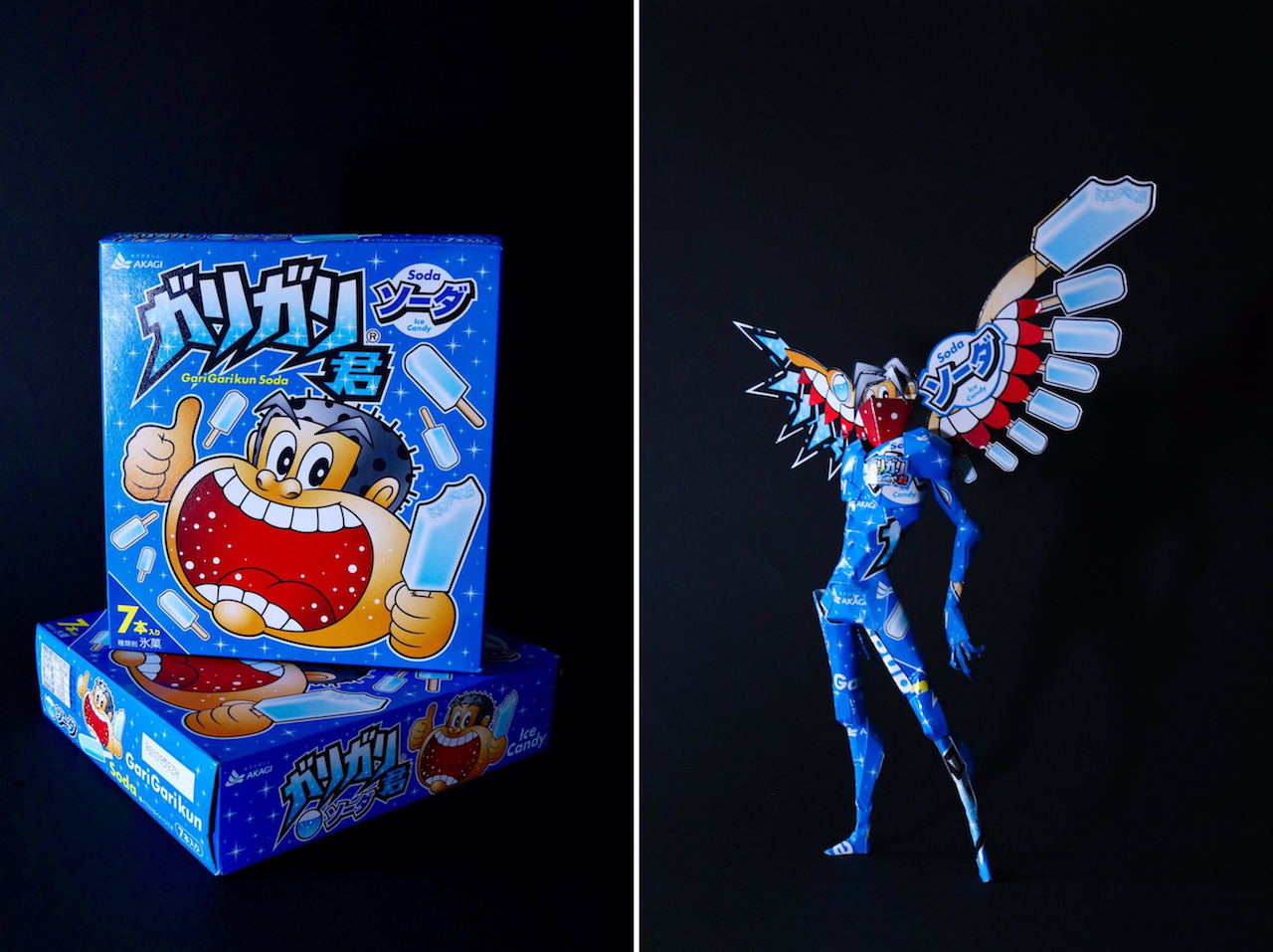
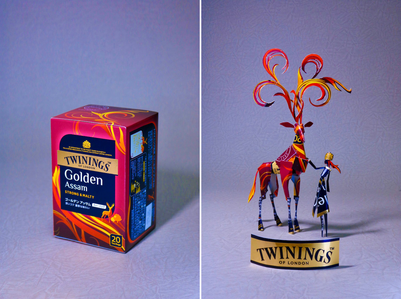
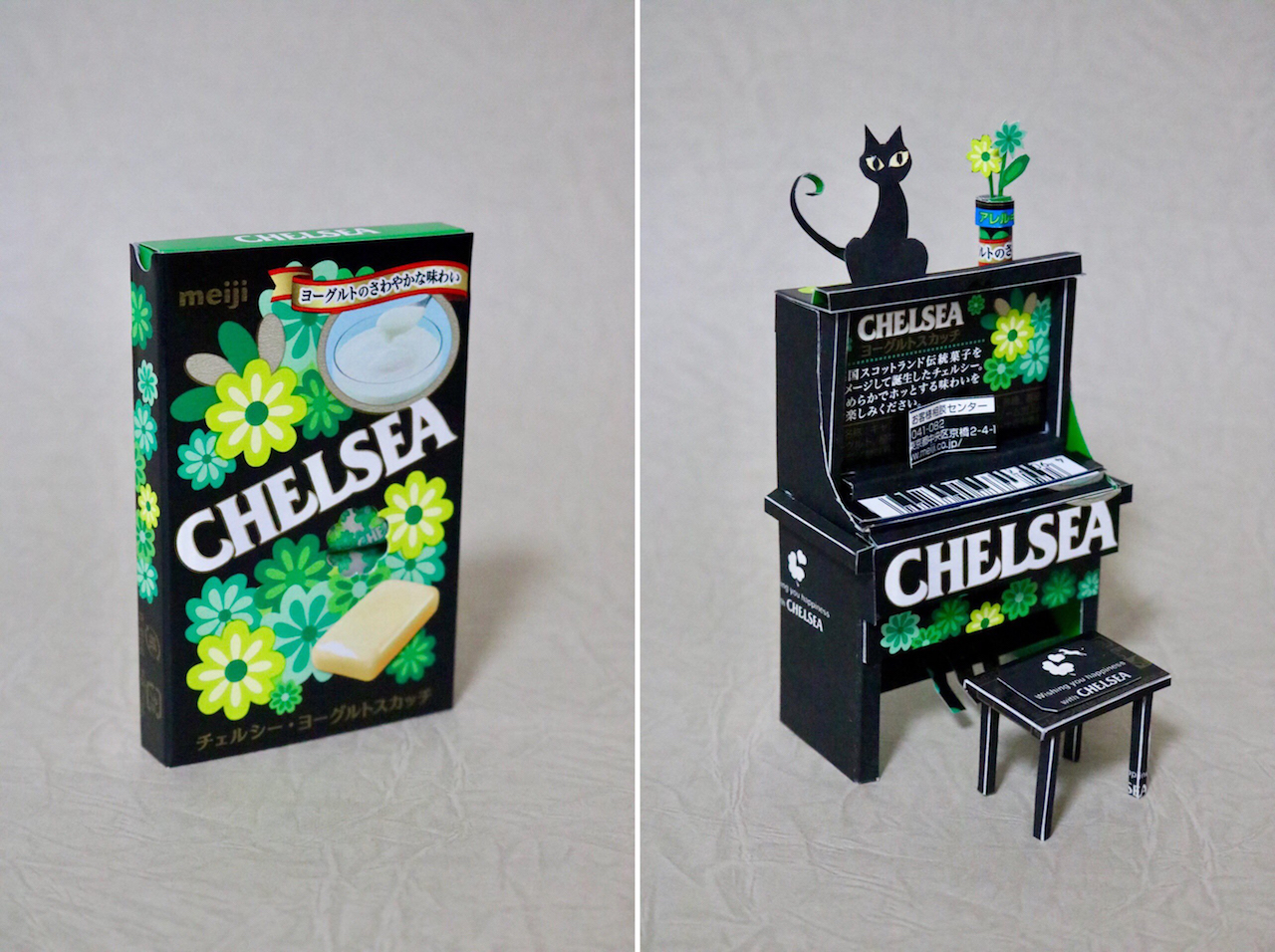
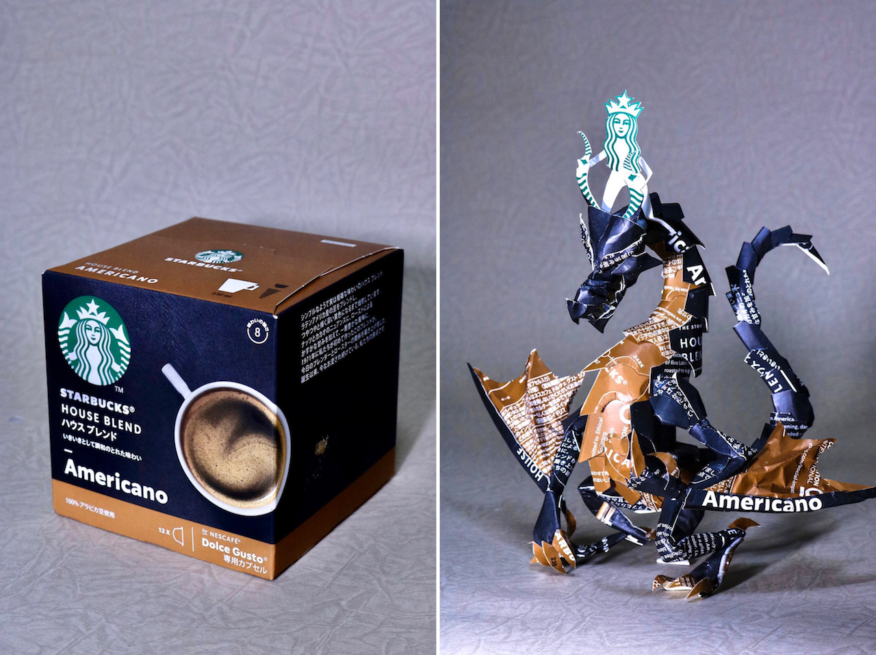
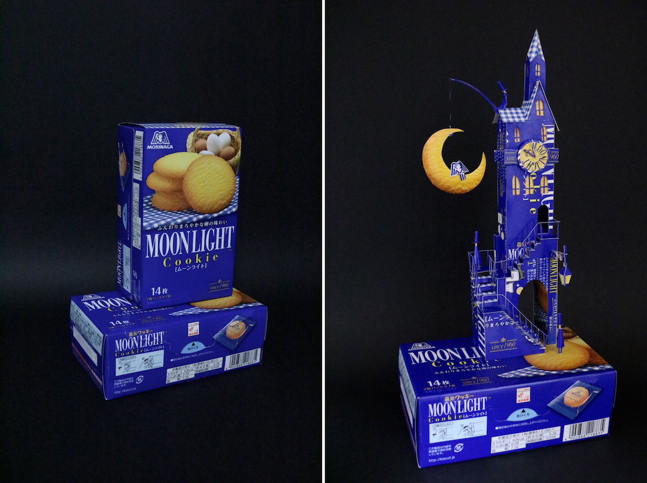
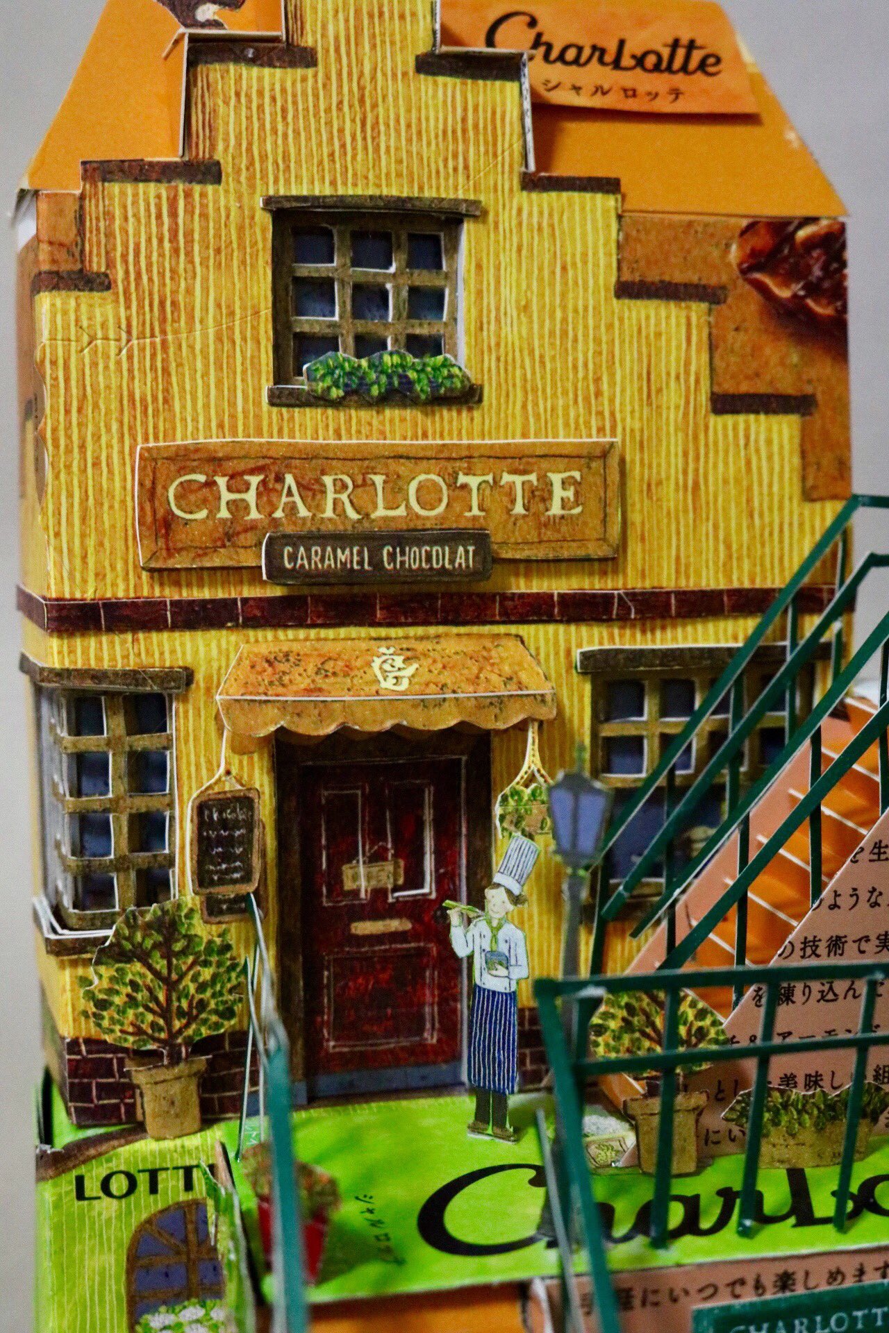
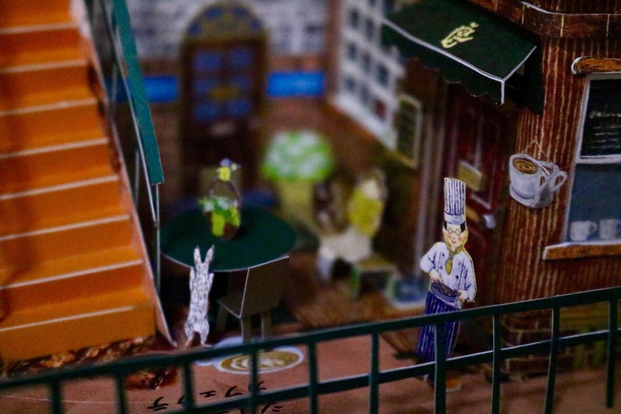
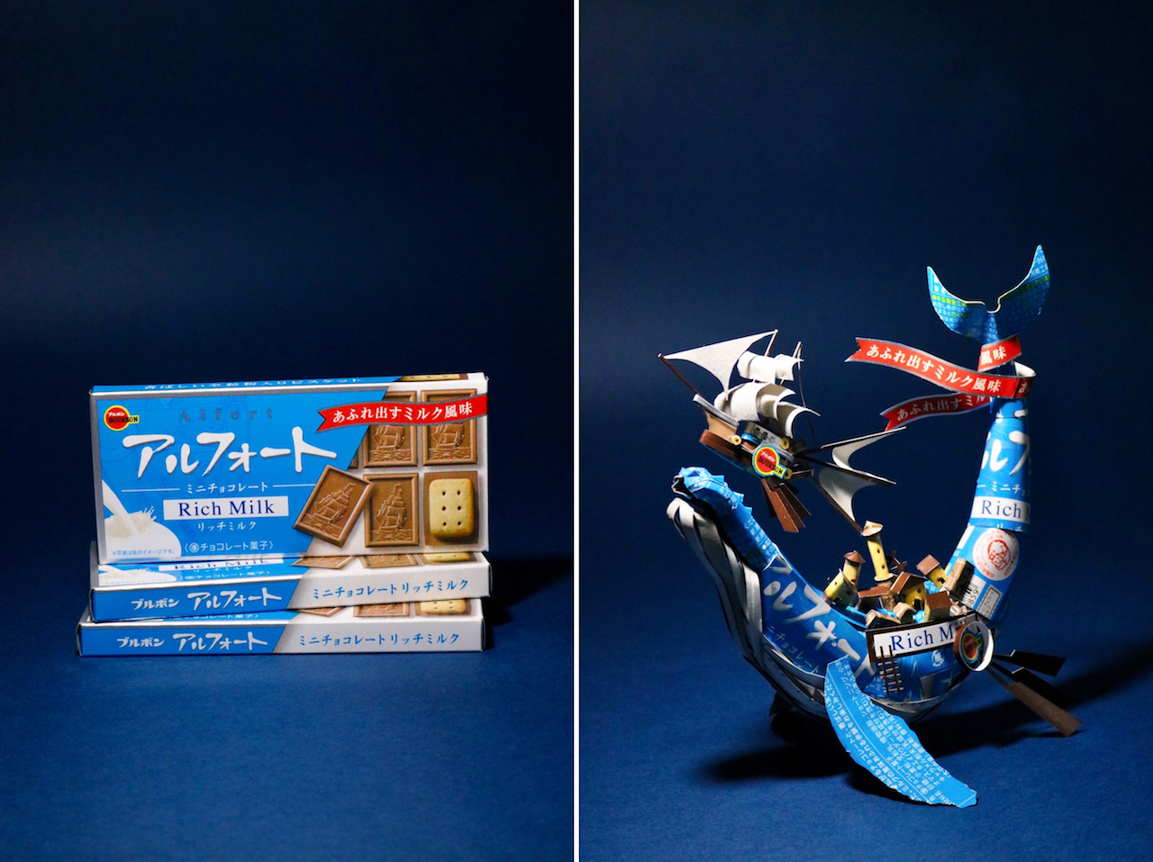
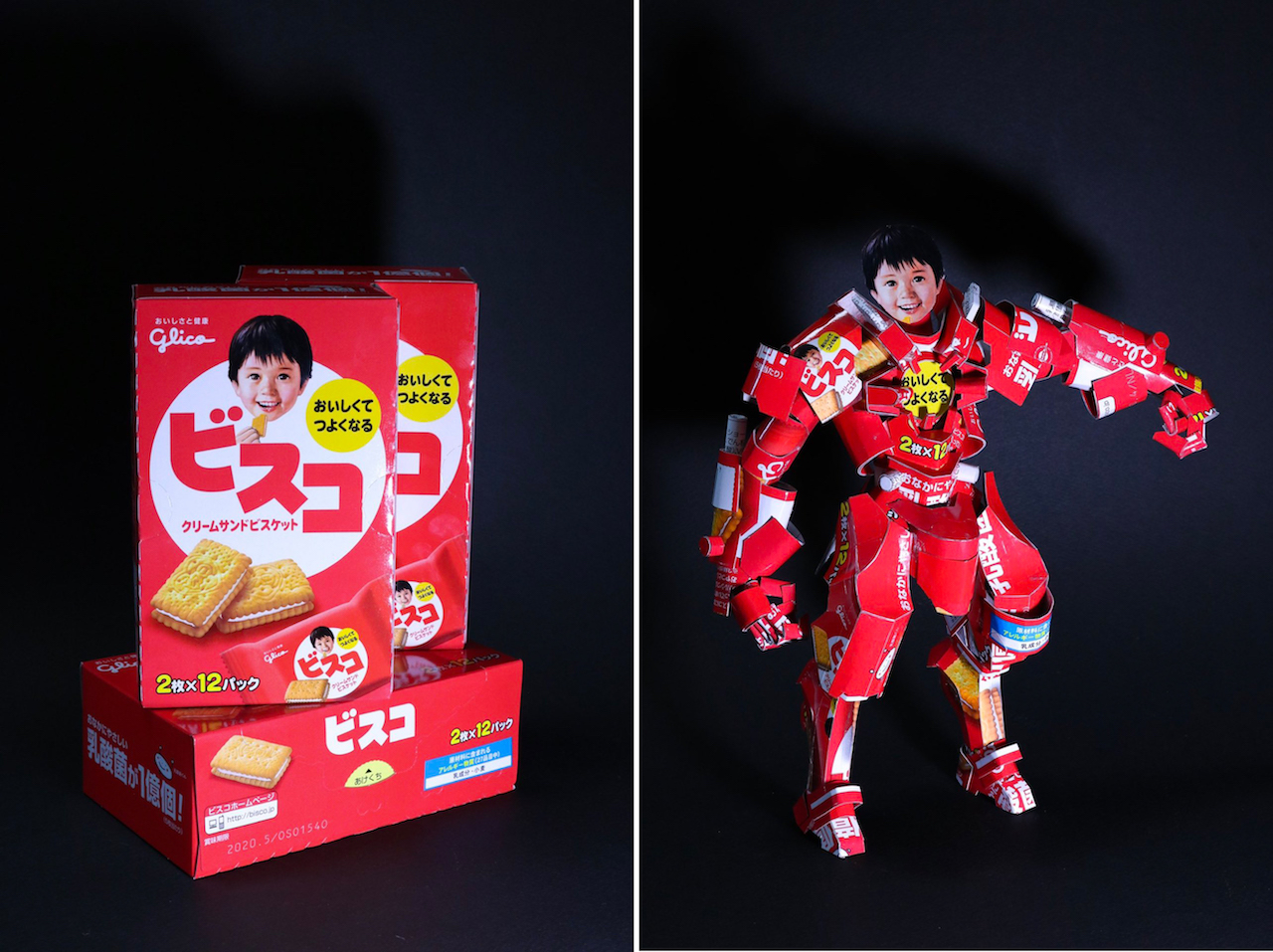
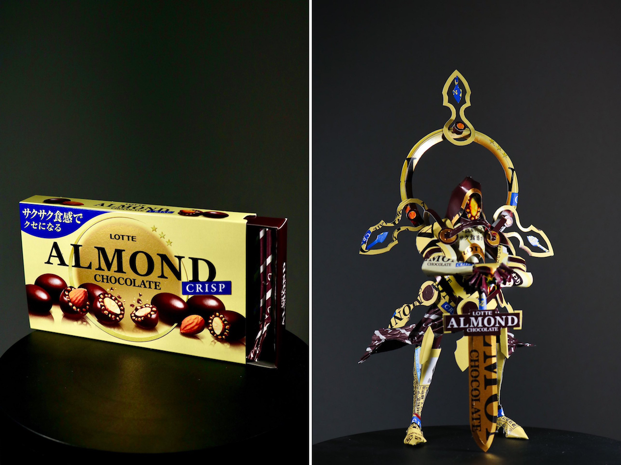
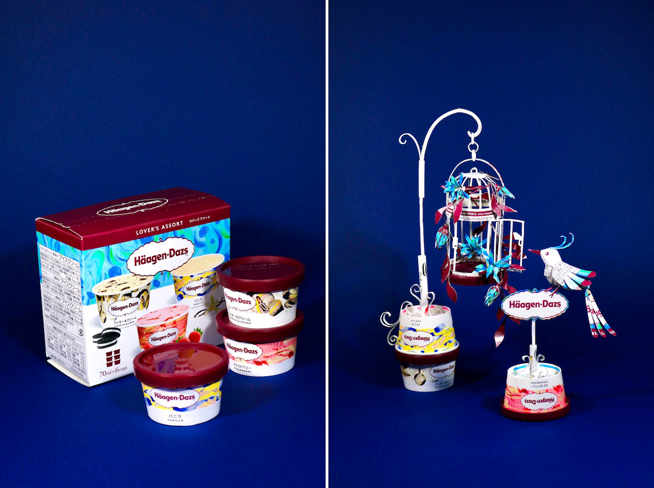
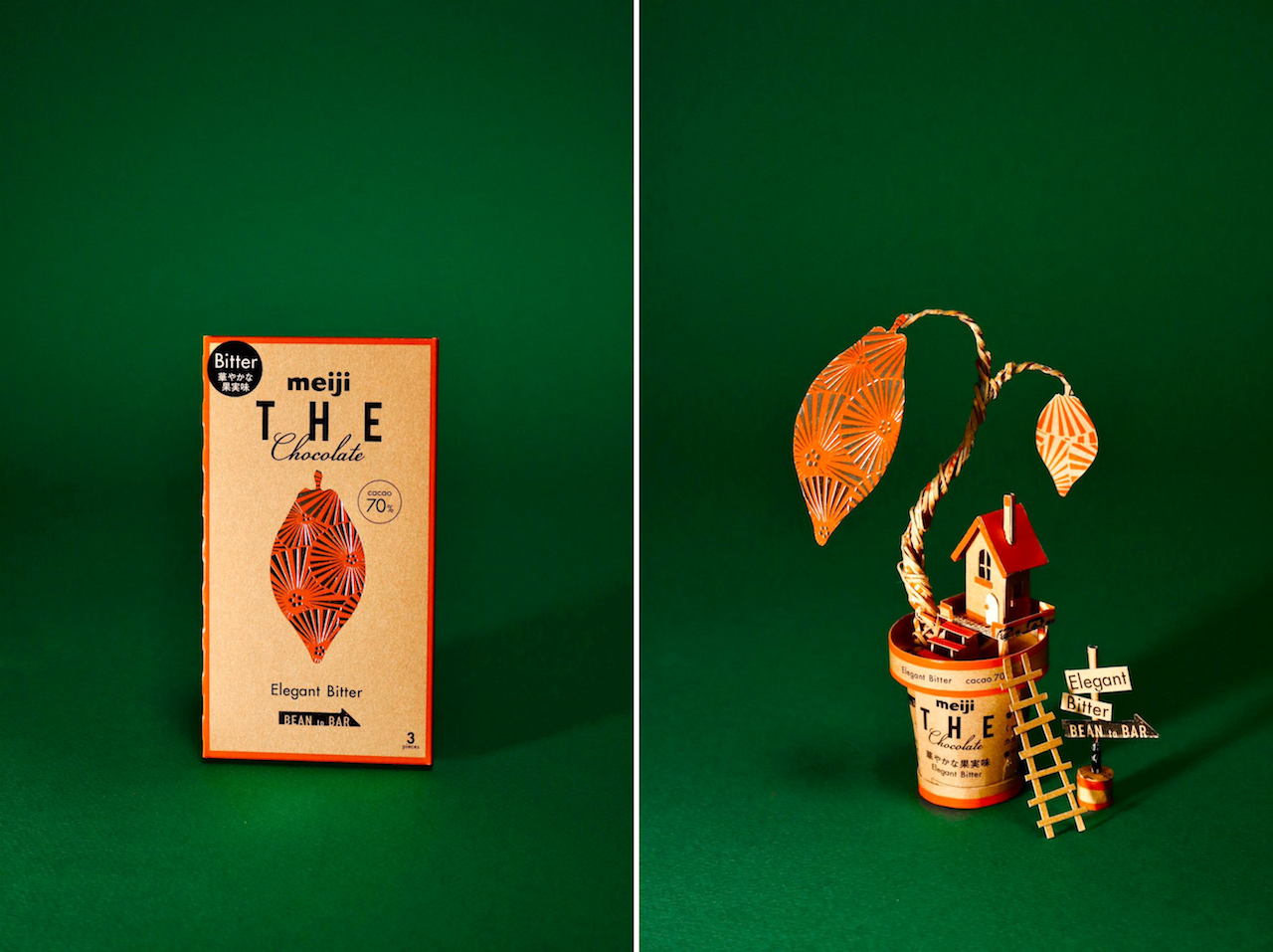
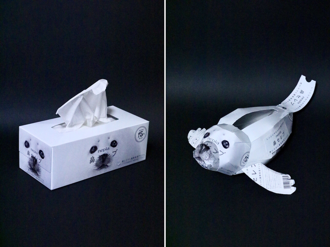
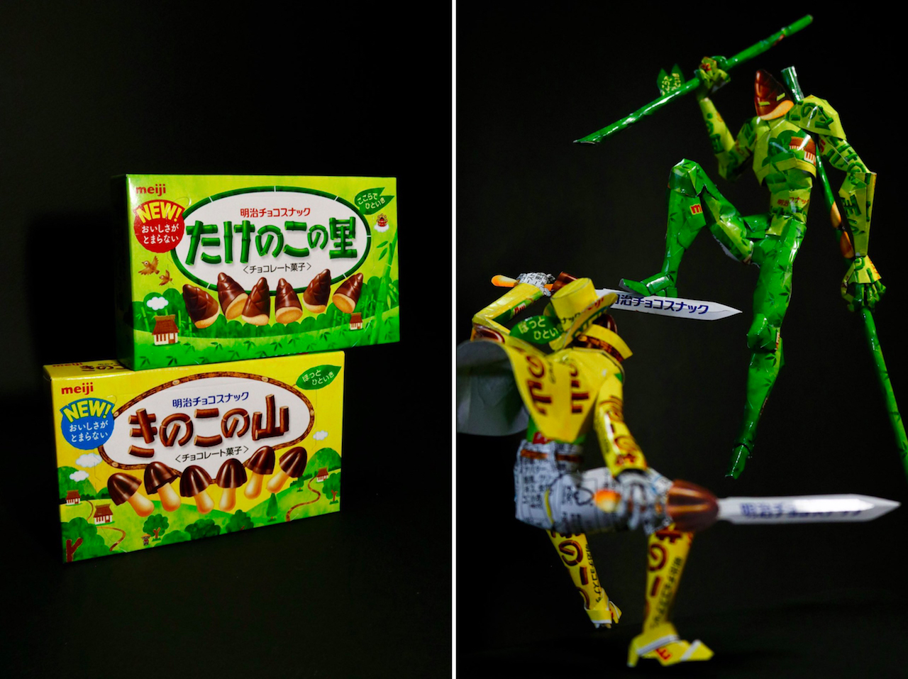
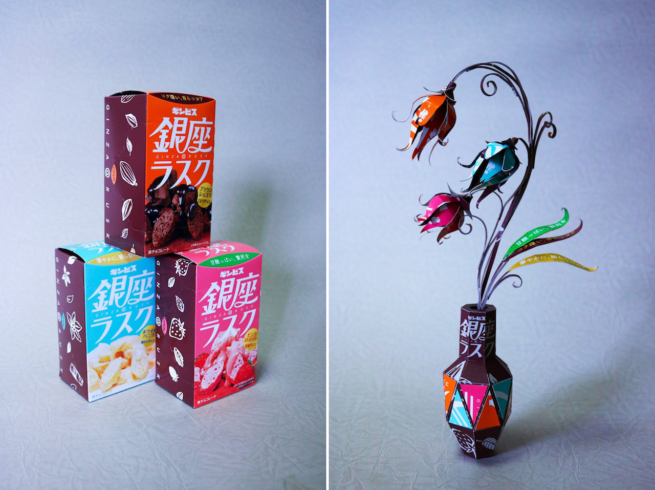
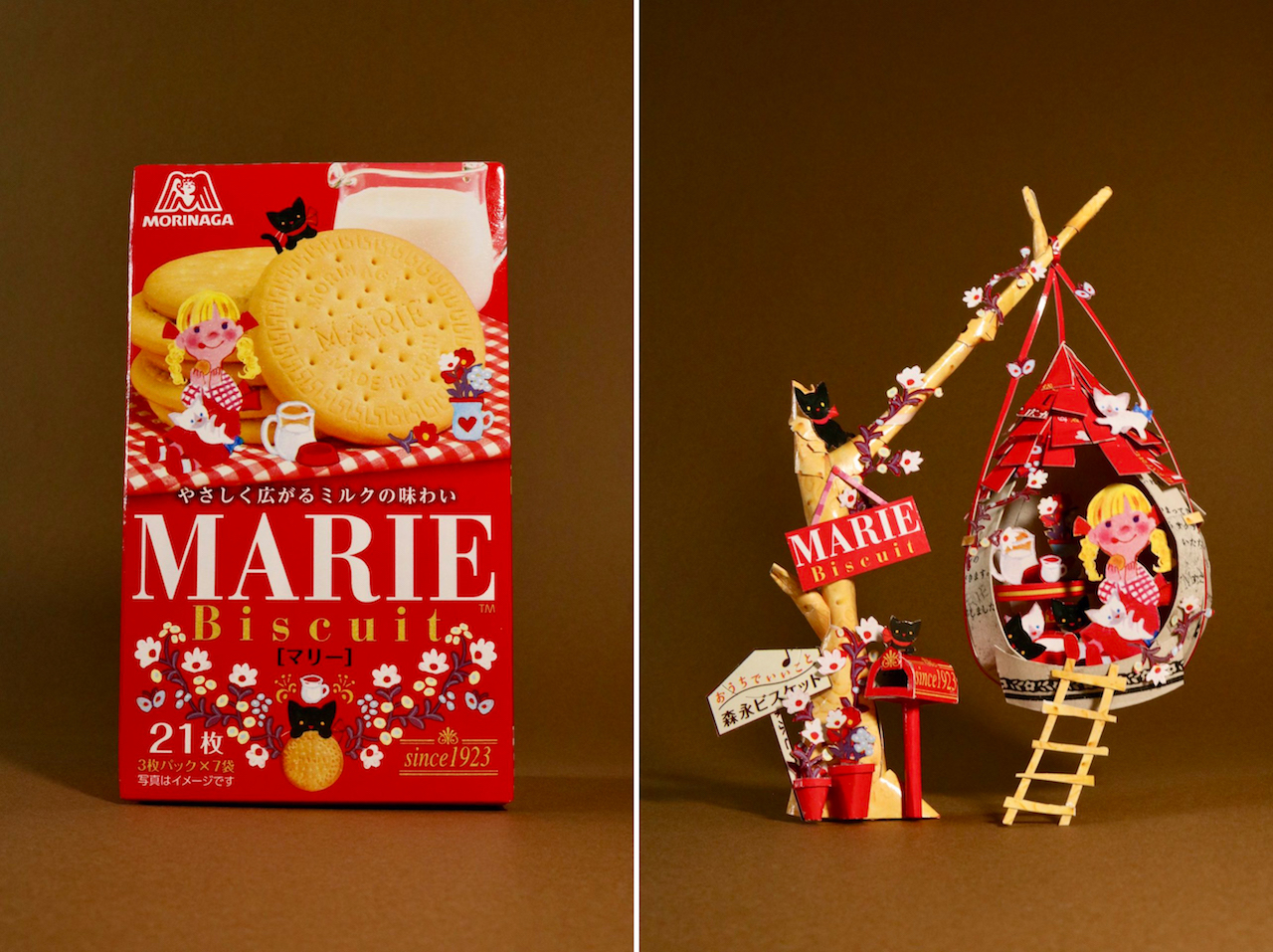
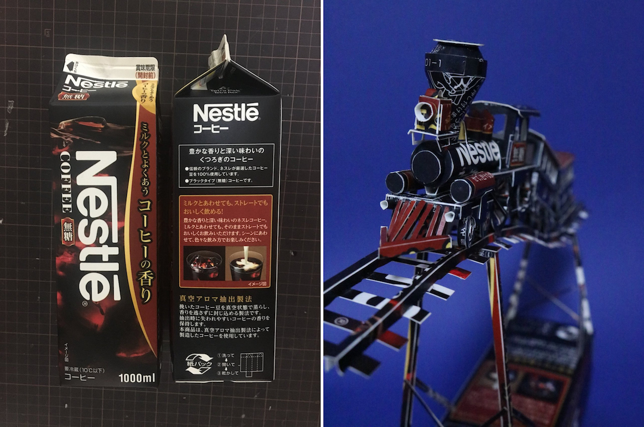
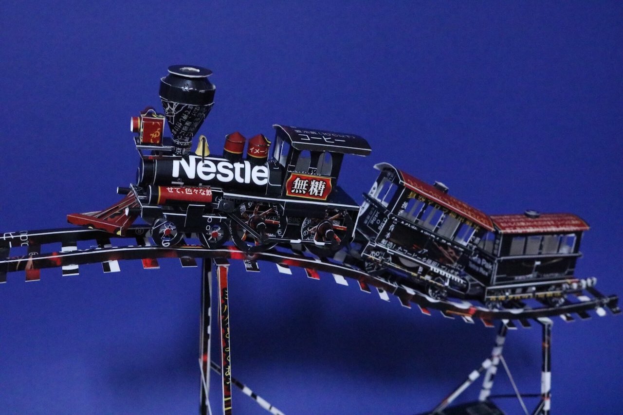
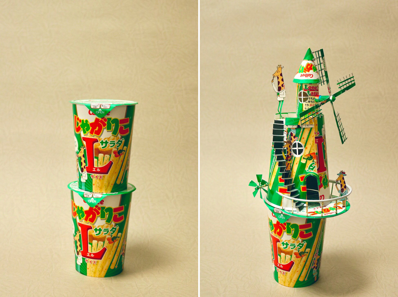
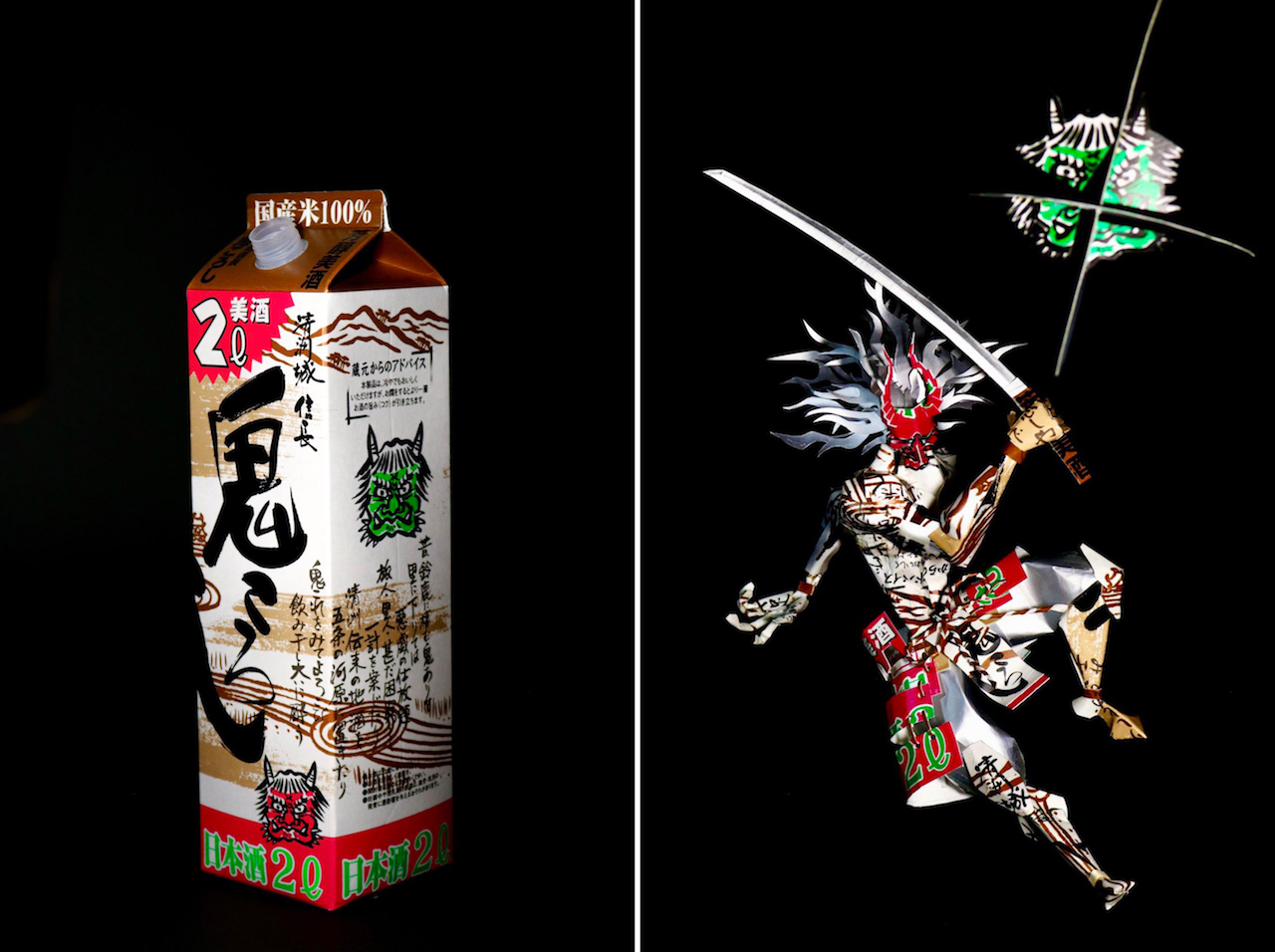
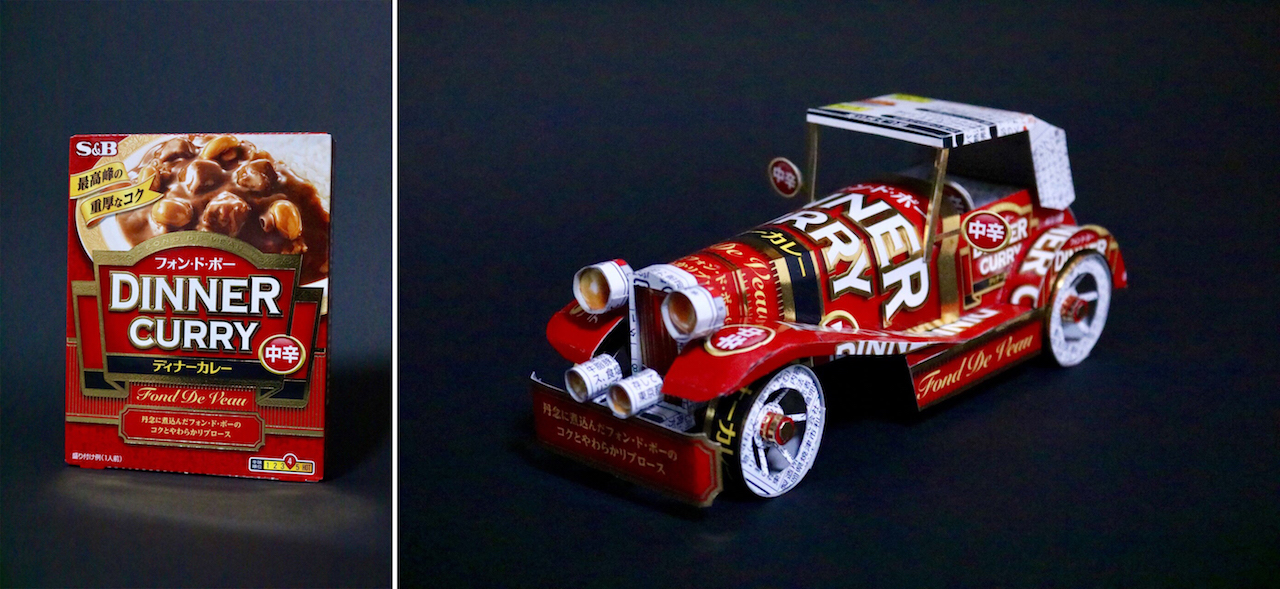
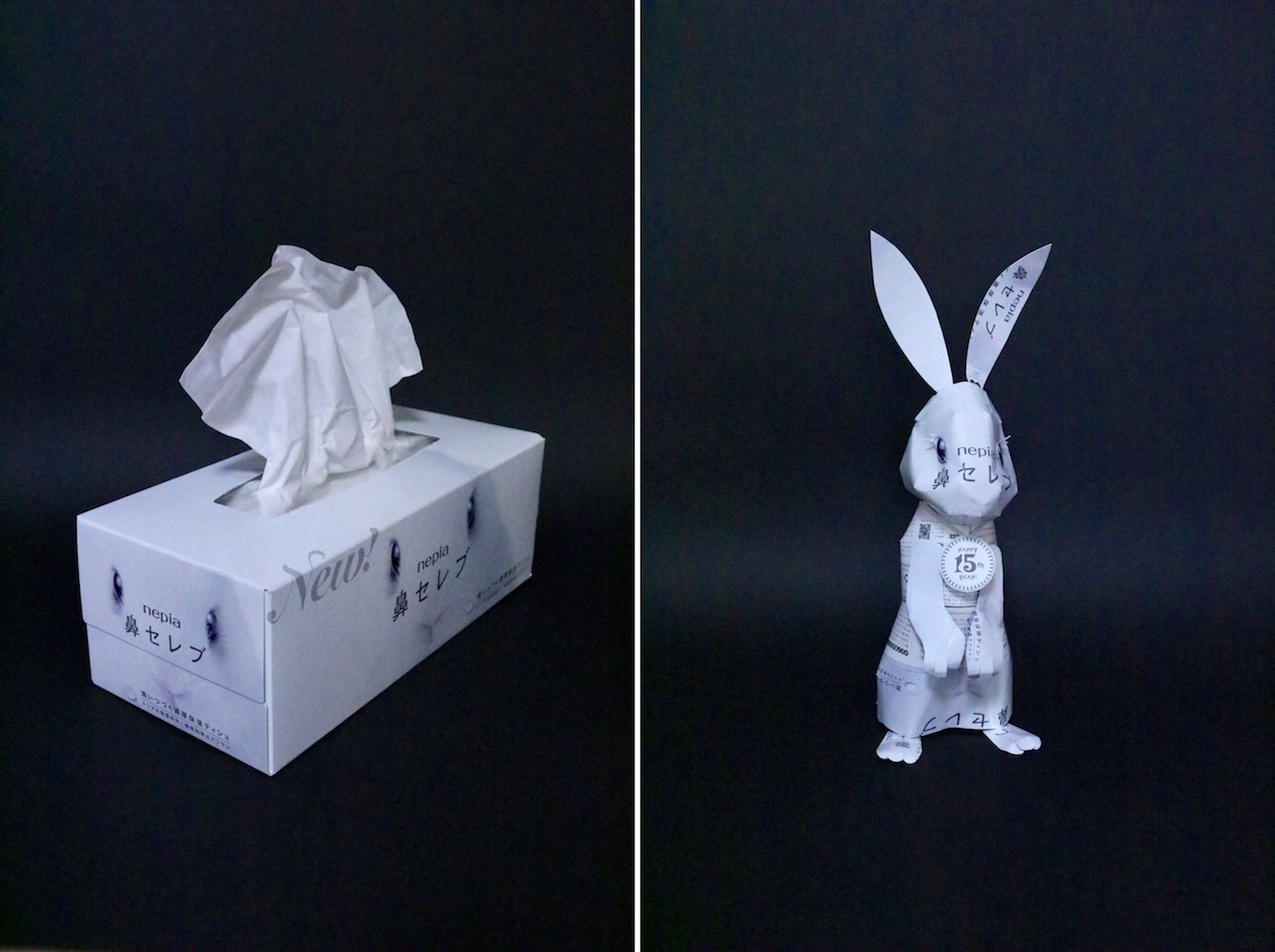
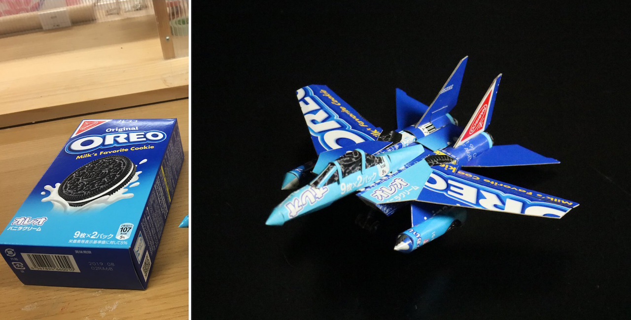
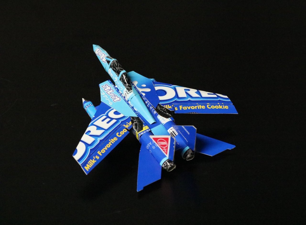
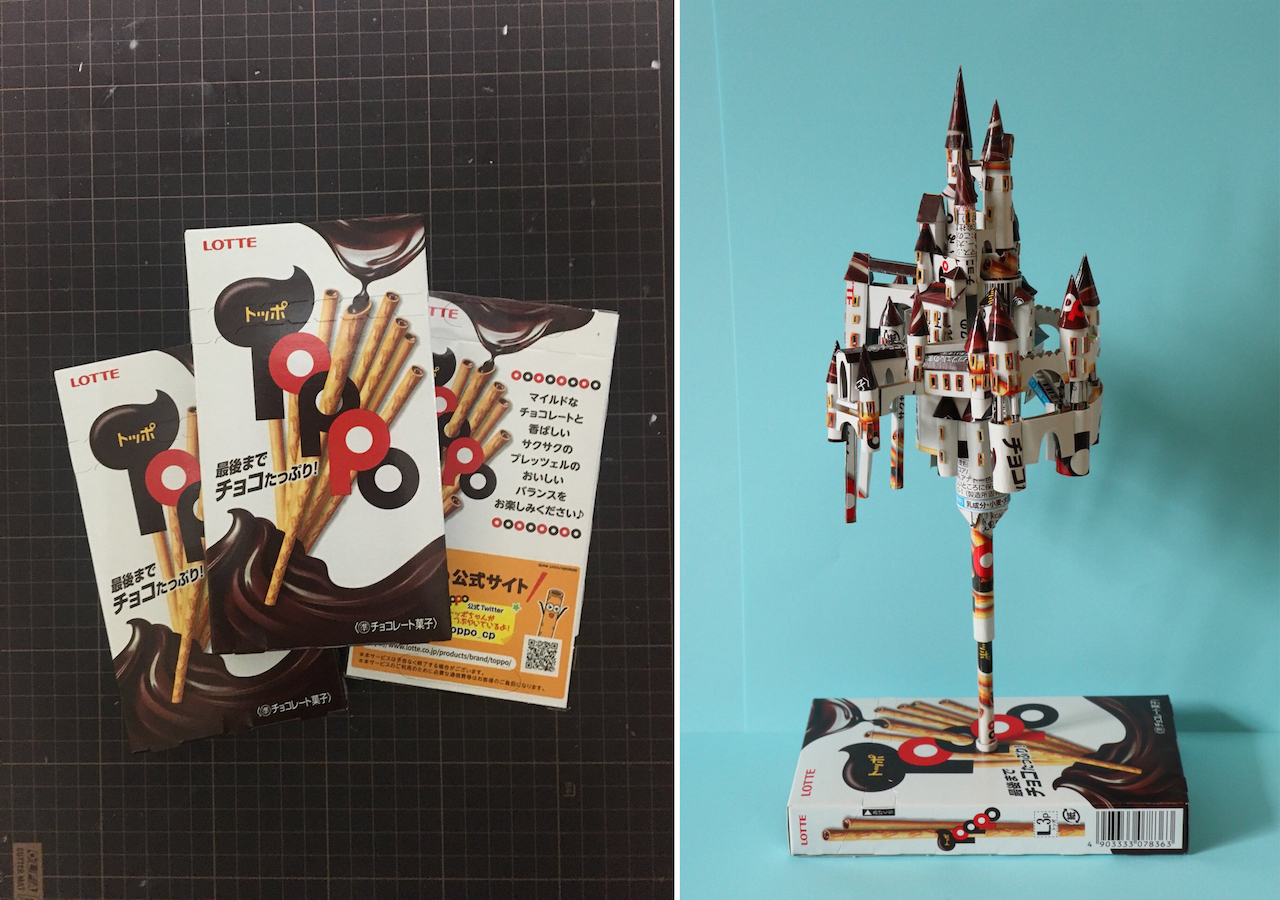
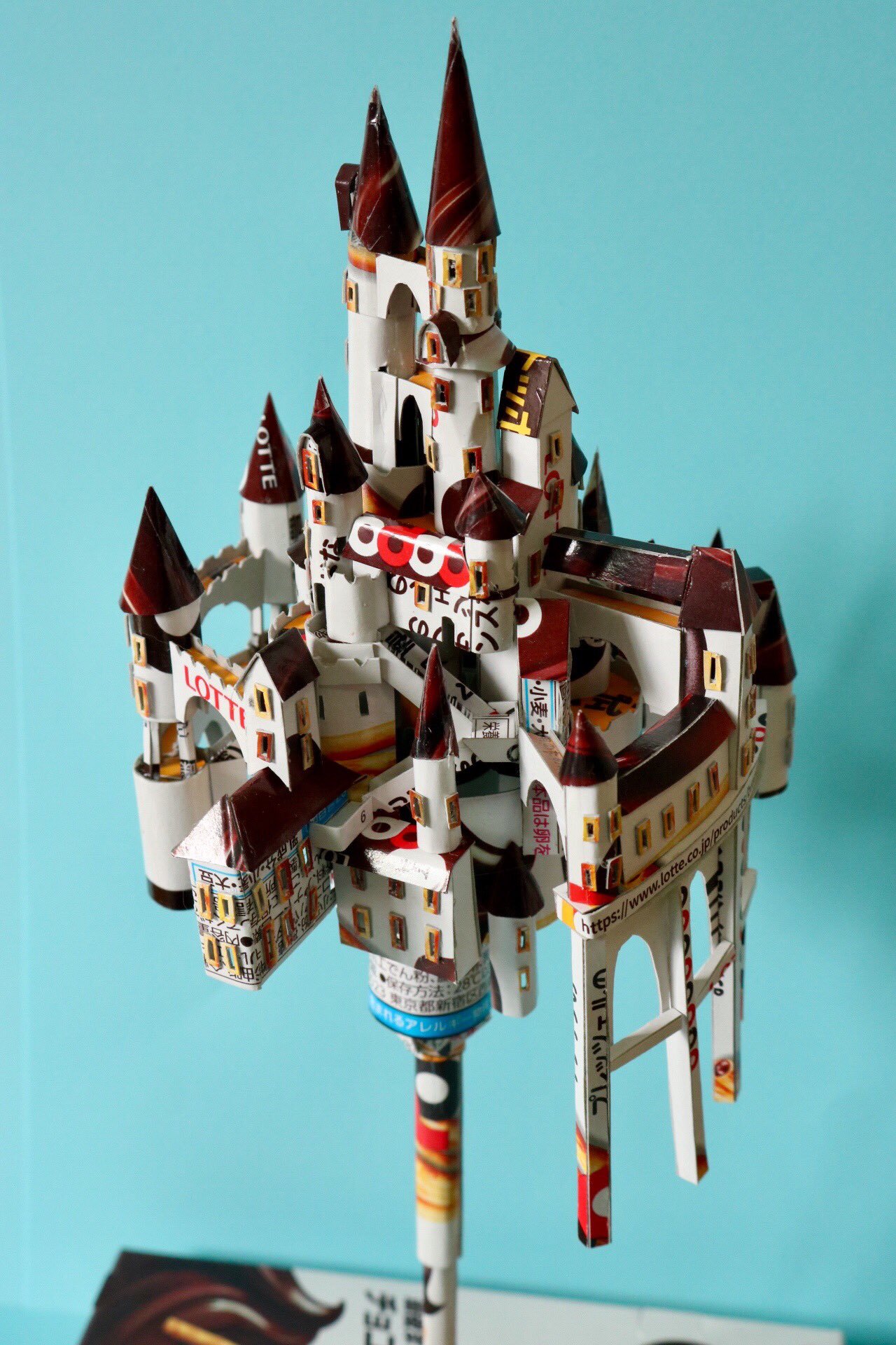
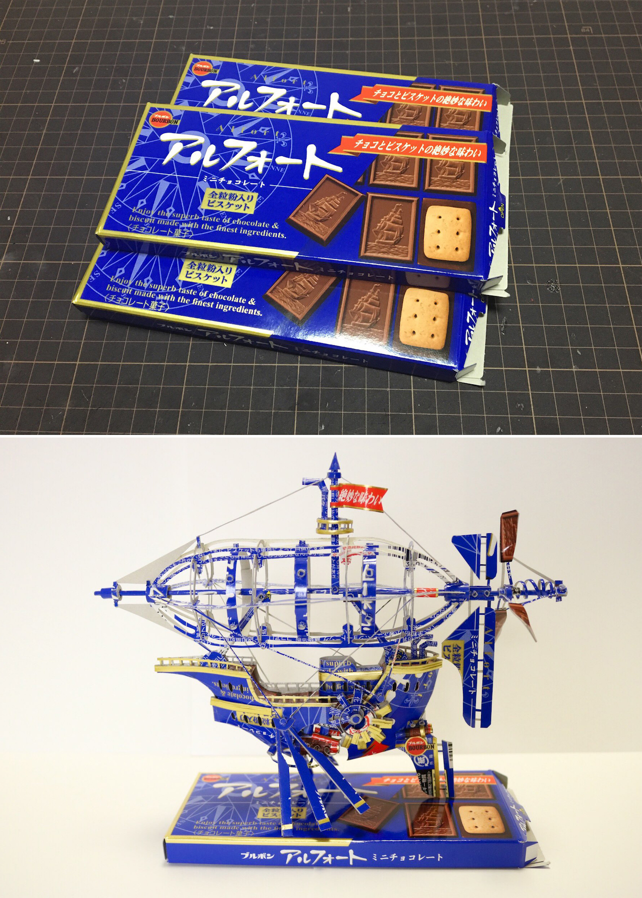
A Chivas Regal carton becomes a sword-wielding knight. A Ritz cracker box turns into a winged lion. A Cacao chocolate package unfolds into a violinist caught mid-performance. Japanese artist Haruki works with nothing but the packaging you’d normally flatten and toss in the recycling bin—no paint, no added material—coaxing the printed cardboard into sculptures that still wear their original branding like a second skin.
The technique behind these paper sculptures is kirigami, a centuries-old Japanese paper art that shares DNA with origami but introduces one crucial move: the cut. Where origami folds a single uncut sheet, kirigami embraces the blade, slicing and scoring paper into forms that folding alone could never reach. It’s an old discipline, and Haruki has pointed it somewhere almost nobody expected.
What makes this packaging art so striking is the restraint. A lesser artist would strip the branding away and start clean. Haruki does the opposite, letting the RITZ logo sweep across a winged lion’s feathers, and the Chivas Regal filigree armor a knight from helm to greave. The commercial graphics aren’t hidden—they’re the whole point, recontextualized until you see the label and the creature at the same time.
This is upcycling elevated to fine art, the kind of transformation that turns disposable consumer design into something you’d put behind glass. Each piece is a quiet argument that value isn’t fixed, that the visual language of a supermarket shelf carries more potential than we ever bother to notice.
Scroll through Haruki’s work below and tell us which transformation impresses you most.