Color Psychology: How Colors Affect Your Mood, Behavior & Decisions
Color is the first thing you register in a design and the last thing you consciously notice, which makes it one of the most quietly powerful forces in visual communication.
Start with the wheel and the logic reveals itself. Primaries, secondaries, tertiaries, and the shifts between hue, tint, tone, and shade form the grammar behind effective color palettes. Understand color theory at that level and you stop picking colors purely by feel and start choosing them for effect.
Then comes the psychology. Each hue carries its own associations. Green is easy on the eyes and is linked with calm and balance. Blue is associated with trust and focus. Red suggests urgency, energy, and appetite. Purple, once more valuable than gold, still whispers luxury. These are patterns designers have relied on for generations.
That’s the real lesson of color psychology. The choice between one shade and another can shape how people feel, what they trust, and whether they act, often before a single word is read. Master it, and you’re guiding a response most people never consciously realize they’re having.
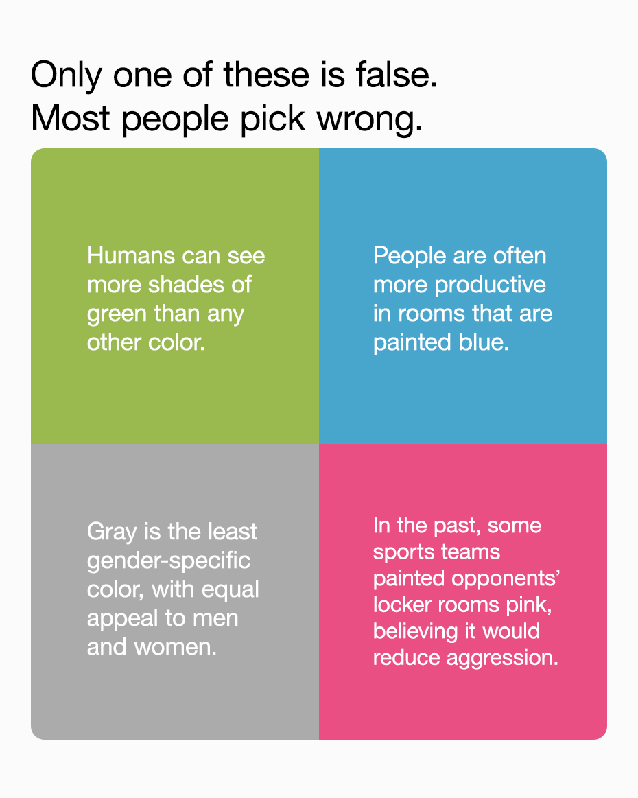
Quiz of the Day
Gray is false. Blue is the color that appeals most equally to men and women.
The infographic below, created by Ript Apparel, breaks all of this down: the color wheel, the psychology of every major hue, and the surprising associations and effects connected with each one. A sharp reference for working designers, and close to essential for art and design students.
The best designers never guess at color. They reach for it the way a writer reaches for the right word, knowing exactly what it will do before anyone else feels it.
Share this post with a designer friend and voice your views in the comments below.