IKEA Turned Its Own Products Into World Cup Flags, And It’s The Smartest Marketing Move Of The Tournament
IKEA Canada did not buy a World Cup sponsorship. It did not license broadcast rights, sign a player or pay to appear beside a stadium pitch. Instead, working with Dentsu Creative, it opened its own product catalogue and began rearranging the furniture. The result is one of the most quietly brilliant pieces of brand marketing to emerge around the 2026 tournament.
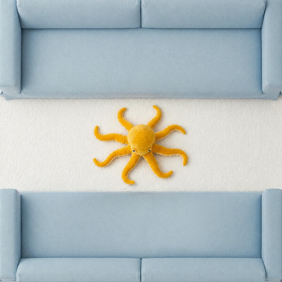
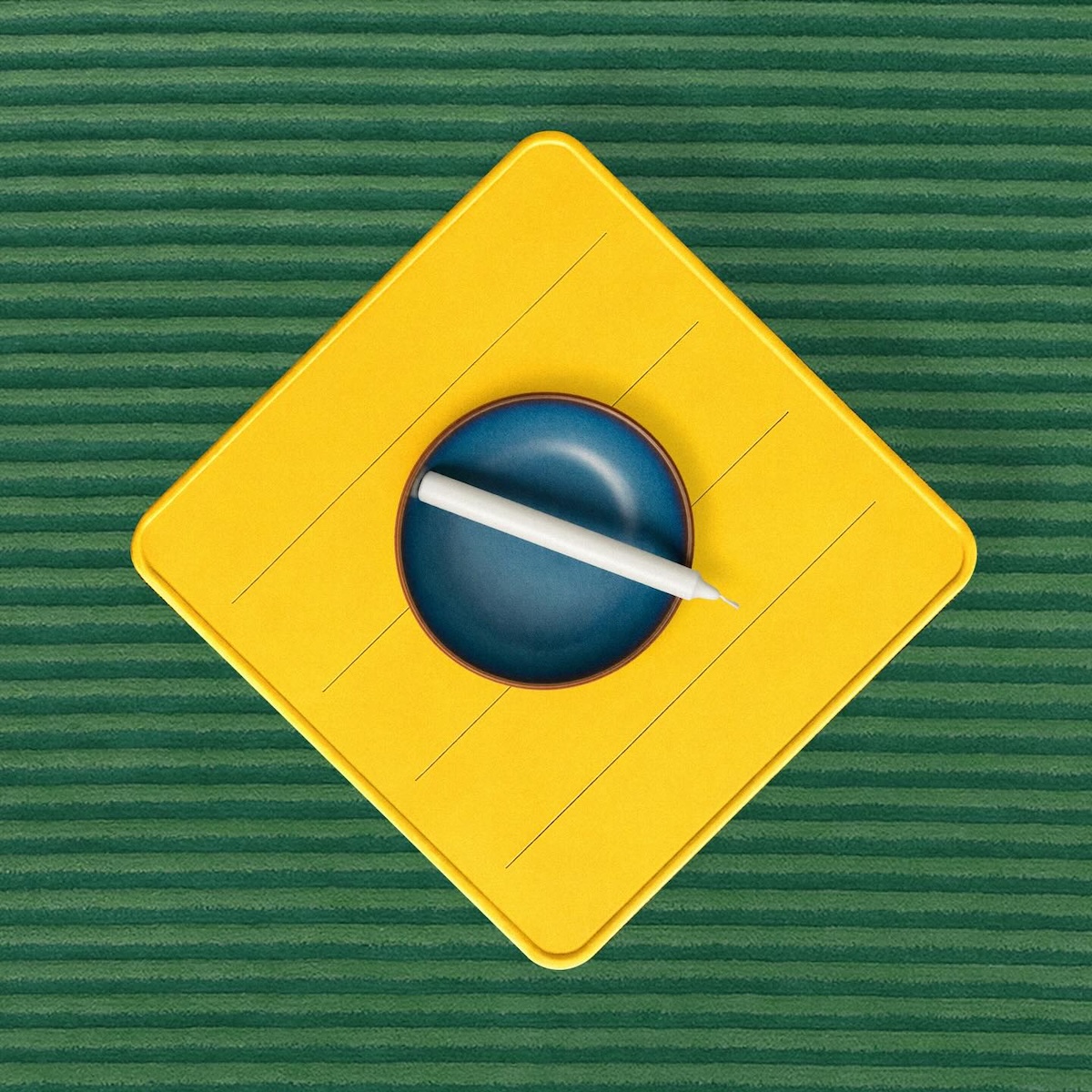
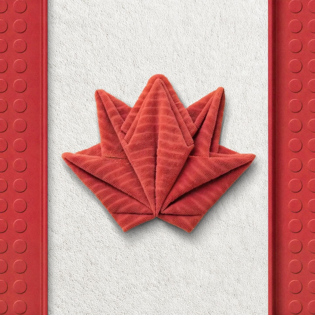
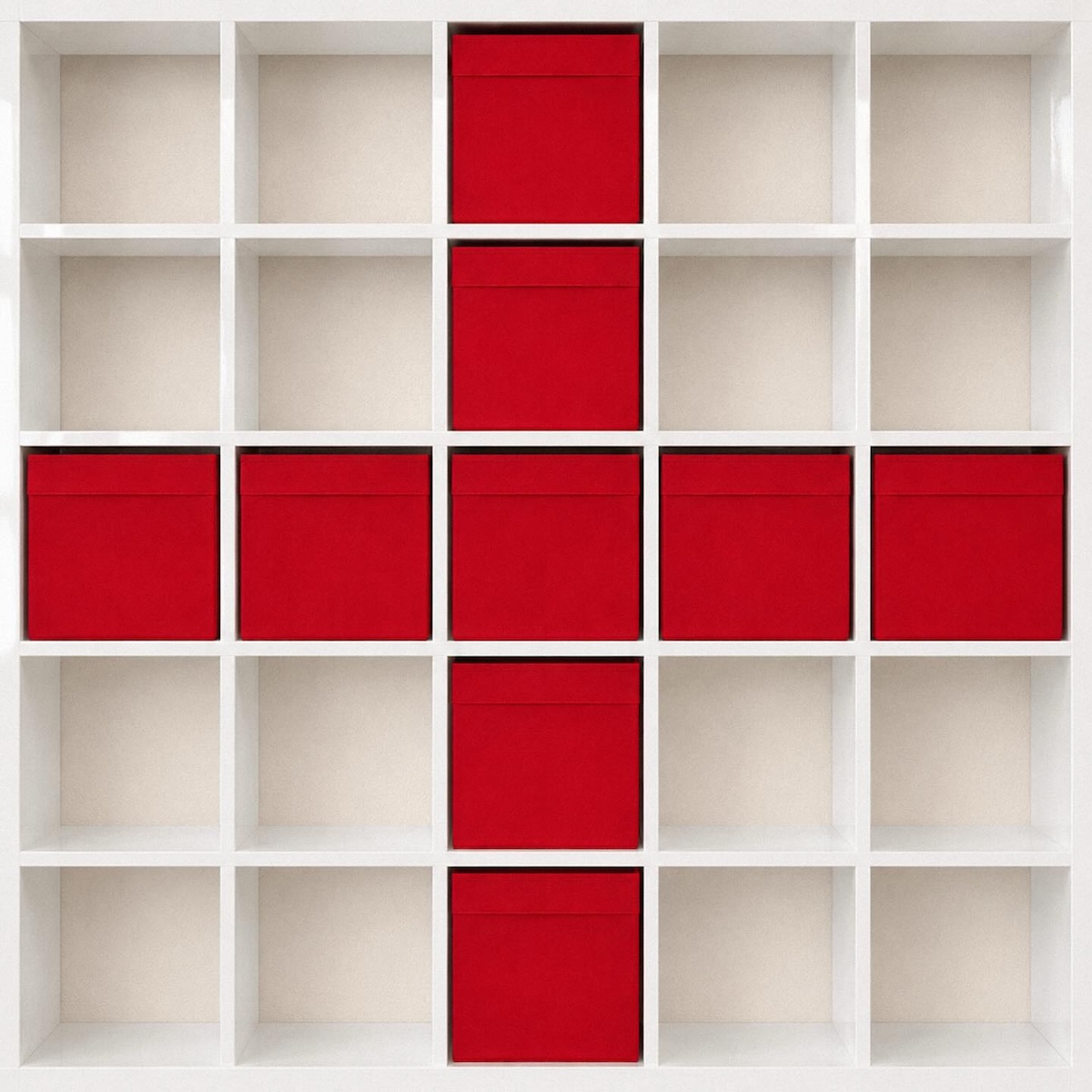
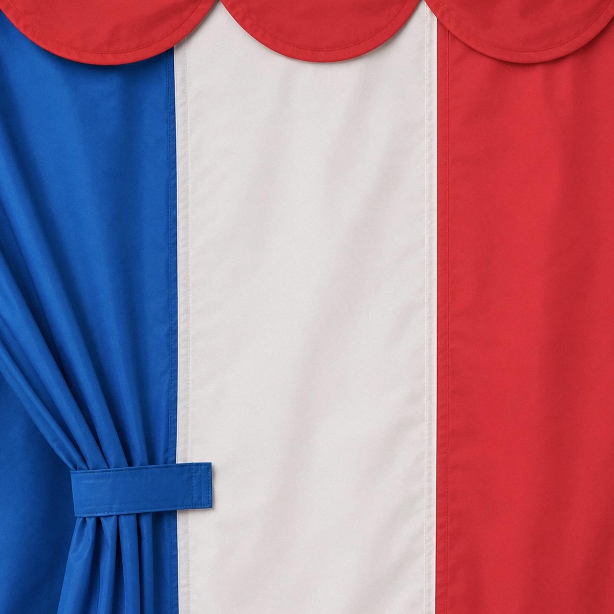
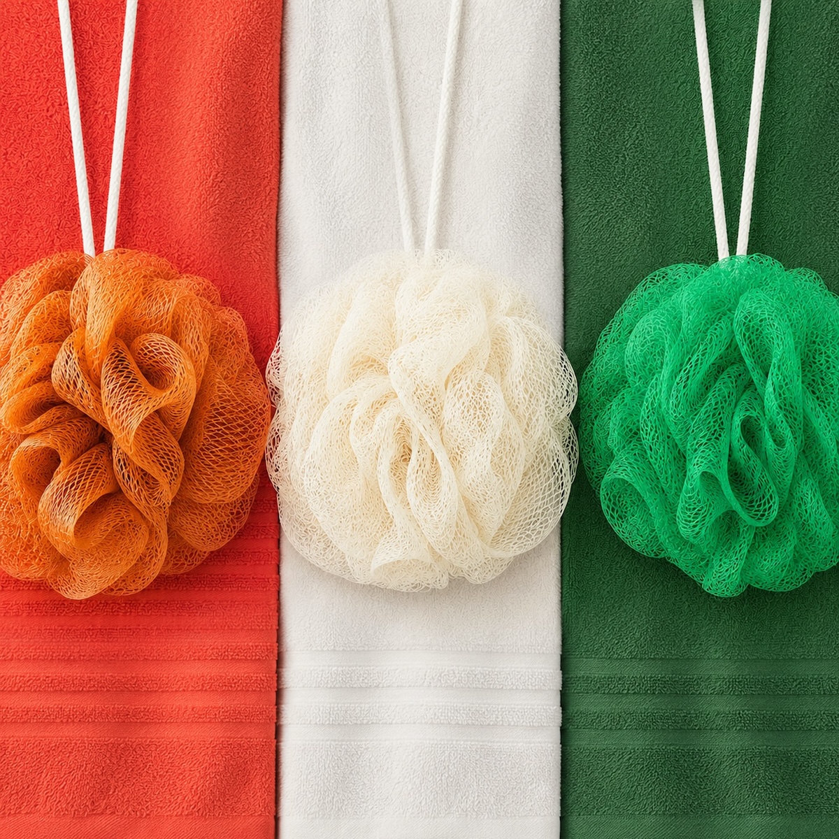
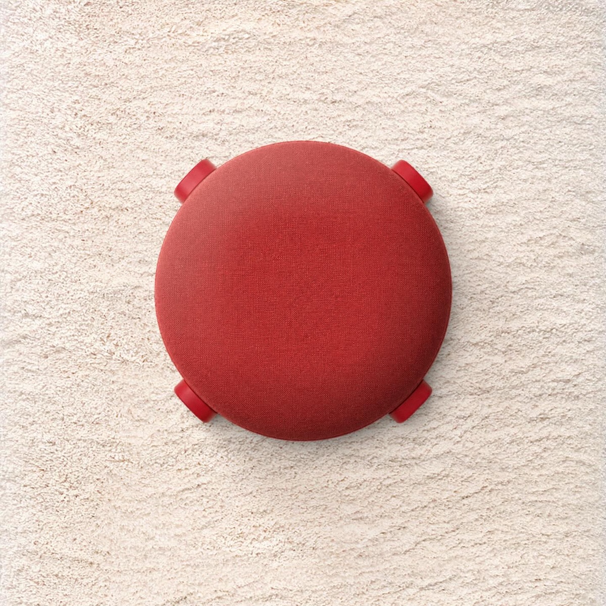
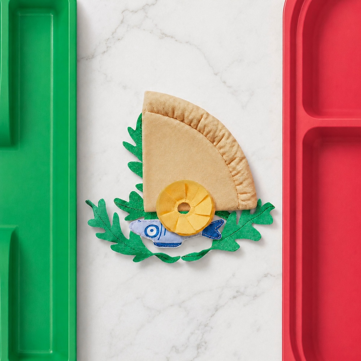
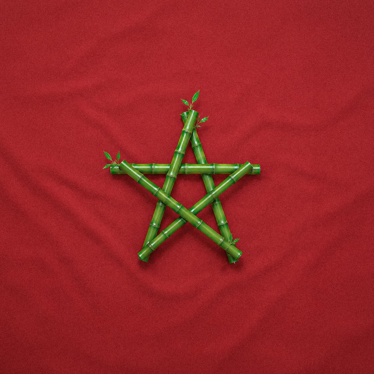
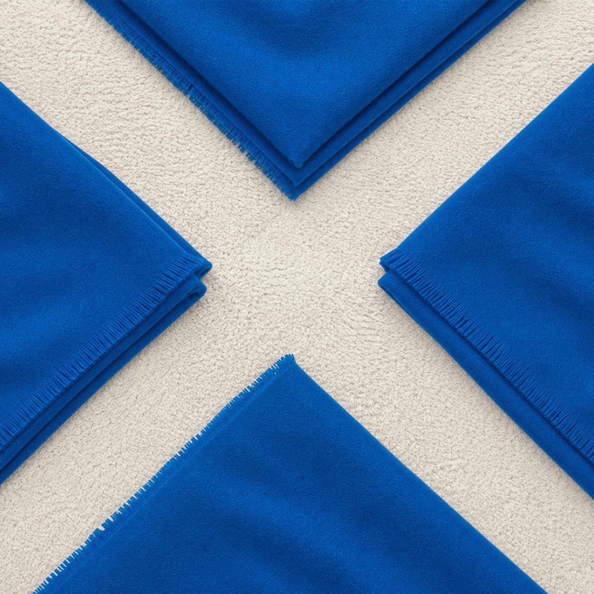
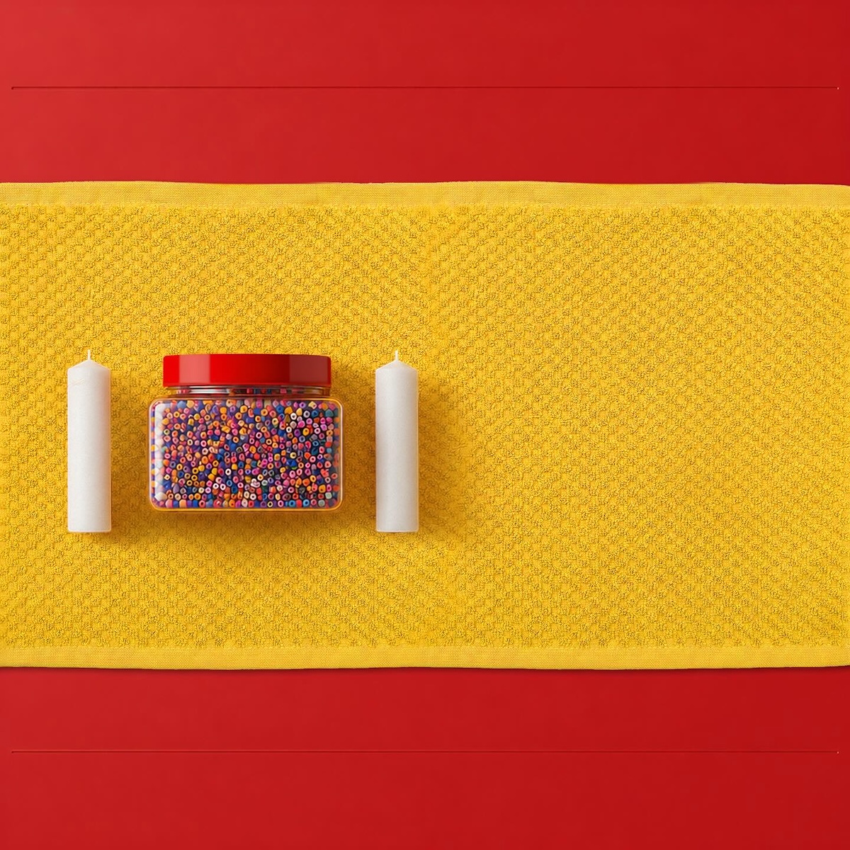
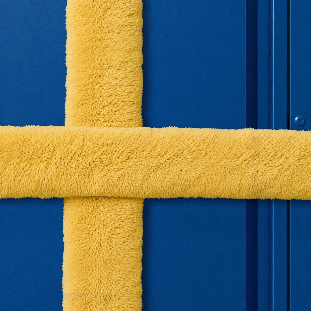
Called “Assemble the World,” the campaign recreates national flags using real IKEA products, arranged and photographed as tightly composed flat lays. A folded VÅGSJÖN towel becomes Canada’s maple leaf, a PEPPRIG duster cover forms part of Sweden’s yellow cross, and a white KALLAX shelving unit filled with red storage boxes becomes the flag of England. It is product photography and flag design colliding, and neither discipline loses.
What makes the campaign genuinely smart is not merely the styling, but the strategic constraint behind it. Without official tournament assets or sponsorship-level media spend, IKEA turned its own catalogue into the campaign’s entire visual language. Each flag works like a small visual puzzle, asking viewers to identify the products before the national design fully resolves.
The idea also fits neatly within IKEA Canada’s wider “Bring Home to Life” platform. For the tournament, the campaign reframes home not simply as a place, but as the point where identity, memory and origin meet. That allows a Swedish retailer to celebrate multiple nationalities without appearing to claim ownership of football culture. The emotional focus remains on Canadians celebrating where they come from.
Argentina
Brazil
Canada
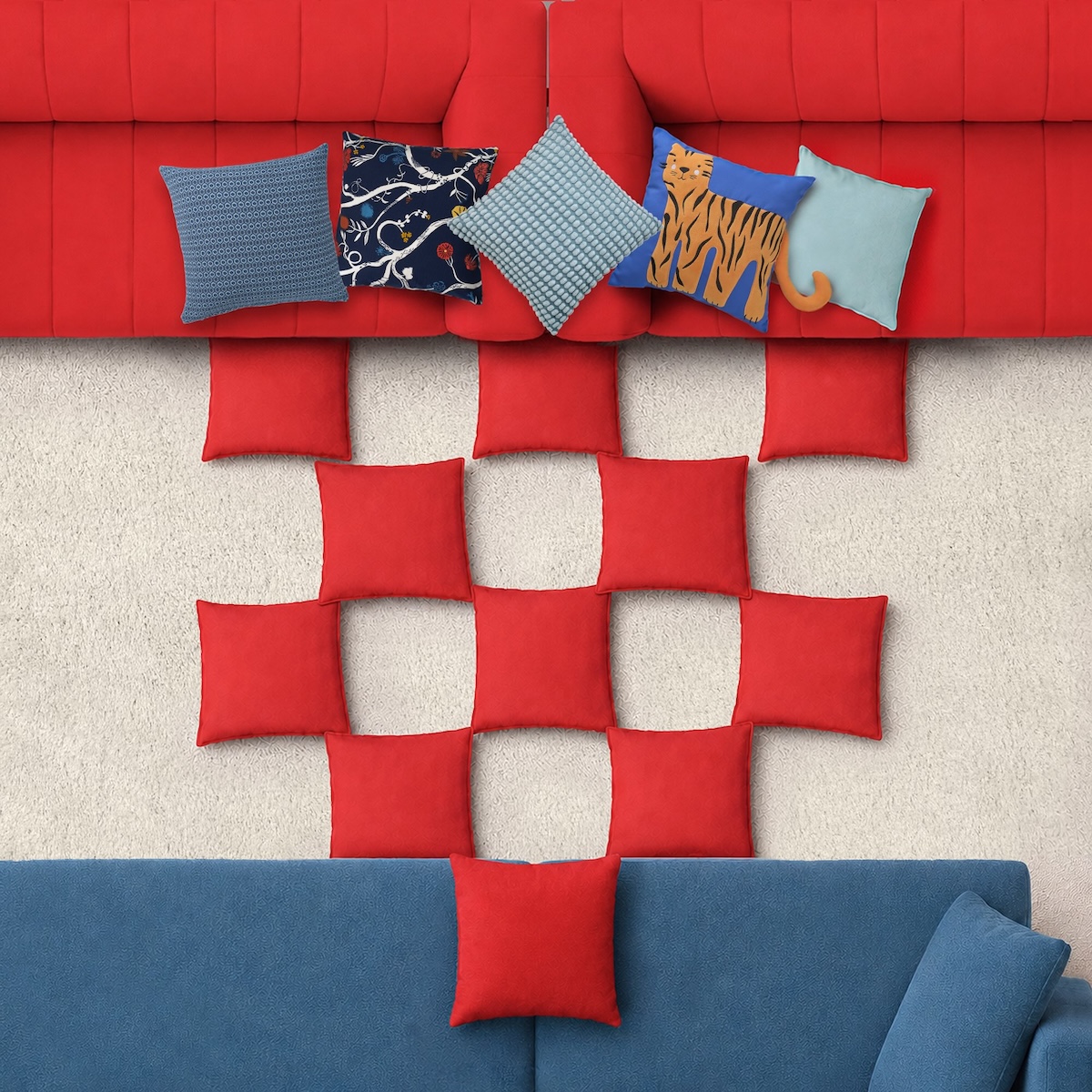
Croatia
England
France
Germany
Ivory Coast
Japan
Mexico
Morocco
Portugal
Scotland
South Africa
Spain
Sweden
Watch the campaign in action
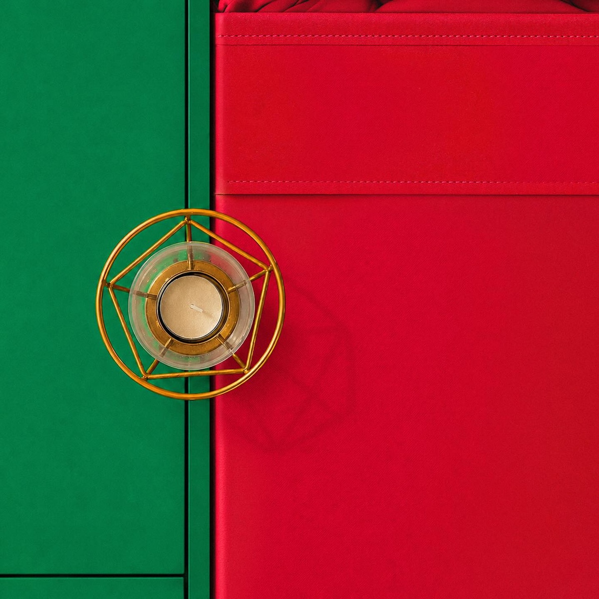
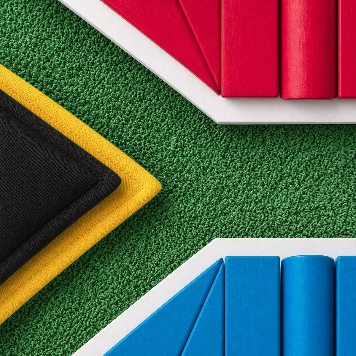
Look closely and the discipline shows. Croatia’s checkerboard shield is reconstructed panel by panel using cushions arranged across red and blue sofas. Portugal’s armillary sphere is suggested by a small gold tealight holder placed where the flag’s green and red fields meet. South Africa’s Y-shaped composition, arguably the most difficult flag in the series to translate into household objects, is rebuilt through folded fabric and upholstered forms while retaining its complex geometry. These are not merely color matches; they are carefully styled attempts to reproduce each flag’s defining structure.
If there is a lesson here for anyone building a campaign around a cultural moment they do not officially own, it is this: the constraint becomes the idea. Without FIFA marks, player endorsements or stadium visibility, IKEA built the entire campaign from what was already sitting in its own showroom. That is not merely a workaround born of necessity. It is the whole pitch, and it is why the campaign will still make sense as a case study long after the tournament’s final whistle.
Share this post with a friend and voice your views in the comments below.