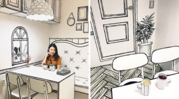
You might have come across comic-themed cafes and restaurants but have you ever been to a cafe that makes you feel like you've actually walked into a comic world? Located in the popular Yeonman-dong district in Seoul, Cafe Yeonnam-dong 239-20 is a place that is (literally) straight out of a comic book. From walls and furniture to dishes and cutlery, every item has been … [Read more...]
Archives for September 2018
Clever Illustrations Of Words That Sound The Same But Have Different Meanings
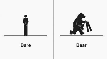
Michigan-based illustrator Bruce Worden creates funny, witty illustrations of homophones - words that have the same pronunciation but different meanings, spellings, or origins. A self-professed grammar nerd, Worden explains the differences between the words with minimalist pictograms that visualize their meanings. Over a period of five years, he has created over 300 … [Read more...]
Graphic Designer Combines Two Completely Unrelated Objects Into Clever Logos

Indonesian designer Rendy Cemix has come up with an interesting project in which he combines the shapes of two completely different objects into one unique logo. The logo in each case is a visual representation of the brand name. For example, the logo for Mountain-Fox is an aesthetically designed symbol of a fox with ears that look like snow-capped peaks. The logo for … [Read more...]
The Weather Channel Uses Incredible Augmented Reality Graphics To Explain Hurricane Florence

Weather reports on news channels are usually boring and mundane in terms of presentation, but not when it comes to US-based The Weather Channel. Last week, while covering the impact of Hurricane Florence on the Southeast Coast, TWC decided to present the gravity of the floods using Augmented Reality (AR). The broadcast began with TWC's on-camera meteorologist Erika Navarro … [Read more...]
Photoshop’s New, More Powerful ‘Content-Aware Fill’ Can Realistically Remove Any Object From Your Photos
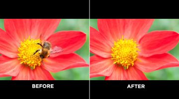
Adobe Photoshop's Content-Aware Fill is a useful tool to remove unwanted objects from your photos, but sometimes the results can fall short and there are no options to customize the results. Well, all that has changed in the latest version of Photoshop CC (20.0). Content-Aware Fill has received a powerful new upgrade that gives the tool its own workspace and additional … [Read more...]
Designers, You’ll Love These $5 Keychains Of Popular Graphic Design Softwares And Memes
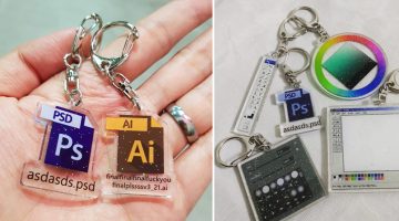
Singapore-based graphic artist Yu Xin has come up with a cool series of $5 keychains for graphic designers, based on popular Adobe programs and their interfaces. If you've ever worked with a demanding client, you'll relate to the meme-based Photoshop and Illustrator keychains that feature PS and AI file icons with funny filenames. The idea came to Xin when she was working on … [Read more...]
This Guy Uses Forced Perspective To Capture Awesome Photos With Toy Superheroes
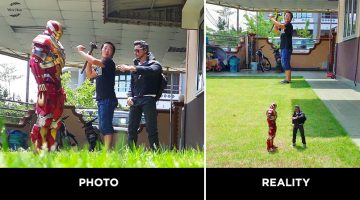
Malaysian photographer and toy collector Wire Hon uses his smart phone camera, a few props, and clever forced perspective techniques to capture hilarious photos of himself with Marvel and DC superhero action figures. He makes it look like the figures are life-size and he is actually interacting with them. Sometimes, he also gets his family into the act. Check out the photos … [Read more...]
This Handy New Tool Shows You Color Palettes Of Artworks From Different Eras
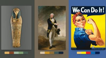
Kentucky-based graphic designer Brandon Shepherd has released a handy online tool called Color Leap that showcases a collection of color palettes used in paintings and artworks throughout different eras in history - from ancient Egypt to the 1960s. The tool consists of 180 palettes spread over 12 different time periods. You can select any time period, browse through … [Read more...]