
"Creativity involves breaking out of established patterns in order to look at things in a different way." - Edward de Bono Boston-based artist Patrick Hanes has worked exclusively in Microsoft Paint for over 10 years. By his own admission, he "sucks at Photoshop and other programs". He honed his craft in MS Paint working long overnights at a hospital reception … [Read more...]
11 Illustrations That Show The Two Kinds Of Graphic Designers
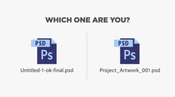
There are two kinds of designers in the world - those who follow a naming convention for layers and files (ProjectName_revision3_final.psd) and those who don't (Untitled-1-ok-final.psd). Similarly, there are designers whose desks resemble a war zone and there are designers who have an OCD attack if there's even one extra object on their desk. Design resource site Pixelo has … [Read more...]
30 Honest Logos Of Famous Companies
What Clif Dickens did to advertising slogans, Viktor Hertz has done to popular brand logos. In a hilarious project titled 'Honest Logos', the Swedish designer shows us what famous company logos would look like if they were brutally honest about their product(s). Some are funny, some brash and some brilliant. Check them out below. … [Read more...]
Microsoft Shows How Easy It Is To Use Windows, With Clever ‘Little’ Marketing Stunt

When it comes to advertising, more often than not, it's the simple ideas that make you smile. Be it a TV commercial, an outdoor promo or an interactive ad. Here's another addition to that list. … [Read more...]
Microsoft’s New Logo – Opinions And A Different Approach
Microsoft unveiled a new logo after 25 years and everyone seems to have an opinion. The new logo has two components - the symbol and the logotype which uses the Segoe font used across all Microsoft products and marketing communications. The symbol is intended to express the company's diverse portfolio of products. … [Read more...]