• Home
  • Design
  • Advertising
  • Inspiration
  • Tools
  • Buzz
  • Follow Us ▾
    • Facebook
    • Facebook Group
    • LinkedIn
    • LinkedIn Group
    • Threads
    • Instagram
    • Pinterest
    • Twitter / X

Digital Synopsis

Design, Advertising & Creative Inspiration

  • Photoshop
  • Logo Design
  • UI/UX
  • AI
  • Web Design
  • Typography
  • Photography
  • About Us
  • Advertise

7 Design Terms You Will Never Get Wrong Again

When starting out, most designers don’t know the difference between a font and a typeface. They use the two terms interchangeably. A font is the variation of weights (regular, bold, italic) of a typeface. A typeface is a family of fonts, such as Helvetica, Futura, Bebas, Gotham, etc.

Another example is the use of the terms hue and color. Hue is any of the primary colors – red, blue, and green – in their purest form, without the addition of white (tint) or gray (tone). Color is a general term referring to every hue, tint, tone, or shade.

UX_meta has come up with a handy image series that explains the differences between 7 commonly used design terms that most designers get wrong. Check it out below.

7 Design Terms You Will Never Get Wrong Again


1. Logotype vs. Logomark

Logotype vs. Logomark - Design Terms Explained


2. Typeface vs. Font

Typeface vs. Font - Design Terms Explained


3. Kerning vs. Tracking

Kerning vs. Tracking - Design Terms Explained


4. Tint vs. Tone

Tint vs. Tone - Design Terms Explained


5. White Space vs. Negative Space

White Space vs. Negative Space - Design Terms Explained


6. PPI vs. DPI

PPI vs. DPI - Design Terms Explained


7. Bitmap vs. Vector

Bitmap vs. Vector - Design Terms Explained


8. Hue vs. Colour

Hue vs. Color - Design Terms Explained

SEE MORE …

Share this post with a designer friend and voice your views in the comments below.

Don't Miss:

  • graphic-design-typography-color-art-terms-explained
    14 Graphic Design Terms That Most Designers Get Wrong
  • Opacity vs fill explained with a simple graphic showing how opacity reduces effects like shadows while fill keeps effects unchanged
    15 Graphic Design Terms That Most Designers Get Wrong
  • typography-typeface-fonts-glossary-terms-guide
    A Useful, Comprehensive List Of Typography Terms For Designers
  • Color psychology chart pairing six colors with their mental effects, from yellow activating memory to blue increasing productivity
    Color Psychology: How Colors Affect Your Mood, Behavior & Decisions
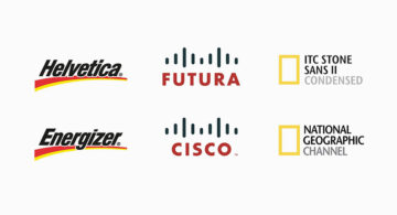
  • Graphic designer replaces wordmarks in famous logos with the fonts they use, featuring Energizer, Cisco, and National Geographic.
    Graphic Designer Replaces Wordmarks In 32 Popular Logos With The Fonts They Use
  • best-font-combinations-typeface-pairings-guide
    30 Great Font Combinations For Your Next Design Project

Share Your Views:

Comments for this post are now closed.
Share your thoughts with 433,000+ design lovers on our Facebook Page.

Popular

  • Graphic Designer Fixes The 9 Worst Logos Ever
  • 50 Incredibly Creative Logos With Hidden Meanings
  • 11 Best And Worst Redesigns Of Famous Logos
  • Top 10 Netflix Documentaries For Graphic Designers
  • 11 Differences Between Designers And Clients

TRENDING

  • Top 20 Graphic Design Trends For 2026
  • Top 10 Logo Design Trends For 2026 And How To Use Them
  • Portfolios Of Designers Who Have Worked At Apple, Google, Meta, And More
  • Designers Are Sharing Their Redesigns Of Famous Logos And Some Of Them Are Better Than The Original
  • “Which Current Graphic Design Trend Will Age Badly?” – Here Are The Top Replies

Follow Us On

  • Facebook
  • Facebook Group
  • LinkedIn
  • LinkedIn Group
  • Threads
  • Instagram
  • Pinterest
  • X / Twitter

Copyright © 2012-2026 Digital Synopsis | Privacy Policy | Affiliate Disclosure | Advertise With Us