Only Expert Graphic Designers Can Reach The Platinum Level In This UI Design Quiz
Great design is invisible. Bad design, once you learn to see it, is impossible to ignore.
The trained eye. The mark of a great UI designer isn’t simply knowing the rules — it’s developing the instinct to catch when something violates them. A button nudged two pixels off its baseline. An icon that breaks the set’s visual language. Inconsistent padding, mismatched corner radii, or a shadow falling the wrong way. These are the details that separate an interface that merely works from one that feels effortless, and most people never learn to notice them.
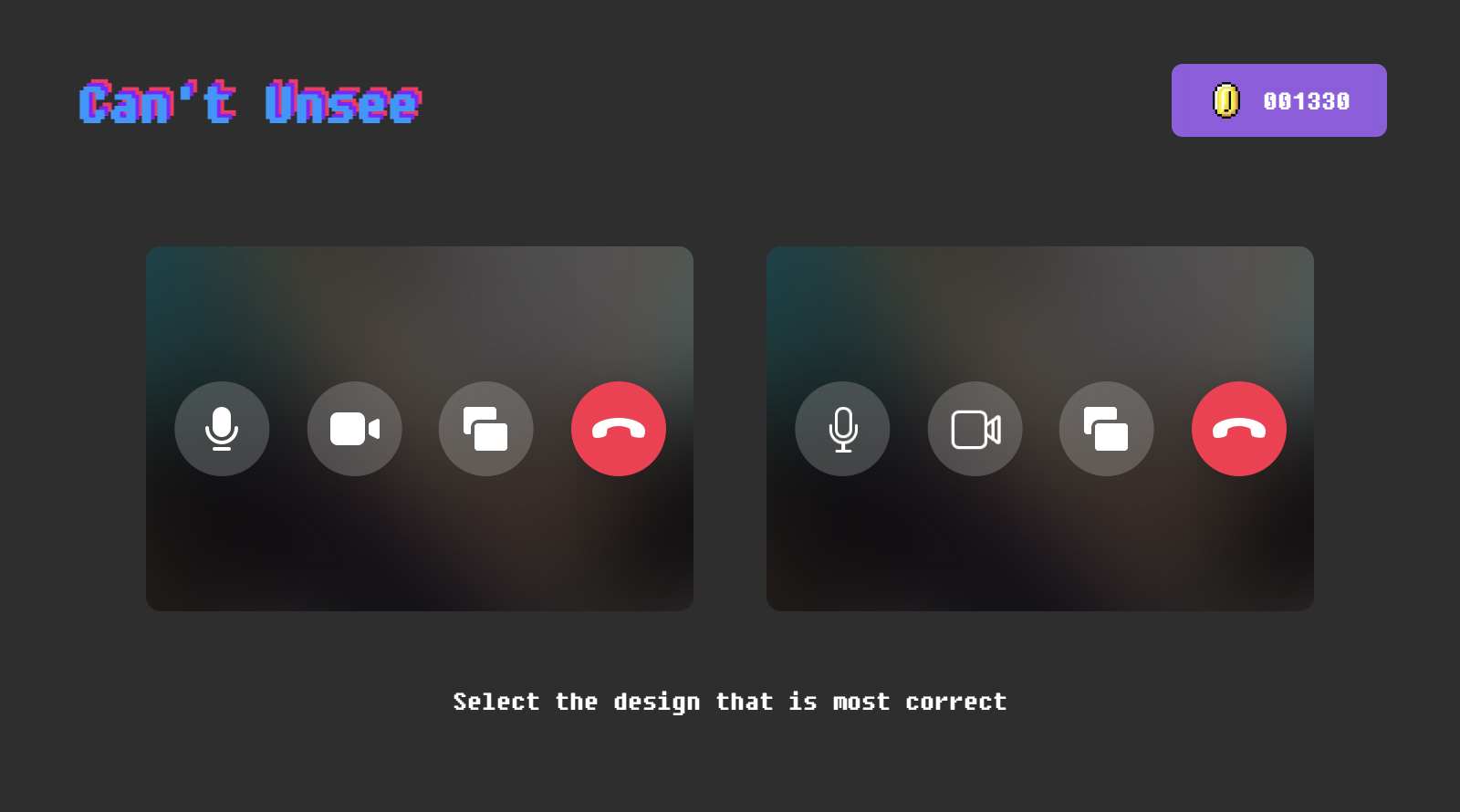
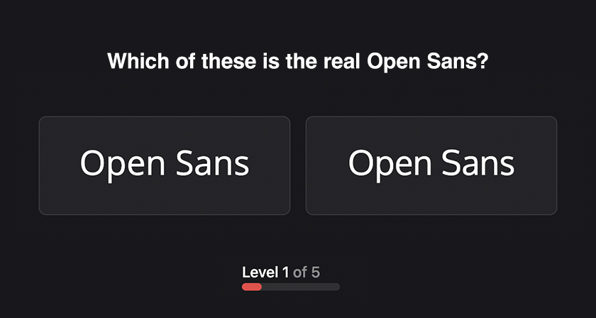
The challenge. Seattle-based UX designer Alex Kotliarskyi created a UI design quiz called Can’t Unsee that tests exactly this skill. The premise is simple: two versions of the same interface appear side by side, and you choose the correct one. Right answers earn coins.
The quiz contains three difficulty levels — easy, medium, and hard — with 18 questions in each. As you progress, the differences become increasingly subtle, until you’re hunting for flaws measured in single pixels. It’s part game, part masterclass in visual attention to detail, and a genuinely humbling test of how sharp your design eye really is.
The left design is correct because the icons follow a consistent visual style.
The aftereffect. Once you start noticing these details, you can’t stop. Misaligned spacing and off-balance layouts will start following you into every app you open — which is exactly where the name comes from.
The bottom line. In the end, the best UI/UX designers aren’t necessarily the ones with the most tools. They’re the ones who catch what everyone else misses. This quiz sharpens precisely that instinct, and it’s an addictive way to put your visual judgment to the test.
Share this post with a designer friend and tell us your score in the comments below.