50 Beautiful Color Combinations For Your Next Design Project
Photography has long been one of the more dependable teachers of color. A well-composed image has already settled the questions most designers wrestle with at the start of a project (which hue leads, which one recedes, how warm the shadows should run), and a palette sampled from it tends to bring that same sense of balance to whatever it’s applied to. Every color combination in this collection was built that way, each one drawn from a single photograph.
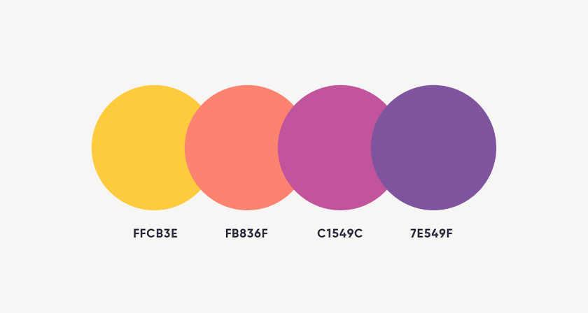
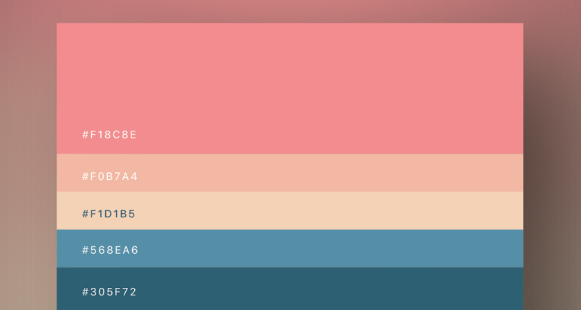
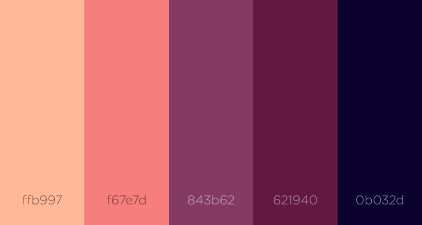
Five hex codes, one source image. Each of the 50 palettes sits beside the photograph it was sampled from, with five hex codes attached, a format first put together by the team at Visme and published here. That makes the set just as handy for brand identity work as for interface design or data visualization, where, frankly, default chart colors are still doing a fair bit of damage.
Proportion is what’s worth studying. Lining up five swatches in a neat row flattens what the photograph actually shows. In most cases one or two dominant tones carry the frame, and the brighter accents turn up only in small doses. The amber in a dusk sky works because there’s so little of it. Read each palette against its image rather than as an evenly weighted strip, and the 60-30-10 principle stops being something you memorized in design school and becomes something you can actually see.
Adapt before you deploy. Colors pulled from a backlit photo often run hotter than print can reproduce, and we’d be surprised if many of these pairings met WCAG contrast requirements for body text without a little adjustment. Treat them as an informed starting point, then tune value and saturation to suit the medium. The full set of 50 color palettes and their hex codes follows below.
1. Blue Sunset
2. Classic and Retro
3. Shimmering Blues and Greens
4. Sunset Over a Swamp
5. Mediterranean Blues
6. Exotic Orchids
7. Sophisticated and Calm
8. Magentas and Yellows
9. Blue Mountain Peaks and Clouds
10. Orange Sunset
11. Vintage 1950s
12. Vivid and Retro
13. Ornamental Reds and Yellows
14. Turquoise and Red
15. Blue Sundew
16. Classic 70s
17. Gothic Architecture
18. Fiery Red Landscape
19. Urban Skyline
20. Natural Elegance
21. Summer Blueberries
22. On the Dock of the Bay
23. Earthy Greens
24. Old Car and Blue Jeans
25. Berries Galore
26. Refreshing and Invigorating
27. Serene and Relaxing
28. Aqua Greens
29. Summer Vacation
30. Twilight Moon
31. Swiss Meadows
32. Tropical Wildlife
33. Child’s Play
34. Sunset in Hamburg
35. Lemon in Water
36. Inspirational and Romantic
37. Riverside London
38. Black and Bright Orange
39. Indian Fields
40. Jazz Night
41. Bright and Energetic
42. Earthy and Natural
43. Czech Architecture
44. Blue Accent
45. Kaleidoscope Illusions
46. Winter Barn
47. Bright and Fruity
48. Purple Garlic
49. The Colors of Nature
50. Oriental Opulence
Share this post with a designer friend and voice your views in the comments below. All images via Visme.