The best logos with hidden meanings do two things at once: they’re instantly recognisable, and they reward a second look. That double duty is exactly what turns a simple mark into something people notice, share, and remember, and it’s why clever logo designs have fascinated designers for decades.
The second read is where the design does its work. A logo with a hidden meaning has to earn its keep twice. It needs to be clear enough to register in the half-second most people give it, yet layered enough that the discovery feels earned when they finally catch it. Pull that off and you don’t just get recognition. You get a small moment of delight that fuses the idea to the brand, and that payoff almost never happens by accident.
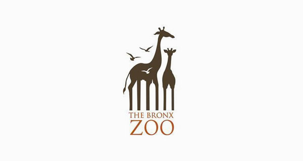
Negative space is the hardest tool to use well. Look at the arrow hiding between the FedEx ‘E’ and ‘x’, the bear standing in the gaps of the Toblerone mountain, the giraffe legs doubling as a barcode in the Bronx Zoo mark. What ties the strongest ones together is restraint. They trust the gap, the silhouette, the single shared letterform to carry the concept, and they resist the urge to spell it out.
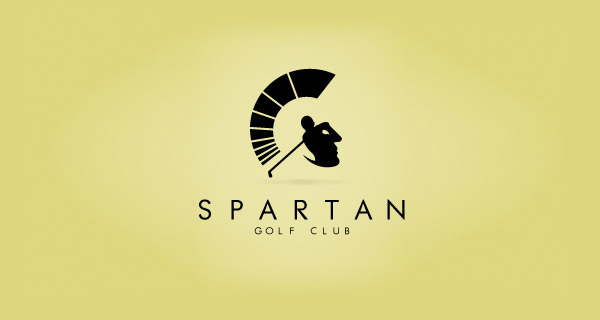
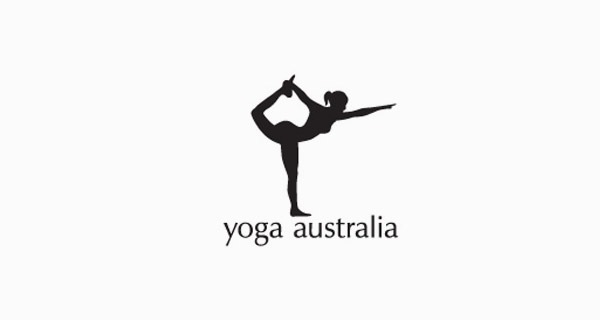
The trick only works when it’s true to the name. A clever double meaning that has nothing to do with the business is just a puzzle. The best clever logo designs here land because the hidden idea is the brand rather than a decoration bolted onto it. Spartan Golf Club folds a swinging golfer into a warrior’s helmet. Yoga Australia bends a single pose into the shape of the continent. Whether you’re a designer, a brand strategist, or just here for the “wait, I never noticed that” moment, these are worth going through slowly.
1. Spartan Golf Club
A golfer + the profile of a Spartan wearing a helmet
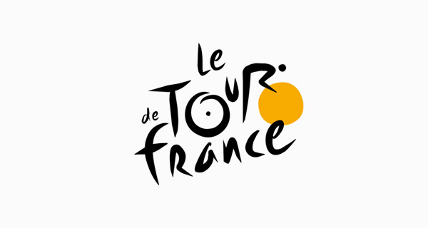
2. Le Tour de France
The letters O, U, and R create the shape of a cyclist. The orange circle is the front wheel.
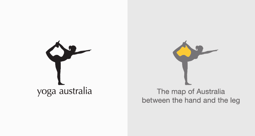
3. Yoga Australia
The hand and leg enclosure forms the map of Australia
4. Flight Finder
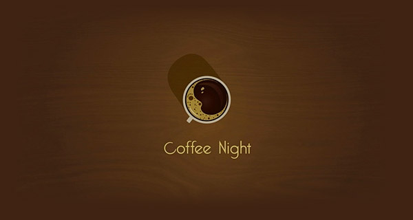
5. Coffee Night
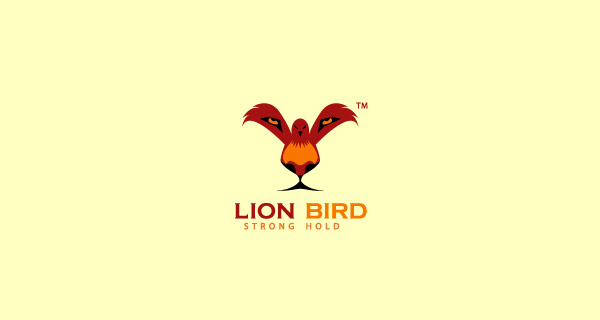
6. Lion Bird
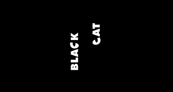
7. Black Cat
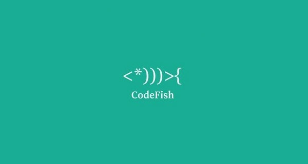
8. CodeFish
9. Shift
10. The Bronx Zoo
The negative spaces between the legs form the buildings of the Bronx
11. Magic Coffee
12. Horror Films
13. BarCode
14. Boundary
15. Bearhanded
16. Art Sharks
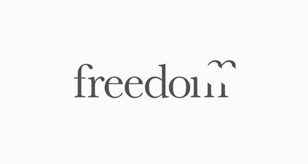
17. Freedom
18. HACI
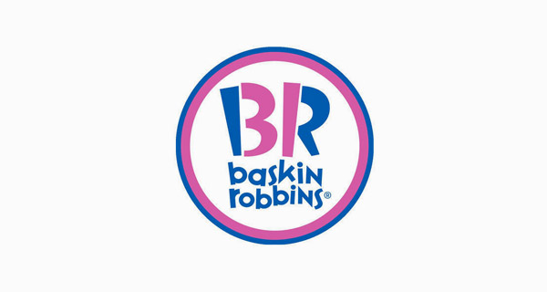
19. Baskin Robbins
Baskin Robbins has 31 flavours – check the ‘B’ & the ‘R’
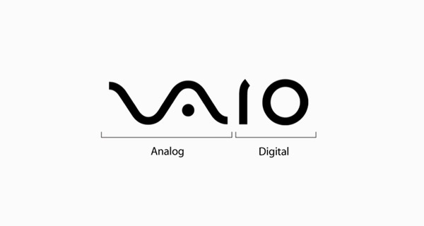
20. Sony VAIO
21. Goodwill Industries
22. Continental
The ‘C’ and the ‘o’ form a tyre
23. Eight
24. FedEx
Ever noticed the arrow in the negative space between the ‘E’ and the ‘x’?
25. Formula One
The number ‘1’ can be seen between the white ‘F’ and the red waves
26. Kölner Zoo
27. Amazon
From ‘a’ to ‘z’, Amazon has it all…and a smile.
28. Mister Cutts
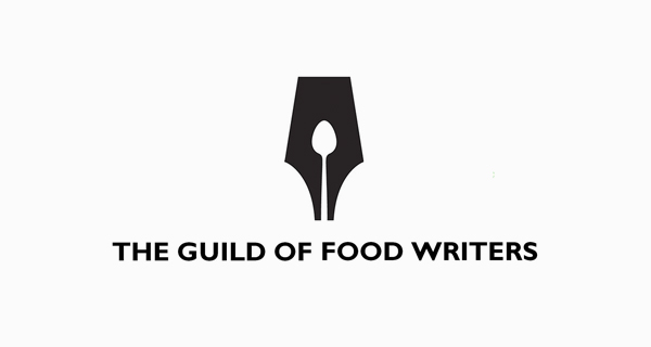
29. The Guild of Food Writers
A spoon between the nib of a fountain pen
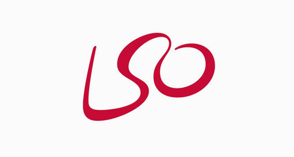
30. London Symphony Orchestra
LSO + a conductor with a baton
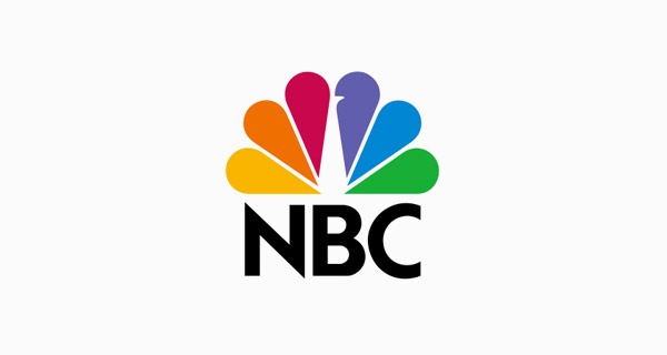
31. NBC
NBC’s peacock logo was introduced in 1956 to highlight the network’s color programming. The six feathers of the peacock represent the network’s six divisions – news, sports, entertainment, stations, network, and productions.
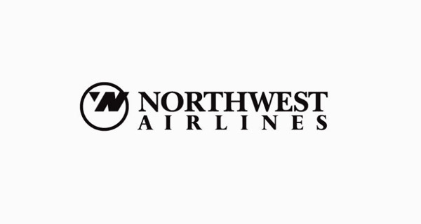
32. Northwest Airlines
The ‘N’ is also a ‘W’ with an arrow pointing north-west
33. Pittsburgh Zoo
34. Portrait Photos
35. Sun Microsystems
The chip forms the word SUN in all directions
36. Toblerone
Ever noticed the bear between the mountain?
37. Newcastle Food & Wine Festival
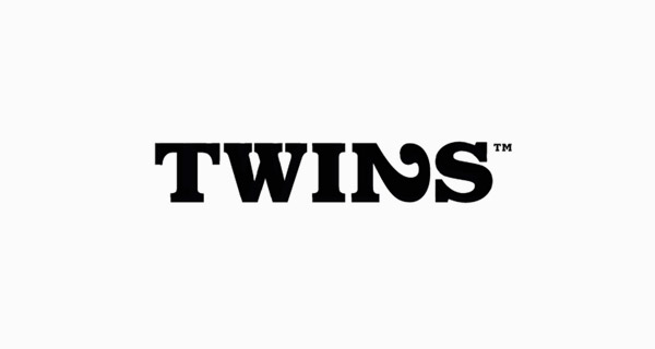
38. Twins
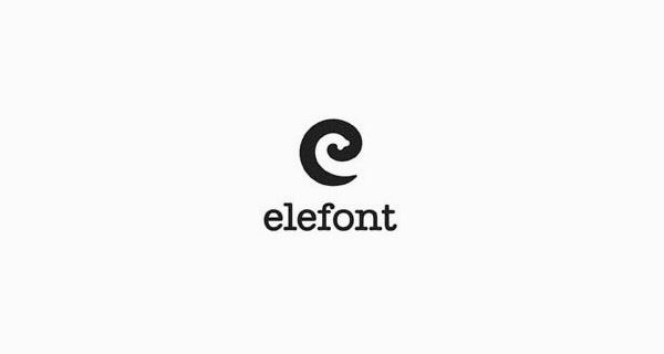
39. Elefont
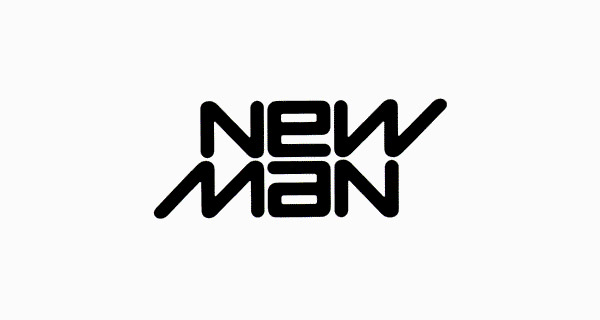
40. New Man
One of the first commercially designed ambigram/reversible logos (1969)
If we had to pick three, Spartan Golf Club, Yoga Australia and London Symphony Orchestra would be our choices. What about you? Share this post and join the discussion below.
Once a logo direction is finalized, many founders use services like Spaceship Domains to secure matching domain names as part of building out their brand presence.
A clever logo also has to retain its impact wherever the identity appears. Details that work beautifully on a screen or business card need to remain clear when the mark is reproduced across larger formats such as signage and event backdrops. Companies such as industridesigns.com apply brand identities across these physical formats, where strong contrast, clean reproduction, and instant recognizability become especially important.