It’s “Wine”, Not Dark Red – Here Are The Correct Names Of All Color Shades
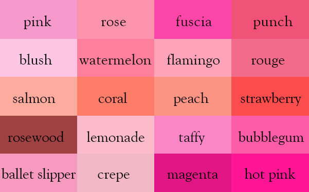
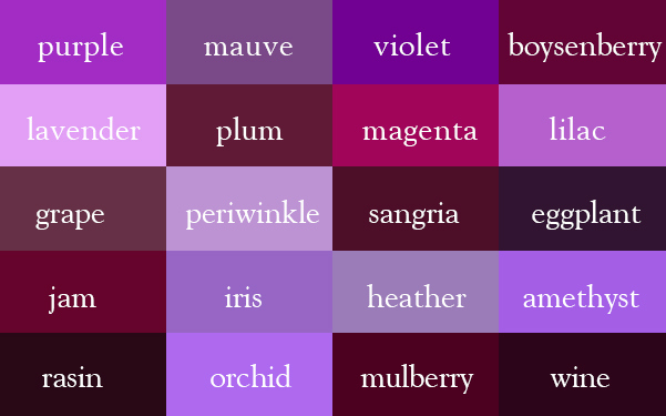
It’s lilac, not light purple. Just like it’s magenta, not dark pink.
If you’ve ever struggled to describe a color beyond “light,” “dark,” or “kind of beige,” you’re not alone. Naming shades accurately is harder than it looks, especially when you’re working in design, illustration, branding, interiors, or makeup.
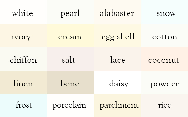
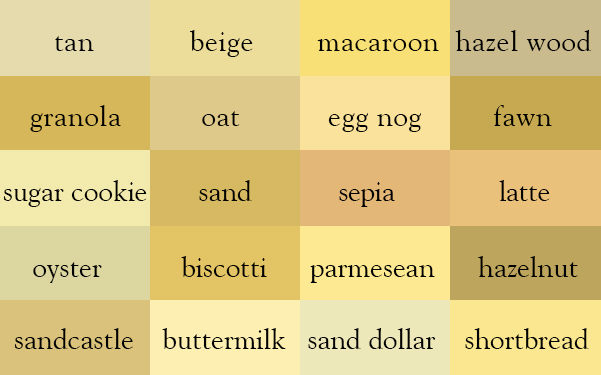
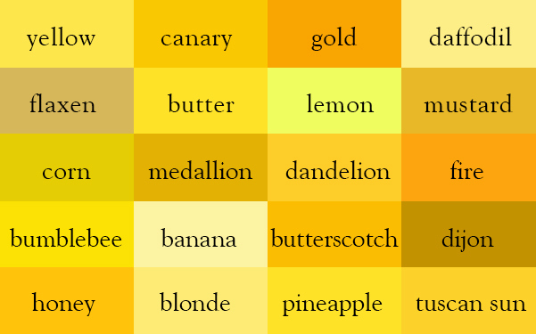
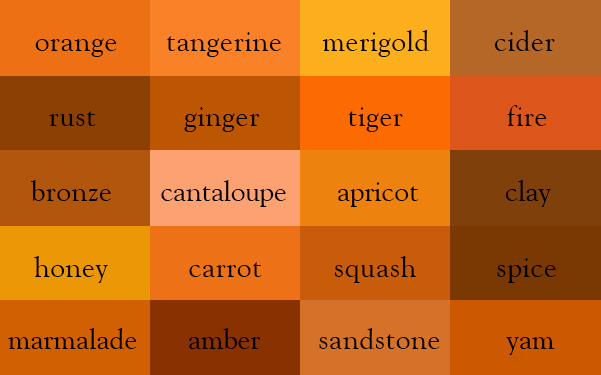
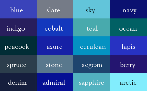
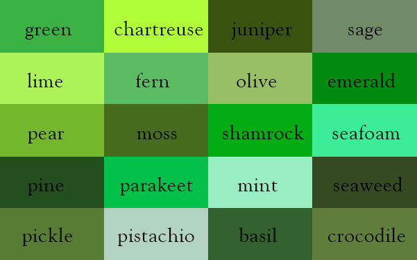
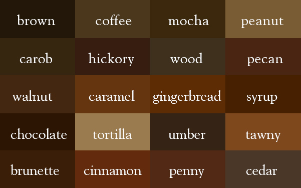
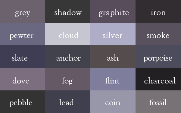
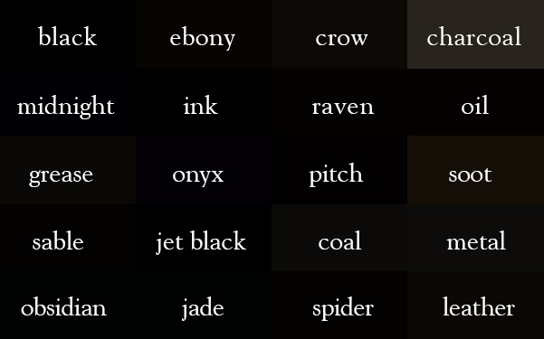
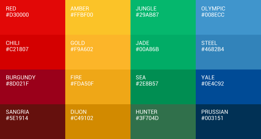
That’s exactly why illustratorIngrid Sundberg created the Color Thesaurus — a beautifully organized collection of 12 color charts that reveal the proper names for hundreds of shades across whites, neutrals, reds, and more. From soft ivories and warm sand tones to rich crimsons and deep garnets, this visual guide helps you put precise words to the colors you see.
Whether you’re a graphic designer, artist, creative professional, or simply planning a paint job or palette, this color thesaurus is an incredibly handy reference. Scroll down to explore the charts and finally learn what those “almost white” or “dark red” shades are actually called.
1. White
2. Tan
3. Yellow
4. Orange
5. Red
6. Pink
7. Purple
8. Blue
9. Green
10. Brown
11. Grey
12. Black
Bookmark this page for future reference. If you want to preserve your favorite color palettes, consider creating a collection in quality photo books so you’ll always have your own personal color thesaurus at hand. Is there a shade that’s not listed on these charts? Share this post with an art-lover, client or colleague and voice your views in the comments below.
Precise color choices matter just as much when a brand moves from the screen into physical spaces. Event graphics, signage, and branded backdrops all need to reproduce a palette consistently so that colors remain recognizable across print and photography. For brands producing large-format event materials, services such as step and repeat nyc printing can help translate established brand colors into a physical backdrop while maintaining the overall visual identity.