A brand can look completely finished in a design presentation and still fall apart as the website grows.
The launch pages look right because designers have reviewed every detail. Six months later, marketing has added campaign pages, new service sections, several case studies, and a few landing pages built under deadline pressure. One page uses the wrong heading size. Another has slightly different spacing. Someone creates a new button because the existing option doesn’t quite fit.
None of these changes seem serious on their own. Together, they slowly turn a clear visual identity into a collection of approximations.
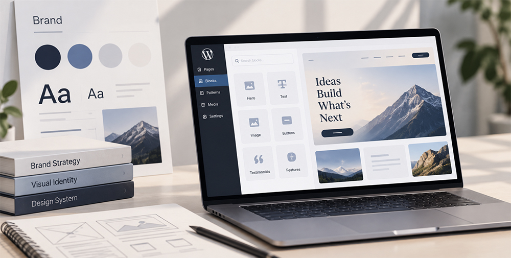
A custom WordPress website can prevent much of that, but only when the brand is treated as a system rather than a set of finished page designs.
Start With Rules, Not Screens
Brand guidelines often describe colors, typography, logo usage, and visual direction. Website designs then show how those choices appear across a handful of key pages.
Development has to fill in everything in between. What happens when a headline runs to three lines instead of one? How much space sits between a testimonial and the next section? Which background combinations are allowed? Can a CTA appear on a dark image? What happens when an editor adds a fourth card to a layout designed with three?
Those decisions need rules.
In WordPress, many of them can be carried into the theme settings rather than left for editors to interpret. A defined color palette can limit the colors available in the editor. Typography settings can establish approved font families, sizes, and line heights. Default spacing can do the same for margins and gaps between blocks.
A useful exercise before development starts is to list the visual decisions editors should never have to make manually. Those are good candidates for theme-level rules.
Turn Repeated Patterns Into Components
Most websites use far fewer unique layouts than they seem. A hero might have several variations, but the underlying structure is familiar. The same is true for testimonials, feature grids, statistics, customer logos, case study previews, forms, CTAs, and comparison sections.
Those repeated patterns are natural candidates for Gutenberg blocks and block patterns.
For example, a testimonial block can keep the quote, portrait, name, and role in their approved positions while letting an editor replace the content. A CTA block might offer two approved background styles instead of the full color palette. A feature grid can define how many columns are allowed and automatically handle the mobile layout.
This is also where development choices start affecting day-to-day brand consistency. Agencies such as IT Monks work with custom WordPress components and editing experiences so recurring page elements can follow established design rules while remaining practical for content teams to update.
The important part isn’t simply having reusable blocks. It’s deciding what stays fixed inside them and what editors are allowed to change.
Decide What Editors Should Control
CMS projects often equate flexibility with the number of available settings. That isn’t always helpful.
An editor probably needs to change a headline, image, CTA destination, testimonial, or background option. They may need to reorder sections or choose between a few approved component layouts.
Do they need to enter arbitrary font sizes? Probably not. The same goes for custom margins, dozens of color choices, or individual controls for every responsive breakpoint.
WordPress makes it possible to restrict some of these choices. Instead of exposing every color, the editor can show only the brand palette. Rather than letting people invent heading sizes, typography presets can provide the approved options. Block locking can prevent someone from accidentally removing or moving structural elements inside a more complex component.
When planning each block, write down its editable properties before building it. If a setting doesn’t support a realistic publishing task, there may be no reason to expose it.
Design for Content You Haven’t Seen Yet
One of the easiest ways to expose a fragile design system is to replace polished mockup copy with real content.
A neat two-line heading becomes four lines. A testimonial is twice as long as the example. One customer logo is unusually wide. A product name doesn’t fit comfortably inside the card designed around a shorter placeholder.
These aren’t edge cases. They are normal publishing conditions.
Test reusable blocks with deliberately awkward content before approving them. Try a long headline, a short testimonial, a portrait and landscape image, five cards instead of three, and an unusually long button label. Then check the same block on a narrow mobile screen.
Image controls deserve attention too. Fixed aspect ratios, predefined image sizes, and sensible cropping rules can stop editors from having to manually resize every asset before publishing.
Keep the Brand Consistent Across Campaign Pages
Campaign pages are where design systems tend to get tested hardest.
Marketing needs something live quickly, and the campaign doesn’t quite match an existing page. Under pressure, it is easy to duplicate an old landing page and start changing things manually.
Block patterns provide another option. A team can save approved combinations such as a campaign hero followed by customer proof and a form, or a product introduction followed by features, testimonials, and a CTA.
Editors still replace the content and can rearrange approved sections where appropriate, but they aren’t starting with an empty page.
It helps to review the last five or ten campaign pages before defining these patterns. Repeated structures are much more useful than patterns created around hypothetical future needs.
Performance Is Part of the Visual Experience
Brand consistency isn’t only about how a page looks in a static screenshot.
A carefully designed hero that takes several seconds to become usable isn’t delivering the intended experience. Neither is a custom font that causes text to jump around during loading, or an oversized image that looks sharp but makes the page unnecessarily heavy.
A few practical rules prevent common problems. Define image dimensions for recurring components, use the correct WordPress image sizes rather than uploading full-resolution files everywhere, and keep font families and weights limited to those the design actually uses.
Reusable blocks help here too. When image treatment and layout behavior are built into a component, editors don’t need to solve the same performance and presentation questions on every new page.
Don’t Let the System Freeze the Brand
A design system shouldn’t become a reason the website can never change.
Brands evolve. New products appear, marketing teams discover new content formats, and campaigns eventually need layouts nobody anticipated during the original build.
Watch for workarounds. If editors repeatedly duplicate one block and manually modify it to achieve the same result, that is a useful signal. The missing variation may deserve to become an official block style, pattern, or component option.
It is worth reviewing the block library periodically with both design and content teams. Remove components nobody uses, improve the awkward ones, and formalize useful patterns that editors have discovered through real publishing work.
The Website Should Carry the Brand for You
A strong custom website doesn’t require every editor to reopen the brand guidelines before publishing a page. Much of that knowledge can already live inside WordPress.
Theme settings define the approved palette and typography. Gutenberg blocks preserve recurring layouts. Block patterns give editors reliable starting points, while locking and limited style options protect the parts that shouldn’t change.
That leaves editors to focus on what genuinely differs from page to page: the message.
When brand identity is translated into WordPress properly, consistency depends less on everyone remembering the same rules. The editor itself quietly reinforces them each time someone creates a page.