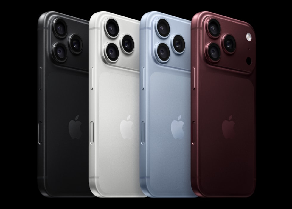
Choosing a case for the iPhone 18 Pro Max gets a lot easier once you think about it in terms of color. The phone comes in four finishes, black, silver, glacier and burgundy, and each one pairs well with a different set of tones and prints.
Some combinations make the phone look styled and intentional. Others look slightly off in a way that’s hard to name. Below is a simple way to think about color pairing, followed by case ideas for each finish.
The Only Color Theory You Need Here
You’ve got three options here. None of them are wrong, they just give you different results.
Matching is the first one, and it’s exactly what it sounds like: case and phone in the same color family. Safe, neat, a little predictable (which is fine). Complementary is the second, where you jump to the opposite side of the color wheel, so blue with orange or red with green, and the phone suddenly pops. The third is neutral. Cream, black, marble. Most of us drift there eventually, me included.
We have a great piece on color psychology if you want the nerdy version. I’d skim it. A case changes the mood of a phone way more than you’d guess.
And yeah, I know the case hides most of the phone. You still see it every time you take the case off, though, and you chose that color for a reason, so they might as well get along.
To illustrate how different colors and patterns work together, we’ve selected a range of iPhone 18 Pro Max cases from BURGA, including minimalist, marble, floral, and abstract styles.
1. If You Bought Black
Black goes with everything. Which sounds great until you realize your phone now looks like every other phone on the train. A case with a bit of personality fixes that pretty fast.
Make A Wish
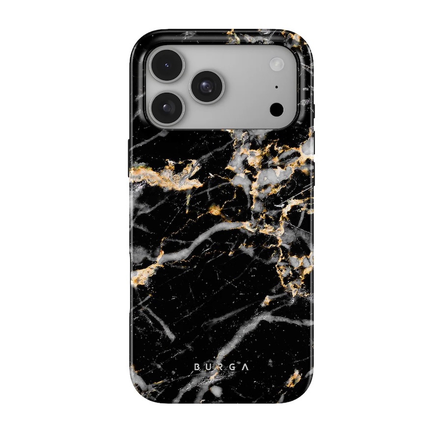
I’m starting with Make A Wish, black marble with little gold flecks. It stays dark, so you don’t lose the sleek thing you paid for, but the gold catches the light when you pick it up. Kind of like a nice watch peeking out of a sleeve.
Roller Disco
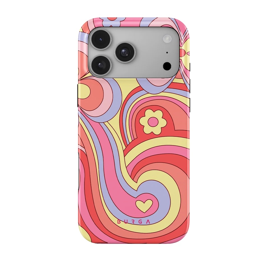
Roller Disco is the opposite idea. Pink and yellow and blue all swirled up, and against black they look almost neon. Big fan of this move. Boring phone, fun case, everybody wins.
Almond Latte
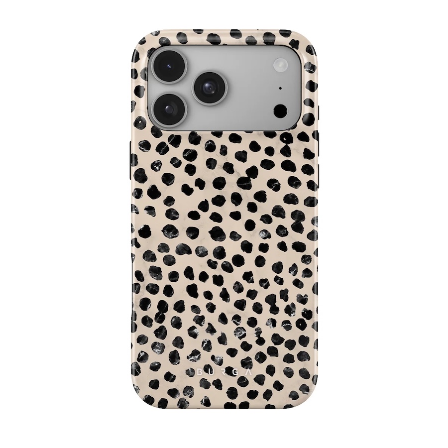
Then there’s Almond Latte, which is cream with black spots. The spots pick up the phone and the cream calms the whole thing down. If you wear a lot of beige, camel or oatmeal (guilty), I think this is the one you’d reach for most.
2. If You Bought Silver
Silver’s the classic one. Bright, a little cold, happiest with crisp prints. Funny thing is, the silver pairing I like most actually has some warmth to it, but I’ll get there.
Night Sky
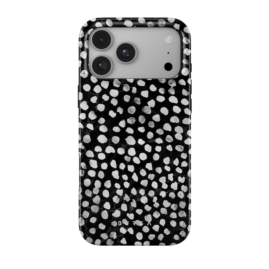
Night Sky first. It’s a dark background covered in tiny light dots, and next to silver you get that sharp black-and-white contrast, the same reason white sneakers with black laces never look dated. Not complicated. I mean that as a compliment.
Frozen Leaves
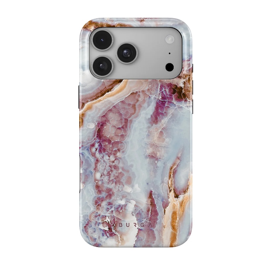
Frozen Leaves is marbling over a soft, dreamy blue, icy in the best way. Picture it with silver on a gray January morning. Frost on a car window, basically.
Old Money
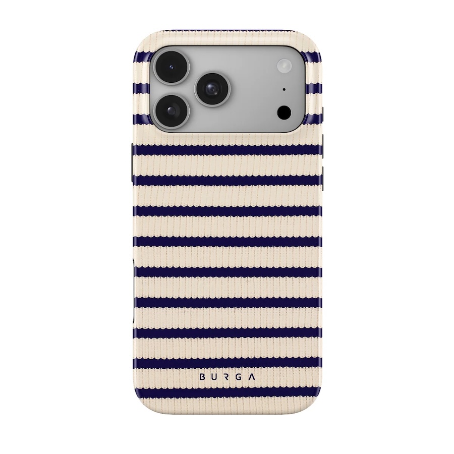
And here’s the warm one I promised. Old Money is cream and navy, very blazer-and-loafers. Silver feeling a little chilly? The cream fixes that and the navy keeps it from getting too soft.
3. If You Bought Glacier
Glacier is the pale, frosty blue, and I’ll admit it’s my favorite one to shop for. You can play it really calm or go kind of wild, and both work.
Lisboa
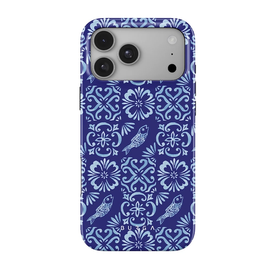
The calm route is Lisboa. It’s mostly a deep ink blue with lighter blue bits running through it, so next to the glacier the phone and case look like two swatches of the same paint card. Nothing fancy. Just nice.
Zen
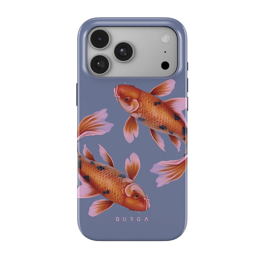
Zen is where it gets fun. Golden koi swimming in blue! The blue picks up the glacier and the orange fish bring the contrast, so you get both without going full orange. If a friend asked me for one combo from this whole article, it’d be this one.
Pumpkin Spice
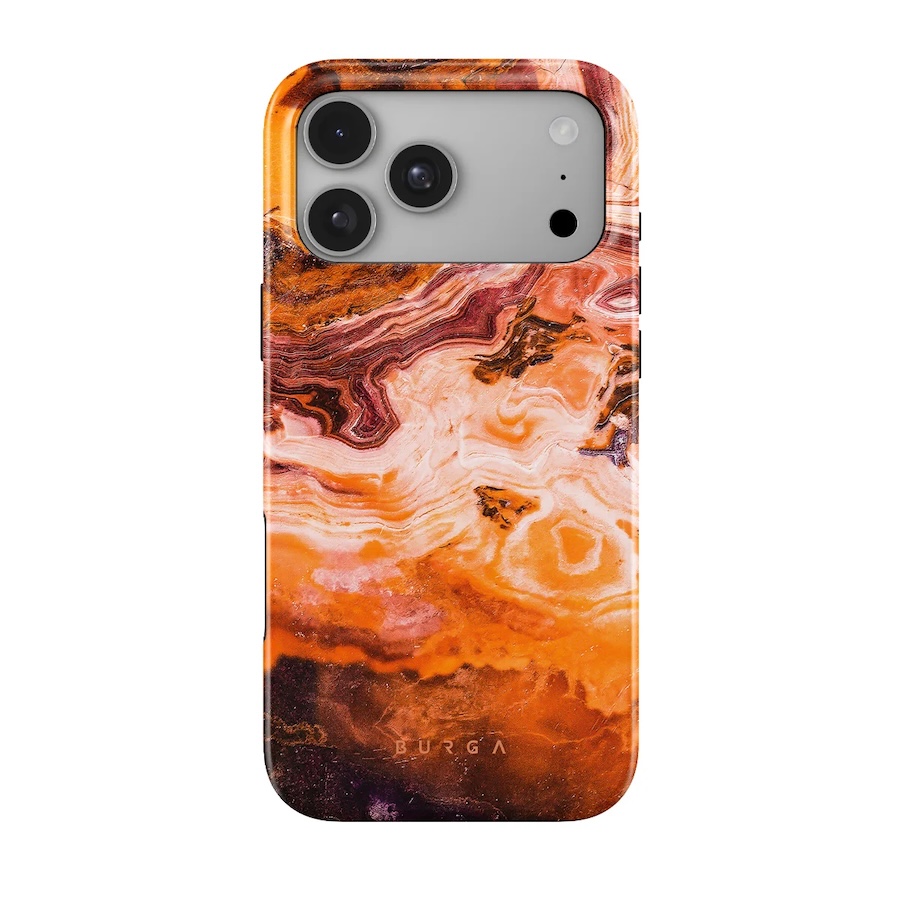
And then Pumpkin Spice, for anyone feeling brave. It’s an orange marble, which is basically as far from glacier blue as you can get. I thought it would be too much. It’s not, and come October it looks so good.
4. If You Bought Burgundy
Burgundy’s the new one this year, and I really like it. It’s dark and a little dramatic, like a glass of red wine. Warm neutrals and greens are its friends. Bright red cases, though? Skip those. The reds just clash.
Lake House
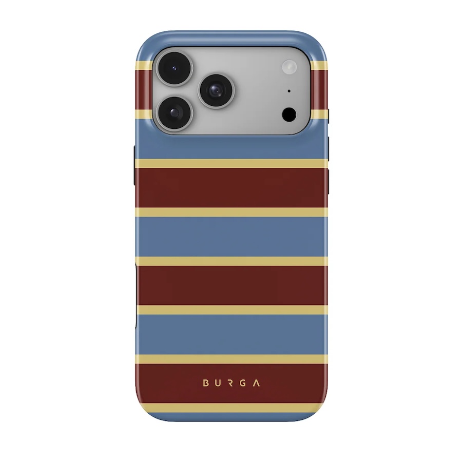
Lake House has burgundy right in the print, along with a dusty blue and a sandy color. I like that it doesn’t simply copy the phone. It echoes the burgundy and then adds two more colors, so the whole thing looks styled on purpose.
Antique
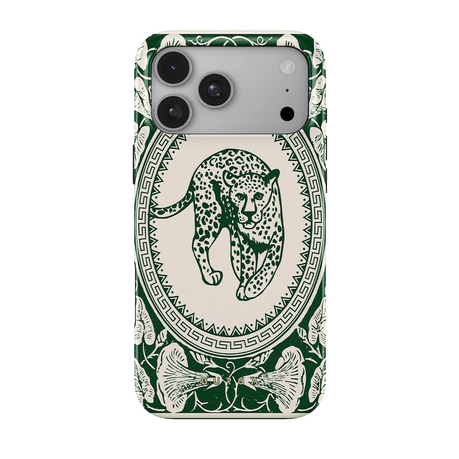
Antique is a leopard plus some green details on a nude background. Sounds a bit random, I know, until you hold it up against burgundy. Red and green are opposites on the color wheel, so the green makes the phone look even richer. Think of a dark rose with its leaves.
Before You Order
A few things I wish someone had told me earlier.
Look at your closet before you look at cases. I know, it’s boring. But if you mostly wear neutrals, a print with one accent color is going to go with way more of your outfits than something really busy.
You also don’t have to pick one case forever. I change mine around October and then again when it gets warm. Oranges and greens in fall, blues and marble once it’s cold.
If you’re into matching sets, a lot of these prints come on AirPods cases and phone charms too. Totally optional. Kind of addictive though.
And check how you charge! Not every case type works with MagSafe, so if there’s a magnetic stand on your desk, make sure the one you order does. Saves you a headache.
Final Thoughts
That’s really it. Your phone color is half the look and the case is the other half. Black can go a bit luxe, silver can warm up, glacier can get louder and burgundy gets even deeper. Figure out if you want to match or clash (nicely), then pick a print you won’t be sick of by spring.