2D game art is not one look. A low-resolution platformer, an inked fantasy world, and a painterly action game can all be described as 2D, yet they make completely different decisions about shape, color, animation, depth, and detail. The useful question is not which style looks best in isolation. It is which visual system makes the game readable, distinctive, and producible at its actual scale.
The categories below describe the dominant visual idea rather than a strict rendering taxonomy. Modern 2D video game art styles often mix hand drawing, vector construction, 3D models, lighting, particles, and post-processing. That overlap is worth studying: a style is what the player perceives, while the pipeline is how the team can deliver it repeatedly.
Pixel Art: Celeste
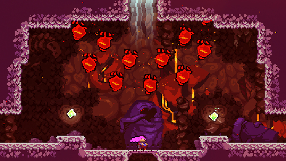
Celeste shows why a 2D pixel art game does not need dense sprites to feel expressive. Madeline’s bright hair, compact silhouette, and exaggerated poses remain readable during fast movement, while hazards use hard edges and clear color separation. The background can carry atmosphere because the gameplay layer never becomes visually ambiguous.
What to notice: Consistency matters more than the number of pixels. Sprite scale, outline weight, palette, and animation timing all obey the same visual grid.
Best fit: Precision platformers, tactics games, compact RPGs, and projects that benefit from modular sprites and controlled asset sizes.
Production hint: Lock the reference resolution and scaling rule before producing the full asset set. Unity’s 2D Pixel Perfect guidance exists to keep pixel art crisp and stable across resolutions, which makes camera setup part of the art direction rather than a late export fix.
Inked Hand-Drawn Art: Hollow Knight
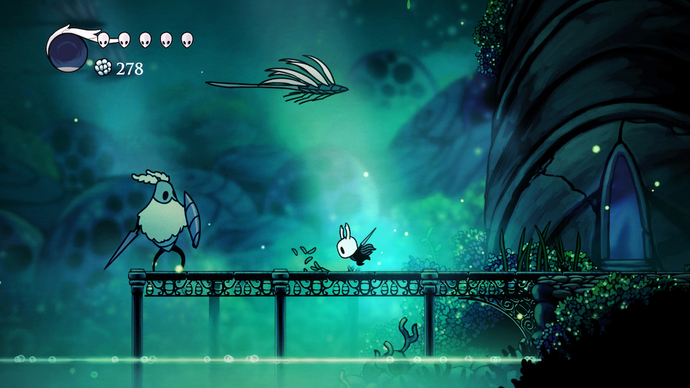
Hollow Knight builds its identity from confident black contours, pale character shapes, restrained color, and layered atmospheric backgrounds. The hero is visually simple enough to read at gameplay scale, while architecture and creatures carry richer linework. This contrast lets the world feel ornate without burying the player inside it.
What to notice: Line hierarchy separates interactive forms from scenery. Foreground shapes are assertive, distant planes are softer, and the character retains a recognizable silhouette in almost every room.
Best fit: Exploration games, narrative platformers, and fantasy worlds where drawing style is a major part of the setting’s personality.
Production hint: Define contour thickness, interior-line weight, edge softness, and parallax depth in the style guide. A loose instruction such as ‘hand-drawn’ is not specific enough for consistent 2D game character art or backgrounds.
Rubber-Hose Cartoon Art: Cuphead
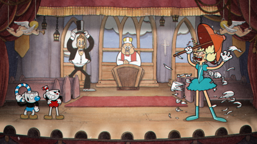
Cuphead does not merely place a vintage filter over modern sprites. Its identity comes from motion: elastic limbs, looping poses, offbeat transformations, and characters that seem unable to stay still. Studio MDHR describes the production recipe as traditional hand-drawn cel animation and watercolor backgrounds. The result works because animation, shape language, music, and interface all support the same period reference.
What to notice: The characters rarely hold a neutral pose. Anticipation, overshoot, squash, stretch, and rhythmic loops make personality visible before dialogue begins.
Best fit: Boss-driven action, comedy, musical games, and projects where animation itself is one of the main attractions.
Production hint: Treat this as an animation-heavy direction, not a surface treatment. Count locomotion, attacks, reactions, transitions, and special states before approving the final detail level; every extra line has to survive across frames.
Painterly Fantasy: Ori and the Blind Forest
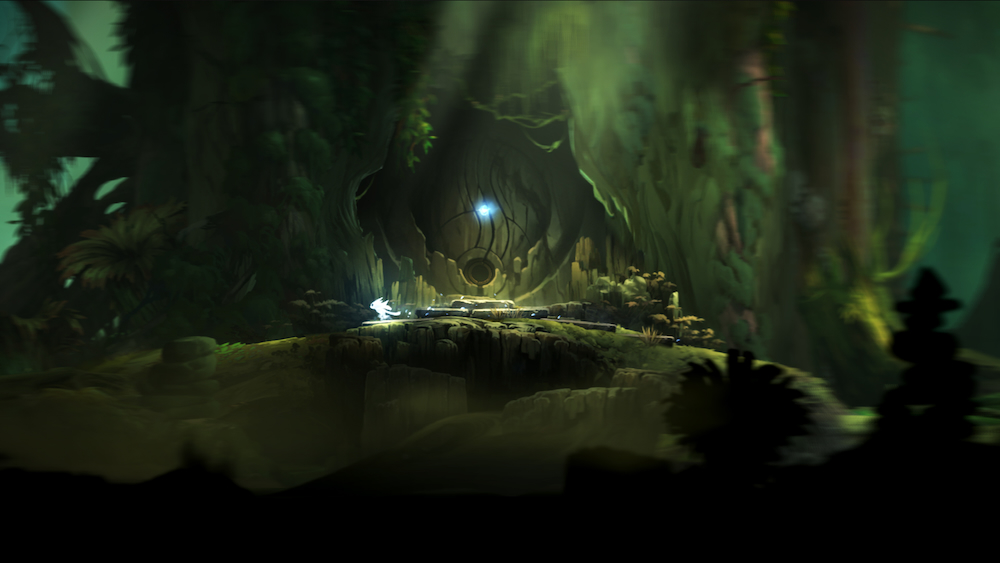
Ori and the Blind Forest uses luminous color, soft edges, layered foliage, and dramatic light to create a world that feels painted rather than assembled from obvious tiles. Yet the playable space remains clear: Ori is bright, hazards carry stronger contrast, and effects pull attention toward movement or impact. This is 2D background art for games doing both emotional and functional work.
What to notice: Value and saturation guide the eye before detail does. Warm light can signal refuge, cool haze can open distance, and high-contrast accents identify the path through a dense scene.
Best fit: Atmospheric adventures, fantasy platformers, and games where environments need to carry emotion without long exposition.
Production hint: Build foreground, gameplay, middle-ground, and background planes separately. Test the composition with effects active, because particles and bloom that look beautiful in a still image can erase platforms and enemies in motion.
Silhouette Minimalism: Limbo
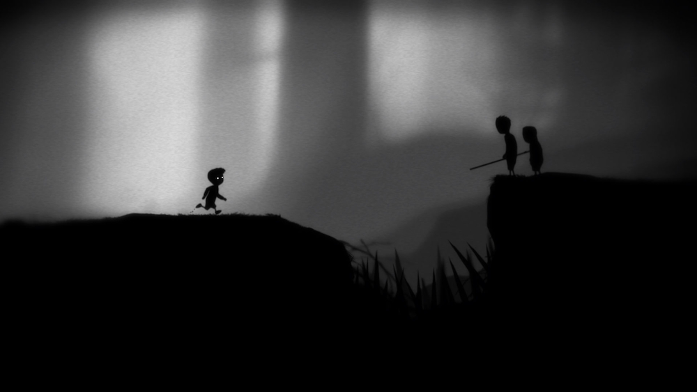
Limbo removes local color and most surface detail, then makes shape, fog, light, and motion carry the scene. The boy’s two bright eyes are enough to anchor the player. Trees, machinery, and creatures become readable through contour and scale, while uncertainty inside the dark areas supports the game’s tension.
Limbo turns negative space into navigation: a clear gap exposes a route, while merged dark masses can hide depth or danger. The figure-ground ideas become easier to recognize across Digital Synopsis’s collection of negative-space illustrations, where the background is allowed to carry as much meaning as the subject.
What to notice: Minimalism shifts the workload rather than removing it. Composition, animation, sound, and timing must compensate for the missing texture and color information.
Best fit: Puzzle platformers, horror, symbolic narratives, and games that benefit from ambiguity or a strongly controlled mood.
Production hint: Test every gameplay object as a flat silhouette first. If an obstacle, enemy, or interaction depends on internal detail to be recognized, the style and the mechanic are working against each other.
Pre-Rendered 2D: Hades
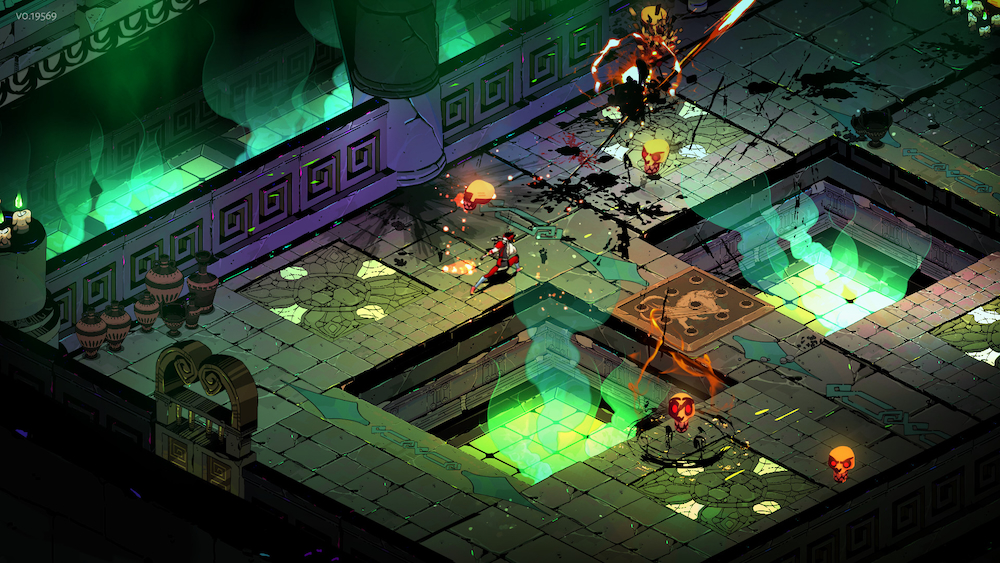
Hades is a useful reminder that 2D video game art describes the player’s view, not necessarily every production tool behind it. The final image combines bold illustrated portraits, an isometric camera, carefully staged environments, effects, and character production that includes 3D work. Artist Paige Carter’s Hades character-production breakdown covers modeling, texturing, rigging, and animation used to adapt the game’s distinctive concepts into production assets.
What to notice: Portraits, gameplay characters, environments, VFX, and UI share angular shapes and high-contrast color accents even though they do not come from one identical technique.
Best fit: Isometric action, tactics, and content-heavy games that need many directional poses or animations while preserving an illustrated final look.
Production hint: Decide early whether characters will be drawn frame by frame, rigged in 2D, or developed through a 3D-to-2D pipeline. The choice changes staffing, revision cost, directional coverage, and how easily skins can be added.
Flat Graphic Illustration: Night in the Woods
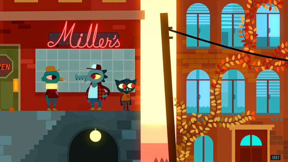
Night in the Woods uses simplified geometry, broad color shapes, minimal shading, and sharply designed animal characters. The apparent simplicity is deliberate. Faces can change with very few marks, poses remain easy to read, and locations feel connected because buildings, props, characters, and typography share the same graphic logic.
What to notice: Personality comes from proportion and timing rather than rendered detail. A head tilt, eye shape, or pause in a pose can carry the emotional beat.
Best fit: Dialogue-heavy games, comedy, social narratives, and projects that need a large cast without highly rendered character sheets.
Production hint: Create a reusable shape library for eyes, mouths, hands, props, signage, and environment details. Flat art exposes inconsistency quickly, so shared proportions and color rules matter more than adding polish later.
HD-2D Hybrid: Octopath Traveler II
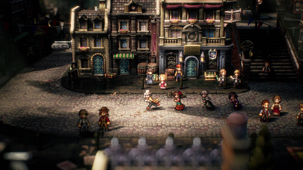
Octopath Traveler II places pixel-based characters inside diorama-like environments with modern lighting, depth, particles, and camera effects. It preserves the memory of a classic RPG without pretending that the display technology is still limited to the 16-bit era. In an Unreal Engine developer interview, Acquire describes increasing map resolution while keeping an organic pixel-art impression.
What to notice: The appeal comes from contrast: flat sprites against dimensional scenery, nostalgic abstraction against realistic light, and compact character faces against cinematic staging.
Best fit: RPGs and strategy games that want retro character language with richer environments, lighting, and presentation.
Production hint: Prototype the full composite before producing asset volume. Pixel density, depth of field, light size, texture filtering, camera angle, and sprite scale must be tuned together or the scene will look like unrelated layers.
How to Choose a 2D Game Art Style
Start with the camera and the player’s decisions. A character that looks excellent in a dialogue portrait may fail at gameplay scale; a richly painted background may conceal a traversal route; a fluid animation style may be impossible to sustain across hundreds of enemies. The best 2D game art styles make the important action easier to read while giving the project a recognizable visual voice.
Test the real frame: Build one representative gameplay screen containing a character, an enemy or interactable object, a background, VFX, and UI. Judge the system together, not as separate portfolio pieces.
Calculate repetition: Estimate characters, poses, animation states, locations, props, icons, resolutions, and variants. A style is affordable only when the team can repeat it consistently through the whole game.
Separate identity from imitation: Borrow principles such as silhouette clarity, limited palettes, graphic linework, or layered depth. Copying a famous game’s exact surface treatment produces familiarity without a visual reason of its own.
A useful style test should define line weight, palette, value range, rendering depth, animation method, file structure, and engine constraints. Producing the full asset set is then a team task: character artists, environment artists, UI designers, animators, and technical artists apply those same rules to different parts of the game. When a studio does not keep every role in-house, 2D game art outsourcing provides the missing production coverage while art direction and final approval remain internal.
Choosing 2D Game Art Software
There is no universal 2D game art software stack because the delivery method follows the style. Pixel artists often work in Aseprite, Photoshop, or Krita; illustrators may add Clip Studio Paint or Procreate; vector-heavy projects may use Illustrator or Affinity Designer; skeletal animation may introduce Spine or engine-native rigging tools. The software matters less than whether the files preserve the layers, pivots, naming, export sizes, and revision control the project needs.
Engine testing should begin during the style test, not after the art is finished. Godot’s 2D sprite animation documentation illustrates a basic but important choice between individual frames, sprite sheets, and property animation. Similar decisions affect memory, batching, iteration speed, and how the 2D art actually behaves in play.
From Graphic/Web Design to Game Art
One distinction matters before planning the move: game designers and game artists are different roles. Game designers shape rules, systems, levels, progression, and player decisions. Graphic and web designers who want to work on the visual side of games usually move toward 2D game art, game UI/UX, visual development, or technical UI rather than game design itself.
The transferable skills are substantial: composition, color, typography, hierarchy, branding, and user flows all remain useful. The difference is that a game asset does not end as a fixed poster or responsive page. It must stay readable while the camera and characters move, react to input, support multiple states, coexist with VFX, and arrive in the engine with usable layers, dimensions, pivots, naming, and export settings.
A Practical Route Into 2D Game Art
- Choose an entry lane. Game UI/UX is the closest match for many web designers; character art, environment art, sprite animation, and visual development suit different illustration strengths.
- Turn portfolio pieces into systems. Replace one polished screen with normal, hover, pressed, disabled, and responsive states. Replace one character pose with a turnaround, expressions, animation frames, and gameplay-scale tests.
- Learn one engine. Import sprites, build an atlas, set pivots, assemble parallax layers, configure UI anchors, and test the work at the target resolution in Unity or Godot.
- Build one playable slice. A small room with one character, one interaction, one HUD state, and one animated response proves more game readiness than a large gallery of disconnected illustrations.
Where 3D Fits
3D design introduces another production language: modeling, UVs, materials, rigging, lighting, and camera work. It also appears inside many projects that look 2D to the player. Teams may use rough 3D scenes for perspective, paint over rendered bases, pre-render animated characters, or combine flat sprites with dimensional environments.
Starting with 2D is a practical transition because graphic and web designers can reuse their strongest visual skills while learning engine constraints, interactive states, animation, and asset handoff. It is not automatically easier than 3D; the complexity shifts into frame counts, layered backgrounds, UI states, and asset variation. Once the 2D asset-to-engine loop feels familiar, basic Blender skills make it easier to explore blockouts, paintovers, lighting references, and hybrid pipelines.
A strong transition portfolio is therefore not a gallery of isolated illustrations. It is one small, engine-tested visual system containing a character with states, a layered background, readable UI, animation, and production-ready files.