27 Inspiring Quotes Beautifully Illustrated With Minimalist Posters
Some quotes deserve more than italics on a plain page. This collection proves it, pairing some of history’s most quoted lines with visual metaphors so precise they feel inevitable, once you’ve seen them.
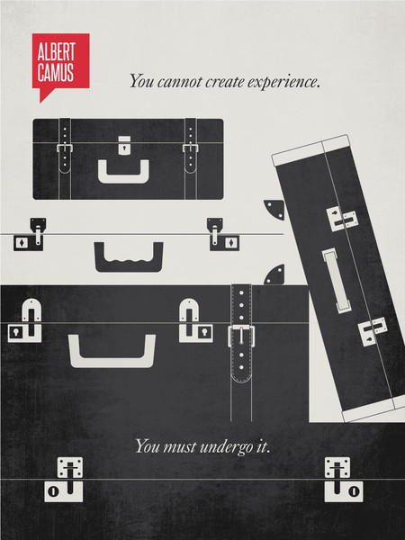
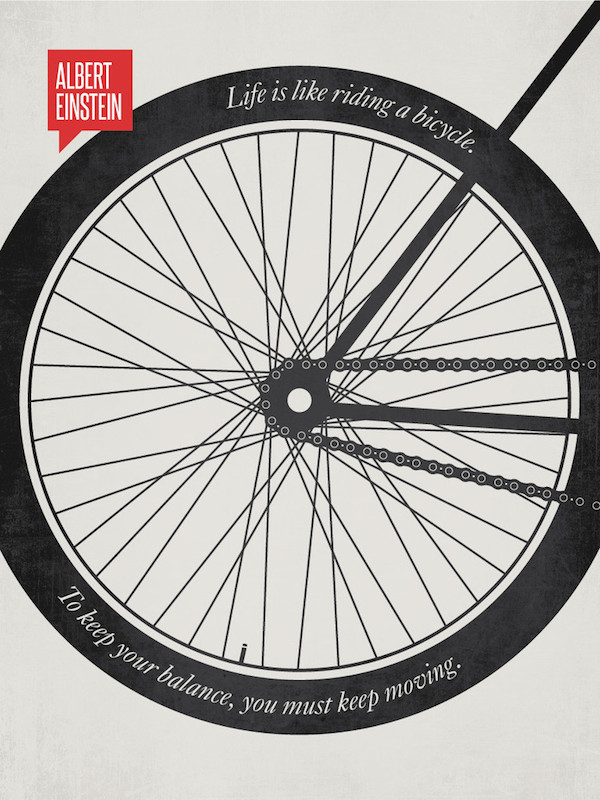
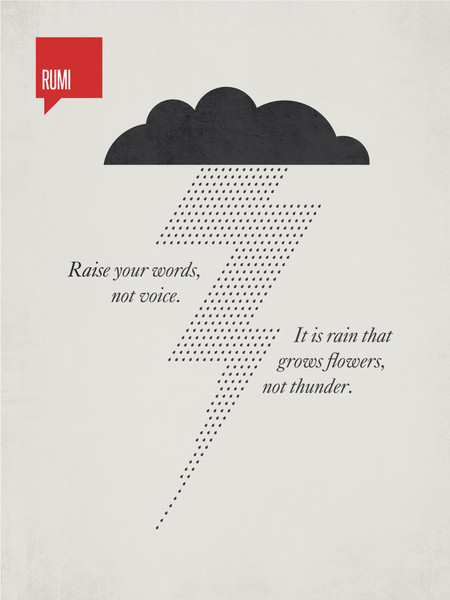
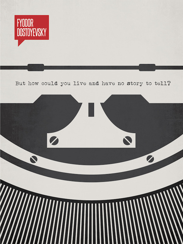
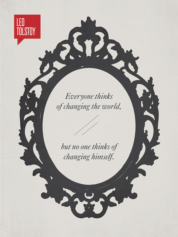
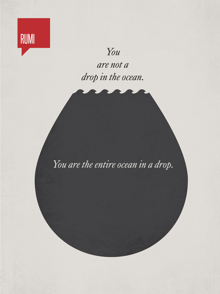
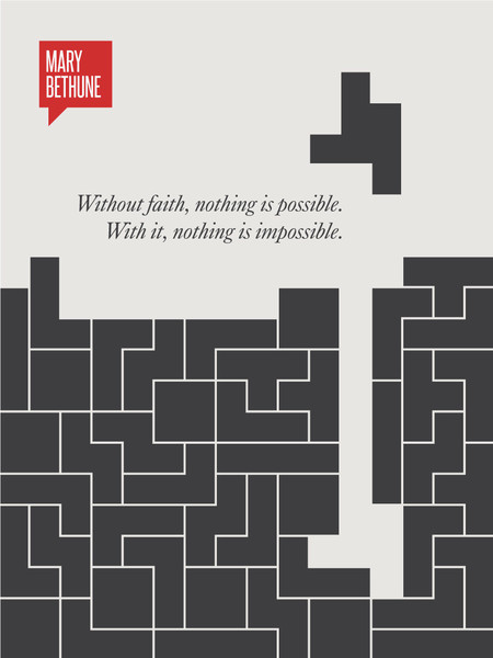
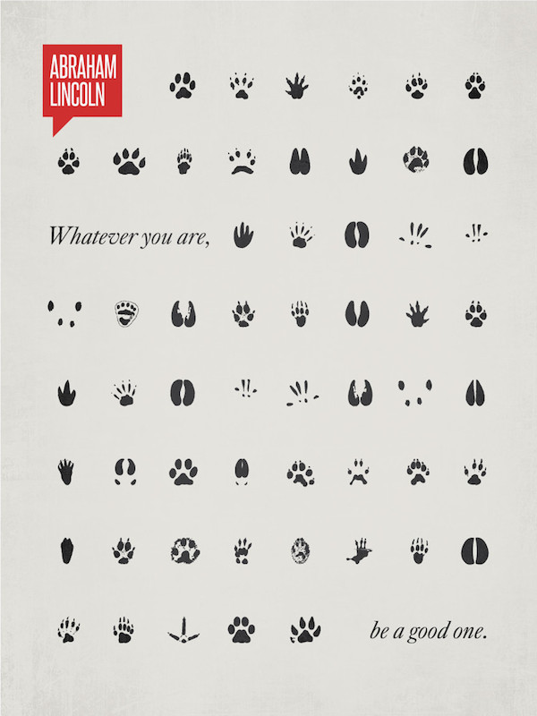
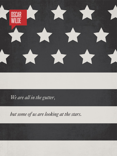
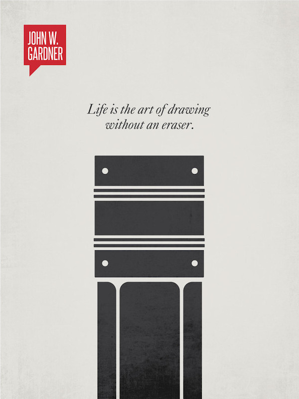
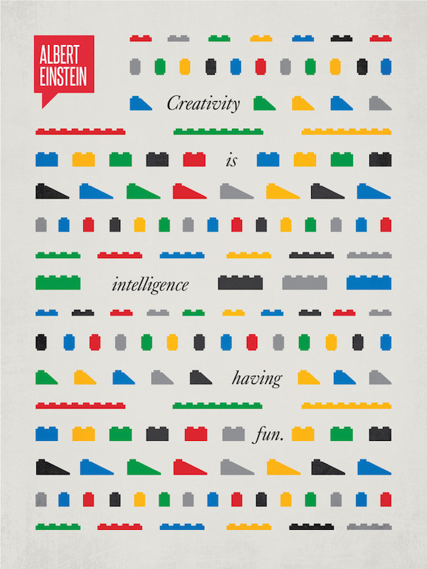
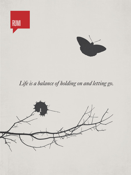
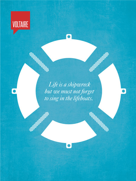
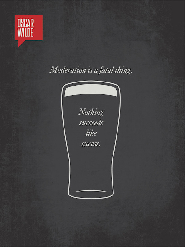
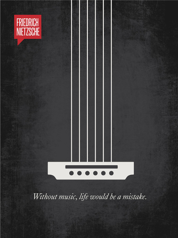
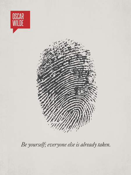
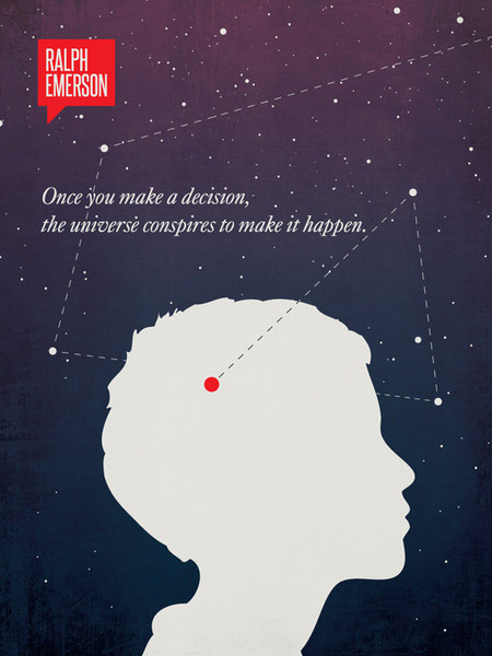
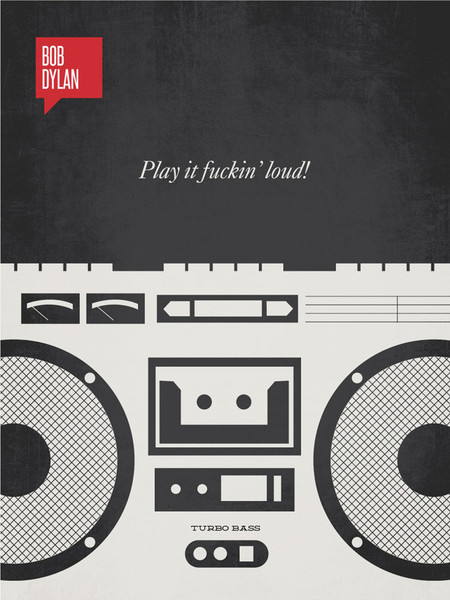
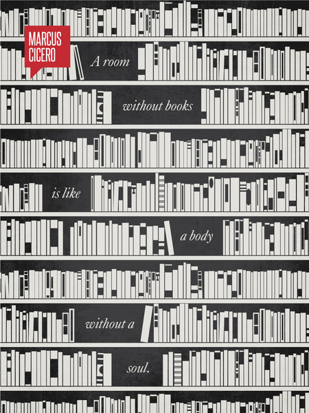
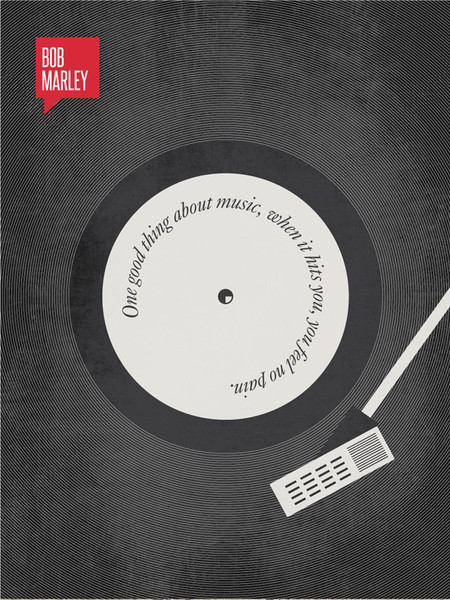
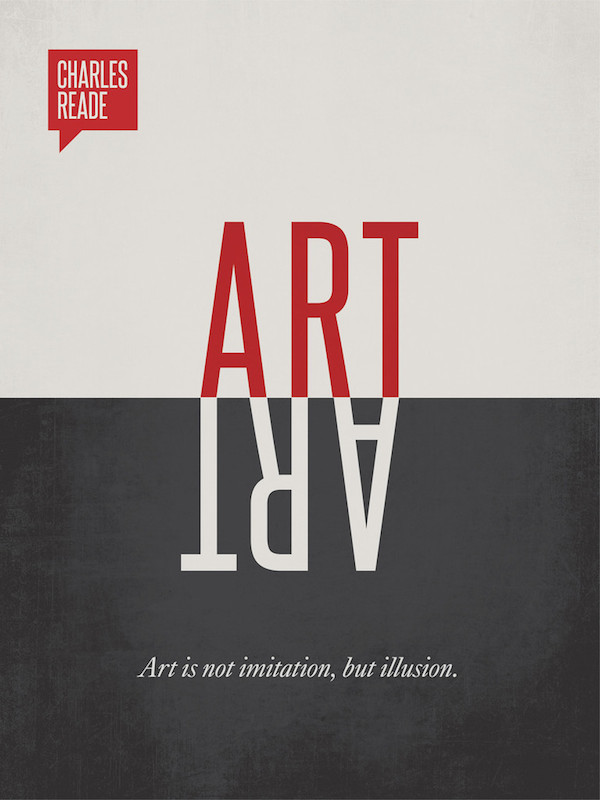
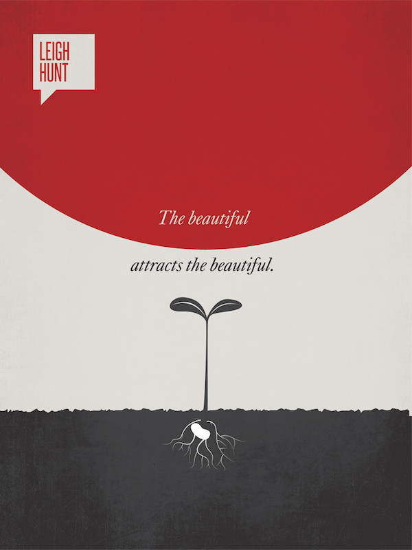
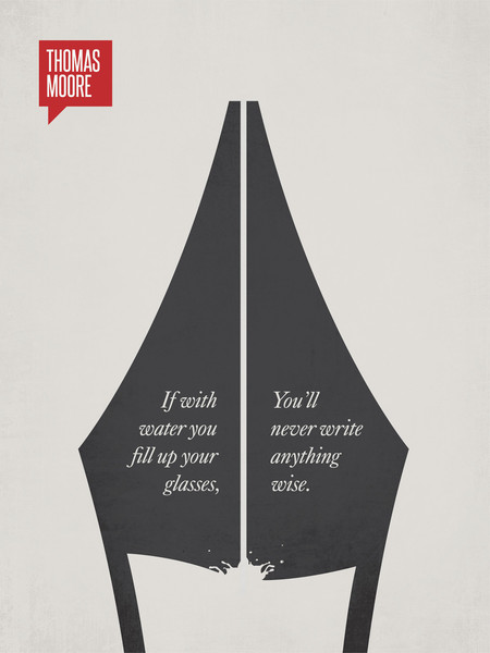
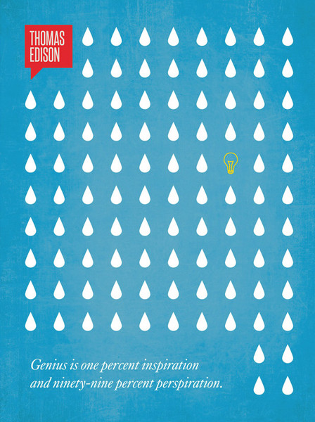
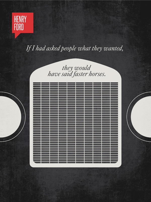
Minimalist poster design works best when restraint does the heavy lifting, and that’s exactly what Toronto-based artist Ryan McArthur delivers here. Each piece strips a famous quote down to a single monochromatic illustration, a radiator grille standing in for Henry Ford’s take on innovation, a bicycle wheel spinning out Einstein’s thoughts on balance. Nothing extra. Nothing wasted.
Typography and image do all the storytelling, which is harder than it looks. The muted greys, the occasional flash of blue, the confident use of negative space, these are the fundamentals of good graphic design applied with real discipline. Every poster reads instantly, but rewards a second look once the visual pun sinks in.
What makes this series work is restraint. McArthur never illustrates the quote literally; he finds the one image that reframes it. That’s the harder skill in poster design, and it’s why this set has circulated among designers for years as a masterclass in visual minimalism.
1.
2.
3.
4.
5.
6.
7.
8.
9.
10.
11.
12.
13.
14.
15.
16.
17.
18.
19.
20.
21.
22.
23.
24.
25.
26.
27.
Here’s a behind-the-scenes look at the making of this Henry Ford quote poster.
Great quote design isn’t about decoration, it’s about translation, taking a sentence and finding its visual equivalent without over-explaining it. That’s the throughline across all twenty-seven posters here, and it’s a useful benchmark for any designer working with typography and imagery today.