
Did you know that you can use Adjustment layers and the Blend If mode in Photoshop to enhance skies and make them look more dramatic in your photos? In this one-minute tutorial, Photoshop instructor Unmesh Dinda from PiXimperfect shows you a simple technique to add details and definition to clouds by using Adjustment Layer, Mask, Brush Tool, and Blend If: Underlying Layer. … [Read more...]
Search Results for: color
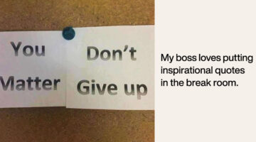
Clever Ads From Post-it Highlight Creatives Who Spend Sleepless Nights Coming Up With Bright Ideas

Ogilvy Istanbul has come up with a brilliant campaign for Post-it that highlights the artists, designers, and creatives who spend sleepless nights honing their craft. The 3-ad series features illustrations of an architect, a musician, and a designer working late into the night while everyone else has left the office or is asleep. The yellow light of their office/studio … [Read more...]
Remember The Graphic Designer Who Trolled Photoshop Requests? He’s Back!
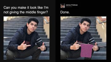
Are you looking for someone who can Photoshop your ex-boyfriend or girlfriend out of a photo? Or fix your bald patch and cut some flab off your waist? Is there a favourite photo of yours that needs some minor Photoshopping to make it even better? If yes, then James Fridman is the man for the job. The British designer is an internet star with nearly 1.5 million followers on … [Read more...]
Designer Creates Beautiful Team Badges During The World Cup
Venezuela-based illustrator and graphic designer Moises Fernandez designed some beautiful team badges for his Instagram page during the World Cup. Created with Adobe Illustrator and Photoshop, the crests feature beautiful illustrations and artwork, with national symbols and relevant colors for each team. Check them out below. … [Read more...]
This Clever Photoshop Trick Lets You Add Realistic Light Or Shine To Any Object
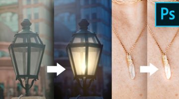
Did you know that you can add realistic-looking lights and shine to images of lamps and jewellery by using the magic of blend modes in Photoshop? In this tutorial, Photoshop instructor Unmesh Dinda shows you how to use color dodge and layer styles to mimic the properties of light and shine. He takes you through five different image examples and shares two different methods … [Read more...]
19 Graphic Design Mistakes That Novice Designers Make
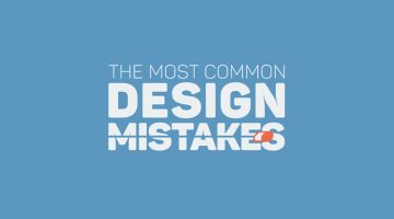
After a few years in the graphic design business, you realize how important it is to get the basics right. Like using proper font and color combinations, implementing visual hierarchy, using grids, alignment, white space, and so on. The team at Visme, an online tool for creating infographics and presentations, has come up with an excellent visual list of 19 graphic design … [Read more...]
21 Memes Only Graphic Designers Will Understand
Monday can be a tricky day for designers, with clients, bosses, and deadlines breathing down their necks. We thought you guys could use some meme therapy to help brighten up your day. Check out the compilation below, and don't forget to browse through some of our other popular meme posts. … [Read more...]
Designer Creates Clever Logos By Combining Two Or More Different Shapes Into One
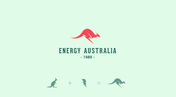
Kochi-based designer Shibu PG has come up with a series of interesting logos in which he combines the shapes of two or more different objects and letters into one unique logo. The logo in each case is a visual representation of the brand name. For example, the logo for Energy Australia is a combination of the shape of a kangaroo and the energy symbol ⚡️. The logo for … [Read more...]
India Today Comes Up With A Brilliant Cover To Raise Awareness About Saving The Taj Mahal
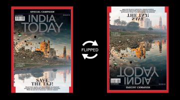
News magazine India Today has come up with a powerful cover for its Save the Taj campaign (July 30 issue) that features a cleverly-inverted photograph of the Taj Mahal and its reflection in the neighbouring Yamuna river. At first glance, the cover photo looks like an eroded image of the Taj surrounded by garbage. When flipped upside down, you realise that the eroded image is … [Read more...]
Top 20 Car Logos Of All Time
From American muscle to European exotics, everyone has a favourite car they would like to own one day. But do you also have a favourite car logo? We asked a panel of designers and art directors to rank the best car logos of all time, strictly from a design perspective, not in terms of brand value. Check out the results below and tell us your favourite in the comments. … [Read more...]
This Clever Photoshop Trick Lets You Generate Unlimited Filters With Just One Click

Did you know that the Gradient Editor in Photoshop has a 'Randomize' feature that lets you browse through unlimited gradients which you can use as filters on your photos? In this tutorial, Photoshop instructor Unmesh Dinda shows you how to combine the concepts of Gradient Fill, Gradient Maps, and Blend Modes to create beautiful color combinations and filters automatically in … [Read more...]
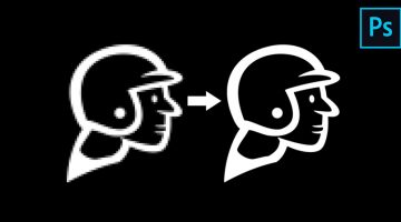
Fix And Sharpen A Blurry Photo With This Clever Photoshop Technique
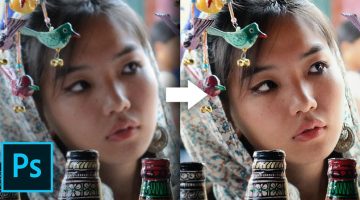
Most cameras nowadays have 'image stabilization' or 'anti-shake' features to reduce the likelihood of taking blurry photos. It works by moving the camera lens automatically to compensate for handheld movements. But once in a while, you do end up with a great capture that's slightly blurred and you don't really want to delete that image. What do you do then? Mumbai-based … [Read more...]
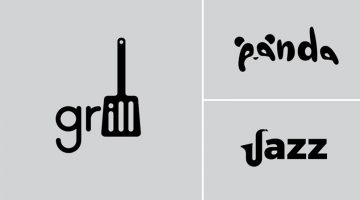
23 Clever Typographic Logos Of Common Words We Use Every Day
Colombo-based graphic designer Samadara Ginige has come up with a series of typographic logos of common nouns and verbs we use every day. The project, titled "Verbicons", visualizes the meanings of the chosen words by using symbolism, negative space, or by adding geometric elements to the letters. For example, the letter 'c' in the word 'cash' looks like a dollar bill. The … [Read more...]
Designer Creates Clever Logos That Visualize The Name And Business Of The Company
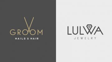
Kuwait-based graphic designer Rami Hoballah has come up with a series of minimalist logos that combine the name and the product (or service) of the company into one unique symbol. The logo in each case visually represents the brand name and the nature of its business. For example, the logo for Groom Salon is a pair of scissors made with the two o's in the word 'Groom'. The … [Read more...]
Designers Challenge Themselves To Create A Typographic Logo Every Day For A Year, And They’re Pretty Cool
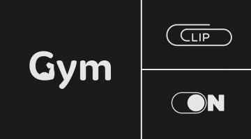
UK-based graphic designers Liam + Jord undertook a 365-day challenge to create one new typographic logo of a common word we use every day. The objective was to visually represent the meanings of the words by using symbols, negative space, or by adding geometric elements to the letters. For example, the letter 'i' in the word 'drive' looks like a gear stick, the letter 'f' in … [Read more...]
Designer Creates Clever Logos That Visually Represent The Name And Business Of The Company
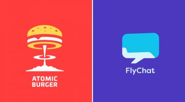
Lithuania-based graphic designer Leo has come up with a series of minimalist logos called "Smart Logos" that combine the name and the product (or service) of the company into one unique symbol. The logo in each case visually represents the brand name and the nature of its business. For example, the logo for Atomic Burger is a burger on top of a mushroom cloud. The logo for … [Read more...]
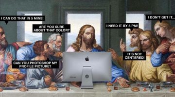
25 Memes Designers And Agencies Will Relate To
Feeling bored at work? Have 5 minutes to spare before your boss comes back from a meeting? If yes, then check out these 25 epic memes that every mouse-weilding, client-bashing, font-loving designer will relate to. Warning: Some of these memes might make you question your choice of profession. This is perfectly normal. If symptoms persist after 48 hours, please talk to a … [Read more...]
29 Images That Prove Why Good Design Is Important
Regular readers of DS know that most of our posts are about inspirational art and design. But once in a while, we like to sneak in a post about design blunders, just to keep the humour alive. Previously, we shared some epic logo disasters, letter-spacing fails, ad-placement blunders, and more. Today's post features some more design fails that are bound to make you laugh at … [Read more...]
Beautiful Alphabet Series Of The World’s Most Famous Cities And Their Iconic Landmarks
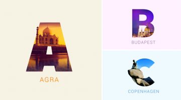
Indian graphic designers Rigved Sathe and Payal Jagwani have come up with a beautiful project titled "Around The World With Type" that mixes typography and photography to represent some of the world's most famous cities and their iconic landmarks. Each letter represents a city and includes a photograph of a famous landmark clip-masked within the letterform. From New York's … [Read more...]
How To Pair Fonts That Complement Each Other (With Examples)
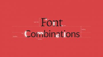
Good font pairing is one of the key differentiators between amateur and professional design. Rookie designers often use more fonts than required and there is lack of typographical contrast in their design. It's tricky because there are no fixed rules as to what kind of fonts work well together, but there are certain guidelines that can help you pick fonts that complement each … [Read more...]
Designer Challenges Himself To Create A Typographic Logo Every Day For A Year, And They’re Pretty Cool
Stockholm-based graphic designer Daniel Carlmatz undertook a 365-day challenge to create one new typographic logo of a common word we use every day. The objective was to visualize the meanings of the words by using symbolism, negative space, or by adding geometric elements to the letters. For example, the letter 'a' in the word 'search' looks like a search bar, the letter 'j' … [Read more...]
NVIDIA Develops A.I. That Can Fix Damaged Photos And Remove Unwanted Objects With Amazing Accuracy
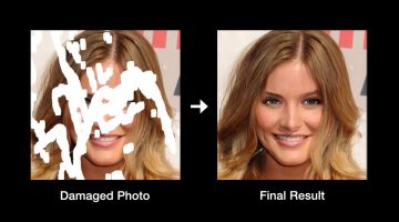
Researchers from American technology company NVIDIA have developed a deep learning method that can reconstruct damaged, corrupted, or partially-erased photos with realistic results. The method performs a process called "image inpainting" that can also be used in photo editing software to remove unwanted objects and fill those areas with realistic computer-generated … [Read more...]
How To Blend Images Seamlessly And Create A Perfect Composite In Photoshop
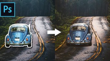
One of the most skillful tasks in Photoshop is to blend objects from multiple images that have different colors, tones, and lighting, into one single image and make it look perfect. This is one of the key differentiators between the work of a professional designer and an amateur. Photoshop instructor Unmesh Dinda from PiXimperfect has come up with a brilliant tutorial that … [Read more...]
23 Beautiful Free Fonts For Your Next Design Project
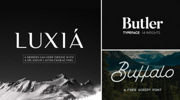
What does a graphic designer love more than a beautiful font? A beautiful font that's available for FREE. There's nothing more heartbreaking than finding a gorgeous font, only to see a big red button next to it that says, "Buy Now for $99". To make life easier for our kind, we at DS have compiled a list of 23 stylish and contemporary fonts that you can download for free. The … [Read more...]
KFC’s Ads For Their Hot & Spicy Chicken Are Literally Explosive
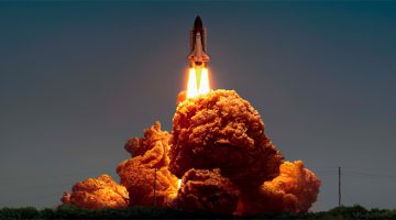
Ogilvy & Mather has come up with an 'explosive' print and outdoor campaign for KFC's Hot & Spicy Chicken in Hong Kong. The three ad series features a drag race car with exhaust flames, a space shuttle launch, and a background explosion in a Power Rangers film. In all three cases, the flames have been skilfully Photoshopped to look like pieces of KFC's Hot & Spicy … [Read more...]
Graphic Designer Substitutes Wordmarks In Famous Logos With The Fonts They Use
Italian graphic designer Emanuele Abrate has come up with an interesting project titled 'Logofonts' that features wordmarks of famous logos substituted with the name of the fonts they use. For example, the Nike wordmark in their swoosh logo has been substituted with 'Futura' written in the same italic style. The WhatsApp wordmark has been substituted with 'HelveticaNeue'. … [Read more...]
10 Clever Tricks Used To Make Food Look Delicious In Photos And Ads
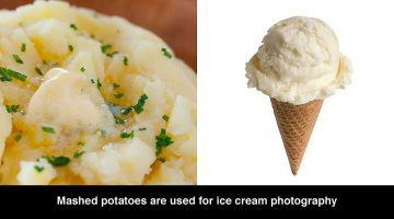
Did you know that scoops of mashed potatoes are dyed in different colors and used in ice cream ads because they don't melt during long shoots under hot studio lights? Cereal ads often use glue instead of milk because it doesn't make the cereal soggy. Shaving cream is used instead of whipped cream because it has a consistent thickness and doesn't melt. Top Trending has come … [Read more...]
6 Important Logo Design Principles Every Designer Should Know
Before you start a logo design project, you need to know who the logo is for? Who is the target audience? The logo will define what the business is all about. Should it be masculine or feminine, traditional or modern, exclusive or inclusive? The colors, typography, and geometry of the symbol will depend on all these factors. DesignMantic has come up with a handy infographic … [Read more...]
This Clever Photoshop Trick Lets You Stretch Backgrounds Without Distorting Your Subject
The Content-Aware Scale tool under the Edit menu in Photoshop lets you stretch or scale an image seamlessly by filling the selection with surrounding pixels and blending them together. However the tool has a stretch limit, beyond which, the subject of the image starts getting distorted. In this short tutorial, Mumbai-based Photoshop expert Unmesh Dinda shares a few useful … [Read more...]
5 Crucial Steps To Make A Consistent And Professional Brand Identity
Businesses across the world enthusiastically adopt branding strategies to lure quality business from customers. In most cases, they achieve the initial phase of branding, the implementation stage, without any issues. But when it comes to the advanced stages and constant updation, they miss out due to a variety of reasons. It becomes an issue of consistency of branding as well … [Read more...]
All You Need To Know About Wix Logo Maker
The digital graphics industry is filled with thousands of logo makers. But not all of them are up to the mark and suitable for professional branding. In this article, we take a look at the online logo maker by Wix, the second largest website building platform after WordPress. Wix Logo Maker is a free logo maker that lets you create stunning logos with its simple and … [Read more...]
Designer Creates Clever Brand Logos By Combining Two Different Objects Into One
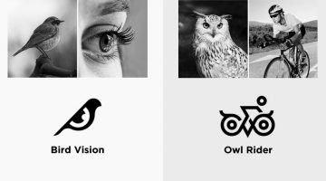
Kochi-based designer Shibu PG has come up with an interesting project in which he combines icons of two different objects into one unique logo based on the brand name. The logo in each case is a visual representation of the brand name. For example, the logo for Bird Vision is an aesthetically designed symbol of a bird and an eye. The logo for Owl Rider is a clever … [Read more...]
5 Crucial Things To Consider When Hiring A Freelance Logo Designer
Every business needs a great logo, especially in the digital age where logos often play a major role in a company’s overall marketing strategy. However, securing a great logo first requires you to find a great logo designer, and this step is vitally important if you hope to come up with a creative, original logo that will portray the right message to your customers. Before … [Read more...]
Vibrant, Dream-Like Illustrations Made With Gradients And Blend Modes
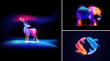
Russian designer Ilya Shapko has come up with a series of vibrant, neon-style artworks using gradients, blend modes, and transparency in Adobe Illustrator and Photoshop. The project, titled 'Fantasy Light', showcases colorful illustrated shapes intricately placed over each other to form abstract animals and objects against dark backgrounds. Shapko's inspiration for this … [Read more...]
This Clever Photoshop Trick Lets You Convert Low-Res Graphics To High-Res
Mumbai-based designer and Photoshop educator Unmesh Dinda has come up with a brilliant tutorial on his YouTube channel PiXimperfect that shows you how to transform low-res graphics to high-res using the concept of contrast and curves. Unmesh uses a clever technique in which he scales up the graphic, blurs it, and then uses the Curves tool to sharpen the edges. Note that this … [Read more...]
- « Previous Page
- 1
- …
- 5
- 6
- 7
- 8
- 9
- …
- 12
- Next Page »