32 Creative And Unique Business Cards That Stand Out
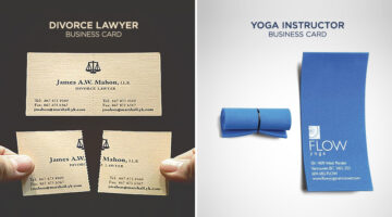
Looking for an innovative business card to impress prospective clients? Check out these 32 ingenious examples that are sure to leave a lasting impression. It’s interesting to see not just creative businesses like agencies, design firms, and photographers using unconventional cards but also lawyers, doctors, and finance professionals. … View Post ▸
15 Types Of Difficult Clients And How To Handle Them Effectively

Every agency has that one client from hell. The one who monopolizes your time, frustrates the entire staff, and makes unreasonable demands. If you've got more than one, you probably spend three out of four weekends in office. If we apply the Pareto principle (or 80:20 rule) to the agency-client relationship, 80% of an agency's resources are … View Post ▸
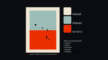
32 Beautiful Color Palettes With Their Corresponding Gradient Palettes
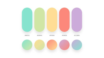
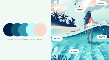
Looking for color palettes for your graphic, web, or UI design? Mr.Pugo is a handy Instagram account that shares beautiful color palettes (with hex codes) and also their corresponding gradient palettes. We’ve shortlisted some of the best ones in terms of aesthetic appeal, usability, and current design trends. Check them out below and tell us your favourites … View Post ▸
12 Visual Hierarchy Principles Every Designer Should Know
Visual hierarchy is the arrangement and presentation of design elements in order of their importance. It influences the order in which the human eye perceives the information that is being displayed. A simple example would be a business card - the name of the organisation is usually the most prominent element, followed by the name of the card holder, job … View Post ▸
51 Brilliant Outdoor Ads That’ll Make You Stop And Notice

How many billboards do you see in your daily commute and how many do you remember? The average attention span of humans is 8 seconds and if advertisers don't work their magic in that time, the message is lost. Today's post features 50 brilliant examples of outdoor, ambient and billboard advertising. These clients and agencies came up with ingenious and … View Post ▸
Dad Photoshops His Kids Into Dangerous Situations To Freak Out Mom At Work
Belgium-based technical director Kenny Deuss and his girlfriend have two children - Alix (born 2019) and Aster (born 2021). When Kenny's girlfriend had to go back to work after maternity leave, she started messaging him all the time, asking for photos to see if the kids are ok. Using this as an opportunity to have some fun, Kenny started sending her … View Post ▸
Japanese Artist Creates Amazing Miniature Dioramas Every Day For 10 Years

Miniature Calendar is an incredible ongoing project by Japanese artist Tatsuya Tanaka, that features beautiful miniature dioramas of everyday life using common household objects such as food, cloth, stationery, electronic devices, and even masks. Tanaka began creating these dioramas in 2011 with an objective to show everyday scenes in a fun, unique way … View Post ▸
How To Master Shadows, Lighting And Create A Perfect Composite In Photoshop
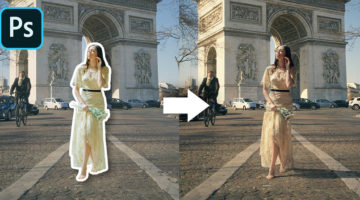
One of the most difficult tasks in Photoshop is to merge objects from multiple images that have different colors, shadows, and lighting, into one single composite and make it look realistic. This is one of the key differences between the work of a professional designer and an amateur. Photoshop instructor Unmesh Dinda from PiXimperfect has come up with an … View Post ▸
Can You Guess What These Clever Ads Are For?
Agency TBWA\Paris has come up with a witty campaign for McDonald's France, to announce the reopening of their fast-food restaurants across the country. The minimalist ads use pixelated color blocks to remind people of popular menu items, namely The Big Mac, Fries, Cheeseburger, and Filet-o-Fish. The tagline reads "Guess who's back". In yet another bold … View Post ▸
How To Accurately Match Colors Of Two Different Objects In An Image In Photoshop
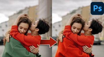
Photoshop instructor Unmesh Dinda from PiXimperfect has come up with a brilliant tutorial that shows you how to precisely replicate the colors of one object in an image and apply them on another using a "Three-Point Curve" technique. Unmesh begins by taking color samples from the shadows, highlights, and midtones of both objects. He then uses the Curve … View Post ▸
Review of Wondershare Mockitt: A Rapidly Evolving Design and Prototyping Tool
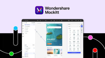
In the world of UI design, several great names stand out from the crowd as iconic products. CorelDraw set the stage for graphic design back in 1989, more than 20 years ago. Balsamiq literally redrew the wireframing landscape in 2008. Sketch made waves when it won the Apple Design Award two years after its release in 2010. Figma was a web-based design tool … View Post ▸
13 Hidden Features In Illustrator That You Probably Didn’t Know
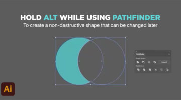
Did you know that holding the alt key while selecting the Pathfinder options creates a non-destructive version of the shape you're working on? This gives you the ability to tweak the shape later on, if you wish to do so. UK-based multidisciplinary designer Mathew Lucas has shared a series of useful tips on relatively less-known features in Adobe … View Post ▸
Art Historian Shares Hilarious Tips That Will Make You An Art Expert
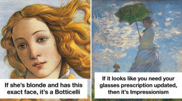
So you want to impress your friends at the art gallery but you have no clue about different art movements and styles. What do you do? There are thousands of guides available online, but who's got the time to go through all of that? Melbourne-based art historian and video content creator Mary McGillivray has come up with a series of humorous tips that'll … View Post ▸
6 Visual Hierarchy Tips That Will Make You A Better Designer

Visual hierarchy is the arrangement and presentation of design elements in order of their importance. It influences the order in which the human eye perceives the information that is being displayed. A simple example would be a business card – the name of the organisation is usually the most prominent element, followed by the name of the card holder, job … View Post ▸
Graphic Designer Improves Adidas Ads By Simply Changing The Typography
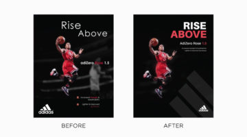
Tom Cargill from Satori Graphics has come up with an interesting before-and-after tutorial in which he improves professional ads by Adidas by making minor changes to their typography and layout. Tom uses different design techniques and principles to improve the hierarchy, contrast, and composition of four ads from different campaigns of the German … View Post ▸
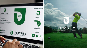
I’ve Been Designing Logos With Hidden Meanings Every Day For 5 Years, How Do You Like My Work?
Indian graphic designer Gary Dimi Pohty has undertaken a design challenge titled "One logo a day" in which he creates logos with hidden meanings on an almost daily basis. At the moment, he is on day 2012, which is roughly 5 years and 5 months! Gary's logos are based on common, everyday words and fictitious brands or films. He uses symbolism, negative … View Post ▸
How To Create A Stunning Glass Effect For Your UI Designs
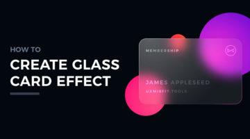
Polish graphic designer Przemyslaw Baraniak, also known as Thalion, has come up with a handy set of tutorials on how to create a glass card effect for your UI and web designs. Glassmorphism is one of the hottest trends in UI/UX right now, and it makes your designs look modern and stylish. Thalion shows you how to use gradient, blur, shadow, and noise to … View Post ▸
7 Design Terms You Will Never Get Wrong Again
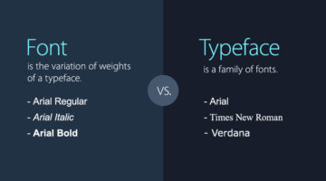
When starting out, most designers don’t know the difference between a font and a typeface. They use the two terms interchangeably. A font is the variation of weights (regular, bold, italic) of a typeface. A typeface is a family of fonts, such as Helvetica, Futura, Bebas, Gotham, etc. Another example is the use of the terms hue and color. Hue is any of the … View Post ▸
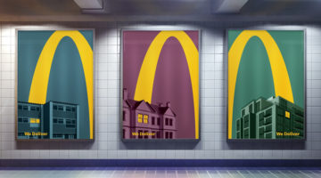
McDonald’s Logo Is So Iconic, Only Half Is Enough In These Brilliant Home Delivery Ads
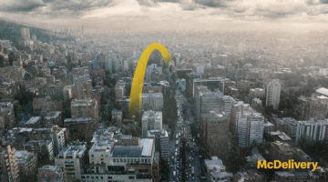
DDB Colombia has come up with an exceptional campaign for McDonald's that uses just half of it's iconic 'Golden Arches' logo to promote their home delivery (McDelivery) service across Latin America. Titled "Good moments don't need to wait", the campaign consists of 5 minimalist outdoor/print ads that feature skylines of Latin American cities with a yellow … View Post ▸
Learn In 15 Seconds How To Remove Any Object From Your Image In Photoshop

Removing unwanted objects from an image in Photoshop can be a tedious and time-consuming task using conventional methods and tools. But now, with Photoshop's new Object Selection Tool and Content-Aware Fill, you can complete such tasks in no time. Photoshop instructor Unmesh Dinda from PiXimperfect has come up with a super short YouTube tutorial that … View Post ▸
35 Beautiful Color Palettes For Your Next Design Project
Looking for color palettes for your graphic, web, or UI design? Coolors is a useful online tool that lets you create, save, and share beautiful color schemes and gradients. You can browse and filter palettes by color or popularity, save them to your account, or download them as PNG, PDF, CSS, SVG, and more. Coolors is also available as an iOS App, Adobe … View Post ▸
30 Dual-Meaning Logos And The Ideas Behind Them
Indonesia-based Grafast Design Studio has come up with a series of interesting logos that combine different shapes and letters into unique symbols that visually represent the brand name. In each logo, the letters used are the initials of the brand name and the shapes represent the product or service offered by the company. For example, the logo for … View Post ▸
Google Monster Mash Is A Fun-To-Use 3D Modelling And Animation Tool For Everyone
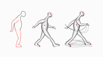
Conventional 3D animation tools are time-consuming, labour-intensive, and can take years to master. Now, Google Research in collaboration with Czech Technical University in Prague, ETH Zurich, and the University of Washington have come up with an open source sketch-based framework named Monster Mash that allows both experts and amateurs to create casual … View Post ▸
This Graphic Design Teacher Has A Unique Way Of Providing Feedback To His Students’ Designs
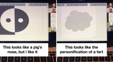
TikToker Natasha Badger recently uploaded a video of her Graphic Design teacher Danny Rankin conducting a "Rapid Roast" session in which he quickly goes through his students' work and shares his first impressions about what's good or bad about the designs. In the preface to the roast session, Danny mentions that the aim of this exercise is not to … View Post ▸
IKEA Launched In Egypt With Clever Ads That Look Like Instruction Manuals
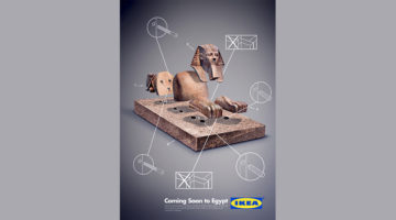
To promote IKEA’s debut in Egypt, agency MI7 Cairo came up with an innovative launch campaign that merged the brand’s modularity with ancient Egyptian architecture and artifacts. The three ad series features the Throne of Tutankhamun, the Qasr El Nil Lion, and the Sphinx in dismantled forms with step-by-step instructions on how to assemble them, just like … View Post ▸
Graphic Designer Improves Professional Ads By Simply Changing The Typography
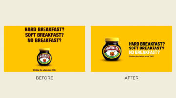
Tom Cargill from Satori Graphics has come up with an interesting before-and-after tutorial that shows you how a design or a layout can be improved considerably by making minor changes to its typography. He uses different techniques to improve the hierarchy, contrast, and legibility of text in professional ads by Gucci, Heineken, Marmite, and more. Are the … View Post ▸
Who Is The Most Popular Artist In Your Country?
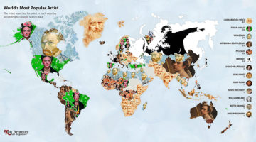
When you think of legendary artists, names like Da Vinci, Van Gogh, and Picasso are a few that come to mind. But who is the most famous artist of all time? And which artists are the most popular in your country? UK-based Ken Bromley Art Supplies analyzed worldwide Google data to find the most searched artist in each country. They created a world map to … View Post ▸
Amazing New ‘Super Resolution’ Tool In Adobe Photoshop Can Turn Low-Res Pics To High-Res
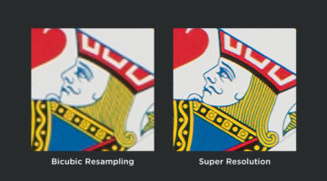
In a major breakthrough for the photography industry, Adobe has released a powerful new feature called 'Super Resolution' that can upsize an image 4x times while preserving its details and colors. For instance, you can turn a 10-megapixel image into a 40-megapixel image and maintain its sharpness at a higher resolution, thereby improving its … View Post ▸
How To Create Flawless And Seamless Backdrops With Photoshop
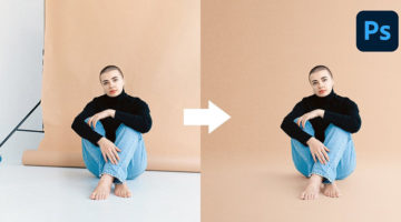
When you're taking product photos for e-commerce or other purposes, you need a plain seamless background that highlights your product or subject. So how do you create a perfectly seamless backdrop from top to bottom and left to right without any major studio equipment? Photoshop instructor Unmesh Dinda from PiXimperfect has come up with a handy tutorial … View Post ▸
McDonald’s Iconic Logo Is So Recognizable, Only Half Is Enough In These Brilliant Home Delivery Ads
Leo Burnett London has come up with an ingenious campaign for McDonald's that uses just half of it's iconic 'Golden Arches' logo to promote their home delivery (McDelivery) service during the COVID-19 lockdown in the UK. Titled "Lights On", the campaign consists of 5 minimalist outdoor/print ads that feature an illustrated yellow curve soaring over … View Post ▸
3 Simple Ways To Extend Photos And Backgrounds In Photoshop
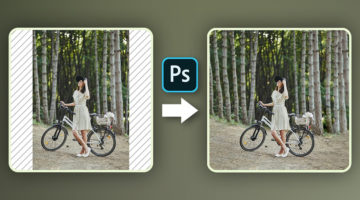
So you have this beautiful vertical photo that you want to upload on Instagram but the platform only allows square or 4:5 ratio images on feed posts. You either crop the photo or add white/blurred borders on the sides, but that just doesn't look good, specially on a graphic designer's feed. So what do you do? In this handy tutorial, Photoshop instructor … View Post ▸
Designers Are Sharing Their Redesigns Of Famous Logos And Some Of Them Are Better Than The Original
Have you ever looked at a famous logo and thought that you could have done a better job? Of course you have! With so many brands opting for redesigning their logos nowadays, designers from all over the world are sharing their rebranding concepts and reimagined versions of iconic brand logos. We've shortlisted some of the best redesigns on Dribbble and … View Post ▸
Free And Cheaper Alternatives To Photoshop, Illustrator, And Other Adobe Creative Software
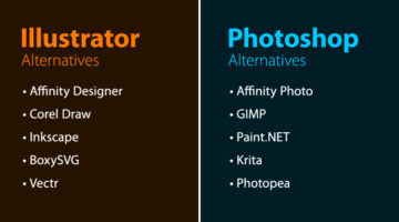
Looking for free options for Adobe Creative Cloud programs? Quze has compiled a list of free and cheaper (one-time purchase) alternatives to Adobe Photoshop, Illustrator, InDesign, XD, Dreamweaver, After Effects, Animate, and Audition. The list includes some well-known alternatives like Affinity Suite, Corel Draw, Canva, Sketch, Figma, etc. and also a few … View Post ▸
22 Images That Show Why Letter-Spacing Is Important
Ever wondered why professional designers focus so much on kerning, i.e., adjusting the spacing between letters or characters in a piece of text? Improper kerning (or keming as it is humorously known) can change the meaning of a sentence to a great extent. And sometimes, the results can be hilarious. These 22 epic images show you why letter-spacing is … View Post ▸
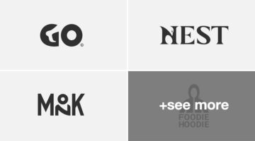
25 Clever Logos With Hidden Meanings
Russian graphic designer Vlad Smolkin has shared an interesting collection of hidden-meaning logos that he has created for different clients over the years. The designs use clever typography and symbols hidden in negative spaces to visually represent the brand name or explain the nature of the business. For example, the logo for Infinity Cat Cafe is an … View Post ▸
Tri-Color Palette Ideas For Your Next Design Project
It's easy to find two colors that go well with each other, but things get tricky when you add a third color to the mix. Each color must complement the other two perfectly. If you’re looking for tri-color palettes for your graphic, web, or UI design, Wolvus Technology has come up with a series of beautiful combinations that look great together. You can use … View Post ▸
How To Add Any Pattern To Clothes In Photoshop
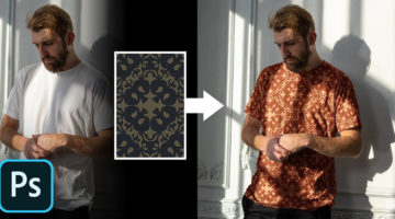
Previously, we featured a tutorial on how to add a pattern to an image with complex perspectives using the Vanishing Point Filter in Photoshop. Today, we will learn how to realistically add any pattern to a piece of clothing in an image in Photoshop. In this comprehensive tutorial, Photoshop instructor Unmesh Dinda from PiXimperfect shows you how to use … View Post ▸
Names And Codes Of All Color Shades
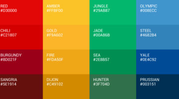
It's "maroon", not dark red. Just like it’s "navy", not dark blue. Graf1x has created a handy Color Thesaurus – a collection of charts and posters that list the correct names and hex codes of all major color shades. The charts are a useful reference tool for artists, designers, studios, students, teachers, interior decorators, make-up professionals, and … View Post ▸
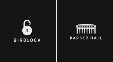
32 Brilliant Logos With Hidden Meanings
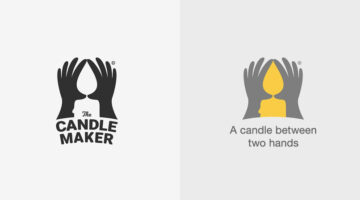
Looking for some logo design inspiration? Here are 32 brilliant examples with dual and hidden meanings, also known as visual double-entendres. In most cases, the hidden symbols are a visual representation of the brand name, and in others, they explain the nature of the business. Clever typography, negative space, and visual symbolism are some of the … View Post ▸
I Photoshopped My Ex-Wife Out Of A Family Pic, People Are Saying It’s The Best Photoshop They’ve Ever Seen
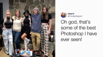
Twitter user Courtney Maloney, whose parents are divorced, posted a picture of her family on one of her social media accounts. Her dad wanted to repost the photo but didn't want his ex-wife in it. He Photoshopped her out with meticulous precision and shared the picture on his Facebook. Courtney, impressed by her father's Photoshop work, posted the … View Post ▸
- « Previous Page
- 1
- 2
- 3
- 4
- 5
- 6
- …
- 33
- Next Page »