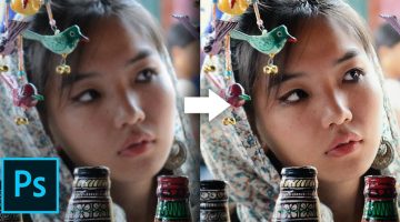
This Clever Photoshop Trick Lets You Add Realistic Light Or Shine To Any Object
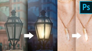
Did you know that you can add realistic-looking lights and shine to images of lamps and jewellery by using the magic of blend modes in Photoshop? In this tutorial, Photoshop instructor Unmesh Dinda shows you how to use color dodge and layer styles to mimic the properties of light and shine. He takes you through five different image examples and shares two … View Post ▸
19 Graphic Design Mistakes That Novice Designers Make
After a few years in the graphic design business, you realize how important it is to get the basics right. Like using proper font and color combinations, implementing visual hierarchy, using grids, alignment, white space, and so on. The team at Visme, an online tool for creating infographics and presentations, has come up with an excellent visual list of … View Post ▸
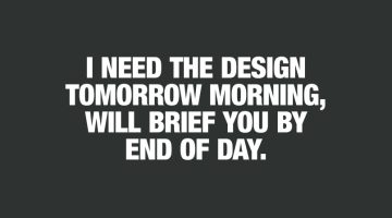
21 Memes Only Graphic Designers Will Understand
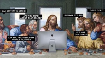
Monday can be a tricky day for designers, with clients, bosses, and deadlines breathing down their necks. We thought you guys could use some meme therapy to help brighten up your day. Check out the compilation below, and don't forget to browse through some of our other popular meme posts. … View Post ▸
News Site Captures World Leaders From Unusual Perspectives In Clever Ad Series
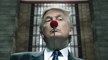
Argentinean news site Dos Miradas (translation: two looks) has come up with a clever campaign that features images of world leaders Donald Trump, Vladimir Putin, and Kim Jong-un captured from unusual but symbolic perspectives. The objective of the campaign is to inform viewers that there are two sides to every story, and Dos Miradas offers "a different … View Post ▸
Designer Creates Clever Logos By Combining Two Or More Different Shapes Into One
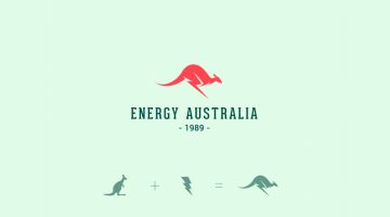
Kochi-based designer Shibu PG has come up with a series of interesting logos in which he combines the shapes of two or more different objects and letters into one unique logo. The logo in each case is a visual representation of the brand name. For example, the logo for Energy Australia is a combination of the shape of a kangaroo and the energy symbol ⚡️. … View Post ▸
India Today Comes Up With A Brilliant Cover To Raise Awareness About Saving The Taj Mahal
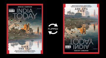
News magazine India Today has come up with a powerful cover for its Save the Taj campaign (July 30 issue) that features a cleverly-inverted photograph of the Taj Mahal and its reflection in the neighbouring Yamuna river. At first glance, the cover photo looks like an eroded image of the Taj surrounded by garbage. When flipped upside down, you realise that … View Post ▸
Top 20 Car Logos Of All Time
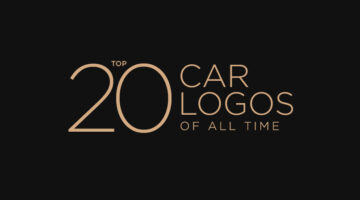
From American muscle to European exotics, everyone has a favourite car they would like to own one day. But do you also have a favourite car logo? We asked a panel of designers and art directors to rank the best car logos of all time, strictly from a design perspective, not in terms of brand value. Check out the results below and tell us your favourite in … View Post ▸
Designer Turns Neymar’s Dramatic Falls Into A Free Font
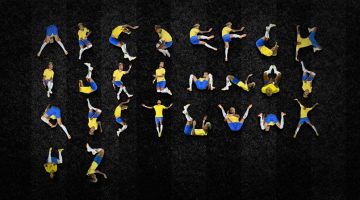
Brazilian art director Luciano Jacob has turned Neymar's dramatic World Cup falls into a free-to-download font called 'Ney Type'. While others were busy mocking the Brazilian footballer's dives on social media, Jacob was convinced Neymar was "just trying to send us a message". He noticed the similarity between Neymar's poses and letterforms of the … View Post ▸
NVIDIA Develops AI That Can Remove Noise, Grain, And Even Watermarks From Photos

Researchers from NVIDIA, Aalto University, and MIT have developed an AI that can remove noise from grainy photos and automatically enhance them. This technology can be beneficial in several real-world situations where it is difficult to obtain clear image data like MRI scans, astronomical imaging, and more. Existing noise-reduction AI systems require both … View Post ▸
This Simple Chart Explains What Common Terms In A Logo Design Brief Mean
What do clients mean when they say their logo needs to be modern, luxurious, or subtle? Dubai-based logo designer Jefferson Pascual has created a handy infographic that uses an illustration of a bird to explain common terms used in logo design briefs. The chart features bird logos designed in different styles (eg. young, modern, feminine) with their … View Post ▸
Shutterstock Comes To The Rescue Of Creatives Everywhere In These Clever Ads
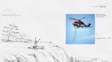
Stock photography site Shutterstock is used by designers, creatives, and agencies all over the world, everyday. To highlight how important and useful the site is for creatives, agency Cazar DDB in Santo Domingo (Dominican Republic) has come up with a witty print campaign that plays on the idea of Shutterstock "rescuing" creatives when they need it … View Post ▸
Brilliant Ads By Stabilo Highlight The Unnoticed Women Who Made History
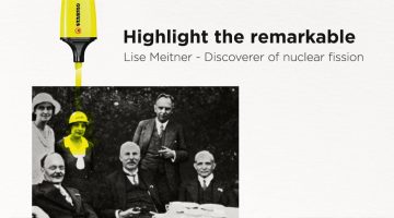
DDB Group Germany has come up with an exceptional print campaign for Stabilo Boss highlighter pens that honours extraordinary but overlooked women who helped change the course of history. The ads feature old black-and-white photos of scientists, NASA engineers, and politicians. The women in the background are highlighted in fluorescent yellow by a Stabilo … View Post ▸
Thermos Shows How Effective Their Flasks Are With These Brilliantly-Art Directed Ads

Thermos has come up with an excellent print and outdoor campaign in Thailand that shows how effective their insulated flasks are. The 3-ad series features visuals of internal organs covered with warm clothing. The idea is that no matter how cold the surrounding temperature is, thermos products will keep your drinks warm enough. The agency is Ogilvy Group … View Post ▸
This Brilliant Newspaper Ad Hides A 3D Kitchen In The Classifieds
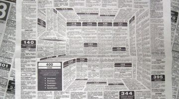
Classified ads are usually boring and mundane but not for this creative duo. Colombia-based creative director Felipe Salazar and graphic designer Karen Castañeda came up with a brilliant optical illusion ad for their home kitchen client HiperCentro Corona. The ad uses disproportionate blocks of text to create the indent of a 3D kitchen in the middle of … View Post ▸
This Clever Photoshop Trick Lets You Generate Unlimited Filters With Just One Click

Did you know that the Gradient Editor in Photoshop has a 'Randomize' feature that lets you browse through unlimited gradients which you can use as filters on your photos? In this tutorial, Photoshop instructor Unmesh Dinda shows you how to combine the concepts of Gradient Fill, Gradient Maps, and Blend Modes to create beautiful color combinations and … View Post ▸
10 Photoshop Commandments Every Designer Should Follow
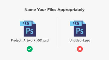
When you’re working in a team and multiple designers and developers are working on the same Photoshop file, there are certain protocols you need to follow. You need to use an appropriate naming convention for PSD files, like ProjectName_Job_Version.psd instead of the default Untitled-1.psd. You should label your layers and organize them into groups. You … View Post ▸
JBL Shows How Effective Their Headphones Are With These Brilliantly Art-Directed Ads

Last year, JBL China came up with an award-winning print/outdoor campaign that used 3D illustrations and negative space to show how effective their noise-cancelling headphones are. The campaign, titled "Block Out The Chaos", was created by Cheil Worldwide Hong Kong and the illustrations were created by Bangkok-based CGI studio Illusion. Now, JBL has … View Post ▸
Fix And Sharpen A Blurry Photo With This Clever Photoshop Technique
Most cameras nowadays have 'image stabilization' or 'anti-shake' features to reduce the likelihood of taking blurry photos. It works by moving the camera lens automatically to compensate for handheld movements. But once in a while, you do end up with a great capture that's slightly blurred and you don't really want to delete that image. What do you do … View Post ▸
The Font On Adidas’ Football World Cup Jerseys Is Causing A Lot Of Confusion
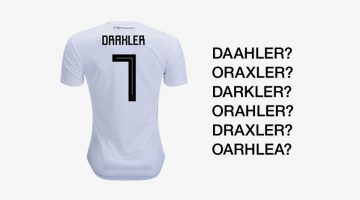
The official Adidas' font, used on its FIFA World Cup jerseys, is causing confusion due to its square, Cyrillic-style letters and numbers. Inspired by traditional Soviet imagery, the font uses sharp 90-degree strokes which causes confusion between letters like 'A' and 'R', 'X' and 'K', 'Z' and '2', etc. FIFA's equipment regulations state that the font … View Post ▸
10 Best Uses Of Color In Movies

Right from the first scene, color sets the mood and tone of a film before any of the actors have uttered a word. Since the dawn of colored cinema, filmmakers have used color to convey drama and emotion in storytelling. Visual-minded directors and cinematographers have created color palettes almost as memorable as the films themselves. The Wachowskis used … View Post ▸
FIFA World Cup Logos From 1930 – 2022, Which One’s The Best?
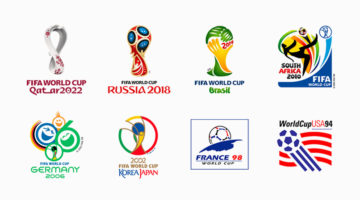
The FIFA World Cup is the most widely viewed and followed sporting event in the world. The logo for the 2022 World Cup in Qatar has been unveiled and we decided to do a round-up of all the World Cup logos from 1930 - 2022. During the first four World Cups from 1930 - 50 (there were no tournaments in '42 and '46 due to World War II), the organizers created … View Post ▸
8 Beautiful Flat Color Palettes For Your Next Design Project

UI/UX designer Ebtihaj Khan has created a series of minimalist flat color palettes for graphic, web, and UI projects. Each palette consists of five colors with their hex codes mentioned alongside. Khan has included both linear and contrasting color schemes. The beautiful presentation of these palettes, with the blurred vignette effect in the background, was … View Post ▸
23 Clever Typographic Logos Of Common Words We Use Every Day
Colombo-based graphic designer Samadara Ginige has come up with a series of typographic logos of common nouns and verbs we use every day. The project, titled "Verbicons", visualizes the meanings of the chosen words by using symbolism, negative space, or by adding geometric elements to the letters. For example, the letter 'c' in the word 'cash' looks like … View Post ▸
Clever Logos Of Letters A To Z Based On Common Words That Start With Them
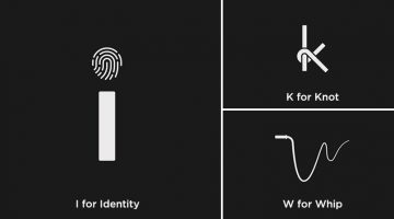
UK-based graphic designers Liam + Jord undertook a 36-day typography challenge to create logos for every letter of the alphabet based on common words that start with them. For example, the letter 'b' has been designed to look like a book, the letter ‘f’ looks like a flag, 'w' looks like a whip, and so on. The objective was to use the shapes of the letters … View Post ▸
Clever Ads For In-Flight Entertainment Use Parts Of An Airplane To Represent Famous Movies
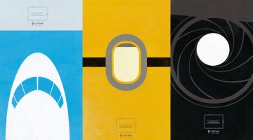
McCann Lima has come up with an excellent print + outdoor campaign to promote LATAM Airlines' inflight entertainment system. The 6-ad series shows illustrations of different parts of an airplane cleverly designed to represent a famous film. For example, the first ad features a black and grey illustration of an airplane turbofan engine that resembles the … View Post ▸
How To Rotate Or Straighten A Tilted Image In Photoshop Without Cropping The Edges

Usually, when you try to rotate or straighten a tilted image in Photoshop, you end up cropping and losing a bit of the corners and edges. Well, not anymore. Mumbai-based Photoshop instructor Unmesh Dinda has come up with an excellent tutorial that shows you how to straighten an image in Photoshop without cutting out the edges. He shows you how to use the … View Post ▸
How Clever Is This ‘Sticky Banner’ Ad By Fevicol Glue?
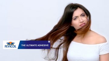
No one pays attention to web banners anymore. So Fevicol, India's leading adhesive brand, decided to create a banner that would genuinely stick, and not just figuratively. They came up with a 'sticky banner' that appears to show up in YouTube pre-roll ads of other brands. The adhesive power of the banner is so strong, that even the characters in the ads … View Post ▸
9 Things Graphic Designers Want To Tell Clients, And Everyone Else
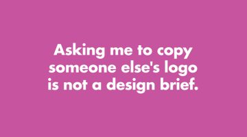
How many times have you received a design brief that asks you to copy someone else's logo? Or a brief that says "Just come up with a few quick logos." Has a client ever asked you to use Comic Sans? London-based product designer Anneke Short has come up with a series of minimalist posters titled "Confessions of a Designer" that feature nine things every … View Post ▸
Designer Creates Clever Logos That Visualize The Name And Business Of The Company
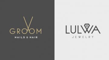
Kuwait-based graphic designer Rami Hoballah has come up with a series of minimalist logos that combine the name and the product (or service) of the company into one unique symbol. The logo in each case visually represents the brand name and the nature of its business. For example, the logo for Groom Salon is a pair of scissors made with the two o's in the … View Post ▸
Airtel Africa Shows How Fast Its Network Is With These Brilliantly Art-Directed Ads
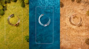
Ogilvy Africa has come up with an excellent print + outdoor campaign for telecommunications company Airtel Africa. The 3-ad series features aerial photographs of a lion, a shark, and a cheetah chasing their preys at full speed in a circular path. The outline of a mobile phone is superimposed on the photograph, which makes the circular path resemble a loading … View Post ▸
Designers Challenge Themselves To Create A Typographic Logo Every Day For A Year, And They’re Pretty Cool
UK-based graphic designers Liam + Jord undertook a 365-day challenge to create one new typographic logo of a common word we use every day. The objective was to visually represent the meanings of the words by using symbols, negative space, or by adding geometric elements to the letters. For example, the letter 'i' in the word 'drive' looks like a gear … View Post ▸
Hilarious Meanings Of Flag Colors Of Different Countries
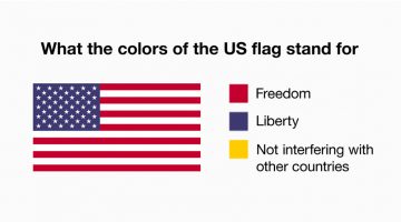
People on the internet are exploring the 'true' meanings behind national flags, based on stereotypes of what that country is famous or notorious for. Here are some of the submissions. … View Post ▸
Designer Creates Clever Logos That Visually Represent The Name And Business Of The Company
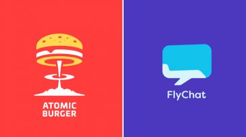
Lithuania-based graphic designer Leo has come up with a series of minimalist logos called "Smart Logos" that combine the name and the product (or service) of the company into one unique symbol. The logo in each case visually represents the brand name and the nature of its business. For example, the logo for Atomic Burger is a burger on top of a mushroom … View Post ▸
13 Things Client Servicing Executives Should Never Say To Graphic Designers
If you've ever worked in a creative agency, you must be aware of the love-hate (or hate-hate) relationship between client servicing executives and designers. CSEs have to manage client expectations and their primary objective is to keep the client happy. Designers want to keep the client happy too, but they don't want to compromise on aesthetics and … View Post ▸
National Geographic Comes Up With An Iconic Cover To Raise Awareness About Plastic Pollution
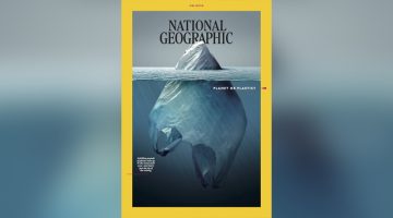
National Geographic magazine has launched a campaign titled 'Planet or Plastic' to raise awareness about plastic pollution and the threat it poses to the oceans. For their June 2018 cover, Mexican artist Jorge Gamboa has come up with an iconic photo-illustration that looks like an iceberg at first, but is actually a plastic bag partially submerged in the … View Post ▸
- « Previous Page
- 1
- …
- 8
- 9
- 10
- 11
- 12
- …
- 33
- Next Page »