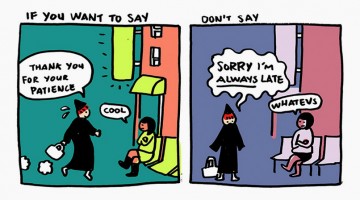
In our daily lives, we often say "sorry" when we want to apologise out of politeness. But this inspiring comic strip by New York-based illustrator Yao Xiao, shows us why it's better to say "thank you" and compliment the other party rather than saying sorry and excusing yourself all the time. Check it out below. … [Read more...]
20 Beautiful, Minimalist Images Of Architecture
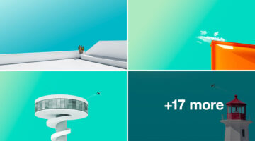
'Minimal Pure' is a beautiful series of cool-toned images by Istanbul-based art director Feridun Akgüngör. He blends teal and cyan gradients of the sky with glimpses of architecture to create calm, minimalist images that have a soothing effect. Check them out below. … [Read more...]
Clever Flag-Colored Icons Of Countries Based On Their Popular Products And Phrases
Here's an interesting visual project by Russian art director Kirill Zaytsev, that showcases minimalist flag-colored icons of various countries based on common phrases, products and stereotypes associated with them. For example, the icon for France is a pair of luscious lips colored blue, white and red, representing the term "French kiss". The icon for US is a dream bubble … [Read more...]
Beautiful Typographic Art Created With Food Items
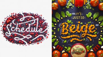
Utah-based designer and lettering artist Becca Clason creates beautiful typographic art using food products and other items. She handles everything from prop styling to art direction, photography and post-production. Her clients include Disney, American Express, Kellog's, Citibank and L'Oréal to name a few. Check out some of her work below. It's the yummiest thing you'll see … [Read more...]
45 Awesome Logo Animations
They're smooth, they're slick, they're cool and they're quick. Check out these 45 brilliant logo animations that pop right off the screen. … [Read more...]
24 Heartwarming Illustrations That Show How Love Is In The Little Things We Do Every Day
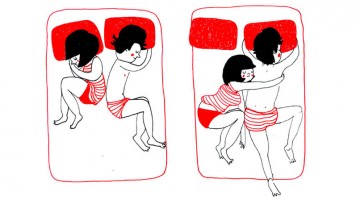
Happiness is...finding joy in the simplest of things. Bristol-based artist Philippa Rice creates adorable illustrations that show how love between couples lies in the little things they do every day. If you're in a relationship, you will relate to at least one, if not more, of these comics. Check them out below. … [Read more...]
30 Comic Strips That Perfectly Describe The Life Of A Designer
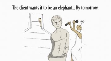
Designers are like gladiators, battling ugliness in the client's colosseum. Creative Market depicts the best and worst parts of being a designer with #DesignerProblems, a weekly comic strip written and illustrated by Seth Roberts and Brian Hawes. Check it out below. … [Read more...]
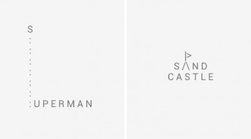
45 Clever Typographic Logos Of Common Words We Use Every Day
California-based design studio Quillo Creative has come up with a series of impressive typographic logos of common words we use every day. They've combined, altered, and replaced letters with visuals that symbolize the word. For example, the letters 'H' and 'A' in the word SHAVE have been designed to look like a razor. The 'M' in CAMP looks like a tent. The words 'H' and 'E' … [Read more...]
Scary Client Feedback Designed As Classic Horror Movie Posters
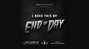
Brand design agency Serious Studio has come up with a series of funny posters for Halloween. Titled 'Creative Horror Stories', the series showcases stupid client comments in the form of classic horror movie posters of the 1920s - 30s. Check them out below. … [Read more...]
Auto Mechanics Recreate Famous Renaissance Paintings In This Hilarious Photo Series By Freddy Fabris

When Chicago-based photographer Freddy Fabris stumbled upon an auto repair shop in the Midwest, he came up with an amusingly bizarre idea. He had always wanted to pay homage to the works of legendary Renaissance artists, but was looking for a conceptual twist. The auto shop triggered his creative juices, and 'The Renaissance Series' was born. Check it out below. … [Read more...]
Beautiful, Hand-Lettered Logos Of Countries From A To Z
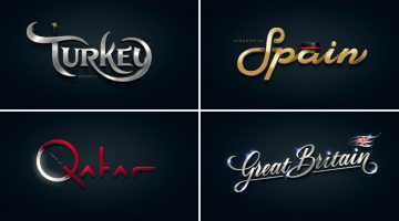
Alphabet of the Countries™ is a non-commercial, just-for-fun project by art director Pavel Zertsikel at Zergutdesign Studio. The idea was to make 26 hand-lettered logotypes, from A to Z, based on common notions of a particular country. The logos were to be hand drawn and created without the use of fonts (allowed for small captions only). The end result is a beautiful … [Read more...]
10 Clever Animal Logos Created With Negative Space
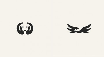
Using negative space with subtle perfection, NY designer George Bokhua has created an adorably clever collection of animal logos. Most of these would make great tattoo designs as well. If you're a design freak and an animal lover, this will make your day. … [Read more...]
BMW Takes You On The Road To Great Music In These Clever Ads With Brilliant Art Direction
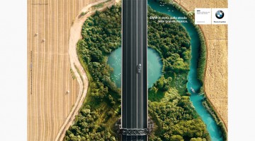
To celebrate their partnership with the prestigious Teatro alla Scala opera house in Milan, BMW came up with a wonderful three-ad campaign that shows a bird's-eye view of a road that looks like a guitar, a violin and a mandolin. The tagline says "BMW takes you on the road to great music". Check them out below. … [Read more...]
Amazing One-Line Illustrations Made With A Single, Continuous Pencil Stroke
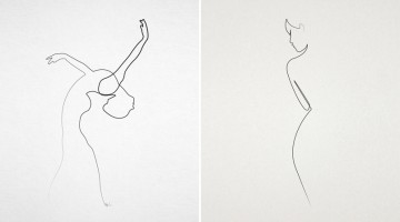
French artist Christophe Louis (a.k.a. Quibe) specialises in one-line illustrations, i.e. drawings made with a single stroke without lifting the pencil. His style is minimal with abstract strokes that form recognisable shapes. The end result is beautiful to say the least. Check out some of his illustrations below. … [Read more...]
36 Inspiring Quotes On Typography That Every Designer Should Live By
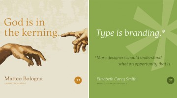
Los Angeles-based graphic designer Bill Dawson has designed a wonderful collection of posters featuring typography quotes from famous designers and type artists. Titled 'Typethos', the project shares tips and words of wisdom from design greats such as Paul Rand, Erik Spiekermann, John Boardley and more. Check it out below. … [Read more...]
60 Brilliant Ads With Amazing Art Direction
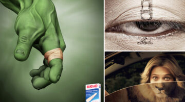
Even the best advertising idea can get ruined if the art direction is not spot on. The design and execution of any campaign is as important as the idea itself. Good art direction makes the message the hero. It makes the consumer think about the product, the brand, and its benefits. Today's post is a compilation of the finest examples of design, illustration, typography, … [Read more...]
Celebrities Pose With Their Younger Selves In These Amazing Illustrations By Fulvio Obregon
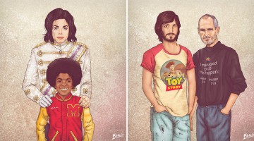
Colombian artist Fulvio Obregon has come up with a fascinating series of illustrations titled "Me & My Other Me", that show music, film and tech celebrities posing with younger versions of themselves. Obregon's inspiration for this project came from an ad showing a woman with her younger self. Not surprisingly, most of the younger versions appear rebellious or hippiesque, a … [Read more...]
20 Leading Artists Share 20 Useful Tips That’ll Make You A Better Designer
To grow in any profession, we need to learn from the experiences of those who've been in the game for long. As research for her online workshop, illustrator Salli Swindell asked 20 leading artists to share one piece of advise that would be helpful to other illustrators. Needless to say, these tips apply to everyone in the design business. Here's what they had to say. … [Read more...]
27 Brilliant Illustrations That’ll Make You Stop And Think
Steve Cutts is a London-based freelance animator and illustrator. When he's not busy working with the leading agencies and production houses, he creates thought-provoking satirical illustrations that highlight important issues like environmental pollution, obesity, tech-addiction and more. After graduating from school, Steve chose to study Fine Arts at university (instead of … [Read more...]
For Designers And Art Lovers – A Beautiful, Informative Video On How Ink Is Made
Here's a wonderful short film by The Printing Ink Company in Canada that takes us through the process, techniques and craft of ink creation. The company shares the methods they use to create every color in the PANTONE spectrum, the challenges they face and the attention to detail that goes into making every jar of ink. The film brings to life the passion and joy of color … [Read more...]
27 Useful Design Tips Explained With Beautiful, Inspiring Graphics
Poppie Pack, senior graphic designer at Canva, has put together a handy list of design tips complemented by beautiful images with inspiring quotes. From typography and layout to image editing and color usage, the list covers some crucial aspects of design that both newbies and professionals will appreciate. We've shortlisted 27 of our favourites to share with you. Check them … [Read more...]
Punny Pixels – A Series Of Clever Visual Puns That’ll Make You Smile
Punny Pixels is a fun series of visual puns by Singapore-based ad creatives Eunice Ng and Nandini Trivedi. The art-copy duo's love for clever puns, wordplay and graphic illustrations resulted in this witty, ever-growing collection that's gained quite a following on Instagram. Here are a few of their best ones. … [Read more...]
Male Vs Female Color Perceptions And Preferences
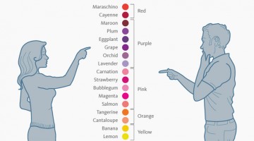
Traditionally, baby boys are wrapped in blue and baby girls in pink. A few years later, you can tell a boy's room from a girl's room just by observing the color combos (and the cleanliness ;) ). As we grow up, gender color preferences are visible in everything from wardrobes to cars (though nowadays the line is thinning). … [Read more...]
This Artist Completes His Cut-Out Sketches Using Skies And Sceneries As Backdrops
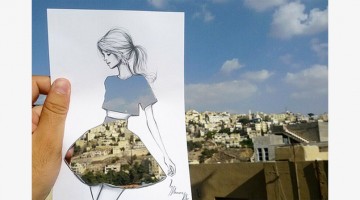
Architect, visual artist and fashion illustrator Shamekh Al-Bluwi has found an ingenious way to combine his passions. The half Saudi, half Jordanian artist uses skies, buildings and everyday patterns to 'fill' his cut-out sketches. The end-results are brilliant to say the least. Check them out below. … [Read more...]
Clever Typographic Art Created With A Phone Keypad Using Letters And Symbols Only
TypoSpective is a minimalist typographic experiment by Cairo-based creative director Sherif Samy. He blends meanings and visual representations of daily-used words to form type-art using letters and symbols found on a mobile keypad. Check it out below. … [Read more...]
32 Clever Illustrations That Show The Two Kinds Of People In The World
There are two kinds of people - morning people and those who want to shoot morning people (designers are usually nocturnal and hence fall under the latter). Portuguese art director Joao Rocha has created a fun series of minimalist illustrations that classifies people into two broad groups based on their daily habits and preferences. Check out some of the good ones below. … [Read more...]
19 Inspiring Quotes Every Designer Will Relate To
There are good days and there are days when you just can't get those creative juices flowing. Wether you're a rookie or a seasoned professional, every designer needs a little inspiration from time to time. Today's post features 18 inspiring quotes that are meant to get you back into the driver's seat, incase you're facing designer's block. Check them out below. … [Read more...]
From A To Z, These Superhero-Themed Alphabets Are Super Cool
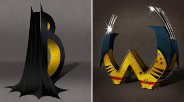
'Superbet' is a superhero-themed alphabet series by Sydney-based illustrator and art director Simon Koay. Each alphabet corresponds to the initial of a superhero and has been designed in 3D using elements from their costumes and weapons. For example, the letter B features Batman's cape and cowl with two pointed ears protruding from the top of the letter. The two arms on the … [Read more...]
11 Fonts That Designers Love To Hate
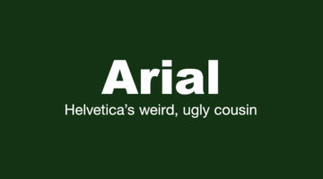
Every design project is unique and requires a typeface that matches the visual aesthetics and compliments the content. However, there are some typefaces that designers try to steer clear of, because they find them ugly, outdated or overused. Today's post showcases a cool series of posters by Creative Market titled "Fonts designers love to hate". Bear in mind that some of … [Read more...]
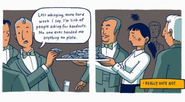
This Brilliant Comic Strip On Rich Vs Poor Upbringing Shows What Privilege Is All About
Auckland-based illustrator Toby Morris reminds us that not everyone gets the same privileges in life, with this brilliant comic titled "On a Plate". The illustrations depict the story of two individuals born into different households and how their backgrounds and families play a huge role in the kind of opportunities they get in life. Check it out below. … [Read more...]
How Humans React To Different Colors
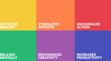
Did you know that green is used for night vision goggles because the human eye is most sensitive to, and able to recognise most shades of that color? People are often more productive in rooms painted blue. Pink makes us crave sugar. Red increases enthusiasm. Grey represents non-involvement, giving it a formal authority. Ript Apparel has created a comprehensive infographic … [Read more...]
17 Amazing 3D Graffiti Artworks That Look Like They’re Floating In Mid-Air
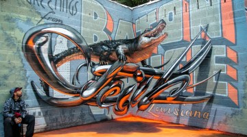
Portuguese street artist Sergio Odeith creates anamorphic 3D graffiti art that, from a certain angle, looks like it's floating in mid-air. His work has been showcased at the Museum of Public Art (Louisiana), Brazilian Museum for Sculpture (São Paulo) and Meeting of Styles (Alemanha), to name a few. Odeith has also created large scale murals for enterprises such as Coca-Cola, … [Read more...]
27 Funny But Thought-Provoking Images Of How Smartphones Have Taken Over Our Lives
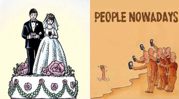
A few days back, we came across a poster that had a beautiful picture of a beach with a headline that said "Can you give up your phone, TV and computer for 24 hours?" This sparked an interesting debate here at DS. Most of us agreed that no TV for 24 hours wouldn't be a problem. No computer? Manageable on a non-working day. But any plans to carry out this 24 hour digital detox … [Read more...]
15 Funny Confessions From Designers; Which One Can You Relate To?
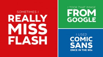
Be honest, have you ever used Comic Sans in your designs? Or a copyrighted image from Google Images? Do you really like the 'flat design' trend that's taken over every interface these days? How often do you actually kern? Creative Market has come up with a series of 15 typographic posters filled with funny confessions from designers who want take a load off their chest. Check … [Read more...]
Is That A Chameleon Or Two Body-Painted Women? Here’s The Answer
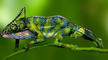
Check out this amazing piece of body art by Italian artist Johannes Stötter. What appears to be a photograph of a chameleon is actually two body-painted women lying on top of each other. Stötter took four hours to design the piece and six hours to body paint with the help of an assistant. The final result is incredible to say the least. Check it out below. … [Read more...]
- « Previous Page
- 1
- …
- 5
- 6
- 7
- 8
- 9
- Next Page »